10,000 search results
(0.02 seconds)
- Peignot by Monotype,
$29.00 - Peanotes by Mvmet,
$15.00
- Beignet JF by Jukebox Collection,
$32.99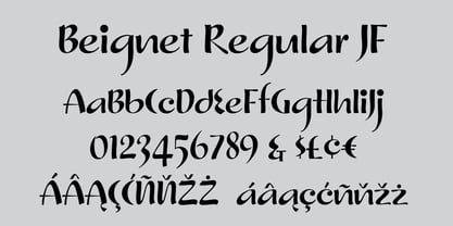
- grotto Med - Personal use only

- Med Splode - Unknown license

- Pinot Noir by Jonahfonts,
$40.00
- Mod - Personal use only

- LED - Unknown license

- WedDing - Unknown license

- MeM by 26+,
$40.00
- Red by Kevin Thrasher,
$20.00
- Ned by Linotype,
$29.99 - Led by Graviton,
$8.00
- Wedding by HiH,
$10.00
- Apothem Caps Med - Personal use only

- Axial Caps Med - Personal use only

- Mee Mee Kids by Designova,
$25.00
- Pinot Grigio Modern by Alan Meeks,
$45.00
- Mid Mid Sun Sun by Daylight Fonts,
$50.00
- Agent Red - Unknown license

- Red October - Personal use only

- Red October - Personal use only

- House M.D. - Unknown license

- Red October - Personal use only

- Xray Ted - Unknown license

- Mr Men - Personal use only

- LED BOARD - Unknown license

- Red Circle - Unknown license

- Mad Marker - Unknown license

- Red Lightning - Unknown license

- Mad scientist - Unknown license

- Frequency Mod - Unknown license

- Texas LED - Unknown license

- red shirt - Unknown license

- Mad scientist + - Unknown license

- KR Wedding - Unknown license

- Red Klin by ParaType,
$25.00
- Wedding Dress by Letterara,
$14.00
- Joe Mad by Comicraft,
$39.00
- Red Ring by Letterhead Studio-YG,
$45.00


Page 1 of 250Next page