10,000 search results
(0.015 seconds)
- Port Of Call JNL by Jeff Levine,
$29.00 The hand lettered titling on a vintage piece of sheet music for the song "Sweet Siamese" is the basis for Port of Call JNL.
 - KG Legacy Of Virtue by Kimberly Geswein,
$5.00 This font is based on the handwriting of an elderly gentleman who hand-copied the Bible twice in his lifetime. His neat, fluid penmanship leaves a written legacy of love for his family and God.
 - Chamber Of Commerce JNL by Jeff Levine,
$29.00Chamber of Commerce JNL is loosely based on a type style used for some rubber stamp letters and numbers from a vintage child's printing set. Originally a cast shadow design, Jeff Levine felt the lettering merited a direct treatment in both regular and oblique styles without the shadow effect. - FT Master Of Poster by Fenotype,
$19.95 Master of Poster is an all caps OpenType family. Each style has over 450 ligatures.
 - Greatest All of Time by Struggle Studio,
$16.00 Greatest All the Time - is a Duo Handwritten with Extras and petite (handwritten and modern look) Font Duo, featuring a sweet and gentle look. This original look will appeal to a variety of crafty ideas, from letterhead and titles to writing implements.
 - The House Of Usher by Intellecta Design,
$13.90 The House Of Usher is a beautiful set of decorative initials, mixing Victorian style in the boxes with gothics capitals. Perfect for beginning of paragraphs in artistic publications, storybooks and several texts conveying the feel of the Art Nouveau period with the gothic writing.
 - Bill of Fare JNL by Jeff Levine,
$29.00 A 1942 menu cover for the restaurant at the Biltmore Hotel in Los Angeles features its name in a stylized Art Deco serif design. This is has been turned into the digital typeface Bill of Fare JNL, and is available in both regular and oblique versions.
 - Darkness of the Night by Letterara,
$10.00 Darkness of the Night is a modern style sans serif brush font. What’s included: 1. Darkness of the night TTF 2. Style in this font include: Regular & Italic 3. Works both on Mac & PC 4. Simple installations 5. Accessible in the Adobe Illustrator, Adobe Photoshop, Adobe InDesign, CorelDraw, even work on Microsoft Word. 6. Support multilingual; ä ö ü Ä Ö Ü ß ¿ ¡ To access the alternate glyphs, you need a program that supports OpenType features such as Adobe Illustrator CS, Adobe Photoshop CC, Adobe Indesign and CorelDraw. More information about how to access alternate glyphs, check out this link
 - KG Drops Of Jupiter by Kimberly Geswein,
$5.00 Pretty handwriting in an upright, classic feminine style. Nice and neat.
 - Message Of The Birds by chicken,
$14.00 A handful of these spiky, sprightly letters made up the twittering title page of 'Message Of The Birds', a song by one Flora Warner, found in stacks of crumbling scores on an old upright piano in the basement of a favorite London bookstore.
 - Better Part Of Me by Epiclinez,
$18.00 Introducing Better Part of Me, a fun and quirky font for adding a touch of whimsy and personality to your designs. This eye-catching font is perfect for creating attention-grabbing headlines, posters, and logos. With its playful style and cheerful spirit, it's sure to brighten up your day. Better Part of Me font includes : Standard Latin Uppercase and Lowercase Numbers, symbols, and punctuations Multilingual Support. PUA Encoded and fully accessible without additional design software Simple Installations Works on PC & Mac Thank You.
 - The King Of Romance by Creativework Studio,
$18.00 The King Of Romance is a classic and elegant handwritten font. It is enriched with alternative characters and ligatures that make this font even more beautiful. Add it to your favorite creative ideas and make them stand out!
 - Agent Of The Uncanny by Device,
$39.00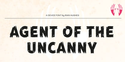
- Stamp Of Approval JNL by Jeff Levine,
$29.00Back in the 20th Century B.C. (Before Computers) there was what was known as a "paper" office. Workers used typewriters, correction fluid and a drawer full of rubber stamps. Jeff Levine has taken twenty-six of the common phrases found on those old office stamps and created Stamp of Approval JNL. Use these images as they are, or run them through a filter for a worn or inked-up effect. - KG All Of Me by Kimberly Geswein,
$5.00 A stamped, eroded font with the texture of a real rubber stamped image.
 - American Way Of Life by Intellecta Design,
$19.90
- Linotype Facts of Life by Linotype,
$29.99 - Bundle Of Joy NF by Nick's Fonts,
$10.00This in-yer-face kinda face is based on a broad brush font from "The New ABC of Showcard & Ticketwriting" by C. Milne, published in Australia in the late 1930s. Brought to my attention by Ms. Kat Black, and named in honor of Ms. Kat's grannie, to whom the book originally belonged. The Postscript and Truetype versions contain a complete Latin language character set (Unicode 1252); in addition, the Opentype version supports Unicode 1250 (Central European) languages as well. - FT Weapon Of Choice by Fenotype,
$19.00 A dingbat set with close combat weapons, guns, baseball bats, knives and other tools of violence.
 - Point Of Sale JNL by Jeff Levine,
$29.00 Point of Sale JNL is a specialty font for producing retro-style price cards, tags, stickers, labels and similar items. Within this design are a large set of numerals and two smaller sets of numerals. Both of the smaller sets are centered against the larger ones with one set also having underscores. In addition, there are a number of price card designs provided for those who want a truly nostalgic feel to their price marks. The layout of Point of Sale JNL breaks down as follows: A through J = 1 through zero in large numbers K = a decimal point L = dollar sign M = cents sign N through Z = various price cards a through j = small centered numbers k through t = small numbers with underscores
 - SF Old South Arabian by Sultan Fonts,
$9.99Historical Background Old South Arabian Script (OSA) was used before the Islamic era not only in the southwest corner of the Arabian Peninsula, but actually in the entire Peninsula. In addition, samples of OSA have been found as far as Uruk in Mesopotamia, Delos in Greece, and Giza in Egypt. Archaeological finds show that as far back as the 8th century BCE, OSA was used in trade, religious writing, and in civil records. Following the spread of Islam in Yemen, the decline of OSA began in the 7th century CE as it was gradually supplanted by Arabic script. OSA was typically known by the name of the then-dominant peoples in the Southern Peninsula. At various times, it was known as Sabaean, Qatabani, or Hadramite, among others. Although it was used for a variety of languages, OSA is most strongly associated with Sabaean. Many Peninsular languages borrowed OSA before introducing further changes of their own. Prime examples are the Thamudic, Safaitic, and Lihyanite scripts which eventually developed into independent scripts. The westward migration of the Sabaean people into the Horn of Africa introduced the South Arabian consonantal alphabet into the region. The transplanted script formed the roots of the Geez script of Ethiopia, which, in time and under presumably external influences, developed into a rich syllabary unlike any other Semitic script in history. Even a cursory examination of the letter forms of Modern Ethiopic writing reveal a striking similarity to South Arabian Script. OSA inscriptions typically reveal a dominant right-to-left directionality, although there are also many cases of alternating directions, known as boustrophedon writing. Figure 1 is a fine example of this style of writing. OSA inscriptions were discovered early in the 19th century. Soon thereafter, two orientalists, Gesenius and Rödiger, made great strides towards deciphering the script. Styles of Writing Old South Arabian inscriptions have survived primarily on stone, ceramic, and metallic surfaces. Hundreds of artifacts have been found and, to this day, continue to be discovered. Some of the best examples number of inscriptions on softer materials, such as wood and leather, have also been discovered. Although there is a significant difference between the styles of letters on the hard surfaces and those on the soft. Old South Arabian (Musnad) is composed of 29 letters , that is one letter more than the Arabic alphabet, which is between “S” and “Sh”, and names “Samekh”. Aspects of difference between Musnad and the present Arabic writing is that Musnad is written in separate letters, and the shape of the letters do not change according to its place in the word. However, some letters change according to the beginning of the writing. Musnad is either prominent, or deep. Prominent writings are for important writings and deep writings are for ordinary. The material on which the Musnad was written were stones, rocks, wood, and metal. In the course of its development the Musnad use appeared in the “Lehyanite’, “Thamudic”, “Safaitic”, pen to which many changes and amendments were made. And from it “Habashi’ writing was born. As regards his place among the Arabs of the Peninsula , when we look at the internet and its role in cultural dialogue , the Arabs of the Peninsula considered Musnad inscription which was indisputably their national writing until the dawn of Islam. It was used by people in all parts of Arabia in their homeland and abroad . It was their means of chronology and record of their glories and history.2- Features of Musnad Script: 1. It is written from right to left and vice versa. 2. Its letters are not joined. 3. Shape of letters are uniform despite their positions in the word. 4. Words are separated by vertical lines. 5. A letter is doubled in case of assertion. 6. No points and punctuations. 7. Easy to be learned by beginners. My OSA Musnad Font My design and technical work is only a treatment of the OSA Musnad as a symbol of writing. And it is possible to use in computer.. My design is not aimed at demonstrating the linguistic and intellectual structure of the Old South Arabian (Musnad). It is so simple that it could be easy to learn by learners and those who are interested in the OSA Musnad letters in computer. The basis of such importance is that it spares a lot of time and effort for researchers and students in this field. Formerly they used to write the Musnad texts either by handwriting or scan them , But now they can easily write its texts in OSA Musnad by using keyboard directly, so that they can change , amend and fulfill easily and accurately . So, we made use of speed, easiness and accuracy. And anyone interested in the South Arabian history in any part of the world can due to this design read and write OSA Musnad letters most easily. This design will also be used by historians and archeologists. , as well as specialist linguistics . The design also demonstrates the aesthetics of the Himyarit writing. About this font family Old South Arabian is An Arabic, Old South Arabian and Latin typeface for desktop applications ,for websites, and for digital ads. Old South Arabian font family contains two types: Old South Arabian and Old South Arabian serif. The font includes a design that supports Arabic, Old South Arabian and Latin languages. Old South Arabian typeface comes with many opentype features. - Dawning of a New Day - Personal use only

- KG Shadow of the Night - Personal use only

- KG Attack of the Robots - Personal use only

- Dot Short of a Matrix - Unknown license

- In the arms of sleep - Unknown license

- SF Archery Black SC Shaded - Unknown license

- KG Luck of the Irish - Personal use only

- LMS Lily Of The Valley - Unknown license

- SF Archery Black SC Outline - Unknown license

- Fear of a Punk Planet - Unknown license

- Zone23_Two Kinds of Love III - Unknown license

- SF Americana Dreams SC Upright - Unknown license

- SF Archery Black SC Shaded - Unknown license

- SF Americana Dreams SC Upright - Unknown license

- Year supply of fairy cakes - Unknown license

- SF Archery Black SC Outline - Unknown license

- KR Out Of This World - Unknown license

- ABTS Day Of The Dead by Albatross,
$19.95 ABTS day of the dead is a highly detailed and meticulously designed symbol font. It’s design is inspired by the Day of the Dead celebration, honoring the deceased. I think The Day of the Dead is one of the greatest reasons anyone should celebrate life, so I decided to make a font honoring that tradition. I'm not even sure If I got all of it right, (traditional symbols and such) but it was a joy to create. There are 2 fonts. The first is the Skulls. This includes uppercase and lowercase A-Z, a-z. There you will find the decorated skulls, blank skulls, and negatives. The second font is the symbols. If you wish to design your own Day of the Dead skull, you should purchase the symbols, as they are designed specifically for adorning the blanks. Purchasing both fonts will give you a discount. Please note, the symbol font will show up in your application of choice as “ABTS Day of the Dead Bold.” This is to avoid software problems with naming the font itself "Symbols." Skulls are awesome!!!
 - Out of Line Pro BB by Blambot,
$10.00 Out of Line Pro BB is a comic book dialogue typeface with Greek and Cyrillic support, as well as a hefty compliment of European diacritical glyphs. It's the improved remix of Blambot's popular Out of Line BB set. Designed after Blambot letterer, Nate Piekos's hand lettering, it features opentype autoligatures, contextual alternates, and fractions.


