10,000 search results
(0.029 seconds)
- H74 Black Label Whiskey by Hydro74,
$25.00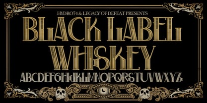
- Well Said Black NF by Nick's Fonts,
$10.00 This commanding typeface is based on Welling Black, a Fotostar offering from the 1970s. Equally well suited for headlines and subheads. Both versions support the Latin 1252, Central European 1250, Turkish 1254 and Baltic 1257 codepages.
 - Display Black Serif Rough by Gerald Gallo,
$20.00 Display Black Serif Rough is a rough version of my font Display Black Serif . It is a display font not intended for text use. It was designed specifically for display, headline, logotype, branding, and similar applications. Display Black Serif Rough has an uppercase alphabet located under the character + shift keys and a complete set of alternate uppercase characters located under the character set keys. It also has numbers and punctuation.
 - P22 Pooper Black Pro by IHOF,
$39.95 Pooper Black Pro is based on a brush ethic and has an extreme axis that lends a certain amount of speed to the font while the lack of connectors slows it down. The pro version expands on the original and popular Pooper Black with the addition of full Central and Eastern European character sets and plenty of alternate characters for those who have applications that support Opentype features. Almost all of the lower case characters now include an in stroke and out stroke version for greater design flexibility. A wonderful face for packaging, titling, and short bursts of text.
 - LHF Black Rose Script by Letterhead Fonts,
$59.00 Nearly 2 years in the making, LHF Black Rose Script is the perfect blend of hand-lettering and modern technology. This beautiful script is loaded with features, such as automatic ligatures, discretionary ligatures, bonus ending characters, swashes, and several alternates (302 glyphs to be exact). You receive 3 versatile fonts to match different moods: Regular, Block Shadow (placed under Regular), and an expertly-crafted Inked version which has been distressed to look like freshly inked lettering. One look at your designs and your clients will fall in love with Black Rose Script. And with so many carefully designed alternates to use, they'll probably think you hand-lettered it yourself!
 - BIG Slant Black UltExp - Personal use only

- View Slant Black ExtExp - Personal use only

- NHL Atlanta - Unknown license

- British Outline Majuscules - Unknown license

- Liquidy Bulbous - Unknown license

- (afGiHmtV)* - Unknown license

- Apothem Caps Med - Personal use only

- NOW YOU SEE ME - Personal use only

- Eat your face now - Unknown license

- Stempel Sans Print Neo by TypoGraphicDesign,
$9.00 The typeface Stempel Sans Print Neo is designed from 2022 for the font foundry Typo Graphic Design by Manuel Viergutz. The display font based on a original set of 29 old rubber stamps (6 cm height). Digitized via hand-stamped, a scanner and Glyphs app. 3 font-styles (Rough, Misprint, Black) with 321 glyphs incl. decorative extras like icons, arrows, dingbats, emojis, symbols, geometric shapes (type the word #LOVE for ♥︎or #SMILE for ☻ as OpenType-Feature dlig) and stylistic alternates (6 stylistic sets). For use in logos, magazines, posters, advertisement plus as webfont for decorative headlines. The font works best for display size. Have fun with this font & use the DEMO-FONT (with reduced glyph-set) FOR FREE! Font Specifications ■ Font Name: Stempel Sans Print Neo ■ Font Styles: 3 font styles (Rough, Misprint, Black) + DEMO (with reduced glyph-set) ■ Font Category: Display Script for headline size ■ Glyph Set: 321 glyphs (incl. decorative extras) ■ Language Support (36 languages): Asu Bemba Bena Chiga Cornish English German Gusii Indonesian Kalenjin Kinyarwanda Luo Luyia Machame Makhuwa-Meetto Makonde Morisyen North Ndebele Nyankole Oromo Rombo Rundi Rwa Samburu Sangu Shambala Shona Soga Somali Swahili Swiss German Taita Teso Uzbek (Latin) Vunjo Zulu ■ OpenType features (16): aalt calt case ccmp dlig liga lnum onum ss01 ss02 ss03 ss04 ss05 ss06 mark mkmk ■ Design Date: 2022 ■ Type Designer: Manuel Viergutz
 - Just A Few Monograms by Intellecta Design,
$18.90
- Collect Em Now BB by Blambot,
$10.00 Collect Em Now BB is the sentence-case companion typeface to the uppercase Collect Em All BB! It includes four fonts: regular, italic, bold and bold italic, double letter opentype ligatures, contextual alternate barred-I correction, manga glyphs, and more!
 - Iwata GNew Gothic Pro by IWATA,
$199.00 教科書や参考書、問題集などの教育教材作成のために開発された新ゴシック体です。 筆やペンの入り、押さえ、ハネ、トメ、筆順などを理解しやすいようデザインしています。
 - Futura Now for Leica by Monotype,
$53.99For nearly 90 years, Paul Renner’s Futura has been as popular as it is versatile—from children’s books to fashion magazines to the plaque on the Moon. Futura is a typographic icon. Futura Now offers designers a chance to see Futura with fresh eyes. It’s more truly Futura-like than any digital version you’ve ever worked with. “It brings some much-needed humanity back to the world of geometric sans serifs,” says Steve Matteson, Monotype’s Creative Type Director who led the design team. “Despite its reputation as the ultimate modern typeface, Futura Now is surprisingly warm,” he explains. “It’s just as at home set next to a leafy tree as it is next to a stainless-steel table, because it skillfully navigates the border between super-clean geometry and humanist warmth.” Futura Now—the definitive Futura—contains 102 styles, including: new Headline and Text weights; new Script and Display weights and styles; and new decorative variants (outlines, inlines, shadows, and fill). Its contemporary alignment of names and weights makes the family easier to understand and use, and its comfortable Text and judicious Headline subfamilies provide instantly refined spacing. With a large Latin, Greek, and Cyrillic character-set, Futura Now serves a wider international creative community. Futura Now is available both as individual OpenType fonts and as a set of Variable fonts, delivering limitless styles in a tidy digital footprint. - Captura Now Core Edition by TypeThis!Studio,
$50.00 Carefully refined shapes and sensitively balanced spacing and kerning create the gentle rythm that grants Captura its warm-hearted face, perfect in form and shape. www.typethis.studio This version covers all the essentials of Captura 265 Characters 8 Styles, including Italics Western European Language Support Numbers Symbols Punctuation If you need more features like small caps, special symbols, Cyrillic or Vietnamese language support, you may review the expert version of CapturaNow.
 - Knitting And Sewing Doodles by Outside the Line,
$19.00Knitting & Sewing Doodles are just that. If you type all caps you get 15 knitting icons and lower case is 15 sewing doodles. Knitting items include yarn, knitting, needles, ball winder, spinning supplies, stitch counter, etc. Sewing machine, buttons, thread, pin cushion, bobbin, thimble and needles, scissors, label, tape measure, darning egg, zipper, seam ripper, and pins, all in the Outside the Line style. - Titan - 100% free

- Ekorre PERSONAL USE ONLY Black - Personal use only

- SF Archery Black SC Shaded - Unknown license

- SF Archery Black SC Outline - Unknown license

- SF Archery Black SC Shaded - Unknown license

- SF Archery Black SC Outline - Unknown license

- Schuss Sans CG Poster Black by typic schuss,
$33.00 Schuss Sans CG Poster 1 upright OTF Font Latin extended, Cyrillic and Greek. Specially developed for headline poster display sizes. A Sans Black Headline-Font in addition to the Schuss superfamily. The heights are optimized for big sizes, different to the text fonts of the Superfamily Schuss. The character set is slightly different to the non poster styles too. No italic, no additional figures, no tabular figures, no small Caps. But with maximum manual kerning. Ligatures: fi, fl, ff, ffi, ffl. No special OpenType features.
 - MCapitals - 100% free

- Wacamóler Caps - Personal use only

- Briskly Cabrales by Crumphand,
$19.00 Hello, Introducing my new font "Briskly Cabrales" The Briskly Cabrales is block handmade font. Strong, elegant, modern, calm. What's Inside The Fonts ? Uppercase Lowercase Symbols Numerals European Multilungual Thank you, Regards!
 - Kis Antiqua Now TB Pro by Elsner+Flake,
$99.00 In the course of the re-vitalization of its Typoart typeface inventory, Elsner+Flake decided in 2006 to offer the “Kis Antiqua” by Hildegard Korger, in a re-worked form and with an extended sortiment, as an OpenType Pro-version. After consultation with Hildegard Korger, Elsner+Flake tasked the Leipzig type designer Erhard Kaiser with the execution of the re-design and expansion of the sortiment. Detlef Schäfer writes in “Fotosatzschriften Type-Design+Schrifthersteller”, VEB Fachbuchverlag Leipzig, 1989: No other printing type has ever generated as far-reaching a controversy as this typeface which Jan Tschichold called the most beautiful of all the old Antiqua types. For a long time, it was thought to have been designed by Anton Janson. In 1720 a large number of the original types were displayed in the catalog of the „Ehrhardische Gycery“ (Ehrhardt Typefoundry) in Leipzig. Recently, thanks to the research performed by Beatrice Warde and especially György Haimann, it has been proven unambiguously that the originator of this typeface was Miklós (Nicholas) Tótfalusi Kis (pronounced „Kisch“) who was born in 1650 in the Hungarian town of Tótfal. His calvinistic church had sent him to the Netherlands to oversee the printing of a Hungarian language bible. He studied printing and punch cutting and earned special recognition for his Armenian and Hebrew types. Upon his return to Hungary, an emergency situation forced him to sell several of his matrice sets to the Ehrhardt Typefoundry in Leipzig. In Hungary he printed from his own typefaces, but religious tensions arose between him and one of his church elders. He died at an early age in 1702. The significant characteristics of the “Dutch Antiqua” by Kis are the larger body size, relatively small lower case letters and strong upper case letters, which show clearly defined contrasts in the stroke widths. The “Kis Antiqua” is less elegant than the Garamond, rather somewhat austere in a calvinistic way, but its expression is unique and full of tension. The upper and lower case serifs are only slightly concave, and the upper case O as well as the lower case o have, for the first time, a vertical axis. In the replica, sensitively and respectfully (responsibly) drawn by Hildegard Korger, these characteristics of this pleasantly readable and beautiful face have been well met. For Typoart it was clear that this typeface has to appear under its only true name “Kis Antiqua.” It will be used primarily in book design. Elsner+Flake added two headline weights, which are available as a separate font family Kis Antiqua Now TH Pro Designer: Miklós (Nicholas) Tótfalusi Kis, 1686 Hildegard Korger, 1986-1988 Erhard Kaiser, 2008
 - Kis Antiqua Now TH Pro by Elsner+Flake,
$99.00 In the course of the re-vitalization of its Typoart typeface inventory, Elsner+Flake decided in 2006 to offer the “Kis Antiqua” by Hildegard Korger, in a re-worked form and with an extended sortiment, as an OpenType Pro-version. After consultation with Hildegard Korger, Elsner+Flake tasked the Leipzig type designer Erhard Kaiser with the execution of the re-design and expansion of the sortiment. Detlef Schäfer writes in “Fotosatzschriften Type-Design+Schrifthersteller”, VEB Fachbuchverlag Leipzig, 1989: No other printing type has ever generated as far-reaching a controversy as this typeface which Jan Tschichold called the most beautiful of all the old Antiqua types. For a long time, it was thought to have been designed by Anton Janson. In 1720 a large number of the original types were displayed in the catalog of the „Ehrhardische Gycery“ (Ehrhardt Typefoundry) in Leipzig. Recently, thanks to the research performed by Beatrice Warde and especially György Haimann, it has been proven unambiguously that the originator of this typeface was Miklós (Nicholas) Tótfalusi Kis (pronounced Kisch) who was born in 1650 in the Hungarian town of Tótfal. His calvinistic church had sent him to the Netherlands to oversee the printing of a Hungarian language bible. He studied printing and punch cutting and earned special recognition for his Armenian and Hebrew types. Upon his return to Hungary, an emergency situation forced him to sell several of his matrice sets to the Ehrhardt Typefoundry in Leipzig. In Hungary he printed from his own typefaces, but religious tensions arose between him and one of his church elders. He died at an early age in 1702. The significant characteristics of the “Dutch Antiqua” by Kis are the larger body size, relatively small lower case letters and strong upper case letters, which show clearly defined contrasts in the stroke widths. The “Kis Antiqua” is less elegant than the Garamond, rather somewhat austere in a calvinistic way, but its expression is unique and full of tension. The upper and lower case serifs are only slightly concave, and the upper case O as well as the lower case o have, for the first time, a vertical axis. In the replica, sensitively and respectfully (responsibly) drawn by Hildegard Korger, these characteristics of this pleasantly readable and beautiful face have been well met. For Typoart it was clear that this typeface has to appear under its only true name “Kis Antiqua.” It will be used primarily in book design. Elsner+Flake added these two headline weights, which are available besides a separate font family Kis Antiqua Now TB Pro. Designer: Miklós (Nicholas) Tótfalusi Kis, 1686 Hildegard Korger, 1986-1988 Erhard Kaiser, 2008
 - Squealer - 100% free

- Advertiser JNL by Jeff Levine,
$29.00Advertiser JNL is a simple A-Z only font used to make retro-styled titles and names. Based on a popular style of retail signage from the 1950s and 1960s, alternating keystrokes will create a contrast of positive and negative letters. The capital letters have the alphabet in white on black boxes, the lower case have the black letters alone—with the white space conforming to the width of the black boxes. In a pinch, the boxed characters can also be used as initial caps. For a more complete character set with the same style of lettering, use DuBois Block JNL. - Ltt Recoleta by Latinotype,
$39.00 This new Recoleta is made up of 24 styles in total. We have added to its classical width two new variants with two different degrees of condensation: one very condensed and svelte, and the other at the midpoint between the standard width and the condensed. Each of the 3 widths has 8 weights, from thin to black. It also has numerous stylistic alternatives in both uppercase and lowercase. On the other hand, Recoleta also supports the Cyrillic alphabet.
 - Warrior by CastleType,
$59.00 Warrior is a chunky typeface design inspired by a Russian Egyptian-style block alphabet (original designer unknown). Now available in seven weights (Hairline, Extra Light, Light, Medium, Regular, Bold, Black) in addition to three decorative styles: Shaded (3-dimensional), Inline, and Open. With its blocky letters and stable slab serifs, Warrior will add a bold, masculine look to your design. All members of the Warrior family support most European languages including modern Greek, and, of course, languages that use the Cyrillic alphabet.
 - Wataha by Soar Studio,
$22.00 Wataha (in polish - wolf pack) is a sharp, robust uppercase family of 3 fonts: Bold, Heavy and Black. Perfect for posters, headlines and logotypes. With a range of OpenType features you have access to alternative letter shapes, fractions, arrows etc. Wataha supports most Latin-based languages and few others.
 - Qbicle 2 BRK - Unknown license

- Basic Pixel by Mandarin,
$12.00 Basic Pixel is the right font to have fun with. With 15 different styles you can combine styles and color like building blocks to create endless new combinations and intriguing visual outputs.


