The Konstruktor font, meticulously designed by Ivan Filipov, embodies a unique synthesis of creativity and structural precision. This typeface, hailing from the inventive mind of Filipov, showcases h...
Alpha Sentry, a font crafted by Iconian Fonts, a prolific font foundry known for its diverse and extensive range of typography styles, emerges as a unique addition to their lineup. This font embodies...
The font Mastodon, created by Apostrophic Labs, is a distinctive typeface that stands out due to its unique style and versatility. It belongs to a category of fonts that combine elements of both nove...
The Sui Generis typeface, designed by the prolific font designer Ray Larabie, is a striking example of contemporary font design that effectively balances uniqueness with versatility. This distinctive...
The Royante font, created by Gilar Studio, stands as a remarkable testament to the artistry and craftsmanship in typography design. This font delicately balances elegance with modernity, embodying a ...
The Notice2Std font, designed by the talented Denis A. Serikov, is a typeface that manages to capture attention through its unique blend of classical charm and contemporary flair. At first glance, No...
Pabellona (A) Símplex is a unique and attention-grabbing font created by the talented deFharo, a versatile typeface designer known for innovative and expressive font designs. This particular variant ...
The font "Odstemplik" by Gluk is a unique and visually engaging typeface that captures the attention of both designers and viewers alike. Its creator, Gluk (whose real name is Paweł Burgiel), has mas...

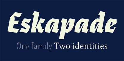
The Eskapade font family is the result of Alisa Nowak’s research into Roman and German blackletter forms, mainly Fraktur letters. The idea was to adapt these broken forms into a contemporary family instead of creating a faithful revival of a historical typeface. On one hand, the ten normal Eskapade styles are conceived for continuous text in books and magazines with good legibility in smaller sizes. On the other hand, the six angled Eskapade Fraktur styles capture the reader’s attention in headlines with its mixture of round and straight forms as seen in ‘e’, ‘g’, and ‘o’. Eskapade works exceptionally well for branding, logotypes, and visual identities, for editorials like magazines, fanzines, or posters, and for packaging. Eskapade roman adopts a humanist structure, but is more condensed than other oldstyle serifs. The reason behind this stems from the goal of closely resembling the Fraktur style to create harmony in mixed text settings. Legibility is enhanced by its low contrast between thick and thin strokes and its tall x-height. Eskapade offers an airy and light typographic colour with its smooth design. Eskapade italic is based on the Cancellaresca script and shows some particularities in its condensed and round forms. This structure also provided the base for Eskapade Fraktur italic. Eskapade Fraktur is more contrasted and slightly bolder than the usual darkness of a regular weight. The innovative Eskapade Fraktur italic, equally based on the Cancellaresca script previously mentioned, is secondarily influenced by the Sütterlin forms — an unique script practiced in Germany in the vanishingly short period between 1915 and 1941. The new ornaments are also hybrid Sütterlin forms to fit with the smooth roman styles. Although there are many Fraktur-style typefaces available today, they usually lack italics, and their italics are usually slanted uprights rather than proper italics. This motivated extensive experimentation with the italic Fraktur shapes and resulted in Eskapade Fraktur’s unusual and interesting solutions. In addition to standard capitals, it offers a second set of more decorative capitals with double-stroke lines to intensify creative application and encourage experimental use. The Thin and Black Fraktur styles are meant for display sizes (headlines, posters, branding, and signage). A typeface with this much tension needs to keep a good harmony between strokes and counters, so Eskapade Black has amplified inktraps and a more dynamic structure seen in the contrast between straight and round forms. These qualities make the family bolder and more enticing, especially with the included uppercase alternates. The Fraktur’s black weights are strident, refusing to let the white of the paper win the tug-of-war. It also won’t give away its secrets: Is it modern or historic, edgy or amicable, beguiling ornamentation or brutish presentation? That all depends on how the radically expanded Eskapade family is used, but its 16 fonts certainly aren’t tame.

Paverify is an all-caps geometric slab serif display face inspired by a particular pavement tile component which is evoking a blocky “I” letter. All other characters were interpreted based on its look and drawn accordingly. There are three uppercase Roman fonts in different weights and widths substantially. With the additional versions, type family consisting of 7 fonts in total. Over 220 Latin, Cyrillic and Greek script languages supported. Each font contains an extensive multilingual support with more than 1600 glyphs and OpenType features, including number forms, fractions, and stylistic alternate sets those provide different looks by the typographic preferences. For the lowercase letters there are small caps variants, i.e., shorter caps. These also have identical glyphs and matching marks to enable “Small Capitals From Capitals” feature. Narrower Medium and Bold styles was produced to accompany the Black first design. Paverify comes with an ornaments font named as “Extras”, which contains geometric graphical elements, i.e., paver stone patterns, banner/sticker background sets, star comps and a collection of catchwords to simplify creating feature rich layouts. As is known as interlocking paver in certain regions — a rectangular shape with the distinctive diagonal tabs — transcribing the simplest letter to draw into the whole alphabet was a challenging task. Not only it was the single thing that can be used as a source, considering its thick form in roughly 1.2:1 proportions compared to the sophistication of letterforms was the challenge. Starting point was keeping design consistent while both avoiding and preserving a particular appearance to achieve a similar texture, basically a repeating pattern on the streets. In contrary of a traditional approach, Paverify tend to have more contrast than the other slab serifs which helps to reduce massive stem weight of the source form. This look contributes to its hand painted sign effect achieved in a certain degree, which may otherwise impractical to transform because the source material is an inorganic, static form by definition. Tight and even spacing of the pavement tiles was inspirational for the kerning balance of the letters. Although the lighter weights have more space between the letter pairs, black weight adjusted as to be close to each other as the original grid. Tight spacing can be ignored by using Capital Spacing OpenType feature for the Outline versions as layer fonts. In one stroke, this gives an extra space between the letters to avoid diagonal armed letter terminals overlap. Black typographic colour and texture gives a sturdy appearance to the lines, it is useful for the projects where a robust display faces preferred for the titling, strong headlines, letter stacks, dropcaps, initials, short names on materials such as advertisements, book covers, posters, logotypes, wordmarks, package designs, and more in print or digital. Paverify can be paired as a complimentary face in a combination with broader type systems, where vintage look compositions and woodcut style fusions requiring an extra stunning texture.

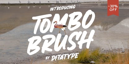
Tombo Brush is an interesting font that combines brush font’s artistic and organic characteristics with even line edges which are clear and firm. Furthermore, the capital letters express more modern, simple impressions by following the brush script font’s characteristics of the soft and smooth brush wipes, yet the even smooth lines on the edges show clearer, firmer nuances. Bright and contrast colors can show interesting, dynamic nuances on designs with this font. The even edge lines will ease the application of colors and show clearer visual effects separated from the background. You can apply this font for big text sizes for a legibility reason and also enjoy the available features here. Features: Multilingual Supports PUA Encoded Numerals and Punctuations Tombo Brush fits best for various design projects, such as brandings, quotes, printed products, merchandise, social media, etc. Find out more ways to use this font by taking a look at the font preview. Thanks for purchasing our fonts. Hopefully, you have a great time using our font. Feel free to contact us anytime for further information or when you have trouble with the font. Thanks a lot and happy designing.
The "Harsh language AC" font, crafted by the well-known type designer PizzaDude, stands out as an exceptional typeface with a unique personality and creative finesse. This font family is distinguishe...
LemonCookieBold, created by Shara's Fonts, is a font that immediately evokes a sense of whimsy and sweetness, much like the delightful treat it is named after. This bold variant of the LemonCookie fo...
The POLLUX9200 font, meticulously crafted by the imaginative junkohanhero, stands as a testament to the confluence of futuristic aesthetics and typographic ingenuity. At the heart of its design lies ...
The Earwig Factory font, created by Ray Larabie, is a unique blend of whimsicality and industrial charm, making it stand out in the crowded world of typography. With its origins deeply rooted in the ...
As of my last update, there is no widely recognized or documented font named "MacType" created by an individual named Timour Jgenti. It's possible there might be confusion or a mix-up with another fo...
The Cactus Sandwich Plain font by FontMesa is a versatile and charming typeface that carries a distinctive personality, blending the rustic charm of the American Southwest with the readability and fu...
Kremlin Georgian I 3D, crafted by Bolt Cutter Design, is a font that intriguingly melds the historical with a contemporary 3D twist, making it a unique specimen in the realm of typography. Originatin...
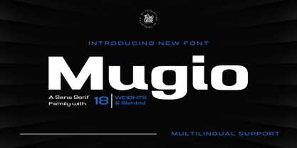
Mugio by Twinletter, $14.00 Mugio is the latest addition to our San Serif font family. Mugio is a one-of-a-kind font that can be used for any project. It includes a lot of qualities that make it particularly powerful and handy for making elaborate designs. This font’s slanted letters and curves make it ideal for logos, flyers, posters, and a wide range of other typographic projects. of course, your various design projects will be perfect and extraordinary if you use this font because this font is equipped with a font family, both for titles and subtitles and sentence text, start using our fonts for your extraordinary projects.
Cardo is a classic yet sophisticated serif typeface that was designed with a clear purpose in mind: to create a font that is highly suitable for academic and professional contexts, particularly those...
GALLEDIS is a font that distinguishes itself with its unique blend of elegance and modern flair, designed to capture the attention of viewers through its distinctive characteristics. This typeface, m...
PF Tempesta Five, crafted by the talented Yuusuke Kamiyamane, stands out as a remarkable typeface distinguished by its unique characteristics and functional beauty. This pixel font, meticulously desi...
Sure thing! The Danube font, created by Levi Halmos, is a distinct and stylish typeface that captures the eye with its contemporary and sleek design. It offers a fresh perspective on sans-serif fonts...
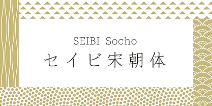
The Socho (Song Dynasty-style) typeface is based on a style used for woodblock printing in Song-period China. The SEIBI Socho typeface updates the Song style by making it simpler and sharper. With minimized size variations between kanji and kana, the design is readable both in vertical and horizontal typesetting. 宋朝体の起源は中国の宋の時代に木版印刷に使われた書体です。セイビ宋朝体は、さらにシンプルでシャープなイメージを目指しました。かな、漢字の大小があまりない、タテ組でもヨコ組でも組みやすくデザインしました。本来の宋朝体は骨が細く、右上がりの斜体がかった長体ですが、セイビ宋朝体はそのシャープな特徴を生かしたまま正体に近く、タテでもヨコでも組みやすい書体に仕上げています。毛筆とは違う、木版用書体の彫刻的な堅いエレメントも特徴です。

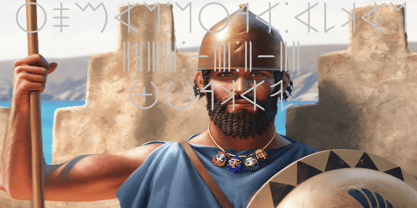
Phoenician/Canaanite The Phoenician alphabet developed from the Proto-Canaanite alphabet, during the 15th century BC. Before then the Phoenicians wrote with a cuneiform script. The earliest known inscriptions in the Phoenician alphabet come from Byblos and date back to 1000 BC. The Phoenician alphabet was perhaps the first alphabetic script to be widely-used - the Phoenicians traded around the Mediterraean and beyond, and set up cities and colonies in parts of southern Europe and North Africa - and the origins of most alphabetic writing systems can be traced back to the Phoenician alphabet, including Greek, Etruscan, Latin, Arabic and Hebrew, as well as the scripts of India and East Asia. Notable features Type of writing system: abjad / consonant alphabet with no vowel indication Writing direction: right to left in hortizontal lines. Sometimes boustrophedon. Script family: Proto-Sinaitic, Phoenician Number of letters: 22 - there was considerable variation in their forms in different regions and at different times. The names of the letters are acrophonic, and their names and shapes can be ultimately traced back to Egyptian Hieroglyphs. For example, the name of the first letter, 'aleph, means ox and developed from a picture of an ox's head. Some of the letter names were changed by the Phoenicians, including gimel, which meant camel in Phoenician, but was originally a picture of a throwing stick (giml).
Another variation on the Renaissance-Baroque Roman face, it extends the selection of text type faces. In comparison with Jannon, the contrast within the letters has been enhanced. The dynamic elements of the Renaissance Roman face have been strengthened in a way which is illustrated best in the letters "a", "b" and "s". These letters contain, in condensed form, the principle of this type face - in round shapes the dark stroke invariably has a round finial at one end and a sharp one at the other. Another typical feature is the lower-case "g"; the upper part of this letter consists of two geometrically exact circles, the inner of which, a negative one, is immersed down on the right, upright to the direction of the lower loop and the upright knob. The vertical strokes slightly splay out upwards. Some details of the upper-case letters may seem to be too daring, but they are less apparent in the text sizes. It has to be admitted that typographers tend to draw letters in exaggerated sizes, as a result of which they stick to details. Serapion Italic are italics inspired partly by the Renaissance Cancelleresca. This is obvious from the drop-shaped finials of its lower-case descenders. The type face is suitable for illustrated books, art posters and short texts. It has a rather ugly name - after St. Serapion.
Bucanera, a font designed by the typeface artist deFharo, is a striking and versatile typeface that exudes a mix of elegance, adventure, and mystique. Its design is inspired by the tales and legends ...
The Vtks Espinhuda font, designed by Douglas Vitkauskas, is a creative and distinctive typeface that truly stands out in the realm of typography. Its name, "Espinhuda," suggests a spiky or thorny qua...
As of my last update in April 2023, the font named "Divine" could refer to numerous typefaces designed with a particular theme or inspiration that may not be universally recognized without further sp...
I'm sorry, but as of my last update in April 2023, there doesn't seem to be any information available on a font specifically named "Ishirkian" by Risket Xero. It's possible that it could be a new or ...
DIVERGENT, a unique font crafted by the designer known as SpideRaY, embodies a standout style that clearly sets it apart from the plethora of typefaces available. This distinctive font captures the e...
As of my last update in April 2023, Pehuensito is not a widely recognized typeface within the vast landscapes of typography and font design. Given this, I will approach the description of Pehuensito ...
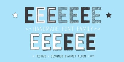
Festivo Font Family is a handmade layered font which includes several textures, shadows. Different font types can be created using various combinations of Festivo Fonts and colors. All fonts of Festivo letters are created as hand-drawn design based on F.L. NO:8 Font's Letters. The fonts No:16, No:17 and No:19 have the same metric and kerning structure than the other Festivo Fonts except No:18. So each one of these 3 fonts are a layer. But they can also be use as wide spaced fonts. No:18 is specific with its metric and kerning structure which was formed by No:17 but No:18 is its bold version. It was designed as a supplemental font. The fonts No:12 and No:15 can be used as shadows. This font family also includes a few ornaments. For your convenience, the files of the fonts were termed by their numbers. The various possibilities of the Festivo Font Family allows you to create a lot of great works such as posters, magazines, printings, t-shirts etc.
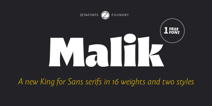
Malik by Zetafonts, $39.00 
Taking its name from the arabic word for "king", Malik is a flared sans serif typeface family designed in 2020 by Andrea Tartarelli. The designer wanted to find a way to bridge the classical letterforms of Roman Old Style typefaces with the readability of contemporary sans typefaces. This was achieved by using the so-called flared serif that emerges gradually from the stem of the letter, ending in a sharp angle. It's something that also reminds of the peculiar shapes of the Simoncini Method, invented by italian type designer Francesco Simoncini to get a sharper definition of letterforms. To this blend of classical elegance and modernist expertise, Malik adds the calligraphic influence of modern masters like Frederic Goudy or Ed Benguiat, visible in signature details like the reverse contrast uppercase B, or the calligraphic lowercase k. Malik also means "owner", and this font surely wants to rule the page. It manages to be extremely readable when used in body text size, but looks surprising and expressive in display use. The inclusion of the Malik Heavy Display weight, with its black texture balanced by deep inktraps, allows for striking logo design. The weight range of the family is extremely wide, including a Book alternative to the Regular weight for fine-tuning readability, a range of light display weights and a solid choice of bold weights for branding, all coming with matching true italics. The 16 cuts of Malik have been equipped with all the features you need to solve your editorial and design challenges, including a wide language coverage (thanks to over one thousand latin and cyrillic characters) and a complete set of open type features (including small capitals, positional numbers, case sensitive forms). Alternate characters and stylistic sets allow you to fine-tune your editorial and branding design by choosing variant letter shapes. Malik is the typeface for everyone who wants to design like a king...or like he doesn't care who the king is!

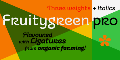
Fruitygreen is Indonesian designer Andi AW. Masry's second typeface following Coomeec™. Idiosyncratic but appealing forms are the signature feature of Fruitygreen™ and provide this new typeface with its truly distinctive character that you can utilize for your projects - and not just in headlines. The unique forms of fruits are not only individually fascinating, but are just as captivating when they are brought together, for example as decoration on a dining table. For Masry, these can be compared with an alphabet whose letters spell out in combination different words and with this as his inspiration, he based his designs for Fruitygreen on the versatile forms of fruits. However, it was not the whole fruits as such but rather small sections of their curves and ends that he decided to use. It is not only because of the characteristic line terminals that the rounded characters of Fruitygreen seem at first glance reminiscent of a brush-written calligraphic typeface; these are traces of the creation process, in which Masry used a digital brush. At the same time, Fruitygreen is by no means simply a brush font. Its dynamic characters reference biological forms and there is definitely something amoeba-like about them, particularly in the bolder variants, and they exude the same serenity and harmony that is inherent to organic structures. The many unconventionally shaped characters also provide for optical contrast. There is, for example, the very scaled down g", the open "q" and the lowercase "r", which has the form of the capital letter. Other letters, such as the sinuous "k" and the rounded uppercase "F" impart an exotic touch to Fruitygreen. Similarly remarkable is the "@", that has only a semi-circle. Available to the designer are other characters that can be used to accentuate a design, such as swash capitals and numerous ligatures. And, last but not least, there are also various numeral sets with oldstyle and lining figures for setting proportional text and table columns together with a selection of symbols, such as arrows and, appropriately, fruits. "
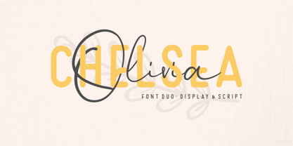
A warm duo of fonts in front of you! This is a super duo with lots of ligature. This is perfect for logos, wedding invitations, easter, posters, business cards, logos, headlines, Instagram stories, youtube stories, book cover, poster promotion and many more! Get the best pairing fonts with Chelsea Olivia!
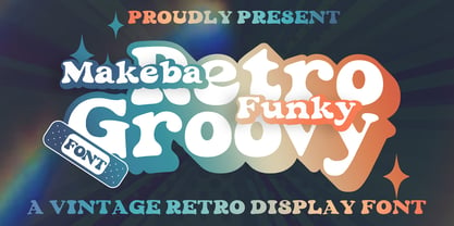
Makeba Retro Funky Groovy Font is a fun and funky display font that brings back the spirit of the 70s. Its bold, rounded letters feature groovy curves and playful embellishments that exude a retro vibe. This font is perfect for creating eye-catching titles and headlines for posters, album covers, and other retro-inspired designs. The font’s energetic and upbeat personality is sure to make any project stand out.


