10,000 search results
(0.037 seconds)
- 21 Kilobyte Salute - 100% free

- Corporatus by Alex Rosario,
$60.00 The legendary retro-futuristic typeface returns, now in digital format! While there may be copycats of varying quality, none of them have taken the time and care to revive, reproduce, and expand the original Roc Mitchell “Corporate” typeface like Corporatus has. Made directly from scans of the original type specimens and expanded to include the full WGL4, Corporatus is YOUR solution for your retro, futuristic, and corporate design needs. Descended from Microgramma and originally designed to be the American competition to distant cousin Eurostile, Corporate and subsequently Corporatus is best known for being the typeface used by video game developer and publisher Nintendo for many NES-related media in the West, including its controllers, and by Colecovision for its logo. With the original Latin character set as well as Greek and Cyrillic lettering available, now you're playing with TYPOPOWER!
 - TF Bleedwax by Teenage Foundry,
$19.00 TF Bleedwax Font - an eerie and spine-chilling typeface perfectly suited for Halloween-themed designs. This font exudes a horror style, created specifically to send shivers down your spine. Each letter is meticulously crafted to resemble dripping blood, giving your designs a blood-curdling and macabre feel. With its gory and unsettling appearance, "TF Bleedwax" font is sure to add a terrifying touch to any Halloween project, horror movie poster, haunted house flyer, or spooky party invitation. Let this font unleash a wave of fear and make your designs stand out in the dark and creepy night. Multilingual contained: Afrikaans, Albanian, Asu, Basque, Bemba, Bena, Breton, Catalan, Chiga, Cornish, Danish, Dutch, English, Estonian, Filipino, Finnish, French, Friulian, Galician, German, Gusii, Indonesian, Irish, Italian, Kabuverdianu, Kalenjin, Kinyarwanda, Luo, Luxembourgish, Luyia, Machame, Makhuwa-Meetto, Makonde, Malagasy, Manx, Morisyen, North Ndebele, Norwegian Bokmål, Norwegian Nynorsk, Nyankole, Oromo, Portuguese, Quechua, Romansh, Rombo, Rundi, Rwa, Samburu, Sango, Sangu, Scottish Gaelic, Sena, Shambala, Shona, Soga, Somali, Spanish, Swahili, Swedish, Swiss German, Taita, Teso, Uzbek (Latin), Volapük, Vunjo, Zulu. For any questions please contact me 🙂 Thanks!
 - Verdana Pro by Microsoft,
$40.00 The Verdana typeface family was designed specifically to address the challenges of on-screen display. Verdana was originally designed by world-renowned type designer Matthew Carter, and tuned for screen display by the leading TrueType hinting expert, Tom Rickner. The Verdana fonts are unique examples of type designed specifically for the computer screen.The Verdana family received a major update in 2011 as a collaboration between The Font Bureau, Monotype Imaging and Matthew Carter. The original Verdana family included only four fonts: regular, italic, bold and bold italic. The new and expanded Verdana Pro family contains 20 fonts in total. The Verdana Pro and Verdana Pro Condensed families each contain 10 fonts: Light, Regular, Semibold, Bold and Black (each with matching italic styles).Verdana exhibits characteristics derived from the pixel rather than the pen, the brush or the chisel. The balance between straight, curve and diagonal were meticulously tuned to ensure that the pixel patterns at small sizes are pleasing, clear and legible. Commonly confused characters, such as the lowercase i j l, the uppercase I J L and the number 1, have been carefully drawn for maximum individuality - an important characteristic of fonts designed for on-screen use. Another reason for the legibility of the Verdana fonts on the screen is their generous width and spacing.Designed by David Berlow and David Johnathan Ross of the Font Bureau, with typographic consultation by Matthew Carter, the new Verdana Pro includes a variety of advanced typographic features including true small capitals, ligatures, fractions, old style figures, lining tabular figures and lining proportional figures. An OpenType-savvy application is required to access these typographic features. The expanded weights and completely new condensed range of fonts provide designers with an expanded palette of typographic options for use in print and on-screen, in both small text sizes and headlines.
 - Le Mano by Afkari Studio,
$13.00 "Le Mano" is a captivating serif display font that seamlessly blends classic elegance with modern sophistication. Crafted with precision, its graceful strokes and refined serifs exude a sense of timeless charm, making it a versatile choice for various design projects. This font commands attention with its distinctive and carefully balanced letterforms, each meticulously designed to offer a harmonious flow and readability. The deliberate spacing and clean lines ensure clarity, even at larger sizes, while maintaining a graceful presence in smaller text. Features: - Uppercase, Lowercase, Number, and Punctuation - Standard and Special Ligatures and alternates - Works on PC & Mac - Simple installations - Accessible in Adobe Illustrator, Adobe Photoshop, Adobe InDesign, and even works on Microsoft Word - Fully accessible without additional design software - Multilingual Support, ä, ö, ü, Ä, Ö, Ü, ß, ¿, and ¡. Utilizing this font for titles, headings, or focal points within a design can create a unique juxtaposition that captures attention and adds a touch of sophistication to the fun and spooky theme. If you're looking to insert "Le Mano" into your designs for these themes, consider experimenting with its application in headlines, titles, accent text, horror theme, and horror font, leveraging its elegant yet slightly haunting aesthetic to amplify the overall feel of the design.
 - Bell Centennial by Bitstream,
$29.99 Designed specifically for AT&T by Matthew Carter at Mergenthaler to replace Bell Gothic with a typeface that made effective use of digital typesetting technology, Bell Centennial gets several more lines per page than Bell Gothic, reduces calls to information because of its significantly higher legibility under adverse printing conditions, saving AT&T many millions of dollars per year. Although intended for use at small sizes, Mazda UK used Bell Centennial at huge sizes to striking effect in a mid-1990s ad campaign.
 - ArcticPatrol by The Northern Block,
$12.80 ArcticPatrol is a modern angular font influenced by military related computer games. Examples include: Ghost Recon and Medal of Honor.
 - Taurus Sense by Hatftype,
$17.00 Is a blackletter typeface font that is inspired by gothic and horror style because it's shape is very unique and is perfect for any project that you will use with this theme. Features : Symbol Number Multilingual support Uppercase & Lowercase Support in Mac and Windows OS Support in design application (photoshop, illustrator, and more) I really hope you enjoy it.
 - Story Brush by Majestype,
$20.00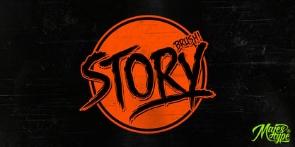 Story Brush is the high detailed brush font that has over 240 glyphs. This font is equipped with OpenType feature to make custom feel for your design. The story brush typeface is designed for t-shirts design, logos, horror design, grunge & etc. Use discretionary ligatures to make your design really nice! See all picture for detail.
 - Bloody Silence by Allouse Studio,
$16.00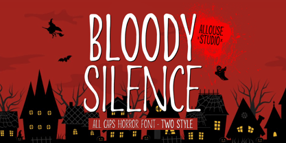 Proudly Presenting, Bloody Silence All Caps Horror Font With Two Style. Bloody Silence is perfect for any titles, logo, product packaging, branding project, megazine, social media, wedding, or just used to express words above the background. Bloody Silence also come with Multi-Lingual Support. Enjoy the font, feel free to comment or feedback, send me PM or email.
 - Gecko Moria by Allouse Studio,
$16.00 Proudly Presenting, Gecko Moria a Horror Handdrawn Font. Gecko Moria is perfect for any titles, logo, product packaging, branding project, megazine, social media, or just used to express words above the background. Gecko Moria also come with Multi-Lingual Support. Enjoy the font, feel free to comment or feedback, send me PM or email. Thank You!
 - Love Rysma by Sealoung,
$15.00 Love Rysma is a stylish brush font with natural movement that looks casual, stylish, and colorful. This font is perfect for kids designs, easter, baby branding, diapers, watermarks, social media posts, product design, labels, stationery, advertisements, logos & branding, designs, product packaging, special events, or anything else. requires a handwritten feel. What's Included: - Glyphs - Works on PC & Mac - Simple installation - Can be accessed in Adobe Illustrator, Adobe Photoshop, Affinity Design. - Fonts include multilingual support.
 - Benson Script by Kyle Wayne Benson,
$10.00 Benson Script is a script that is desperately trying to be anything but a script. With 3 contrast levels, and 2 styles, the six styles of Benson Script are an experiment in the diversity of a single stem width. Modernism’s desire to fit all elements within geometric constraints and adhere to strong verticals has spread throughout type design, but has had little to do with the frills and ornaments of script. Cutting a script down to its bare bones is an offensive idea to many—almost seeming insulting to its genre. Benson Script bridges that genre gap between frill and function. As a matter of genre Benson Script errs on the side of modernism, and adds flair as a last resort. Read more about her open type features, and the development process here.
 - Romanovsky by ParaType,
$30.00 Romanovsky is the font developed on the base of samples from the catalogue of Osip Lehman foundry in Sankt Petersburg. Original Latin design that was used for Romanovsky can be found in Feder Grotesk by Jacob Erbar. The current digital font is not a scanned version of Lehman’s samples but a newly drawn typeface that differs from the original in many details. Romanovsky is a sans serif typeface with narrow proportions and noticeable contrast. It will be good for headings and display matters. Character set covers languages of Western and Central Europe and Cyrillic-based languages. It also contains around 20 ligatures of uppercase letters for the most frequent combinations. Designed by Vasily Biryukov. The bold weight was developed together with Olexa Volochay. Released by ParaType in 2013.
 - Bazoo Tow NF by Nick's Fonts,
$10.00Here's a faithful rendering of the slightly quirky, but thoroughly yeomanlike headline face Basuto, designed by Stanley Baxter and released by the Stephenson Blake Type Foundry in 1927. Bold, brassy and a little sassy, this one will perk up your headlines fer sure. Both versions include the complete Latin 1252, Central European 1250 and Turkish 1254 character sets, as well as localization for Moldovan and Romanian. - Monia by Johannes Hoffmann,
$15.00 Monia is a modern grotesque typeface family designed as a copy and display typeface. With its range of twelve weights, true italic weights, it offers a wide variety of design possibilities such as posters, magazine, corporate or packaging.
 - Fast Rewind by Wing's Art Studio,
$20.00 Fast Rewind: A Timeless Handwritten Script Font A handwritten brush script with a versatile, relaxed and nostalgic feel. This illustrative brush script owes its inspiration to the 1950s art direction typical of mainstream magazines and book covers. A relaxed hand-lettered title was often paired with illustrations of handsome couples or escapist scenes, encouraging readers to settle into the latest gripping story from authors such as Ray Bradbury, Donald Westlake or Arthur Miller. Fast Rewind aims to repurpose this vintage look for contemporary designers with two handwritten fonts, drawn in ink and brush, and then digitally mastered to maintain those all-important human imperfections. Included are the Regular and Alternative designs, with a complete set of uppercase and lowercase characters, along with numbers, symbols and language support. Also included are a variety of underlines and illustrations as seen in these visuals. Each style also comes with its own selection of extra glyphs to helps you achieve the perfect flow between characters and avoid tell-tale repetition. Thanks to all the great photographers who provided images for these visuals.
 - Melancholia by Barnbrook Fonts,
$75.00 Melancholia is a subtle and beautiful sans-serif inspired by calligraphic letterforms. The name describes a feeling of deep sadness, an intense sensitivity to the world. The design of Melancholia is an attempt to introduce some of that wistfulness into the sans-serif form, a typographic classification that is often characterised by an austere functionality. Melancholia includes a set of true italics influenced by old-style serif italics, such as those found in Claude Garamond’s eponymous typeface, as well as a set of stylistic alternates and calligraphic-style swash characters.
 - Cocaine Sans - Unknown license

- cabanyalZ - Personal use only

- Evil Dead - Unknown license

- Friday13 - Unknown license

- Carnivalee Freakshow - Personal use only

- Dirty Female Feet - Personal use only

- Burton's Nightmare - Unknown license

- Knife Fight - Personal use only

- GhostTown - Unknown license

- It Lives In The Swamp (BRK) - 100% free

- BackSplatter - Unknown license

- Dead World - Unknown license

- Deportees - Unknown license

- !the troubles - Unknown license

- Pia by Baseline Fonts,
$24.00Pia is a new typeface named in honor of one of the most fun people we know, Sophia Williams aka Pia. Extended Character set for multilanguage support. - Eroxion BT by Bitstream,
$50.99Eroxion was designed by Eduardo Manso in 1997. It is a good example of degenerative typographic design, borrowing from techniques first explored in the early 1990s by the designers at Letterror. - Secret Ring by Ditatype,
$29.00 Secret Ring is a captivating display font that will unravel the mysteries of the unknown in your designs. Designed in uppercase and bold, this typeface commands attention and exudes an aura of secrecy and horror. Each letter is meticulously crafted with details resembling plant roots with sharp edges, adding an eerie and enigmatic touch to the font. With its bold weight and uppercase design, Secret Ring creates a powerful and impactful presence. The root-like details in each letter of this font bring an organic and otherworldly appearance, as if the font draws its power from ancient and malevolent roots. These haunting details add an element of supernatural energy and create an atmosphere of foreboding and suspense. The combination of bold weight and sharp-edged root details gives this font a sinister and enigmatic look, evoking images of hidden rituals and occult symbols. For the best legibility you can use this font in the bigger text sizes. Enjoy the available features here. Features: Alternates Multilingual Supports PUA Encoded Numerals and Punctuations Secret Ring fits in headlines, logos, movie posters, flyers, invitations, branding materials, print media, editorial layouts, headers, and any horror-themed project. Find out more ways to use this font by taking a look at the font preview. Thanks for purchasing our fonts. Hopefully, you have a great time using our font. Feel free to contact us anytime for further information or when you have trouble with the font. Thanks a lot and happy designing.
 - PR Hallow Doodles 01 by PR Fonts,
$10.00 This font is a collection of ornaments and drawings suitable for Halloween themed materials. There are bats, singly and in swarms, owls, dead trees, spiders and webs, as well as calligraphic ornaments with a decidedly creepy bent. Most of the characters in this font were drawn on a napkin with a felt marker, and the resulting ragged texture was very suitable to the Halloween subject matter. Where the same stroke is repeated in one glyph, the contours have been edited to minimize obvious repetition. Use it for your Halloween party invitations and posters. Combines well with: PR Bramble Wood 1, PR Bramble Wood 2, PR Hallow Doodles 02, PR Cauldron, PR Swirlies 01, PR Swirlies 05.
 - My Left Hand by Breauhare,
$35.00 My Left Hand is exactly what it is...well, not my actual flesh-and-blood left hand but my actual handwriting, and I know that it really is My Left Hand because people tell me all the time, "You're left-handed!" When I hear people say that, it always reassures me that I am left-handed, in case I am ever doubtful about it. Five of the last eight U.S. presidents have been left-handed, so we're in good company, no matter which political party you're a fan of. This font has an appealing rough look at large sizes, but at smaller sizes it looks smooth as silk. Digitized by John Bomparte.
 - Kewl Script by Sudtipos,
$59.00 Kewl is the result of being caught in the afterimage of one design project while conceptualizing another one. Just before finishing the final tests on Mrs Blackfort, the first of what became a long series of Charles Bluemlein fonts, some of the letters began morphing differently in my mind. The idea was to go on the heavier and more playful side, but with a South American sign letterer’s twist, rather than just good handwriting. I did some sketching, took some notes, then got busy with other projects. Some of that stuff eventually seeped into Candy Script and, to a lesser extent, the Whomp font. But it was only a matter of time before I got back to the original concept and finished it. Kewl is ideal for food packaging, book and music covers, magazines, and window splashes. Illustrations by Catriel Martinez.
 - Pragmatica Slab Serif by ParaType,
$30.00 Pragmatica Slabserif was designed as a complement to the popular type family Pragmatica by Vladimir Yefimov and Isabella Chaeva (1989-2004) by addition of square serifs. Inspired by Helserif (Phil Martin, 1978) which was formed in the same way by addition of square serifs to Helvetica (Eduard Hoffman and Max Miedinger, 1957). First sketches of Pragmatica Slabserif were created by Vladimir Yefimov in 1988 during development of Pragmatica. Olga Umpeleva designed the whole slabserif type family of six weights basing on those sketches. All styles of Pragmatica Slabserif coordinate with corresponding Pragmatica styles on metrics, proportions, weights and design. The new family can be used together with Pragmatica and separately. It’s convenient for technical texts, for magazines of general nature, for business applications as well as for advertising and display matter. Pragmatica Slabserif was released by ParaType in 2011.
 - ITC Luna by ITC,
$40.99 ITC Luna is the work of Japanese designer Akira Kobayashi. He turned to the designs of the 1930s for his inspiration for both ITC Luna and ITC Silvermoon. Luna is designed to fill the gap between a pure Art Deco display face and an ordinary text face," says Kobayashi. "It has an Art Deco style but is still fairly easy to read. It can be used in short passages of text. As for individual characters, I especially liked the distinctive O, shaded only on one side. Lowercase a and g are also unusual, but they are somehow legible enough in text matter." And for a finishing touch on his Luna, Kobayashi added the charming moon face as an extra character.


