10,000 search results
(0.149 seconds)
- LTC Forum Title by Lanston Type Co.,
$24.95 Forum Title was originally designed by Frederic Goudy in 1911. It was intended to be the heading font used for a book set in Kennerley. Based on inscriptional Roman stone cut capitals, this face is true to the early Roman forms which did not have a lower case. Forum exemplifies the classic Roman letterform at its finest. If a lower case were desired, Forum Title can be paired with Goudy Oldstyle for a harmonious hybrid font.
 - LTC Swing Bold by Lanston Type Co.,
$24.95
- LTC Record Title by Lanston Type Co.,
$24.95 Record Title was designed by Frederic Goudy in 1927 as a proprietary commission for the Architectural Record magazine. Based on classic Roman letter proportions, Goudy considered this one of his most successful commissions ever. It is an all caps titling face originally digitized by Jim Rimmer for Lanston in 2001. It was remastered in early 2007.
 - LTC Law Italic by Lanston Type Co.,
$24.95 Law Italic was designed as an imitation of a formal style of penmanship used in legal documents. It has a more pronounced angle than standard italics. It is intended to be used by itself but can be combined with other faces to suit a designer's inclination. Historically, this face was once used by Bruce Rogers strictly for headings.
 - LTC Fleurons Granjon by Lanston Type Co.,
$24.95
- LTC Pabst Oldstyle by Lanston Type Co.,
$24.95 Frederic W. Goudy originally designed Pabst in 1902. This lettering was used by the Pabst Brewing Company for their promotional materials. It was later developed into type for ATF. Goudy later licensed Pabst Oldstyle to the Lanston Type Library. Lanston Pabst Oldstyle features several differences from the more familiar ATF version. Some caps are narrower while some lower case characters are wider than the ATF version. The descenders are also shorter in the Lanston version. Logotypes of italic words and, of, and the are included as originally designed as well as ligatures including the unusual tt ligature.
 - LTC Goudy Initials by Lanston Type Co.,
$24.95LTC Goudy Initials has been a best-seller since it was reformatted to font format by P22 in 2005. We decided that while it works very well at medium sizes, when it was used extra large, the outlines were not as true to Frederic Goudy’s 1917 drawings as they could be. We decided to redraw from the ground up—and here we have the NEW LTC Goudy Initials! Meticulously redrawn by Miranda Roth, these ornaments referenced original proofs of large sizes of Cloister Initials. In our quest for artwork for this project, we even arranged a quickly sold out recasting of the 120 point size and have produced a limited edition letterpress print from this casting This new digital version features two additional layers to allow for quick colorizing of the central letter and/or the floriated background. Registered users of the previous version of LTC Goudy Initials may upgrade to the set at a discount. - LTC Remington Typewriter by Lanston Type Co.,
$39.95 Remington Typewriter, whose original designer is unknown, was one of the earliest Lanston Monotype designs. The italic was designed by Frederic Goudy in 1927. His approach was to make an unconventional typewriter form that looked well-spaced even though all letters shared the same width.
 - LTC Fleurons Garamont by Lanston Type Co.,
$24.95
- LTC Holiday Ornaments by Lanston Type Co.,
$24.95 Assembled for those less commercialized holidays, LTC Holiday Ornaments features over 80 printers' ornaments from Lanston Monotype and other historical foundries such as BBS and ATF. Holidays include Easter, Valentine's Day, St. Patrick's Day, April Fool's Day, Thanksgiving and 4th of July. There¹s even a pirate to represent international "Talk Like a Pirate" day. LTC Holiday Ornaments joins the Lanston Collection alongside the popular LTC Halloween and Christmas Ornaments. LTC Holiday Ornaments contains additional Halloween and Christmas ornaments as well.
 - LTC Goudy Thirty by Lanston Type Co.,
$24.95
- LTC Ornaments Three by Lanston Type Co.,
$24.95 LTC Ornaments Three combines ornaments previously released as "Printers Vine Leaves C", "Printers Fleurons C" and "Water Garden Ornaments Round" plus additional Lanston ornaments for a total of over 70 printers ornaments for single accentuation or combined for border creation.
 - MerryCouple Demo San Serif - Personal use only

- Querencia Army DEMO VERSION - Unknown license

- Rowling Stone Semi Bold - Unknown license

- Bebas Neue Semi Rounded by Dharma Type,
$4.99 Bebas Neue SemiRounded is the Bebas Neue with rounded corners. As you know, Bebas Neue is the most widely used free font recently. This semi-rounded version is the new style for more widely use. The basic theory and proportion are same as Bebas Neue but rounded shape gives a warm, soft and natural impression. A bit more rigid than Bebas Neue Rounded. Available at an affordable price.
 - Rotarry Semi Geometric Font by Maulana Creative,
$15.00 Rotarry is a modern sans display font. Medium stroke, fun character with a bit of ligatures and alternates. To give you an extra creative work. Rotarry font support multilingual more than 100+ language. This font is good for logo design, Social media, Movie Titles, Books Titles, a short text even a long text letter and good for your secondary text font with script or serif. Make a stunning work with Rotarry font. Cheers, Maulana Creative
 - Sussex Semi Stencil JNL by Jeff Levine,
$29.00 A set of oil board stencils from Great Britain (probably from the 1950s) was the model for Sussex Semi Stencil JNL, which is available in both regular and oblique versions. Because many of the characters are ‘solid’ rather than containing the breaks [known as ‘islands’] of a traditional stencil letter, this is why the type design was given the ‘semi stencil’ designation.
 - Rotis Semi Sans Paneuropean by Monotype,
$92.99Rotis¿ is a comprehensive family group with Sans Serif, Semi Sans, Serif, and Semi Serif styles, for a total of 17 weights including italics. The four families have similar weights, heights and proportions; though the Sans is primarily monotone, the Semi Sans has swelling strokes, the Semi Serif has just a few serifs, and the Serif has serifs and strokes with mostly vertical axes. Designed by Otl Aicher for Agfa in 1989, Rotis has become something of a European zeitgeist. This highly rationalized yet intriguing type is seen everywhere, from book text to billboards. The blending of sans with serif was almost revolutionary when Aicher first started working on the idea. Traditionalists felt that discarding serifs from some forms and giving unusual curves and edges to others might be something new, but not something better. But Rotis was based on those principles, and has proven itself not only highly legible, but also remarkably successful on a wide scale. Rotis is easily identifiable in all its styles by the cap C and lowercase c and e: note the hooked tops, serifless bottoms, and underslung body curves. Aicher is a long-time teacher of design and has many years of practical experience as a graphic designer. He named Rotis after the small village in southern German where he lives. Rotis¿ is suitable for just about any use: book text, documentation, business reports, business correspondence, magazines, newspapers, posters, advertisements, multimedia, and corporate design.Today Rotis ia also available with pan european caracter set. - Rotis Semi Serif Paneuropean by Monotype,
$92.99Rotis¿ is a comprehensive family group with Sans Serif, Semi Sans, Serif, and Semi Serif styles, for a total of 17 weights including italics. The four families have similar weights, heights and proportions; though the Sans is primarily monotone, the Semi Sans has swelling strokes, the Semi Serif has just a few serifs, and the Serif has serifs and strokes with mostly vertical axes. Designed by Otl Aicher for Agfa in 1989, Rotis has become something of a European zeitgeist. This highly rationalized yet intriguing type is seen everywhere, from book text to billboards. The blending of sans with serif was almost revolutionary when Aicher first started working on the idea. Traditionalists felt that discarding serifs from some forms and giving unusual curves and edges to others might be something new, but not something better. But Rotis was based on those principles, and has proven itself not only highly legible, but also remarkably successful on a wide scale. Rotis is easily identifiable in all its styles by the cap C and lowercase c and e: note the hooked tops, serifless bottoms, and underslung body curves. Aicher is a long-time teacher of design and has many years of practical experience as a graphic designer. He named Rotis after the small village in southern German where he lives. Rotis¿ is suitable for just about any use: book text, documentation, business reports, business correspondence, magazines, newspapers, posters, advertisements, multimedia, and corporate design. Today Rotis ia also available with paneuropean caracter set. - Deco Semi Serif JNL by Jeff Levine,
$29.00 Deco Semi Serif JNL was modeled from the hand lettered title on the sheet music cover for the 1933 song "Another Perfect Day Has Passed Away". This interesting design blend of serif, sans serif and partial-serif characters commands attention with its eccentric mix of letter forms, and is available in both regular and oblique versions.
 - Preto Semi OT Std by DizajnDesign,
$- Preto Semi is an experiment. It is an attempt to create a readable type for text point sizes (other than sans-serif and serif). Preto Semi is not a Sans with added serifs or Serif with serifs removed. The use of the serifs is redefined and used for other purpose(s). The serifs became the extension of the stroke, they help to solve the spacing problem of sans-serif types and they use the primary function of serifs – keeping the eye on the baseline and emphasize the horizontal rhythm of the lines of text. Preto Semi is intended for magazines and editorial design, as other members of Preto family. Preto is an extensive type family, which explores the function of serifs on readability and legibility. Preto consist of three subfamilies: Sans, Semi and Serif. Preto is designed for multilingual typesetting. All of the subfamilies have equal gray value but different texture which can be use to differentiate languages. Preto sub-families have two text weights and two bold styles (Regular -> Bold, Medium -> Black). Every weight has a companion Italic style as well.
 - Nouveau Semi Stencil JNL by Jeff Levine,
$29.00 The cover on the sheet music for the 1922 song "If She Comes from Dixie" had the title hand-lettered in an Art Nouveau style with a semi-stencil effect. It's now available as Nouveau Semi Stencil JNL in both regular and oblique versions. The typeface is not considered a "pure" stencil because many of the letters were made solid; lacking the classic stencil "breaks" at key points found in more traditional stencil designs.
 - Capture it - 100% free

- Capture it - 100% free

- Swatch it - Unknown license

- ACED IT - Personal use only

- Lady Ice - Unknown license

- Face it! - Unknown license

- Lady Ice - Unknown license

- Illustrate IT - Unknown license

- Lady Ice - Unknown license

- Buckwheat TC by Tom Chalky,
$12.00 Introducing the Buckwheat Font Collection; Each and every font within the Buckwheat Collection was carefully created to be timeless, super versatile, and effortlessly cohesive. An essential kit to come back to time and time again for any number of design projects; from clean and modern, to rough and organic. What's Inside? - Buckwheat TC Regular: A condensed heading/titling font boasting real small caps (along with numerals, currency glyphs and more to match the small caps). - Buckwheat TC Sans: A rounded sans-serif font with several stylistic alternatives for various capitals (A, B, G, H, J, K, P, and R). - Buckwheat TC Script: Tying everything together, a simple yet effective monoline script font designed to look great big or small. - Rough and Smooth Styles: All of the aforementioned fonts are available in both smooth and textured styles. The textures are consistent throughout the collection, improving the cohesion of the fonts and eliminating the need to texture them yourself. - All of the typefaces within this collection include multilingual support and a full western character glyph range.
 - Ice Valley by Good Java Studio,
$25.00 Introducing Ice Valley Hand-drawn Fonts The Ice Valley hand-drawn font is perfect for logos, invitations, stationery, wedding designs, social media posts, advertisements, product packaging, product designs, label, photography, watermark, special events or anything. This font includes: Ice Valley OTF font file, Ligatures, and Multilingual support.
 - IC Havolane by Ironbird Creative,
$7.00 Havolane, A display serif font with a modern vintage twist, ideal for branding, headlines, and packaging. Havolane offers two styles, "Regular" and "Inked," to add versatility and depth to your designs. Perfectly complements sans-serif fonts, making your creations stand out effortlessly.
 - Ice Flowers by kapitza,
$69.00 Kapitza's 2009 Ice Flowers font is a derivative of their snowflake font Snow. It is a much bolder interpretation of the theme, with strong black and white contrasts. The graphic style of Ice Flowers is inspired by 1960s folk art and embroidery.
 - Ice Creamery by FontMesa,
$29.00Ice Creamery is a new variation of our Saloon Girl font family complete with italics and fill fonts which may be used to layer different colors into the open parts of each glyph. We don’t recommend using the fill fonts for Ice Creamery as stand alone solid fonts, Ice Creamery Chocolate was designed as a the stand alone solid font for this font family. Fill fonts go back to the 1850's where they would design matched sets of printing blocks and the layering of colors took place on the printing press, they would print a page in black then on a second printing they would print a solid letter in red or blue over the letters with open spaces to fill them in. Most of the time the second printing didn't line up exactly to the open faced font and it created a misprinted look. With the fill fonts in Ice Creamery and other FontMesa fonts you have the option to perfectly align the fill fonts with the open faced fonts or shift it a little to create a misprinted look which looks pretty cool in some projects such as t-shirt designs. I have some ice cream making history in my family, my Grandfather Fred Hagemann was the manager of the ice cream plant for thirty years at Cock Robin Ice Cream and Burgers in Naperville IL. In the images above I've included an old 1960's photo of the Cock Robin Naperville location, the ice cream plant was behind the restaurant as seen by the chimney stack which was part of the plant. If you were to travel 2000 feet directly behind the Cock Robin sign in the photo, that's where I started the FontMesa type foundry at my home in Naperville. My favorite ice cream flavor was their green pistachio ice cream with black cherries, they called it Spumoni even though it wasn't a true Spumoni recipe. Their butter pecan ice cream was also incredibly good, the pecans were super fresh, their Tin Roof Sundae ice cream was chocolate fudge, caramel and peanuts swirled into vanilla ice cream. One unique thing about Cock Robin and Prince Castle was they used a square ice cream scoop for their sundaes. - Ice Cream by Positype,
$25.00 Ice Cream is the product of an abandoned typeface concept a non-connected script for food packaging. The original exemplars were so iconic, so inspiring, it demanded completion. Curvy with a huge dollop of fun, to be honest, and I wouldn’t have it any other way with this one. Influenced heavily by Kari and Juicy (and even the shameless copies of my originals, wink wink), Ice Cream’s recipe blends in some very simple elements that are unobtrusive and clean, perfect for packaging designs, children’s books, and anywhere a light-hearted scoop with a cherry on top is needed.
 - Hand It by PintassilgoPrints,
$24.00 Carefully messy, sweetly odd, this friendly family conveys a cool - but warm - organic feel. With mixed letterforms and somewhat unexpected choices here and there, each font brings a handful of alternates for a nice natural look: there are five alternates for letters, three for numbers plus alternates for punctuation marks. All cleverly programmed into Contextual Alternates feature to instantly cycle at your command. This is not an usual font. Is that one just strange enough to nicely fit a wide range of designs, carrying your idea with plenty of personality. Quite cool. Hand it!
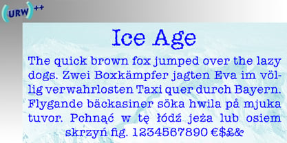
 - Ice Age by URW Type Foundry,
$35.00