10,000 search results (0.038 seconds)
  1. Leafyshade - Unknown license
  2. HGB Bacco by HGB fonts, $23.00
    Since 2005, I have repeatedly attempted to create a neutral-looking grotesque with a humanistic character. I wanted a pleasant, soft typeface. The typeface should appear similar to Helvetica or Univers, but with more open shapes and therefore better readability. The features are deliberately reserved with 4 gradations plus italics. The onum feature for Old Style Figures contains additional alternative letters such as a looped g. The italics have a swash feature with some decorative shapes. As a sans serif, HGB Bacco does not appear to be technically constructed, but has a friendly, open character and is also suitable for longer texts.
  3. FF Fago Correspondence Serif by FontFont, $68.99
    German type designer Ole Schäfer created this sans FontFont in 2000. The family contains 4 weights: Regular, Italic, Bold, and Bold Italic and is ideally suited for advertising and packaging, editorial and publishing, logo, branding and creative industries, small text as well as wayfinding and signage. FF Fago Correspondence Serif provides advanced typographical support with features such as ligatures, alternate characters, case-sensitive forms, fractions, super- and subscript characters, and stylistic alternates. It comes with tabular lining figures. This FontFont is a member of the FF Fago super family, which also includes FF Fago, FF Fago Correspondence Sans, and FF Fago Monospaced.
  4. Dimensions by Dharma Type, $19.99
    Dimensions is redesigned font family based on Blackout font released as free font in 2005. The original blackout has been used especially for company or brand logo of fashion and music label in the world. In 2011, Blackout had evolved into this Dimensions font family of seven weights with roman and italics. They are one of the most condensed, black and skinny font in the world. All weights and italics have upper and lower cases, accented characters and small capital glyphs that can be used with OpenType smcp feature. There is high contrast version called Speedometer.
  5. Montix by Linotype, $49.00
    Montix is a narrow, constructed type family that developed by the German designer Diana Fischer in 2003. With five weights (light, light italic, regular, regular italic, and bold), Montix is a particularly effective small family, especially when used for headline or display purposes. Montix's letterforms have relatively long ascenders and descenders, which compared with its horizontally compact body gives it its unique style. Words or lines of text set in Montix would look best when some amount of white space is left around them. Because of this, the faces are well suited for logos and corporate identity uses.
  6. FF Fago Correspondence Sans by FontFont, $68.99
    German type designer Ole Schäfer created this sans FontFont in 2000. The family contains 4 weights: Regular, Italic, Bold, and Bold Italic and is ideally suited for advertising and packaging, editorial and publishing, logo, branding and creative industries as well as software and gaming. FF Fago Correspondence Sans provides advanced typographical support with features such as ligatures, alternate characters, case-sensitive forms, fractions, super- and subscript characters, and stylistic alternates. It comes with tabular lining figures. This FontFont is a member of the FF Fago super family, which also includes FF Fago, FF Fago Correspondence Serif, and FF Fago Monospaced.
  7. boring - Unknown license
  8. MARIA BONITA - Unknown license
  9. BitLow - Unknown license
  10. Tenbitesch - Personal use only
  11. Sweden Funkis Straight - Unknown license
  12. Miltown - Unknown license
  13. Elido by Kontour Type, $50.00
    Elido (Odile in reverse) is the sans counterpart to the Odile type. Together they form a sans/serif superfamily with a wide range of variations for editorial use. Elido follows Odile’s proportions and matches the weight and typographic color of its serif twin. Elido is a sans with classical proportions. A slight geometric hint and open counters convey an airy feel. Elido’s family structure and relations within echo the conceptual approach of Odile. The arched stroke low off the stem reveals a script characteristic most pronounced in the Elido Upright Italic. This particular interpretation is gradually diminished in the Italic and becomes even less emphasized in the Regular. Six balanced weights, from an elegant Light to a pronounced Black, are in tune with three display solutions and a set of beautiful Ornaments. These variants allow for a diverse and multifaceted typography for the discerning type user. Sans serif initials amount to a rare finding. The charming monolinear Elido Initials come in two flavors, elaborate and rational, designed to hold their own in editorial and headline sizes. This type design boasts an extensive character set, many OpenType features including roman and italic Small Caps, five sets of numerals, beautiful ligatures, and many more. OT stylistic variants (with accents) offer a one-story “a” for the roman weights, alternate “g” and “s” designs for the italics, and a variant glyph “s” for the Upright Italic. These distinct qualities with its versatile and sincere traits make Elido an excellent choice for text and display use.
  14. ZARAUTZ - Unknown license
  15. Big In America - Unknown license
  16. ZodiacsSignStars - Unknown license
  17. Oil Age Heiroglyphs - Unknown license
  18. MR FUGLESANG CLEAN - Unknown license
  19. Q-Bert's Funeral - Unknown license
  20. Elemental Sans Pro by Latinotype, $39.00
    Elemental is a font created in 1997 and launched in 2001. It is a Sans Serif of humanist type and its principal characteristic is a hybrid between different form of calligraphic outlines. In 2010 it was redesigned for Chile’s bicentenary in Opentype version and an improved italic. It is offered in eight weights: Light, Regular, Bold and Extrabold and small capitals for each one of them.
  21. ASM by Extratype, $40.00
    The initials ASM represent the acronym of the Santa Monica Arts cultural center located in Barcelona, Spain, where this typeface, with the same name, has served as the custom corporate typeface since 2008 till today (2013). ASM is an energetic monospaced with extreme legibility consisting of two original weights, with an underlined version – used on some of corporate applications – all with their corresponding italics.
  22. Bumpo Soft by Graphite, $24.00
    Bumpo Soft is a chunky and a fun display typeface family with rounded edges. It is the softer version of Bumpo. With an extra heavy but friendly personality, Bumpo Soft works well for posters, food packaging, children’s products and books, or any communications which needs to be friendly, fun, casual or loud.
  23. Jason Barry by Insan Perkasya, $12.00
    Jason Barry is a handwritten font with a simple and minimalist character. Crafted with sincerity, each letter reflects a friendly and full-of-character personality. This font is perfect for various designs, from greeting cards to branding projects that seek a minimalistic and appealing touch. If you have any question, please contact us.
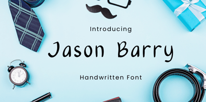
  24. Labyrinthus Rounded by Cerri Antonio, $30.00
    Labyrinthus Rounded is a multiline decorative font that works very well for identity logos, posters and 3D-works. It continues the tradition of the precedent Labyrinthus but with a softer rounded impact. It's interesting to note that with it it's possible to play with the multiline concept to create endless overlapping geometric creations.
  25. Kicker FC by Arkitype, $16.00
    Kicker FC is a typeface created for the love of sport, it has all the right elements to make for a great sports display font to give your brand and art work the right look and feel in this genre. It has a great variation in weights, stylistic alternates to provide flexibility and to add more customisation a shadow version for each weight to give your typography a custom graphic look and feel. Kicker FC is perfect for use in various sports categories, college sports, baseball, basketball, football and as show in all the poster images and more specifically the name Kicker FC, soccer. Not only is the typeface a perfect fit for sport, it works just as well for beverage, tech and various other industries. Narrow in width provides great eye catching headlines.
  26. Grymmoire - Unknown license
  27. My Puma - Unknown license
  28. Titania - Unknown license
  29. Ephesian Condensed - Unknown license
  30. Rubbed - Unknown license
  31. Celexa - Unknown license
  32. Iron Lounge - Unknown license
  33. A La Nage - Unknown license
  34. Bruno Ace Pro Rounded by Stiggy & Sands, $29.00
    Auto-Techno-Motive Stance in a softer package. Bruno Ace Rounded Pro is a fresh derivative of our Bruno Ace Pro typeface. It draws its inspiration from modern automotive logotypes. This geometric sans-serif has a wide stance with a tall x-height for a strong look and appeal, as well as ease of legibility. The SmallCaps and extensive figure sets offer a more extensive range of use as well as a more intense vibe. Bruno Ace Rounded Pro has an obviously softer feel to it compared to the original. See the 5th graphic for a comprehensive character map preview. Opentype features include: - SmallCaps. - Full set of Inferiors and Superiors for limitless fractions. - Tabular, Proportional, and Oldstyle figure sets (along with SmallCaps versions of the figures). - Stylistic Alternates for Caps to SmallCaps conversion.
  35. Distorted and Scratchy - Unknown license
  36. Cast Iron - Unknown license
  37. Yippy Alt - Unknown license
  38. Little Days - Unknown license
  39. lauralinda - Unknown license
  40. Face it! - Unknown license
Looking for more fonts? Check out our New, Sans, Script, Handwriting fonts or Categories
abstract fontscontact usprivacy policyweb font generator
Processing