10,000 search results
(0.076 seconds)
- Prosa by Satori TF,
$22.00 Introducing Prosa - a modern geometric typeface that will bring your words to life. With its minimalistic design and sleek lines, whether you're working on a book, a magazine, or a website, Prosa will help you create a look and feel that is both modern and timeless. With a full range of weights and styles, is versatile enough to handle any project, from headlines to body copy. And with its clean lines and geometric forms, Prosa is both easy to read and pleasing to the eye.
 - ITC Zipper by ITC,
$40.99Zipper is a striking font designed in 1970 by Phillip Kelly for the Letraset dry transfer sheets and it shows itself as a true child of the 1970s. The most distinguishing characteristic is the markedly robust horizontal stroke, heavier by far than the verticals. In a line of text, the figures present a close, stripe-like line, strongly dominated by the horizontal. Zipper is meant exclusively as a headline font and should be used in larger point sizes to highlight its unique, eye-catching characteristics. - Turquoise by Resistenza,
$59.00 Many calligraphers agree that Roman Capitals is one of the most beautiful yet difficult hands to master. Its beauty lies in its simplicity of form and structure, yet understanding and applying these skillfully can take years of mindful practice. My goal was to design Roman Capitals that were smoothly designed with a brush, not carved. The main concept was based on the fundamental strokes that are commonly studied when you practice Roman letters. That’s why many Serifs have these unfinished terminal serifs. I created the Turquoise typeface based on my Capitalis Romana practice with a flexible broad edged brush and gouache. During the lowercase process I was still following Foundational calligraphy with a flat brush. My Turquoise Capitals were then adjusted and redesigned at the Tipobrda calligraphy workshop in Slovenia. Turquoise contains small caps, many discretionary ligatures, ornaments, swashes as well as several brushy nature-inspired ornaments, accessible via OpenType. Ideally suited for headlines or body text in advertising, packaging and visual identities, its delicate shapes, curves and endings give projects a harmonious elegance and stylistic feel in unique Turquoise style. My inspiration for this font showcase is one of the richest islands in the Mediterranean, the place where my parents are from, Sicily. This southern Italian region has so many unique spots: Stromboli, part of the Aeolian Islands, and the Pelagie Islands is one of my favorite places in Sicily. The pictures I used were taken there this year. So enjoy the sun, the serifs, the water and its Turquoise colors. The brush is mightier than the sword. Opentype Features: https://www.rsztype.com/article/how-to-use-opentype-features-adobe-microsoft-pages Turquoise works very well with Nautica Check also Turquoise Inline
 - Skagwae by Ingrimayne Type,
$7.95 The characters of Skagwae have no curves, just straight line segments. The letter shapes themselves are fairly standard, but the choppy line segments used to construct them give the fonts a crude, unfinished look that is highlighted at large point sizes. At small point sizes the fonts are surprisingly legible. The family has nine styles. The regular, bold, italic, bold italic, shadow, and shadow inside styles are proportionally spaced. Shadowinside is very similar to regular but is spaced to be used in a layer with the shadow style. SkagwaeMono-Regular and SkagwaeMono-Bold are monospaced versions of the family. A third monospaced style, SkagwaeMono-Rippled, is a distorted version with squiggly lines full of curves.
 - Burdigala X Serif by Asgeir Pedersen,
$24.99 Burdigala X Serif is an open and spacious typeface inspired by the classic Didones. The X Serif is ideal for larger amounts of (printed) texts in brochures, magazines and books. Being wider than usual, it works especially well in media intended for on-screen reading, such as in Pdf-documents and e-books etc. Burdigala is the ancient Roman name of the city of Bordeaux France.
 - Lockhart by Danielle Eneh,
$15.00 Lockhart is a romantic, modern script font family available in 3 weights- light, regular and bold. Lockhart is perfect for branding projects, logos, wedding designs, social media posts, advertisements, product packaging, product designs, labels, photography, and invitations. It includes custom swashes, opentype features and ligatures to make your projects more unique and customizable. Language Support: English. Danish, Finnish, French, German, Italian, Portuguese, Spanish, Swedish, welsh, Icelandic
 - The Vintage Town by Nathatype,
$29.00 Looking for a font that will make your branding stand out? Do you sometimes have an appetite for a bit more wholesome typography? Looking for a fabulous, retro, and adventure font? We've got what you want. The Vintage Town- A Script Font The Vintage Town is a script font that has a varied base line, fine lines, retro, and fun touches. This font features thick and angular letters that easy on the eyes and nice to look while it’s also easy to read. It is becomes more special with extruding version option. Fall in love with it's authentic feel and use it to create gorgeous titles., beautiful poster designs, eye-catching social media posts, cute logos, and many more. Our font always includes Multilingual Support to make your branding reach a global audience. Features: Ligatures Stylistic Set Swashes PUA Encoded Numerals and Punctuation Thank you for downloading premium fonts from Natha Studio
 - La Chore Typeface by Krismagraph,
$17.00 La Chore is a modern & elegant serif typeface with a high contrast version of the famous Didot look that has been synonymous with fashion for decades. This font has multiple ligatures with multilingual fonts included. This font is modern and nostalgic and is perfect for logos, masterheads, sharp displays, magazines, blog titles, wedding invitations, social media, prints and quotes. Accessible in the Adobe Illustrator, Adobe Photoshop, Adobe InDesign, even work on Microsoft Word. PUA Encoded Characters – Fully accessible without additional design software. Fonts include multilingual support Image used : All photographs/pictures/vector used in the preview are not included, they are intended for illustration purpose only. Feel free to follow, like and share. Thanks so much for checking out my shop! If you need a custom license or have questions, please email to: krismagraph@gmail.com
 - Angelic Robe by Pixesia Studio,
$23.00 Introducing Angelic Robe - Modern Blackletter Font Angelic Robe is a modern blackletter font that combines timeless elegance with a contemporary twist. Angelic Robe is perfectly suited for branding, logotype, social media posts, advertisement, product packaging, label, photography, watermark, t-shirt, website design, invitation, stationery and any projects seeking a touch of modern blackletter elegance. FEATURES - Stylistic Alternates - Ligatures - Uppercase and Lowercase letters - Numbering and Punctuations - Works on PC or Mac - Simple Installation - PUA Encoded Characters - Easily accessible without additional design software. - Support Adobe Illustrator, Adobe Photoshop, Adobe InDesign, also works on Microsoft Word - Multilingual Support for 68 languages including Afrikaans, Albanian, Basque, Catalan, Danish, Dutch, English, Estonian, Faroese, Filipino, Finnish, French, Galician, German, Icelandic, Indonesian, Irish, Italian, Malay, Norwegian Bokmål, Portuguese, Spanish, Swahili, Swedish, and Zulu Hope you Like it. Thanks.
 - Fluire by Lián Types,
$37.00 MAS AMOR POR FAVOR (1) (more love, please) Fluire means -to flow- in Italian and that’s what this font is all about. The story began when a friend of mine asked for a tattoo with the word -Fluir- (to flow in Spanish). She didn't want a tattoo full of swashes and swirls, like I'm used to doing, but something more fluent, soft and minimal. My very first attempts were more related to copperplate calligraphy but I wasn't even close: I discovered that I needed to forget a little bit about the classic contrast and speed of the engrosser's nib and started playing with a tiny flat metal nib. Letters started to flow, and I immediately thought of turning them into a font. Inspired by the tattoo I created and by other tattoos I saw, I started the journey of what would be a very fun process. The result is a very cute, almost monoline font with a wide range of uses. USES If not used for a tattoo (my first ‘target’), the font delivers amazing results in combination with Fluire Caps: These two need each other, they go together, they talk. I designed Fluire Caps Down and Fluire Caps Up so it’s easier to manage their colors. Also there’s Fluire Caps Down Lines, which has a decorative thin line to add yet another dimension. Use the fonts in magazines, book covers, posters, greeting cards, weddings, lettered walls, storefronts! TIPS Since the font is Open-Type programmed, I strongly recommend using it in applications that support that feature. Also, the font looks way better when -contextual alternates- are activated, but it’s your choice :) Try Fluire, and keep flowing. NOTES (1) The phrase alludes to maybe the most tattooed phrase in Latin America.
 - Kono by Thinkdust,
$10.00 Kono is a font straight from the modern, gritty, warfare computer game genre. Rough and ready, with letters that double as numbers and look fit to be sprayed on a bunker wall, Kono brings you a bleak example of the near-future, where pragmatism rules out over artistry. Kono itself, ironically, is stylistically crafted to capture this feeling, carefully selecting the perfect mix between flat, straight lines and rounded corners, using wide, squat characters to mimic practical architectural styles. Kono is great for capturing a bleak but somewhat heroic attitude, whether you want to use that to encourage optimism or advertise pessimism.
 - Tsanger Yun Hei SC by Tsanger,
$198.00 Tsanger Yunhei was designed and published by Tsanger. Tsanger Yunhei contains 8 styles and family package options. The designer has made unique treatment on the shape and structure of the pen, based on the Chinese calligraphy style and writing, which makes it easier to identify under the same size of the font and group reading effect better. Tsanger Yunhei is more in line with the aesthetic habits of Chinese characters getting the reading an easy task. This font adopts GB 2312—1980 standard, with a total of 6763 Chinese characters, matching Latin letters, Greek letters, Hiragana, Katakana, Russian Cyrillic letters, etc.
 - Zirkel by Ondrej Kahanek,
$35.00 Zirkel is a geometric sans serif typeface which includes 16 fonts – eight weights and eight matching italics. Each character is geometrical, but optically corrected for better readability. Featuring austere lines, the font gains its strength in the final layout, which is created by the user. Zirkel Sans is suitable for headlines of all sizes, but it can be used in variety of long text as well. This font supports Western, Central and Eastern European languages, ligatures, alternate characters such as A, V, w, etc., and will find its place in the beginning, centre or end of any word. Geometry rulezz...
 - Biomorph by Rillatype,
$20.00 Proudly Introducing, Biomorph! Biomorph is a brand new condensed sans font family released by us. This font is very suitable for your projects especially for brandingm publishing, titles, book, magazine, website, etc. Biomorph is font family that comes from thin, extra light, light, regular, medium, semibold, and bold version, with all of these styles gives yoiu freedom to design as you like!
 - Amazing Slab by Zetafonts,
$39.00 Amazing Slab is a typeface family designed by Francesco Canovaro and Andrea Tartarelli as a development of the Amazing Grotesk family designed by Cosimo Lorenzo Pancini. Mixing an egyptian serif, low contrast approach with the curved endings and open shapes of humanist sans grotesques, it was developed to embody the energetic and friendly nature of the startup scene: a feeling of innovation, information and energy, with a desire for simplicity and straightforward communication. The basic design shapes for the font come from the strong personality of the extrabold letterforms drawn by Francesco Canovaro for his StartupItalia logo, that informed the display design of the four darkest weights (from medium to black). Each of these weights, has been paired with an inline version, designed by Mario De Libero, to extend the range of uses for the typefaces, from bold signage to logo design, to editorial titling. The lighter range of the family features two weights (regular and light) that are designed for text use, complemented by the thin and extralight weights that are better suited to big point size, for editorial and signage use. All the weights of Amazing Slab, as well the matching true italics forms, feature an extended charset of over 900 glyphs, covering 211 languages using latin, cyrillic and greek alphabets, and sporting a complete set of Open type features including positional numbers, annotation and case-sensitive forms, standard ligatures and a wide array of stylistic sets to customize glyph shapes for logo and display usage. With its friendly, energetic mood and its versatile range of application use, Amazing Slab is born to make every design project look simply... amazing! Suggested uses: old signage, logo design, editorial titling, display 21 styles: 8 weights, 8 italics, 4 inline styles, 1 variable font 965 glyphs in each weight Useful OpenType features: Small Capitals; Standard Ligatures; Discretionary Ligatures; Stylistic Alternates; Stylistic sets 01, 02, 03, 04, 05, 06; Ordinals; Fractions; Tabular Figures; Old-style Figures; Slashed Zero; Circled Numbers; Case Sensitive Forms; Numerators; Denominators; Subscript; Superscript; Scientific Inferiors; 211 languages supported: extended Latin, Cyrillic, Greek English, Spanish, Portuguese, French, Russian, German, Javanese (Latin), Turkish, Italian, Polish, Afaan Oromo, Azeri, Tagalog, Sundanese (Latin), Filipino, Moldovan, Romanian, Indonesian, Dutch, Cebuano, Malay, Uzbek (Latin), Kurdish (Latin), Swahili, Greek, Hungarian, Czech, Haitian Creole, Hiligaynon, Afrikaans, Somali, Zulu, Serbian, Swedish, Bulgarian, Shona, Quechua, Albanian, Catalan, Chichewa, Ilocano, Kikongo, Kinyarwanda, Neapolitan, Xhosa, Tshiluba, Slovak, Danish, Finnish, Norwegian, Sicilian, Sotho (Southern), Kirundi, Tswana, Sotho (Northern), Belarusian (Latin), Turkmen (Latin), Bemba, Lombard, Lithuanian, Tsonga, Wolof, Jamaican, Dholuo, Galician, Ganda, Low Saxon, Waray-Waray, Makhuwa, Bikol, Kapampangan (Latin), Aymara, Zarma, Ndebele, Slovenian, Tumbuka, Venetian, Genoese, Piedmontese, Swazi, Zazaki, Latvian, Nahuatl, Silesian, Bashkir (Latin), Sardinian, Estonian, Afar, Cape Verdean Creole, Maasai, Occitan, Tetum, Oshiwambo, Basque, Welsh, Chavacano, Dawan, Montenegrin, Walloon, Asturian, Kaqchikel, Ossetian (Latin), Zapotec, Frisian, Guadeloupean Creole, Q’eqchi’, Karakalpak (Latin), Crimean Tatar (Latin), Sango, Luxembourgish, Samoan, Maltese, Tzotzil, Fijian, Friulian, Icelandic, Sranan, Wayuu, Papiamento, Aromanian, Corsican, Breton, Amis, Gagauz (Latin), Māori, Tok Pisin, Tongan, Alsatian, Atayal, Kiribati, Seychellois Creole, Võro, Tahitian, Scottish Gaelic, Chamorro, Kashubian, Faroese, Rarotongan, Sorbian (Upper Sorbian), Karelian (Latin), Romansh, Chickasaw, Arvanitic (Latin), Nagamese Creole, Saramaccan, Ladin, Palauan, Sami (Northern Sami), Sorbian (Lower Sorbian), Drehu, Wallisian, Aragonese, Tuvaluan, Zuni, Montagnais, Hawaiian, Marquesan, Niuean, Yapese, Vepsian, Bislama, Hopi, Megleno-Romanian, Creek, Aranese, Rotokas, Tokelauan, Mohawk, Warlpiri, Cimbrian, Sami (Lule Sami), Jèrriais, Arrernte, Murrinh-Patha, Kala Lagaw Ya, Cofán, Gwich’in, Seri, Sami (Southern Sami), Istro-Romanian, Wik-Mungkan, Anuta, Cornish, Sami (Inari Sami), Yindjibarndi, Noongar, Hotcąk (Latin), Meriam Mir, Manx, Shawnee, Gooniyandi, Ido, Wiradjuri, Hän, Ngiyambaa, Delaware, Potawatomi, Abenaki, Esperanto, Folkspraak, Interglossa, Interlingua, Latin, Latino sine Flexione, Lojban, Novial, Occidental, Old Icelandic, Old Norse, Slovio (Latin), Volapük
 - New Lanzelott by Otto Maurer,
$12.00 The New Lanzelott is a brand new Version of an old Font of me called Lanzelott. The new Version get more curves and round Glyphes, it get more Soul. The Serif - Versions are shorter but more exactly. Every Font comes with many Open-type-features and Handmade Kerning. I like the old Version but this much better, much beautyfuller. All Fonts come with the German new big sharp S and a smaler sharp S and the normal sharp S. I you Write SS and want the big sharp S, you have only to make it with the Ligatur-Feature I hope you ll like it...
 - Blank Manuscript by Aah Yes,
$14.95Blank Manuscript allows you to produce sophisticated musical scoresheets even on basic Word Processors - anything from simple plain staves to complex full-page orchestral scores of your own design, to write in the notation yourself. The basic stuff is really easy and straightforward, but there's some quite advanced things you can do as well. So Copy and Save these Instructions. • The main stuff is simple and tends to follow the initial letter. Treble, Bass and Alto clefs are on upper case T B A (there are more clefs, below). The 5 Lines for the clefs are on L or l. • A small v will give a small vertical line (like a bar line) and a Big U will give a Big Upright - these can start or end a line or piece. • Time Signatures - type the following letters: Think of W for Waltz and it's easy to remember that 3/4 time is on W. Then from that they go up or down together like this: V=2/4 W=3/4 X=4/4 Y=5/4 Z=6/4 Compound Times are on H I J K like this: H=3/8 I=6/8 J=9/8 K=12/8 Common Time and Cut Common symbols can be found on semi-colon and colon respectively (all begin with Co- ). 2/2 3/2 are on lower case a and b, 7/4 and 7/8 are on lower case c and d, 5/8 is on small k (think POL-k-A) • Flat signs are on the numbers. Flat signs on LINES 1 to 5 are on numbers 1 to 5. Flat signs on SPACES 1 to 5 are on numbers 6 to 0 (space 1 being above line 1, space 5 being above the top line of the stave). Sharp signs are on the letters BELOW the long-row numbers. Which is q w e r t for the sharp signs on Lines 1 to 5, and y u i o p for sharp signs on spaces 1 to 5. Doing it this way means it works the same for all clefs, whether Treble, Bass, Alto, Tenor or any other. Sharp and Flat Signs always go in this order, depending on how many sharps or flats your key signature requires: Treble Clef Sharps t i p r u o e Flats 3 9 7 4 2 8 6 Bass Clef Sharps r u o e t i w Flats 2 8 6 3 1 7 = Alto Clef Sharps o e t i w r u Flats 7 4 2 8 6 3 1 • Guitar Chord Boxes are on G and g (G for Guitar) Upper Case G has a thick line across the top Lower case g has an open top, for chords up the fretboard TAB symbols are available: Six-string Tablature is on s & S for Six. Four-string Tablature is on f & F for Four. (Lower case has the "TAB" symbol on it, Upper Case has just the lines to continue.) Five-string tablature, is on lower case "j" (as in BAN-j-O) and of course L or l will continue the 5 lines. •RARE CLEF SIGNS including Tenor Clef, are on various punctuation marks, i.e. dollar, percent, circumflex, ampersand & asterisk, above the numbers 4 to 8. NOTE: The important symbols were kept on the letter and number keys, which are fairly standard all over, but some of the less important symbols are on various punctuation keys, which in different countries are not the same as on my keyboard. If it comes out wrong on your system, all I can say is it's right on the systems we've tried, and they'll be in here somewhere, probably on a different key. CLOSING THE ENDS OF THE LINES and BAR-LINES is done with the 3 varieties of brackets - brackets, brace and parentheses - Left/Right for the Left/Right end of the line. Parentheses L/R () which are above 9, 0 give a clef with a small vertical upright (the same as a bar line). Brace L/R and Brackets L/R (both on the 2 keys to the right of P on my keyboard) will close off a staff line with tall upright bars. Brace gives a double upright - one thick, one thin. Brackets give a single tall upright. A Big Upright is on Big U, (Big U for Big Upright) and a small vertical line is on small v (small v for small vertical). The Big Upright is the maximum height, and the small vertical is exactly the same height as a stave. And there's a tall upright Bar, on Bar (which is to the left of z on my keyboard, with Shift,) which is the same height as the bar on upper case U but twice as broad. • There's a staff intended for writing melodies, which is a little bit higher up than an ordinary treble clef giving a space underneath to put lyrics in - on m and M for Melody line. Lower case has the Treble Clef on, Upper case M has just the higher-up staff lines with no clef. (Use mMMMMMMM etc.) However this clef will be in the wrong place to put in sharp and flat signs, key signatures and so on, so if you use this clef you'll have to write the sharps, flats and key signature yourself. There's also a clef that's smaller (less tall) than the ordinary clef, but with the same horizontal spacing so it will align with other standard-sized clefs - on slash (a plain clef) and backslash (with a Treble Clef). • There are some large brackets for enclosing groups of staves, such as you'd use on large orchestral scores, on Upper Case N O P Q R, which can aid clarity. N and O on the left, Q and R on the right. P is a Perpendicular line to be used on both sides to increase the height of the enclosure, in this way but with the staff lines in between: N Q P P P P P P O R OTHERS —————————————— • Repeat marks are on comma (left) and period/full stop (right). • Hyphen is left as a sort of hyphen - it's a thin line like a single staff line, with the same horizontal spacing as ordinary staff lines - in case you want to draw a line across for a Percussion Instrument, or a Title or Lyric Line. • Space is a Space, but with HALF the width or horizontal spacing as ordinary staff lines, so 2 space symbols will be the same width as a clef symbol or line. • Grave (to the left of 1 on the long row, or hold down Alt and type 0096 then let go) gives a staff line that is one eighth the width of an ordinary staff line. • If you want manuscript in a clef and key which requires a flat or sharp sign in the space underneath the 5 lines, they’re on = equals and + plus . SYMBOLS • Many of these symbols will only be useful if you have worked out in advance which bars will need them, but they are here in case you've done that and wish to include them. • Symbols for p and f (piano and forte) are on 'less than' and 'greater than' < > (above comma and full stop) and m for mezzo is on Question, next to them. They can be combined to make mp, mf, ff, pp, etc. These signs -- and other signs and symbols like Pedal Sign, Coda Sign and so on -- can be found on various punctuation mark keys, including above 1, 2, 3 in the long row, and others around the keyboard. There's a sort of logic to their layout, but in different countries the keys are likely to give different results to what is stated here, so it's probably best to just try the punctuation and see if there's any you might want to use. (But on my keyboard a Coda sign is on circumflex - because of the visual similarity. Pedal sign is on underscore. A "Sign" symbol is on exclamation mark.) They were only included in case you really need them to be printed rather than handwritten. • However, a Copyright symbol is deemed necessary, and also included are a "Registered" symbol and a TradeMark symbol. They are found in the conventional places, and can be accessed by holding down ALT and typing 0169, 0174 or 0153 respectively in the numberpad section and letting go. • Staff lines with arco and pizz. above are on capital C and D respectively ---C for ar-C-o. • An empty circle above a staff line (to indicate sections by writing letters A, B, C or 1,2,3 inside for rehearsal marks) is on n. The actual signs for an A, B, C and D in a circle above the staff line can be produced by holding down ALT and typing 0188, 0189, 0190 and 0191 respectively and letting go. • The word "Page", for indicating page numbers, is on the numbersign key. • The two quotes keys, (quote single and quote double) have symbols representing "Tempo is", and "play as triplets", respectively. • INSTRUMENT NAMES There's a whole lot of Instrument Names built in (over a hundred) which can be printed out above the clef, and you do it like this. Hold down Alt and type in the given number in the numberpad section, then let go. For Piccolo it's 0130, for Flute it's 0131, Cornet is on 0154, Violin is on 0193, and the numbers go up to over 0250, it's a fairly complete set. There's also a blank which is used to align un-named clefs on 0096. Put them at the very beginning of the line for the best results. Here they are: WOODWIND Piccolo 0130 Flute 0131 Oboe 0132 Clarinet 0133 Eng Horn 0134 Bassoon 0135 Soprano Sax 0137 Alto Sax 0138 Tenor Sax 0139 Baritone Sax 0140 Saxophone 0142 Contrabassoon 0145 Recorder 0146 Alto Flute 0147 Bass Flute 0148 Oboe d'Amore 0149 Cor anglais 0152 Pipes 0241 Whistle 0242 BRASS Cornet 0154 Trumpet 0155 Flugelhorn 0156 Trombone 0158 Euphonium 0159 Tuba 0161 French Horn 0162 Horn 0163 Tenor Trombone 0164 Bass Trombone 0165 Alto Trombone 0166 Piccolo Cornet 0167 Piccolo Trumpet 0168 Bass Trumpet 0170 Bass Tuba 0171 Brass 0172 VOICES Vocal 0175 Melody 0176 Solo 0177 Harmony 0178 Soprano 0179 Alto 0180 Tenor 0181 Baritone 0182 Treble 0183 Bass 0197 (see also PLUCKED STRINGS) Descant 0184 Mezzo Soprano 0185 Contralto 0186 Counter Tenor 0187 Lead 0206 BOWED STRINGS Strings 0192 Violin 0193 Viola 0194 Cello 0195 Contrabass 0196 Bass 0197 Double Bass 0198 Violoncello 0199 Violin 1 0200 Violin 2 0201 Fiddle 0252 PLUCKED STRINGS Harp 0202 Guitar 0203 Ac. Gtr 0204 El. Gtr 0205 Lead 0206 Bass 0197 Ac. Bass 0207 El. Bass 0208 Slide Gtr 0209 Mandolin 0210 Banjo 0211 Ukelele 0212 Zither 0213 Sitar 0214 Lute 0215 Pedal Steel 0216 Nylon Gtr. 0238 Koto 0239 Fretless 0244 KEYBOARDS + ORGAN Piano 0217 El. Piano 0218 Organ 0219 El. Organ 0220 Harpsichord 0221 Celesta 0222 Accordion 0223 Clavinet 0224 Harmonium 0225 Synth 0226 Synth Bass 0227 Keyboards 0228 Sampler 0249 PERCUSSION and TUNED PERCUSSION Percussion 0229 Drums 0230 Vibes 0231 Marimba 0232 Glockenspiel 0233 Xylophone 0234 Bass marimba 0235 Tubular Bells 0236 Steel Drums 0237 Kalimba 0240 OTHERS Harmonica 0246 Mouth Organ 0247 FX 0251 Intro 0243 Verse 0245 Refrain 0248 Chorus 0250 un-named 0096 (this is a small spacer stave for aligning clefs without a name) ALSO copyright 0169 registered 0174 TradeMark 0153 Rehearsal marks 0188-0191 (giving A, B, C, D in a circle, an empty circle is on n ) Clef signs for Treble Bass Alto without any staff lines 0253-0255 An Alphabetic List of all signs: a 2/2 time b 3/2 time c 7/4 time d 7/8 time e sharp sign, centre line f Tab sign for 4-string tab g Guitar Chord Box, no nut h half-width stave I sharp sign, third space up j Tab sign for 5-string tab k 5/8 time l Lines - 5 horizontal lines for a stave m Melody Clef - a standard clef but placed higher up, with Treble sign n Stave with an empty circle above o sharp sign, fourth space up p sharp sign, space above stave q sharp sign, bottom line r sharp sign, fourth line up s Tab sign for 6-string tab t sharp sign, top line (fifth line up) u sharp sign, second space up v vertical line (bar-line) w sharp sign, second line up x Fretboard, four strings y sharp sign, first space up z Fretboard, five strings A Alto Clef B Bass Clef C “arco” above stave D “pizz.” above stave E Double Vertical Lines F Four Horizontal lines (for 4-string tab) G Guitar Chord Box with nut H 3/8 time I 6/8 time J 9/8 time K 12/8 time L Lines - 5 horizontal lines for a stave M Melody Clef - a standard clef but placed higher up, plain N Bounding Line for grouping clefs - top left O Bounding Line for grouping clefs - bottom left P Bounding Line for grouping clefs - Perpendicular Q Bounding Line for grouping clefs - top right R Bounding Line for grouping clefs - bottom right S Six Horizontal lines (for 6-string tab) T Treble Clef U tall, thin Upright line V 2/4 time W 3 / 4 time X 4/4 time Y 5/4 time Z 6/4 time 1 flat sign, first line up (the lowest line) 2 flat sign, second line up 3 flat sign, third line up 4 flat sign, fourth line up 5 flat sign, fifth line up (the top line) 6 flat sign, first space up (the lowest space) 7 flat sign, second space up 8 flat sign, third space up 9 flat sign, fourth space up 0 flat sign, space above stave - Holykadot by Allouse Studio,
$16.00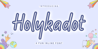 Proudly Presenting, Holykadot A Fun Inline Font Holykadot is perfect for any titles, logo, product packaging, branding project, megazine, social media, wedding, or just used to express words above the background. Holykadot also come with Multi-Lingual Support. Enjoy the font, feel free to comment or feedback, send me PM or email. Thank You!
 - Millerline by Allouse Studio,
$16.00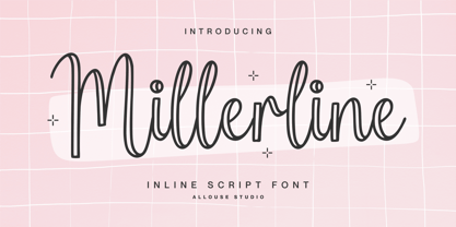 Proudly Presenting, Millerline A Inline Script Font. Millerline is perfect for any titles, logo, product packaging, branding project, megazine, social media, wedding, or just used to express words above the background. Millerline also come with Multi-Lingual Support. Enjoy the font, feel free to comment or feedback, send me PM or email. Thank You!
 - Mythsmiley by Allouse Studio,
$16.00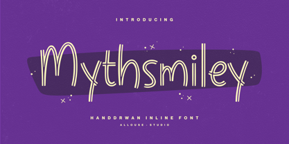 Proudly Presenting, Mythsmiley A Handdrawn Inline Font Mythsmiley is perfect for any titles, logo, product packaging, branding project, megazine, social media, wedding, or just used to express words above the background. Mythsmiley also come with Multi-Lingual Support. Enjoy the font, feel free to comment or feedback, send me PM or email. Thank You!
 - Ohara by Allouse Studio,
$16.00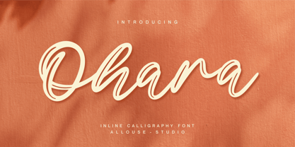 Proudly Presenting, Ohara a Inline Calligraphy Font. Ohara is perfect for any titles, logo, product packaging, branding project, megazine, social media, wedding, or just used to express words above the background. Ohara also come with Multi-Lingual Support. Enjoy the font, feel free to comment or feedback, send me PM or email. Thank You!
 - Chocobelly by Allouse Studio,
$16.00 Proudly Presenting, Chocobelly A Handwritten Inline Font. Chocobelly is perfect for any titles, logo, product packaging, branding project, megazine, social media, wedding, or just used to express words above the background. Chocobelly also come with Multi-Lingual Support. Enjoy the font, feel free to comment or feedback, send me PM or email. Thank You!
 - Storyteller - Personal use only

- DS Rabbit - Unknown license

- Barista - Personal use only

- Peninsula - 100% free

- Brewsky - 100% free

- KG Primary Penmanship 2 - Personal use only

- Sion - 100% free

- LinkeHand Pro by Oliver Linke Type Foundry,
$12.50 LinkeHand Pro was based on the handwriting of Oliver Linke. Due to its rather compact appearance with short ascenders and descenders LinkeHand can be used with rather tight line spacing. Both Regular and Bold come with Small Caps and a multitude of special ligatures to make LinkeHand look really manually written.
 - Ragtime by ITC,
$29.00Ragtime was designed by Alan Meetks, an all capital condensed sans serif typeface. It features thick/thin weight variances and fine line casing adornment which recalls magazine styles of the 1940s. This typeface should not be letter spaced too closely. Ragtime is excellent for anything requiring an elegant, refined look. - Connectica by Tour De Force,
$25.00 Connectica, as the name itself refers, is joined monolinear script family. Comes in two weights, Light and Regular. Due to specific design, we added fake Swash OpenType feature for initial capital characters, where letters like E, F, U, V, W, Y lack joining line on the left side of the characters.
 - University Roman by ITC,
$40.99University Roman font is based on Speedball hand-lettering. Designed at the Letraset Type Studio in 1983. University Roman is notable for its narrow capitals with crossbars that sit well above the median line. This unique roman design evokes a romantic air in display work such as packaging and advertising. - Saginaw - Unknown license

- Beffle - Unknown license

- Ashtronaut by Chank,
$20.00 Like a phoenix rising from the ashes, the new Ashtronaut font is on fire and blasting off into outer space. This futuristic new font combines basic geometric forms like circles and dashes to form uppercase shapes that are softer and more traditional and lowercase letters with sharp and abstract characteristics. The result is a minimalist style that creates distinct and innovative new glyphs and letter combinations. The basic Bold variety is the strongest of the bunch. Try overlapping it with the other styles — Inlines, Outlines, and Bulbs — in different colors for dramatic and exciting effects.
 - Danizatti script by Slex Studio,
$15.00 I want to create a font, which is very elegant. So I made Danizatti Script, a kind of classic decorative script with a modern twist. This is a display font intended for vintage logos, fashion labels, custom card headers, badges, food packaging designs, especially wine labels. Actually a lot of great style was consumed when creating this type :) there are 300 fancy letter and punctuation glyphs. I also offer a number of viable stylistic alternatives for multiple letters. NOTE, that you will get full access to font options only in Open Type smart applications like InDesign or Illustrator. You can find more about how to access OpenType features in Adobe Apps here: http://fontfeed.com/archives/opentype-in-adobe-creative-suite-the-raiders-of-the-lost-glyphs-pt_1/ Check out my other elegant script fonts at the my frofile
 - Bricksram by Parker Creative,
$18.00 Bricksram is a sleek and modern geometric sans serif font that draws inspiration from popular typefaces like Futura, Gotham, and Proxima Nova. With its own unique flair and minimalistic design qualities, Bricksram is the perfect choice for those looking to achieve a clean and contemporary look across a variety of mediums. Featuring sharp angles and smooth mathematical curves, Bricksram's meticulous balance creates a super clean and eye-catching aesthetic. With a choice of eight different font weights, this versatile typeface is ideal for demanding design applications like websites, logos, mockups, apps, ads, and more.
 - Les Bonbon Boutique PW by Patty Whack Fonts,
$29.98Reminiscent of vintage Paris. Think Tea Parties, Sweet Treats, Candy Shoppes, Boutiques, Fine China, Couture, Cakes and Pastries. This font is perfect for cards, menus, signage, and much more. Les Bonbon Boutique PW is intended and suitable for Display use and Titles. It's not suitable for long paragraphs of text. This font is meant for display, titles, beautiful signage, cards, etc. Les Bonbon Boutique PW is available in OpenType, and TrueType format. - Blaq by Resistenza,
$39.00 Inspired by Henry W. Troy, BLAQ is a new version of Trojan Text not available as font. Is an ornamental blackletter alphabet. Works great in headlines and other ‘masculine’ like design settings. The Victorian Gothic or Neo-Gothic is an architectural movement that began in the 1740s in England. Its popularity grew rapidly in the early nineteenth century. The revived Gothic style was not limited to architecture. We recommend to combine Blaq with: Turquoise Nautica


