10,000 search results
(0.05 seconds)
- XiparosLombard - Unknown license

- AT Move Artu by André Toet Design,
$39.95 Artù ! Strano ma vero, strange but true. A beautiful, intelligent and lively Italian dog and a great friend, unfortunately no longer among us ... but his memory lingers. A typeface designed in Rosennano (Tuscany), its Italian, but executed in Amsterdam. This monospace typeface might prove to be extremely useful for household products like washing powder or any anything like that. Just use it in your designs, let it live! Concept/Art Direction/Design: André Toet © 2017
 - Retromax by Debut Studio,
$15.00 Debut Studio Presents The Retromax.... This Script is a special script or typeface in which the emphasis is reversed from the norm: instead of the vertical lines being wider or thicker than the horizontal lines, which is normal in Latin alphabet writing and especially printing, horizontal lines are the thickest. It's quirky and fun, you can use for any project. Retromax is also a Layered Fonts, Layered fonts have letters that appear raised, or stacked in multiple layers of different shades or colors. Some layered fonts actually include multiple files for each layer. With layered font families, we can create novel combinations of 3D with Shade. Features: Uppercase & Lowercase Number & Punctuation Multiple Language & Stylistic Alternate Files Included: Retromax Regular Retromax Offset Retromax 3D Retromax Shade I hope you like my latest product, This collection will be perfect for creating posters, art prints, apparel and t-shirt designs, Instagram and other social media posts, and many more. if you have questions and problems when using it, please leave a message in the comments or via direct message, I will be very happy to reply, Happy Designing!
 - Budinger Oldstyle by The Ampersand Forest,
$20.00 The Ampersand Forest has its first book family! Budinger Oldstyle is elegant and approachable at the same time, with five different weights, making it a perfect choice for text or display in situations that require a hint of scholarship, fine arts, craft, erudition, and clarity. Budinger Oldstyle has the legibility of a Garalde (like those of Garamond, Manutius, et al.), with a whiff of Venetian revival (after the fashion of Schneidler & Goudy). The letters are arbitrary, with conventions like cupped serifs and leftward stress. It also has a higher x-height than might be expected, to give it an upright posture and openness in the counters. The italic is more compact, with more clearly calligraphic letterforms and conventions like Swash Caps. Its many features include OpenType alternates (a one-story a and g, and a K, R, and Q with elongated descenders), full and true small caps, both standard and discretionary ligatures, oldstyle and lining numerals, and Swash letterforms in the Italic (all capitals and descenders, plus the ascender of the d). Plus, the most adorable pudge of an ampersand you've ever seen!
 - Toma Sans by JAM Type Design,
$- Toma Sans is a sans serif type family of seven weights plus matching italics. Influenced by the geometric-style sans serif faces that were popular during the 1920s and 30s, the fonts are based on geometric forms that have been optically corrected for better legibility. Toma Sans has a functional look with a friendly open touch. While the ExtraLight and the black weights are great performers in display sizes the light, regular and medium weights are well suited to longer texts. The small x-height and the restrained forms lend it a distinctive elegance. The typeface has an extended character set to support most European languages.
 - Nata by MysticalType,
$10.00 Nata is a sans serif family with fourteen weights plus matching italics. It was designed by Candi Erwanto in 2019. This sans serif family is based and influenced by geometric styles that were popular during the 1920s and 30s and have been optically corrected for better readability. Nata has a functional look with a warm touch. While thin and black weights are great players in display size, lightweights, regular, and medium are suitable for longer texts. Small x-height and curbed shape provide a distinctive elegance. Nata is equipped for complex and professional typography. This OpenType font family has extended characters to support Central and Eastern European and Western European languages.
 - Daffadowndilly NF by Nick's Fonts,
$10.00Here’s another offering based on the work of Alf Becker, long-time contributor to Signs of the Times magazine. This only comes from the 1940s, and is a light and bouncy single-stroke face that’s sure to pep up any project it graces. This font contains the complete Latin language character set (Unicode 1252) plus support for Central European (Unicode 1250) languages as well. - Hob Gob NF by Nick's Fonts,
$10.00Although not credited, the inspiration for this typeface, originally called "Dancer", has all the earmarks of the work of legendary lettering artist Alf Becker. Creepy and kooky, mysterious and spooky, but not in the least ooky, this monocase face is just what the doctor ordered; Dr Frankenstein, that is. Both versions of this font include the complete Unicode Latin 1252 and Central European 1250 character sets. - Talqual by Type-Ø-Tones,
$40.00 Sometimes work done in a rush survives and gets better and better. This is the case of Talqual, a Joan Barjau handwriting font straight from the strokes made with a Wacom tablet while listening to a Barça football match on the radio.
 - Somuch Fabrica by Allouse Studio,
$16.00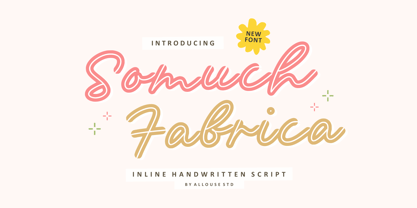 A Inline Handwritten Script. Somuch Fabrica is perfect for any titles, logo, product packaging, branding project, megazine, social media, wedding, or just used to express words above the background. Somuch Fabrica also come with Multi-Lingual Support. Enjoy the font, feel free to comment or feedback, send me PM or email. Thank You!
 - Cryptic by Jessie Makes Stuff,
$16.00 Cryptic is a font family of caps and small caps whose unique design was inspired by Morse Code. The traditional dots and dashes have been re-imagined as diamonds that you can read from top to bottom on the letters themselves. Secret code hidden within the letters, hence - Cryptic. This font family is truly versatile! The letters are all based on the character shapes of the Naked style, and all the diamonds have the same proportions, so you can stack and layer as many as you like to create a custom look for any project. Cryptic is perfect for website headers, posters, t-shirts, billboards, book covers, SVG cutting files, and anything else you want to add a little mystery, intrigue, or glitz to. Please note that some styles are better suited for larger scale projects to show off the fine details.
 - RM Deco by Ray Meadows,
$19.00 A mixture of bold and fine line helps this distinctive design evoke the spirit of the 1930s Jazz Age. Due to the modular nature of this design there may be a slight lack of smoothness to the curves at very large point sizes (around 100 pt and above).
 - Klee by ITC,
$29.99Klee is the work of British designer Timothy Donaldson, who was inspired by the work of the famous modern artist Paul Klee. The capitals can be used alone or with the lowercase letters. Klee is a unique, roman typeface whose fine line structure gives it a delicate, feminine appearance. - Deco Elongated JNL by Jeff Levine,
$29.00 Tall and narrow in stature, elegant by design and Art Deco in style, Deco Elongated JNL is a wonderful type design for setting long lines of copy in less space. The retro elements of this font conjure up images of fine fashions, fancy nightclubs and big band music…
 - Odessa by ITC,
$29.99Odessa was designed by Peter O'Donnell, an impressive, refined sans serif typeface based on the compass and ruler design of Futura. It is best set with wide letter spacing and is particularly good for an upscale, fashionable look. The fine-line casing of Odessa emphasizes its clean, proportioned features. - Liberty Walk by Sipanji21,
$15.00 "Liberty Walk" is a display font featuring characters with straight, upright lines. Fonts like this are often used to give a clean, simple, and assertive appearance to designs. They are suitable for various design projects, including logos, posters, titles, or other design elements that require clear and upright typography.
 - Trebuchet MS by Microsoft Corporation,
$49.00Trebuchet™ Family, designed by Vincent Connare in 1996, is a humanist sans serif designed for easy screen readability. Trebuchet Family takes its inspiration from the sans serifs of the 1930s which had large x heights and round features intended to promote readability on signs. The typeface name is credited to a puzzle heard at Microsoft, where the question was asked, 'could you build a Trebuchet (a form of medieval catapult) to launch a person from the main campus to the consumer campus, and how™' The Trebuchet fonts are intended to be the vehicle that fires your messages across the Internet. 'Launch your message with a Trebuchet page'. Character Set: Latin-1, WGL Pan-European (Eastern Europe, Cyrillic, Greek and Turkish). - DS Dots - Unknown license

- TypographerFraktur - Unknown license

- Saturday Champagne by Roland Hüse Design,
$18.00 SATURDAY CHAMPAGNE is a monoline modern calligraphy script. Perfect for titles, headings and logotypes for blogs, ads, quote prints, home decor, book title, invitation, birthday, custom product, lifestyle imagery (like quotes and stuff). This font is written by the amazing hand letterer and fellow artist of mine, Leah Chong, and is a collaboration project. The character set contains Western and Eastern European accents and extra characters, symbols and the following open type features: Ligatures: ff ll oo rr th tt ty Finals: b c d l g p y z Instagram: @leahdesign @rolandhusedesign https://leahdesign.sg https://rolandhuse.com Awesome background image for main poster by Simon Buchou from Unsplash https://unsplash.com/@simon_buchou Background mock ups for Girls Night Out and White Sea Cosmetics are from graphicburger.com http://graphicburger.com The Quote "Reality aligns with your mindset" is my favorite and is from Matt Lopez from the Lambo Goal podcast, picture is taken and photoshopped by me. Thank you I hope you like this font & good luck with your project! Roland
 - Chevalon by Asenbayu,
$15.00 Chevalon is a versatile serif font consisting of 7 styles. Inspired by medieval roman letter, the Chevalon is like a glorious horse that has a strong yet elegant appearance. Each Chevalon letter is carefully crafted. Chevalon fonts can help you complete various projects such as luxury brand logos, journals, business cards, headlines, products, social media posts, web and much more. If you are involved in a project that requires strong, elegant and professional writing, Chevalon font is perfect to help you get it done.
 - Bowen Script by Ashton,
$9.00 The font was inspired by the persistent demands of editors for scripts which actually looked like real handwriting, a lot of historical fiction projects and a love of maps. While making a map for a prequel to Treasure Island I decided to make a font from the lettering of some Caribbean maps of the period. The glyphs are all hand drawn vector outlines which although very legible and consistent in style carry the variation and irregularity you expect from handwriting. This font has been featured on maps for books by authors such as Peter V. Brett, Mark Lawrence and Michael Crichton.
 - Skema Pro by Mint Type,
$40.00 Skema Pro is a versatile system of 6 serif typefaces - each bearing a distinct character and purpose. Together they form a huge superfamily of 84 fonts to fit any imaginable task. Skema Pro Livro is a low contrast, low x-height typeface with inclined axis. It is designed to work in books, where long ascenders and descenders along with increased line-spacing aid comfortable reading. Skema Pro Text has low contrast, medium x-height, and slightly tilted axis. Its neutrality along with modern feel makes it default choice for long texts of any nature. Skema Pro Omni features medium contrast, medium x-height, and slightly inclined axis. Being a more contrasted version of Skema Pro Text, it shares its intent of usage, however, creates a different texture with more formal look. Skema Pro News is a low contrast, large x-height typeface with vertical axis. Works best in newspapers and in screen applications. Skema Pro Title has medium contrast, large x-height, and vertical axis. Designed to work in larger text sizes, it offers contemporary detailing for pull-quotes and subheadings. Skema Pro Display is a typeface with high contrast, large x-height, and vertical axis. It shows its features in large text sizes, such as editorial headings.
 - Neuro X by Sawdust,
$35.00 Neuro X is a narrow sans serif typeface consisting of three weights with additional rounded versions and matching italics. It was first drawn as an exploration for a headline font and later expanded on to become a full typeface family. Neuro X explores the extremities of narrow proportions whilst also allowing for eccentric cuts. The typeface has been tightly monospaced and intended for use at larger sizes as a display but can also work at smaller scales for the more courageous among us. This 339 glyph font has language support for 26 languages: Afrikaans, Albanian, Catalan, Croatian, Czech, Danish, Dutch, English, Estonian, Finnish, French, German, Hungarian, Icelandic, Italian, Lithuanian, Maltese, Norwegian, Polish, Portuguese, Slovak, Slovenian, Spanish, Swedish, Turkish, Zulu.
 - HS Dream by Hiba Studio,
$50.00 HS Dream is based on some modern lines of Kufi calligraphy which supports Arabic, Persian. The typeface has been optimized for corporate identity work and modern projects when a contemporary and simple look is requested. It is an Opent type Arabic font and features four stylistic sets. This font consists of four weights (light, regular, medium and bold) which can constitute a striking addition to the library of Arabic fonts models that meet the purposes of various designs for all taste.
 - Qotho by Scholtz Fonts,
$7.50 Qotho is a clean, geometric sans serif font, available in five weights. Qotho Dark, Qotho Medium, Qotho Light and Qotho Thin also come in two widths, regular and Cond. Clear and versatile, Qotho is designed for magazine pages, newspapers etc. Its large x-height and simple lines make it extremely legible. The font contains over 235 characters - (upper and lower case characters, punctuation, numerals, symbols and accented characters are present). It has all the accented characters used in the major European languages.
 - PF Adamant Pro by Parachute,
$59.00 The Adamant family is a serif typeface that comes in six weights, from Light to ExtraBold, each with italic and small caps versions. It has received an original typeface award from Granshan Awards 2010. Every font in this family includes ligatures, lining and oldstyle figures in proportional and tabular widths, fractions, alternate characters, and other typographic features. The weights are finely balanced so that they can be easily combined, depending on type of paper and print conditions. Its proportions, sturdy serifs, high x-height and wide apertures make it very readable at small sizes. It is suitable for setting books, magazines and newspapers, but is also appropriate for use in large sizes like in poster design.
 - ALS Klementina by Art. Lebedev Studio,
$63.00 Klementina is a cursive typeface based on brush pen handwriting. It has flowing feminine shapes and letters drawn with care and love, much like you find in a romantic young lady's album. All characters settle into a line with ease, partially thanks to a number of ligatures and contextual alternates that help you avoid unpleasant combinations. This type is ideal to set something personal and touching. It will have this effect regardless of the presence of any sense in the text. Due to the attention paid to fine details it looks great even in big sizes. Klementina will come as a helping muse to any designer working with wedding invitations, announcements, gift and delicatessen packaging, or magazine layouts.
 - Yoko by Thinkdust,
$10.00 Yoko is a straightforward font with a straightforward message, and an interesting finish. Yoko wants you to enjoy life, live to your fullest and be happy. Yoko understands that it doesn’t look easy, but it can be, and you can achieve it. Straight lines and perfect corners make Yoko’s messages come across simply and openly. There’s no fancy flourishes in what you say with this font, just a goal and a solution. That’s not to say it’s dull though, because the textured finish gives Yoko a depth that carries its own form of weight. The solid impact of the shapes and the rough texture of the finish make Yoko’s message stand out, whatever you choose to say with it.
 - Plinc Banjo by House Industries,
$33.00 When it comes to poster design, the line between wild west and psychedelic can be surprisingly fine. Dave West combined both typographic genres to create his refreshing Banjo. Developed in the late 1960s for Photo-Lettering, Inc., this curvaceous high-contrast sort-of serif might have been born on the nineteenth-century frontier, but it was raised in the counterculture of the mid-twentieth century. Use it wherever the conventional and uncommon collide. Vectorized by Mitja Miklavčič in 2017. Like all good subversives, House Industries hides in plain sight while amplifying the look, feel and style of the world’s most interesting brands, products and people. Based in Delaware, visually influencing the world.
 - Tall Skinny Condensed by Outside the Line,
$19.00 This is the tallest, skinniest, most condensed, non serif font I know of. I designed this because I felt a serious need for that one big, thin word to fit in a narrow space. It is great for ‘SALE!’ in a one column ad. Also is a life saver for several long words in a narrow space like Merry Christmas... If you need a full character set take a look at the new Ultra Condensed 3 font family. Ultra Condensed was based on Tall Skinny Condensed with some changes and a full character set. Ultra Condensed Lettered is a hand lettered version and Ultra Condensed Line is a lighter hand drawn version
 - Lifeform by Supremat,
$12.00 Lifeform is a modern display font created as a result of my experiments on the forms of letters. While working on the font, I had ambivalent feelings, on the one hand I liked the individual curved lines, on the other hand they seemed very strange, alien and illogical. It was like looking into a microscope and seeing something strange. I wanted to develop and study these forms as something new, because I had never seen anything similar before. The result is a contrasting font that has both curves and sharp, and smooth lines that resemble some kind of organic matter. The font is well suited for large headlines, posters and covers. Its strange design catches the eye and will not leave the viewer indifferent.
 - Frost by Fenotype,
$35.00 Firing Imaginations and lively connected script family of three weights, ornament and banner sets and separate caps and small caps designed to support the script. Frost is influenced by the hand lettering and sign painting of the 1950s and 1960s with more polished appearance to better suit contemporary design trends. Frost is equipped with loads of automatic ligatures to make the text better flowing and has minimum three alternatives to every basic letter: To activate the alternates click on Swash, Stylistic or Titling Alternates in any OpenType Savvy program or manually choose from even more alternate characters from the Glyph Palette. Frost is an effective and easy to use font family for creating ambitious headlines, logos & posters with a custom-made feeling. For the absolutely best price purchase the complete family!
 - Livia - Unknown license

- Bughouse - Unknown license

- Neuropol - Unknown license

- Paperclip Reg - Unknown license

- Pocketknife by Blank Is The New Black,
$13.00 Pocketknife is a simple grid-based titling font on it’s surface, but it has a surprisingly prolific set of features under the surface. The most notable of these features is an abundant set of ligatures that give Pocketknife it’s unique look. There are very few kerning pairs contained within Pocketwatch, and these ligatures fill in most gaps that could be created by letters with more empty space, such as L and T, and also give a more playful look to an otherwise sharp-edged typeface. Pocketknife also contains with 2 full sets of alternate characters, one pairing with the uppercase set and one pairing with the lowercase—available as OpenType stylistic alternates or individually in the Glyphs panel. Pocketknife Regular is designed to be used on it’s own, while the Inline and Base fonts are designed to be used as a simple layered combination. The Base font is nearly identical to Regular, but contains a few specially adjusted characters that better accommodate the Inline style. Pocketknife Outline is a combination of the Inline/Base styles, to be used individually. Pocketknife is sharp, but playful. Simple, but sophisticated. Sporty, technical, and aggressive, yet elegant and fun. Pocketknife, while simple at first glance, is a deceivingly versatile typeface.
 - Puchiflit by sugargliderz,
$44.00 Puchiflit is a typeface disguised as a pen script. I didn't create this typeface by importing the letters on paper and tracing them into a computer with a draw application. So I think it's a pseudo-pen script typeface. By the way, I used a famous Japanese maker's felt-tip pen as a reference for line widths. I thought, "Isn't this what it would look like if I wrote with this pen? I drew a line in the draw application while fantasizing about this.
 - Vonique 43 by Sharkshock,
$125.00 Vonique 43 is a stylish display font designed to stop passerby in their tracks. Curvaceous lowercase members define this font along with a consistently thin line weight throughout. Most are elegantly styled after circles featuring very short descenders and matching the cap height of capital letters. Vonique 43, like its predecessors, was not designed for everyday text, but eye catching logos. It's equipped with support for many different languages including Russian and Greek. Use it for a luxury brand, clothing line, or a company logo.


