10,000 search results
(0.594 seconds)
- Capaldi by Lunas Type,
$19.00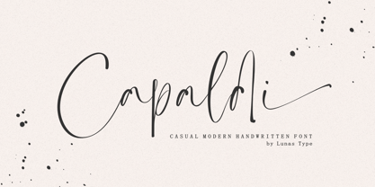
- Bromrose Sands Signature by Rillatype,
$15.00
- Stylized Deco JNL by Jeff Levine,
$29.00
- New Victoria by Gartype Studio,
$10.00
- Minomu by Owl king project,
$37.00
- Yustine Signature by Lemonthe,
$14.00
- Dry Billow S by Tadiar,
$13.00
- Cattigan by Hoftype,
$49.00
- Display Art Two by Gerald Gallo,
$20.00
- Carbonara by Hanoded,
$20.00
- Display Art Three by Gerald Gallo,
$20.00
- Rataczak by Ingrimayne Type,
$9.00
- Scissorgirl by Type-Ø-Tones,
$40.00
- Mordings JNL by Jeff Levine,
$29.00 - Frakturus by MAC Rhino Fonts,
$49.00
- Phantaztik by PintassilgoPrints,
$27.00
- Healthy Freak by Vozzy,
$10.00
- Schwung by Hubert Jocham Type,
$29.90
- Beautiful Victoria by Letterena Studios,
$9.00
- Bithead by Comicraft,
$19.00
- Priock by Holis.Mjd,
$10.00
- Caliber by Loaded Fonts,
$15.00 - Everleigh by Gleb Guralnyk,
$14.00
- MPI French Antique by mpressInteractive,
$5.00
- Chevalier LP by LetterPerfect,
$39.00
- Karmilla by Akufadhl,
$25.00
- Ragtime by ITC,
$29.00 - Arista 2.0 by Zetafonts,
$29.00
- Ahimsa by Satori TF,
$12.00
- Insigne Display by Gian Studio,
$15.00
- Tuskcandy by Ingrimayne Type,
$7.95
- Evil Laughter by Hanoded,
$10.00
- Broad, conceived and distributed by Apostrophic Labs, embodies a venture into the realms of boldness and legibility, meriting its place in the diverse world of typography. As its name straightforward...
- HoTom by Linotype,
$29.99 - Wacamóler Caps - Personal use only

- gAbAcHiTA FFP - Personal use only

- Pricedown - Unknown license

- Earwig Factory - Unknown license

- Insula - Unknown license

- Kenyan Coffee - Unknown license


