10,000 search results (0.016 seconds)
  1. Planet Benson - Unknown license
  2. Riot Act - Unknown license
  3. Top Bond - Unknown license
  4. Worthless Bum - Unknown license
  5. Sad Films - Unknown license
  6. Shifty Chica - Unknown license
  7. Oliver'sBarney - Unknown license
  8. Zipper by Présence Typo, $36.00
    Zipper tries to give the feeling of a typeface made with pieces of bold and thin letters pasted together.
  9. Ah, the 20th Century Font by Ray Larabie, a typeface that's as ambitious and forward-looking as its name suggests, yet marinated in the nostalgic vibes of the past century. Imagine a font that decide...
  10. Wakefield by Galapagos, $39.00
    A gentle breeze caressed his face as his body took on the easy posture of a dancer on break. Flickering sparklets of light sprinkled the glass-smooth surface of the aqua liquid on which he floated. His mind wandered; he was only days away from his scheduled departure date. This day was no different from a hundred other days he had spent melded to his windsurfer, skittering along the breadth of the modest lake, soaking up the sun's rays and forgetting about the entire rest of the world. Lake Quannapowitt, and the town of Wakefield, Massachusetts, were familiar to Steve, a long-time resident of the picturesque New England town. This is where he grew up; this is where he married and lived for many years; and this is the place he was preparing to leave, not one week hence. Not generally prone to nostalgia, it was in just such a state he nonetheless found himself once Zephyrus retreated, as was his custom, periodically, while patrolling the resplendent lake. Steve was going to miss the lake, and he was going to miss the town. How many hours of how many days had he spent exactly like this, standing on his motionless board, waiting for his sail to fill, and staring at the lake's shores, its tiny beach, the town Common with its carefully maintained greenery, and equally well-tended gazebo, the Center church - its spire shadow piercing the water's edge, like a scissor-cut the better to begin a full-fabric tear? Yes, he was going to miss this place - this town which all of a sudden had become a place out of time, just as he was about to become a person out of place. Once this idea struck him, he couldn't shake it. He was transported back in time four score years, now watching his ancestors walk along the shore. Nothing in view belied this belief - not the church's century old architecture, not the gazebo frozen in time, nor the timeless sands of the beach, nor the unchanging Common. Everything belonged exactly where it was, and where it always would be. This, he decided, was how he would remember his hometown. And this is when it occurred to Steve to design a typeface that would evoke these images and musings - a typeface with an old-fashioned look, reflected in high crossbars, an x-height small in size relative to its uppercase, and an intangible quality reminiscent of small-town quaintness. Wakefield, the typeface, was born on Lake Quannapowitt in the town for which it was named, shortly before Steve moved away. It is at once a tribute to his birthplace and a keepsake.
  11. Wine Cellar JNL by Jeff Levine, $29.00
    Wine Cellar JNL is a bold, yet casual display face found on some 1930s-era sheet music entitled "Everybody Wants a Key to My Cellar". Since the subject of the song had a number of good times underneath the house, it's a fitting name for the font. The hand lettering for the original song sheet showed strong influence of the 1920s and the Art Nouveau style, and has hints of the popular metal type "Hobo" in its character shapes.
  12. Flaminia by Andinistas, $39.95
    Flaminia is a typeface family of 4 members designed by Carlos Fabián Camargo G. The central idea started as Dingbats and titles labeled with fine-tipped brushes and flat tip for graphic design related restaurant menus, instructions, packaging, food containers and labels. Thus began the process of drawings and letters integrated by shapes and counterblocks that seem inaccurate yet but at the same time clean and attractive. For this reason each variable suggests fresh brushstrokes that combine ideas from Roman and italic calligraphy. Flaminia members work separately or together by solving needs in different scenarios. This will enhance its properties in order to control and diagram titles, subtitles and short paragraphs with an effusive and manuscript character. Flaminia is useful for generating a flavor of "hand lettered by skilled artists lettering." In conclusion, Flaminia Regular and Italic are used to write short paragraphs. His ascending and downs are lower that the X height. Its width is imperceptibly condensed to save horizontal space. Its smooth lines and finishes simulating a crescent moon have been made with fine-tipped brush. The contrast between thick and thin has medium intensity. Its complement is an ideal italic to emphasize words and phrases. Its conceptual characteristics are similar with foundation's handwriting, except for his companion who takes ideas from the ornamental italic calligraphy. Flaminia Black is compact and ideal for ranking information such as words and titles. Its personality is based on ornamental penmanship italics mixed with humanistic ideas outlined with contrast-type, flat-tipped brush thickness. Its overall width is slightly condensed, rising and falling are short compared to an exaggerated X height. Its smooth lines and terminations as in a crescent moon simulate the path of a broad brush. Its amount of contrast between strokes have average intensity. In brief, push to the limit parameters such as the type and amount of contrast, size, backward, forward, overall width, etc. And finally, Flaminia Dingbats offers three sets of different illustrations, a total of almost 90 drawings useful in communications related to: Food, Clothes and Sketchy. Each carefully wrought through research, testing, analytical design, visual strategy and high-definition of Bezier paths, optimizing time and work to their users. And in conclusion, I have plans to continue expanding the family with more complete versions in the future.
  13. Khmer - Unknown license
  14. Larabiefont - Unknown license
  15. Karma Suture - Unknown license
  16. Alfredo's Dance - Unknown license
  17. Abandoned Bitplane - Unknown license
  18. Chicken Wire Lady - Unknown license
  19. Tumb by That That Creative, $18.00
    Tumb is a bold quirky modern display font with stylized ink traps. It is perfect for giving your project a fun sophistocated playfulness. Perfect for headlines on posters, Instagram, print projects, branding, and logo design.
  20. Inhuman BB - Personal use only
  21. Pawl by The Ampersand Forest, $20.00
    Meet Pawl, an affordable 48-font squarish sans family with a little grotesque in him! Oh, you may think you’ve got him pegged at first glance, but he’ll surprise you with his versatility. AND he's just been totally refurbished from top to bottom and boy, did he need it! Pawl lives in the same visual landscape as fantastic modular superfamilies like Eurostile, Agency, Geogrotesque, Barlow, and even the great American Gothics. Unlike those faces, though, he's nimble enough to switch between looks effortlessly. Pawl is energetic, aggressive, strident, and structural. Depending on how you use him, his voice can be retro, futuristic, industrial, or sleek. He can be sober or splashy, techy or oldschool. Use his alternate characters and stylistic sets to create looks ranging from Streamline Moderne to Futurism to Brutalism to Swiss. He works from small paragraphs all the way up to monumental signage. This guy is smart and useful, with a lotta looks! How many times have you needed multiple weights, styles, and widths for your hierarchy, but standard type families were either shockingly expensive or couldn't deliver? Pawl delivers. Give him a shot!
  22. Sickness - Unknown license
  23. Swadi Marker by Sipanji21, $15.00
    Swadi Marker is a sweet and friendly serif font and features Cyrillic and Thai character. Its natural and unique style makes it incredibly fitting to a large pool of designs. The only limit is your imagination!
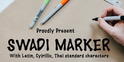
  24. Aperture Display by Mi Chen, $5.99
    Aperture Display is a san-serif typeface which combines the “standard” forms of grotesks and the modern takes on the use of ink traps. It is a display typeface designed mainly for branding and printed matter.
  25. Primer Print - Unknown license
  26. Send Cash - Unknown license
  27. 20th Century Font - Unknown license
  28. EndlessShowroom - Unknown license
  29. Pulse State - Unknown license
  30. Webster World - Unknown license
  31. Model Worker - Unknown license
  32. Yellow Pills - Unknown license
  33. Soul Mama - Unknown license
  34. Soul Papa - Unknown license
  35. Primer Print - Unknown license
  36. Yytrium Dioxide - Unknown license
  37. Xolto - Unknown license
  38. Eclipse - Unknown license
  39. Dwarves - Unknown license
  40. Castro - Unknown license
Looking for more fonts? Check out our New, Sans, Script, Handwriting fonts or Categories
abstract fontscontact usprivacy policyweb font generator
Processing