10,000 search results
(0.026 seconds)
- LT Eat - Personal use only

- LT Glockenspiel Black - 100% free

- LT Carpet Text - 100% free

- XXII BLACK-BLOCK by Doubletwo Studios,
$22.22
- Back In Black by IKIIKOWRK,
$17.00
- Black - Unknown license

- Blackness by Letterara,
$12.00
- Black by Runsell Type,
$16.00
- Black by Intellecta Design,
$16.90 - XXII BLACK-BLOCK-SERIFA by Doubletwo Studios,
$22.22
- Archive Black Title Text by Archive Type,
$19.95 - Kaput Black Black - Personal use only

- Plasmatica Ext - Unknown license

- Plasmatica Ext - Unknown license

- EXT Unicase by Kevin Thrasher,
$5.00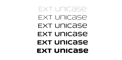
- Labelo Ext by T-26,
$19.00 - LT Signage - 100% free

- LT Funk - 100% free

- LT Soul - 100% free

- LT Highlight - 100% free

- LT Yorkshire - 100% free

- LT Panneaux - 100% free

- LT Perfume - 100% free

- LT Novelty - 100% free

- LT Diploma - 100% free

- LT Oksana - Personal use only

- LT Focus - 100% free

- LT Staircase - 100% free

- LT Starlight - 100% free

- LT Marathon - 100% free

- LT Hoop - 100% free

- LT Anomaly - 100% free

- LT Oksana - Personal use only

- LT Chickenhawk - Personal use only

- Dom LT by Linotype,
$29.99 - Corona LT by Linotype,
$29.99 - Excelsior LT by Linotype,
$36.99
- Artica Lt by Green Type,
$28.00
- Normative Lt by Green Type,
$19.00
- Chemsymbols LT by Linotype,
$29.99


Page 1 of 250Next page