1,388 search results (0.054 seconds)
  1. VTKS GENERAL USE - 100% free
  2. Cigar - Unknown license
  3. Raydiate (BRK) - 100% free
  4. Raslani Ancient Script - Unknown license
  5. !Futurelic Sans Souci - Unknown license
  6. crustype_crust - Unknown license
  7. Punk Kid - Personal use only
  8. la fraktouille - Unknown license
  9. District - 100% free
  10. verdy évolution - Personal use only
  11. PANHEAD - Personal use only
  12. hardcorium - Unknown license
  13. BARBARA PERSONAL USE - Personal use only
  14. Chocolates Italic - Personal use only
  15. KG Already Home by Kimberly Geswein, $5.00
    A cute doodled outline typewriter style font.
  16. Remix by Intellecta Design, $20.00
    a typewriter font with many style variations
  17. Typist Slab Mono by VanderKeur, $25.00
    The typeface Typist originated during an extensive research on the origin and development of typewriter typestyles. The first commercially manufactured typewriter came on the market in 1878 by Remington. The typestyles on these machines were only possible in capitals, the combination of capitals and lowercase came available around the end of the nineteenth century. Apart from a few exceptions, most typestyles had a fixed letter width and a more or less unambiguous design that resembled a thread-like structure. A lot of this mechanical structure was due to the method the typestyles were produced. Looking at type-specimens for print before the first typewriters were good enough to came on the market we can see that in 1853 and in 1882 Bruce’s Type Foundry already had printing type that had a structure of the typewriter typestyles. Of course printing types were proportional designed as typewriter typestyles had a fixed width. So it is possible that except from the method of production for typewriter typestyles, the design of printing types were copied. In the design of the Typist, the purpose was – next to the monospace feature – to include some of the features of the early typewriter typestyles. Features such as the ball terminals and the remarkable design of the letter Q. This new typeface lacks the mechanical and cold look of the early typewriter typestyles. The Typist comes in six weights with matching italics in two versions. One that resembled the early typewriter typestyles (Typist Slab) and a version designed with coding programmers in mind (Typist Code).
  18. Typist Code Mono by VanderKeur, $25.00
    The typeface Typist originated during an extensive research on the origin and development of typewriter typestyles. The first commercially manufactured typewriter came on the market in 1878 by Remington. The typestyles on these machines were only possible in capitals, the combination of capitals and lowercase came available around the end of the nineteenth century. Apart from a few exceptions, most typestyles had a fixed letter width and a more or less unambiguous design that resembled a thread-like structure. A lot of this mechanical structure was due to the method the typestyles were produced. Looking at type-specimens for print before the first typewriters were good enough to came on the market we can see that in 1853 and in 1882 Bruce’s Type Foundry already had printing type that had a structure of the typewriter typestyles. Of course printing types were proportional designed as typewriter typestyles had a fixed width. So it is possible that except from the method of production for typewriter typestyles, the design of printing types were copied. In the design of the Typist, the purpose was – next to the monospace feature – to include some of the features of the early typewriter typestyles. Features such as the ball terminals and the remarkable design of the letter Q. This new typeface laks the mechanical and cold look of the early typewriter typestyles. The Typist comes in six weights with matching italics in two versions. One that resembled the early typewriter typestyles (Typist Slab) and a version designed with coding programmers in mind (Typist Code).
  19. Hockeynight Sans Rough by XTOPH, $25.00
    "Hockeynight Sans Rough" is the Letterpress version of my font "Hockeynight Sans". It's a contemporary college-sports font with the little twist – that its a misprinted grunge font. With its detailed grunge textures it is designed to go big and bold. "Hockeynight Sans Rough" is an uppercase font and it offers alternate glyphs as lowercases. Also you find a lot of bonus glyphs in the alternate glyphs panel! It pairs perfect with my other "Hockeynight" Fonts – Check it out!
  20. GarbageG - Unknown license
  21. Soto by Thinkdust, $10.00
    A grungy, blocky, sans-serif font, Soto has one goal: get the message across. Saying it plain and simple, in a way that no-one can misunderstand, Soto’s very slight angles and thick style carry a weight and impact that make it stand out. With the textured finish it even jumps out from the backgrounds it’s placed on, so you can make use of the contrast to draw people in. Soto is best used in headlines and announcements that want to get their message across in an interesting and quick way. Stand out from the crowd and make people want to read what you’re writing by using a font like Soho to shout it out. If you like Soto but you're not feeling the grunge texture, then check out Ebisu.
  22. KG Somebody That I Used To Know by Kimberly Geswein, $5.00
    Narrow, playful, jaggedy letters inspired by a typewriter.
  23. Light Sleeper by PizzaDude.dk, $15.00
    Light Sleeper is a messy and scratchy grunge, metal, surfer, grafitti, skater and punk font - but even though it is wild and crazy, it is still super legible!
  24. Magisk Time by Bogstav, $11.00
    This is my roughly handprinted typewrite-ish font. It has all the cool and classic moves of the traditional typewriter look, but with a more rough attitude due to the contextual alternates (which offer 6 different versions of each letter!)
  25. Gothico Antiqua by MADType, $21.00
    Gothico Antiqua is the result of grunging up one of my early sans-serif type designs. It strangely works very well and looks authentic at small to medium settings.
  26. Bad Boy by BA Graphics, $45.00
    If you are looking for some wild extreme grunge this is it. No holds barred this is some bad stuff. Let your imagination go there is no stopping here.
  27. Beatster by MuSan, $19.00
    Beatster is handmade modern vintage textured display typefaces. It includes Regular, Outline, Grunge, Rough (with complete uppercase, lowercase, and numerals), and Letterpress (uppercase only). All weights have multilingual characters.
  28. Detention JNL by Jeff Levine, $29.00
    Detention JNL is simply the hand printing of its designer, Jeff Levine. Its uses range from personalizing notes and messages to a graffiti look or as "legible grunge lettering".
  29. Selectric by Indian Summer Studio, $55.00
    Selectric typewriter font. The part of the large, many years project on revival and further development (over 1000 glyphs) of the 20th century’s most famous typewriter Selectric golfball fonts, lost for many decades, not being created since then in digital vector form.
  30. Orlando - 100% free
  31. Olympia by Linotype, $29.99
    The typewriter font Olympia was developed by Hell Design Studio and is available in one weight. A typical characteristic of a typewriter face is that it is monospaced, meaning all characters take up the same amount of space, whether a relatively wide m or a relatively narrow i. Typewriters have all but disappeared from the workplace and such faces have lost their original, practical use, but their style and effect has kept them alive and well, especially in advertisements.
  32. Mangaled by Ingrimayne Type, $9.00
    A grungy, mangled font.
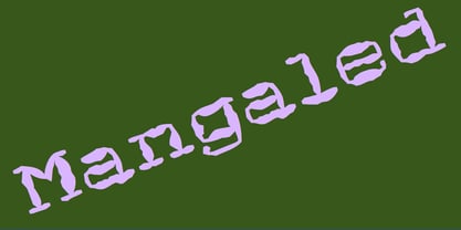
  33. TDF Arena by TypeDrift, $15.00
    TDF Arena is a solid block font built for a sellout crowd. One of our best-selling typefaces is now available here, exclusively in a grunge style with Monotype Fonts.
  34. NorB Type Writer Roughen by NorFonts, $25.00
    NorB TypeWriter Roughen is the roughen version of my NorB TypeWriter typeface witch's my emulation of the IBM Selectric 'Light Italic' ball witch was used by my grand-brother for his correspondance during the 70’s and 80’s. It's however a slanted mono-spaced looking typewriter font. You may want to use this font with any word processing program for text and display use, print and web projects, apps and ePub, comic books, graphic identities, branding, editorial, advertising, scrapbooking, cards and invitations and any casual lettering purpose… or even just for fun! NorB TypeWriter Roughen features 677 glyphs, OpenType features and comes in 6 weights each with their matching italics and in a Light, Normal and Bold version.
  35. Jailbox1 - Personal use only
  36. 28 Days Later - Unknown license
  37. Revers by GRIN3 (Nowak), $19.00
    Revers is a rough, grunge slab serif based on newspaper headlines from the 1950s. Language support includes Western, Central and Eastern European character sets, as well as Baltic and Turkish languages.
  38. Rubbish JNL by Jeff Levine, $29.00
    Rubbish JNL from Jeff Levine is simply letters scribbled from an old stencil as if made by a child... But the look takes on a form of "stencil grunge" as well!
  39. Selectric Pyramid by Indian Summer Studio, $45.00
    Selectric Pyramid is a typewriter font. Egyptian slab serif · Geometric slab serif Pyramid is version of Memphis (1929) by Dr. Rudolf Wolf. The part of the large project on revival and further development (by drawing many additional glyphs, sometimes over 1000) of the 20th century’s typewriters’ fonts.
  40. Konscript by Michael Browers, $25.00
    Konscript is a distressed typewriter face developed from analog samples from papers Mary Browers typed in the 1950s for her high school coursework. The model and age of the typewriter are not known. Additional characters were developed based on the analog samples to complete the character set.
Looking for more fonts? Check out our New, Sans, Script, Handwriting fonts or Categories
abstract fontscontact usprivacy policyweb font generator
Processing