10,000 search results
(0.034 seconds)
- Twist Jelly by Allouse Studio,
$16.00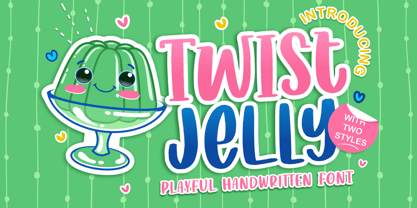
- Arabec by Canden Meutuah,
$25.00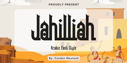
- Rude Icons by DSType,
$50.00
- Rude SemiCondensed by DSType,
$50.00
- Langostions by UICreative,
$23.00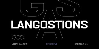
- Anarckhie by Ingrimayne Type,
$12.95
- Elkysis by Typogama,
$19.00
- Sanchez Condensed by Latinotype,
$-
- Polands by Edignwn Type,
$18.00
- Rude SemiWide by DSType,
$50.00
- People Talk JNL by Jeff Levine,
$29.00
- Gojogia by Canden Meutuah,
$25.00
- Beppo Brush by Lindstrom Design,
$20.00
- Reclaim - Personal use only

- Farm Girl by Open Window,
$19.95
- PAG Ministero by Prop-a-ganda,
$19.99 - Monotype Goudy Catalogue by Monotype,
$29.99 - Candyful - Personal use only

- Dopestyle - Personal use only

- Kick The Font - Personal use only

- LT Funk - 100% free

- Vineyard - 100% free

- FarCry - Personal use only

- NFL Packers - Unknown license

- A Cuchillada - Personal use only

- Sucker Font - Personal use only

- GIANTS ITALIC PERSONAL USE - Personal use only

- Olympus Mount - Personal use only

- Heineken - Unknown license

- Shit Happens - Personal use only

- Beef'd - 100% free

- Hang the DJ - Unknown license

- Balloon - Unknown license

- Chesterfield - Personal use only

- Caminata One - Personal use only

- CEREAL KILLERZ - Personal use only

- Armalite Rifle - Unknown license

- B de bonita shadow - Personal use only

- Modern LED Board-7 - Personal use only

- CANDY INC. - Personal use only


