10,000 search results
(0.042 seconds)
- font twelve - Personal use only

- HVD Peace - Unknown license

- Project Z - Personal use only

- Cubiculo Gallery) - Personal use only

- Kid Kosmic - Personal use only

- Psiphoon BB - Personal use only

- Sweeep - Unknown license

- CMSquish - 100% free

- Stargazers - Unknown license

- Besign - 100% free

- Shot - Unknown license

- Karloff - Unknown license

- Gothic Alarm Clock - Unknown license

- Achilles - Unknown license

- QuickQuick - Unknown license

- Vila Morena - Unknown license

- Tetris - Unknown license

- TNG Monitors - Unknown license

- Vaguely Repulsive - Unknown license

- Clutchee - 100% free

- Alizarine by Mysterylab,
$18.00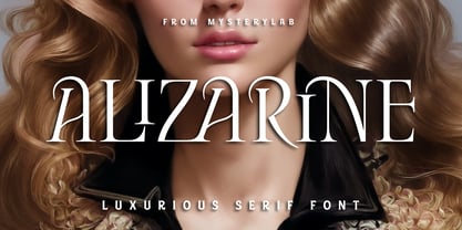 Alizarine is an elegant and luxurious serif font with flowing embellishments. This posh typeface features medium weight with a matching italic, and includes many capital ligature pairs. Excellent for high fashion couture, jewelry, boutique logos, perfume branding, arts organizations, museums, book titles, web banners, and much more.
 - Prestige 12 Pitch by Bitstream,
$29.99Limited to a single width for all characters and a rough image transferred through a ribbon to the paper, in 1953 Clayton Smith at IBM, Lexington, adapted the classical serifed letterform to this difficult medium to obtain a typewriter face of good readability and interesting texture. - MPI Roman Condensed by mpressInteractive,
$5.00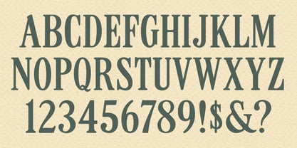 Roman Condensed is a condensed, classic roman typeface. It has a medium contrast in stroke weight, slightly rounded serifs, and is easy to read. This version is based on a typeface from Showcard Machine Company, which was made specifically to be used with their proof presses.
 - Bitmax by ITC,
$29.00Bitmax is the work of British designer Alan Birch, who was inspired by the look of fax transmissions. He took Helvetica medium and used controlled distortions to create this commanding, high-tech style. Bitmax is best used in large display sizes for a limited number of words. - Deltarbo by Aah Yes,
$16.00Deltarbo is a medium-heavy sans-serif typeface that is designed primarily for great legibilty in graphics and display situations, with clean lines and a modern "rounded-rectangle" feel. Please note that this font is not intended to be formal, the characters are ever so slightly casual. - Heket by Eurotypo,
$48.00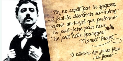 Heket was a goddess of childbirth and fertility in Ancient Egypt. She was depicted as a frog, or a woman with the head of a frog. Frogs symbolized fruitfulness and new life. Heket font is an expressive handwritten font, it is available in four versions: Regular and slanted. They have many advantages of the OpenType futures to choose from: stylistic alternates, swashes, contextual alternates, and a full set of standard and discretionary ligatures. Heket supports all diacritics for CE languages; they come also with a huge variety of ornaments, underlines, beginnings and word endings that will allow you to work in a creative way. They've been specially thought to use in packaging design, children books, advertising, logotypes, greeting cards, web sites and much more.
 - Tyneside by Trequartista Studio,
$25.00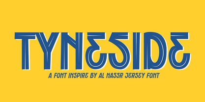 created in 2023, Tyneside is corporate and not too eccentric, but still has a strong character that makes it a the perfect starting point for the new Tyneside text font family. Clarity is very important when displaying a lot of information on the screen. The ranking table is full of names and times and while the display typeface should stand out, the text pieces should be eye-catching and very legitimate. We sharpened the corners, made some shapes easier to read and more modular, clean and sporty overall. We are very satisfied that Tyneside managed to capture the “spirit of sporting enthusiasm” in the personality of the typeface. We hope to create a growing family of typefaces in the future and maintain our partnership
 - Raxon by Product Type,
$15.00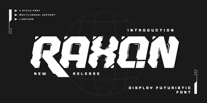 RAXON is a futuristic mecha typeface. Highly inspired by industrial vibes and future-themed mecha-robots. Font design will make your project more powerful and inspiring. Perfect for headlines, billboards, magazines, websites, titles, posters, branding, thumbnails, creative logos, and many others. We are always passionate about bringing new futuristic typography to market. This time we present a special futuristic font for you. **What’s Included:** - File font - All glyphs Iso Latin 1 - Ligature, Alternate - We highly recommend using a program that supports OpenType features and Glyphs panels like many Adobe apps and Corel Draw, so you can see and access all Glyph variations. - PUA Encoded Characters – Fully accessible without additional design software. - Fonts include Multilingual support Thank you for your purchase!
 - Mestika Arabic by Boharat Cairo,
$20.00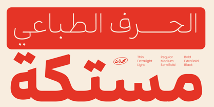 Mestika is a resinous spice, in Arabic means gum, the name is Mestika cause the mestika has a mixture of sharp edges and cursive connections, that mixture gives the typeface an edge to stand out, a low contrast sharp design with 9 weights making it works well with text and headlines. The design is a collaboration with the Iranian designer Kamyab Jafari, The typeface is a modern design, and has a wide range of ligatures and features for better justifications. The typeface comes with 9 weights, and works in variable axes, the typeface now supports only Arabic-based languages, but in the near future, it would support Latin-based languages, the Typeface is based on Naskh calligraphy, something in between the Iranian and the Arabic styles.
 - Lirio by Eurotypo,
$48.00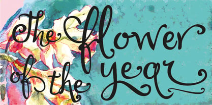 Lirio is a decorative and expressive typeface, it’s elegant yet eccentrically handwritten font. Lirio is presented in two versions: Regular and Slanted. They have many advantages of the OpenType futures to choose from: stylistic alternates, swashes, contextual alternates, and a full set of standard and discretional ligatures. Lirio supports all diacritics for CE languages; they come also with a huge variety of ornaments, underlines, beginnings and word endings that will allow you to work in a creative way. Lirio can fit into many clients’ design brief. They've been specially thought to use in packaging design, children books, advertising, logotypes, greeting cards, restaurants, web sites and much more. These fonts may enlarge your graphic capabilities and your work can be more competitive.
 - Wisdom Teeth by DM Founts,
$20.00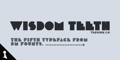 Wisdom Teeth is the fifth typeface released by DM Founts. It's a modern and personal take on the original Baby Teeth font by Milton Glaser, and inspired by the lettering used for the Pac-Man series of games (and its clones). This typeface was around 25 years in the making, and was made in response to the large number of hideously bad clones of Baby Teeth circulating around the Internet. Version 1.0 Included in Version 1.0 are a number of accent characters, and alternate characters for A and Y, along with the usual ASCII characters. For the time being this is an all caps typeface. Please let me know your thoughts and suggestions, and I may add some more characters in the near future.
 - Dvarlin Staves by Sins,
$37.48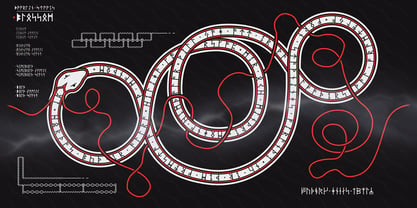 Dvarlin Staves is a collection of 512 rune glyph's divided into six font family's. The three main font's are Root, Caber and Bole, while Remnant, Branch and Blossom are taller versions of the main set. They all come in four weights: Light, Regular, Semibold and Bold. As well as a Italic and a Slant style for the purpose of adjusting letters on a curved line. It also features codex:437 glyph set and an extended array of letters and corner alternatives, including the default runic glyph's. The collection stands at 72 styles that contains a total of 36 864 glyph's. For extra supporters consider gifting some Staves away to a crafty friend.
 - Quadrim by Artisticandunique,
$40.00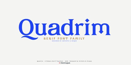 Quadrim - Serif Font Family - Multilingual -12 Style (2020) On the basis of Quadrim, it is a mix of the old-fashioned Roman serif family. The old style serif combination combines, modern aesthetics with fantasy and Art Nouveau serif fonts, making Quadrim a versatile family that can be used in many different design projects. This font offers a wide variety of styles to help you discover the best mood for your projects, from body text to large titles, from classic styles to modern and bold styles. It is very suitable for book and magazines, magazine covers, editorial, titles, websites, logos, invitations, branding, advertising and more. CHARACTER RANGES : Basic Latin, Latin-1 Supplement, Latin Extended-A, Latin Extended-B, General Punctuation, Currency Symbols, CJK Symbols And Punctuation, Private Use Area (plane 0), With this font you can create your unique designs. If you have a question, please contact me. Have a good time.
 - Juxta Sans Mono by NaumType,
$19.00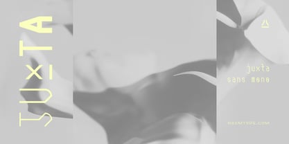 Juxta Sans Mono is an experimental monospace sans, an extension of the Juxta superfamily. During the creation of the Juxta script, I felt that the aesthetics and the main idea of the font had promising potential and I started thinking about a pair for it. So the idea of Juxta Sans Mono was formulated. Juxta has several style-forming elements: 45° beveled or cross out bowls, squared m and w arcs and other unobvious letter structures. Despite its unusual and sometimes odd (f, g, m) letterforms, Juxta Sans is fairly easy to read due to its monospace font nature and wide spacing. Juxta Sans Mono offers great customization potential. It has two sets of stylistic alternates — [salt] makes a letter underscored, but keep it in line, [ss01] replaces some of the glyphs with different letterforms. The [case] function automatically adjusts the height of the punctuation marks to the neighbor letter and [onum] is a set of old style numbers. Juxta Sans Mono also has subscript and superscript features, but they are utilized a bit unconventionally — if you want to customize your logo or headline, you can make a glyph superscript and the one next to it subscript and they automatically kern into one letter width. You can see examples of using these features in the presentation. Juxta Sans Mono is available in 8 weights, including Thin, Light, Regular, Medium, SemiBold, Bold, ExtraBold and Black. It extends multilingual support to Basic Latin, Western European, Euro, Catalan, Baltic, Turkish, Central European, Pan African Latin, Afrikaans, and Basic Cyrillic.
 - Transport New by K-Type,
$20.00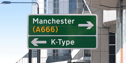 Transport New is a redrawing of the typeface designed for British road signs. In addition to the familiar Heavy and Medium weights, Transport New extrapolates and adds a previously unreleased Light weight font originally planned for back-lit signage but never actually applied. Version 3.0 of Transport New features significant improvements including numerous outline and spacing refinements, and a full complement of Latin Extended-A characters. Also, to align Transport New with the 2015 release of Motorway, the other typeface used for UK road signage, Italic fonts for all three weights have been added. Originally designed by Jock Kinneir and Margaret Calvert beginning in 1957 and first published on the Preston bypass in 1958, the original Transport font has subtle eccentricities which add to its distinctiveness, and drawing the New version involved walking a tightrope between impertinently eliminating awkwardness and maintaining idiosyncrasy. The Grotesk roots of the glyphs were investigated and cheekily fine-tuned – uncomfortably close terminals of characters such as 5, 6, C, G, and e were shortened, the S and s were given a more upright aspect and their protruding lower terminals tucked in, overly wide glyphs like the number 4 were narrowed, and some claustrophobic counters were slightly opened up. The question mark was redesigned and parentheses given some stroke contrast. The x height was edged fractionally even taller. The Heavy font is actually more of a Bold, and the Light is pretty much a regular weight, but the original nomenclature has been retained for old times’ sake.
 - Classic Roots Personal Use - Personal use only

- Kingthings Versalis - 100% free

- Dragonwick - Unknown license

- PiratesTwo - Unknown license

- Deberny by Typorium,
$15.00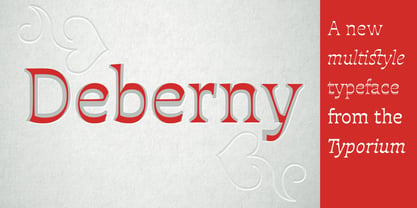 The Deberny typeface is an interpretation–carrying a contemporary imprint–of a typographic style which appeared and spread at the end of the 19th century until the begining of the 20th. These typefaces were named Italian, Venetian, Veronese and were classified in the Hellenic category, a spontaneous typographic movement caracterized by triangular and heavy serifs. They found their inspiration among numerous references, from incised to slab serif typefaces and their extreme expressions in wood type letterforms. The Deberny font family is made of 26 styles in 3 complementary sets of style, offering a wide palette of visual resonance: • Deberny Line is ideally suited for editorial, branding, posters and billboards. It has sharp contrast between thick and thin strokes. Heavy horizontal strokes are not frequent in roman letters, but here they fit naturally with the italic letters. • Deberny Open is a stylish outline declination of Deberny Line Medium and Medium Italic. • Deberny Text is an adaptation of Deberny Line made for broader use. Its shapes are less contrasted, which makes it perfectly legible for print or screen reading in small size text. Old style figures and small caps complete Deberny Text in all its 8 styles. The Deberny typeface family supports Latin-based languages and will be available soon in Cyrillic and Greek. Deberny Narrow will be released this year in all its 26 styles.


