1,021 search results
(0.016 seconds)
- Veggie Fruit by Gerald Gallo,
$20.00 VeggieFruit is an assortment of 47 vegetables and fruits all located under the character keys.
 - MC Ertige by Maulana Creative,
$16.00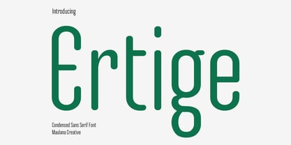 Ertige is a condensed sans serif Display font. Regular stroke, fun character with a bit of ligatures and alternates. To give you an extra creative work. Ertige font support multilingual more than 100+ language. This font is good for logo design, Social media, Movie Titles, Books Titles, a short text even a long text letter and good for your secondary text font with script or serif. Make a stunning work with Ertige font. Cheers, Maulana Creative
 - Fruit Viesta by Epiclinez,
$18.00 Fruit Viesta is a simple, fun, and relaxed handwritten font. A little bit bouncy, this smooth and bold font looks incredibly adept in a wide variety of contexts, whether you're using it for crafting, digital designing, presentations, or even school projects, it's perfetto! Get creative with its childlike playfulness, and use it to brighten up any of your wonderful projects.
 - Summer Fruit by Letterara,
$12.00 Summer Fruit is a fresh & modern playful font. It has a bold cute style and will add an upscale to all your designs. This Font is perfect for many different projects such as logos & branding, birthday parties, stationery, kids, posters, advertisements, product packaging, product designs, special events, and much more!
 - Fruit Syrup by Olivetype,
$18.00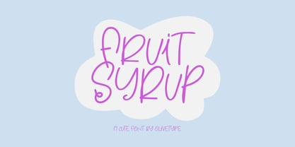 Fruit Syrup is a playful handwritten font with a dancing baseline!. This font is suitable for children craft, teaching material, or any other design that needs a splash of cuteness. So what’s included: Fruit Syrup (OTF) Basic Latin A-Z, a-z, numbers, symbols, and punctuations International Characters. Thank You
 - Polytype Fruits by Prime Graphics,
$45.00 - Fruit Shake by Epiclinez,
$17.00 Fruit Shake is a smooth and bold script font with a relaxed theme, featuring a lovely style. No matter the topic, this font will be an incredible asset to your fonts’ library, as it has the potential to elevate any design. So what's included: Basic Latin, numbers, symbols, punctuations, and ligatures Simple Installations: works on PC & Mac Multilingual Support includes Afrikaans Albanian Catalan Danish Dutch English Estonian Finnish French German Italian Norwegian Portuguese Spanish Swedish Zulu. Accented Characters : ÀÁÂÃÄÅÆÇÈÉÊËÌÍÎÏÑÒÓÔÕÖØŒŠÙÚÛÜŸÝŽàáâãäåæçèéêëìíîïñòóôõöøœšùúûüýÿžß Accessible in Adobe Illustrator, Adobe Photoshop, Adobe InDesign, even works on Microsoft Word PUA Encoded and fully accessible without additional design software Thank you! We hope you enjoy our font!
 - Juicy Fruit by Seemly Fonts,
$14.00 Juicy Fruit is a bold and paint-brushed display font. No matter the topic, this font will be an incredible asset to your fonts’ library, as it has the potential to elevate any creation.
 - LT Festive Medium - 100% free

- LT Glockenspiel Black - 100% free

- LT Aspirer Neue - 100% free

- LT Afficher Neue - 100% free

- LT Carpet Text - 100% free

- LT Sweet Nothings - Personal use only

- LT Nutshell Library - Personal use only

- LT White Fang - Personal use only

- Stempel Garamond LT by Linotype,
$29.99 Opinion varies regarding the role of Claude Garamond (ca. 1480–1561) in the development of the Old Face font Garamond. What is accepted is the influence this font had on other typeface developments from the time of its creation to the present. Garamond, or Garamont, is related to the alphabet of Claude Garamond (1480–1561) as well as to the work of Jean Jannon (1580–1635 or 1658), much of which was attributed to Garamond. In comparison to the earlier Italian font forms, Garamond has finer serif and a generally more elegant image. The Garamond of Jean Jannon was introduced at the Paris World’s Fair in 1900 as Original Garamond, whereafter many font foundries began to cast similar types. The famous Stempel Garamond interpretation of the 1920s remains true to the original Garamond font with its typical Old Face characteristics. The bold italic was a modern addition at the end of the 1920s and the small caps provided an alternative to the standard capital letters. In the mid 1980s, a light version was added to Stempel Garamond. Since its appearance, Stempel Garamond has been one of the most frequently used text fonts.
 - Koch Antiqua LT by Linotype,
$29.99Koch Antiqua is based on forms of old Roman writings, chiseled in marble thousands of years ago. This contemporary version is more playful and reminiscent of the Roaring 20s. - Times Europa LT by Linotype,
$29.99In 1931, The Times of London commissioned a new text type design from Stanley Morison and the Monotype Corporation, after Morison had written an article criticizing The Times for being badly printed and typographically behind the times. The new design was supervised by Stanley Morison and drawn by Victor Lardent, an artist from the advertising department of The Times. Morison used an older typeface, Plantin, as the basis for his design, but made revisions for legibility and economy of space (always important concerns for newspapers). As the old type used by the newspaper had been called Times Old Roman," Morison's revision became "Times New Roman." The Times of London debuted the new typeface in October 1932, and after one year the design was released for commercial sale. The Linotype version, called simply "Times," was optimized for line-casting technology, though the differences in the basic design are subtle. The typeface was very successful for the Times of London, which used a higher grade of newsprint than most newspapers. The better, whiter paper enhanced the new typeface's high degree of contrast and sharp serifs, and created a sparkling, modern look. In 1972, Walter Tracy designed Times Europa for The Times of London. This was a sturdier version, and it was needed to hold up to the newest demands of newspaper printing: faster presses and cheaper paper. In the United States, the Times font family has enjoyed popularity as a magazine and book type since the 1940s. Times continues to be very popular around the world because of its versatility and readability. And because it is a standard font on most computers and digital printers, it has become universally familiar as the office workhorse. Times™, Times™ Europa, and Times New Roman™ are sure bets for proposals, annual reports, office correspondence, magazines, and newspapers. Linotype offers many versions of this font: Times™ is the universal version of Times, used formerly as the matrices for the Linotype hot metal line-casting machines. The basic four weights of roman, italic, bold and bold italic are standard fonts on most printers. There are also small caps, Old style Figures, phonetic characters, and Central European characters. Times™ Ten is the version specially designed for smaller text (12 point and below); its characters are wider and the hairlines are a little stronger. Times Ten has many weights for Latin typography, as well as several weights for Central European, Cyrillic, and Greek typesetting. Times™ Eighteen is the headline version, ideal for point sizes of 18 and larger. The characters are subtly condensed and the hairlines are finer. Times™ Europa is the Walter Tracy re-design of 1972, its sturdier characters and open counterspaces maintain readability in rougher printing conditions. Times New Roman™ is the historic font version first drawn by Victor Lardent and Stanley Morison for the Monotype hot metal caster." - New Aster LT by Linotype,
$29.99This book and newspaper font was designed by Francesco Simoncini in 1958. After the Second World War brought type design to a standstill, the years of reconstruction meant a reconsideration of old values in the typographical world as well as in Europe in general. Aster is the result of this movement, displaying instead of Modern Face influence, a tendency toward Transitional characteristics and giving text a light feel. - Neuzeit S LT by Linotype,
$30.99 Designed by Wilhelm C. Pischner, Neuzeit-Grotesk first appeared in 1928 with the font foundry D. Stempel AG. In 1966, Neuzeit S was introduced by Linotype-Hell AG, intended for large bodies of text and predecessor of Siemens corporate design. Neuzeit S is timeless, combining strength of form and objectivity and legible even on inferior papers.
 - Courier LT round by Linotype,
$29.99 - Trump Mediaeval LT by Linotype,
$67.99 Trump Mediaeval is an Old Face font developed by Georg Trump between 1954 and 1962. All cuts have both normal and old style numbers and their robust characters make them suitable even for inferior paper. Light and legible, the open forms of the lower case letters allow this font to be legible in text with as small a point size as 5.
 - LT DIE HARD by Latam Type Foundry,
$9.00 LT DIE-HARD FONT DUO+EXTRAS is a handcrafted typeface, carefully designed to capture the essence of strength and determination. With its horrible and worn strokes, this font transmits a sensation of resistance and solidity, Each letter is made in a unique style, creating a sense of movement and dynamism in the text. DIE-HARD typeface is ideal for projects requiring a strong and determined approach, such as posters, titles, logos...
 - Baskerville LT Cyrilic by Linotype,
$29.99John Baskerville (1706-1775) was an accomplished writing master and printer from Birmingham, England. He was the designer of several types, punchcut by John Handy, which are the basis for the fonts that bear the name Baskerville today. The excellent quality of his printing influenced such famous printers as Didot in France and Bodoni in Italy. Though he was known internationally as an innovator of technique and style, his high standards for paper and ink quality made it difficult for him to compete with local commercial printers. However, his fellow Englishmen imitated his types, and in 1768, Isaac Moore punchcut a version of Baskerville's letterforms for the Fry Foundry. Baskerville produced a masterpiece folio Bible for Cambridge University, and today, his types are considered to be fine representations of eighteenth century rationalism and neoclassicism. Legible and eminently dignified, Baskerville makes an excellent text typeface; and its sharp, high-contrast forms make it suitable for elegant advertising pieces as well. The Linotype portfolio offers many versions of this design: ITC New Baskerville® was designed by John Quaranda in 1978. Baskerville Cyrillic was designed by the Linotype Design Studio. Baskerville Greek was designed by Matthew Carter in 1978. Baskerville™ Classico was designed by Franko Luin in 1995." - LT Hakuna Matata by Latam Type Foundry,
$15.00 Introducing "LT Hakuna Matata" font collection, inspired by The Classic Movie Lion King. Styles: Normal, Outline, Shadow, Ink. Captures Timon and Pumbaa's essence. Normal exudes joy, Outline adds an artistic touch. Shadow creates depth, Ink offers handcrafted charm. Experience African savannah's energy in typography.- Where typography meets the magic of The Lion King. Enjoy! Thank's for Support!
 - Stempel Schneidler LT by Linotype,
$29.99 F .H. Ernst Schneidler, type designer and teacher, originally designed Schneidler Old Style in 1936 for the Bauer foundry. Stempel Schneidler is based on the typefaces of Venetian printers from the Renaissance period and possesses their grace, beauty, and classical proportions. The Stempel Schneidler, a completely reworked and tuned font family made by D. Stempel AG in Frankfurt, is a fine, legible text font that also works well in display. One of Schneidler's more unique features is its question marks.
 - Century Expanded LT by Linotype,
$29.99In 1894, Linn Boyd Benton finished a commission for a new text typeface with the American periodical, Century magazine. Century is typical of the neorenaissance movement in typography at the end of the 19th century. Morris Fuller Benton drew a number of versions of the font for the font foundry, American Typefounders, and Century was later taken up by the firms Linotype, Intertype and Monotype. - LT Binary Neue - 100% free

- LT Superior Serif - 100% free

- LT Streetway Neue - 100% free

- LT Edge Sans - 100% free

- LT Asus Print - 100% free

- LT Leap Medium - 100% free

- LT Shortcake Medium - 100% free

- LT Fillet Medium - 100% free

- LT Bread Medium - 100% free

- LT Cushion Light - 100% free

- LT Asus Pro - 100% free

- Romance Fatal Serif Std - Personal use only


