Droid Serif is a contemporary serif typeface family commissioned by Google and designed by Steve Matteson of Ascender Corporation. Unveiled in 2007 as part of the Droid family of fonts, it was crafte...
Ihminen, designed by Jenny Barck, is a highly captivating font that reflects an artistic melding of humanistic qualities and typographic design. This font family is named after the Finnish word for "...
Spund, as it sounds, might evoke the idea of a font that is playful and perhaps rounded, suggesting a certain whimsy and casualness in its design. As there isn't a widely recognized typeface by this ...
As of my last update, Grandesign Roman is not a widely recognized or standard font in the extensive libraries of typefaces used across various design platforms and projects. However, the style sugges...
As of my last knowledge update in 2023, there isn't a widely recognized font named "Complete" that has gained significant attention in the graphic design or typography communities. However, the conce...
Alrighty, imagine you're diving into a world where comic books aren't just stories; they're experiences that leap off the page. That's where ShockTherapy BB by Blambot Fonts punches its way in, decki...
Imagine a font that practically wraps itself in the stars and stripes, saluting every time a character is typed – this, my dear friends, is the American Flag font, the typographical equivalent of an ...
As of my last update in early 2023, there isn't a widely recognized or popular font specifically called "Lastman" in the vast world of typography. However, let me paint a picture for you, imagining w...
Ah, the font Oohlalalulucurvy. Imagine, if you will, a font so lively and flamboyant that each letter seems to be thrown into a dance party from the moment it hits the page. This is no ordinary colle...
As of my last update in April 2023, CrawfishPopsicle is not a widely recognized or specific font within mainstream font libraries or the typographic community, which suggests it might be a custom or ...
**Squeeze Me Baby!** by PizzaDude conjures up images of a font that refuses to go unnoticed, much like a zany friend who always knows how to make an entrance. If fonts had personalities, Squeeze Me B...
Ah, Olympus by Levi Halmos, the typeface that climbed out of the typography pantheon to grace us mere mortals with its divine presence! This font, much like the mythical abode it's named after, stand...
Imagine a font that wakes up in the morning, blasts motivational anthems, and high-fives itself in the mirror. Meet "YES!" — the typographical equivalent of a double espresso shot infused with pure o...
The font named "LED" draws inspiration from the segmented, luminous displays we often see in digital clocks, calculators, and public signage. Designed to mimic the look and feel of light-emitting dio...
Ah, Urban Brigade, the font that struts down the street of typography like it owns the place. Imagine, if you will, a graffiti artist and a highly disciplined calligrapher had a love child; Urban Bri...

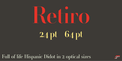
Full of life Hispanic Didot in 2 optical sizes Retiro is a daring interpretation of Spanish typography. Severe, austere and yet, full of life, Retiro is a vernacular version of Castilian and Andalusian in a typical Didot. Named after a lovely park in Madrid, Retiro started life as a a bespoke typeface designed to give a unique voice to the magazine Madriz. In 2006, the founder of Madriz was looking for a Didot for his new magazine. The Didot is the archetypal typeface used in high-end magazines. Retiro is a synthesis of these high contrast styles mixed with an Hispanic mind. Result is then, after 2-3 years of work, a typeface with countless variations to establish typographic shades adapted to different sections and pages of the Madriz. In 2014, it was necessary to further revise the typeface before its launch at Typofonderie. In order to keep its originality, the unique weight was retained, but complemented with optical size variants to set highly contrasted headlines into various sizes, visually balanced. How to use Retiro optical sizes? Each font provided in Retiro family is named according to the scale of body size: 24 pt and 64 pt. Of course, these names are referring to the body sizes used in typographic design. In the “glorious old days,” the letterpress period, it was customary to cut punches directly to the size at which typefaces would be used. The punchcutter had to visually adapt his design to the engraving size. The aim was to optimize the best contrast and general weight, but also to respect both design’s and reader’s needs. In Retiro’s case, intended for large titling sizes, it’s an adaptation of this ancient practice for our contemporary uses. Although each font is named by a typographic point size, do not feel obliged to use this font at this precise size, but why not, in larger or smaller. It’s rather the concept of gradients that must be preserved in layouts, rather than strictly size numbers. It’s up to the designer to select the right font size for his own designs. Granshan Awards 2012 Creative Review Type Annual 2011 Designpreis 2011 Club des directeurs artistiques, 41e palmarès Type Directors Club 2010 Certificate of Type design Excellence

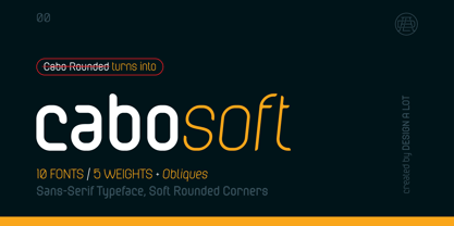
Cabo Soft is the 2.0 version of our original Cabo Rounded Typeface, created back in 2015. With this new version, Cabo Soft, we have brought multiple upgrades and updates compared with the original version. Some of those consist in the addition of more glyphs and accents, alternate designs for many of the glyphs (including an alternate for @, #, some of the numbers and more), and most importantly, we have done a slight update in the design of the letters, which we'll give more details in the following paragraphs. The main style and thought behind our Cabo fonts has always been the rounded corners and the soft and welcoming vibe that it gives. It's friendly and familiar, but also modern and slightly elegant, especially the Thin and Light styles. With Cabo Soft we have worked on adding an extra touch to the design of the letters by working on the termination edges of each letter. If Cabo Rounded had an exact round termination for each letter, with Cabo Soft we have developed a unique non-equally rounded shape that is applied to all types of terminations for each letter. This new design approach makes it have a more clean style, a more modern and unique look, but it also gives stylish, exclusivist and elegant vibes, while still being friendly and familiar. Thanks to it's variety in weights and styles, you can use Cabo Soft in almost any design project. It works well with headlines and paragraphs, it's a perfect match for logo design and branding, but can also do wonders in videos, signage and many other elements. The typeface covers most likely the entire Latin Alphabet, it comes with multiple design alternates for many of the letters, glyphs and numbers, with accents applied for all of the available alternates. As a finishing note, with the help of our Cabo Soft typeface you can create an friendly and welcoming designs, as well as stylish, elegant and exclusivist. It has all the necessary glyphs and accents for any Latin Alphabet projects, and you can play around with all of the alternates to create unique designs right from the start.

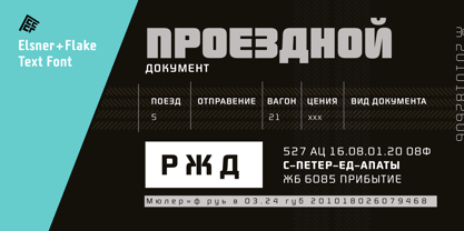
Digital Sans Now combines and completes the many diverse requests and requirements by users of the past years. By now, 36 versions for over 70 Latin and Cyrillic languages have become available, including Small Caps. Digital Sans Now is also available as a webfont and reflects, with its simplified and geometric construction and its consciously maintained poster-like forms as well as with its ornamental character, the spirit of the decorative serif-less headline typefaces of the 1970s. The basic severity of other grotesque typefaces is here repressed by means of targeted rounds. Exactly these formal breaks allow the impression that it could be used in a variety of visual applications. Short texts, headlines and logos of all descriptions are its domain. It is because of this versatility that the typeface has become a desirable stylistic element, especially in such design provinces as technology, games and sports, and that, for many years now, it appears to be timeless. Additional weights designed on the basis of the original, from Thin to Ultra, the Italics, Small Caps and alternative characters allow for differentiated “looks and feels”, and, with deliberate usage, give the “Digital Sans Now” expanded possibilities for expression. The basis for the design of Digital Sans Now is a headline typeface created in 1973 by Marty Goldstein and the Digital Sans family which has been available from Elsner+Flake since the mid-1990s under a license agreement. The four weights designed by Marty Goldstein, Thin, Plain, Heavy and Fat, were originally sold by the American company Visual Graphics Corporation (VGC) under the name of “Sol”. Similarly, the company Fotostar International offered film fonts for 2” phototypesetting machines, these however under the name “Sun”. The first digital adaptation had already been ordered in the mid 1970s in Germany by Walter Brendel for the phototypesetting system Unitype used by the TypeShop Group, in three widths and under the name “Digital Part of the Serial Collection.” Based on the versions by VGC, Thin, Plain, Heavy and Fat, new versions were then created with appropriate stroke and width adaptations for data sets for the fonts Light, Medium and Bold as well as for the corresponding italics

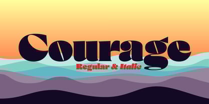
High-contrast? High impact? Have Courage? Eye-catching and (extra, extra) bold, Courage balances ultra-high stroke weight, delicate details, and unique letterforms with a self-indulgent passion that will make you feel a little guilty using it. Honestly, use it large and don’t try to force it into a small space, because these fearless letterforms need room to move. Flavored with both upright and italic styles, each font includes an indulgent level of alternates, swashes and titling options, visual elements and more. A backstory with a different name Years ago, I was commissioned to take my Lust typeface and produce something unique to use for large format graphics for an event…cool. It needed to be hyper-contrast with a lot of over-the-top details. With a tight turnaround, I looked for primers within my development catalogue to help me, and settled on some early work on a typeface I had drawn called Hedonist. I used those sketches and its conventions to retrofit and build out Lust Hedonist (only to see the project go bust on the client’s end). I intended to go back shortly after the Lust Hedonist release to finalize a retail version of the OG Hedonist, but I never could settle on the look of the 'g' or the numerals, got distracted with other projects, and never picked it back up… until last year. After randomly doodling a fat, flat ‘g’ with an extremely tilted counter axis, I knew immediately how it could be used and that (re)set things in motion. Only problem was, in the process of refining the letterforms I began truly dissecting the pieces, rediscovering all of the recklessness within Hedonist, and decided on fundamentally rewriting the approach to the typeface… literally flaying it to the bone. I’m much, much happier with this finished typeface now, but the name no longer fit the moniker given to the first, adolescent approach—there’s far more audacity and cleverness in these letterforms, tenacious in their resolution now. As a result, the name Courage fit the mettle of this typeface so much more, so I kept it.

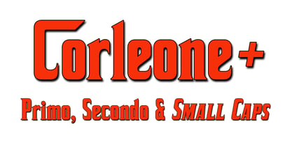
Corleone was originally designed as a two font family in 2001 and offered for free. This year we've expanded the font family to twelve fonts including small caps and italics. While the new Corleone has been greatly refined and is a much more professional quality font we've decided to still offer the original two fonts for free. Corleone is the perfect font for t-shirts and other merch, the new small caps make this font stand out and bring attention to whatever you use it on. Corleone is the font you can't refuse. Tech notes: Corleone was designed after a famous movie logo in the 1970's with a title name that sounds a lot like The Grandfather if you know what I mean. The movies had three installments, my original font was patterned after the logo for the third movie, the new Corleone Primo and Secondo versions are patterned after the logos of the first two movies. The differences are noticed mostly in the lowercase letters. One thing you will not find in this font family is the puppeteer or puppet master hand because it's been registered as a separate trademark of Paramount Pictures. If you're using an application that works in layers then you'll be interested in the four extra over score glyphs included in some of the versions of this font. Sorry, MS Word does not work in layers so this feature will not work in MS Word. When you open up the glyph map in Adobe Creative Suite you should see the over score glyphs when you scroll down to the bottom. These extra over score glyphs allow you to extend the top line of a single capital letter, with four different lengths you should be able to mix and match to achieve the length that you desire. When using the over score glyphs it's best to divide your word or headline into separate text objects, the cap being one object and the remaining letters being the second. If you try using the over score glyphs on a single text object then with each over score that you add the text after it will get pushed down the line.

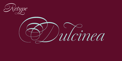
Dulcinea is the title of Ramiro Espinoza’s in-depth look at Spanish Baroque calligraphy’s most extreme tendencies, and especially at some of those produced by the writing masters Pedro Díaz Morante and Juan Claudio Aznar de Polanco. These 17th and 18th centuries alphabets with their plentiful calligraphic flourishes represented a marked break with the harmonic and angular Renaissance Cancellaresca style. It was Morante who first introduced and popularized the use of the pointed quill in Spain, and although his famous text entitled “Arte Nueva de escribir” – first volume published in 1616 – contains alphabets that have much in common with traditional broad nib Cancellaresca calligraphy, most of the examples therein are outgrowths of the new models put forward by the Italian master Gianfrancesco Cresci. The writing’s swashes are complex and intricate, but at the same time they feature a profusion of defects. Many of them sometimes come close to ugliness. However, these pages contain an artistic essence that bears a relationship to the ironic and sometimes somber character of Spanish Baroque. That’s why the name of the font pays homage to “Dulcinea del Toboso”, the fictional beauty from Miguel de Cervantes’s ‘Don Quixote’, a work that reveals many of the period’s conflicts, such as the contrast between utopian ideals and reality, uncertainty and madness. But Dulcinea is far from being just a revival. Its forms are not careful tracings of the outlines of Morante and Polanco’s letters, nor are they attempts to reproduce them digitally. In fact, the author of the letters says that had the font been created that way it would have been too archaic to serve as acceptable contemporary typography. However, he believes that there are myriad interesting details that can be rescued and preserved, along with the playful spirit of the original. The work of designing Dulcinea consisted of combining original historical elements with the creativity and calligraphy of the font’s author in order to produce a modern typography that isn’t based on the same traditional sources as many recently created scripts fonts. Dulcinea offers attractive options for the setting of texts and headlines: abundant ligatures and swashes along with intricate alternate characters. It sophisticated forms make it an ideal option for women’s magazines, recipe books, lingerie products or perfume packaging.
Imagine if Tim Burton decided to dabble in typography after a night spent reading ancient grimoires by candlelight, and you'll have a smidgen of an idea about the delightfully eccentric charm of the ...
Ahoy, typography aficionados and design deckhands! Hoist the main sail and set course for the adventurous seas of fontography with the Captain Kidd Demo by The Scriptorium — a font so dashing and dar...
As of my last update in April 2023, "Snag Mag" by The Logo Factory isn't a widely recognized or documented font in the most accessible font libraries or in the common resources graphic designers turn...
The font id-Kaze2OT-Light, crafted by Inoue Masaru, is a distinct and refined typeface that stands out for its delicate elegance and gentle grace. Masaru, known for his meticulous attention to detail...
Oh, "Heartfont," the name alone conjures images of love letters penned in the wee hours, secret admirers typing away on their vintage typewriters, and the digital equivalent of a heart-shaped box of ...
As of my last update in early 2023, the font "Futureman" by TeA Calcium does not exist in prominent font libraries or design portfolios, and information on it is not widely available. However, let me...
As of the last update before my last knowledge update in 2023, "Morevil" is not a widely recognized or standard font within the vast catalog of typography. This could imply that it is either a very s...
Ah, the Flame on! font, not just a typeface but a fiery declaration, a typographic torchbearer of passion and intensity! Picture this: each letter, ablaze, casting a warm, flickering glow across the ...
As of my last update in April 2023, there is no widely recognized font specifically named "Jetmix" in the mainstream typographic or design communities. However, the concept of a font named "Jetmix" p...
The Rio Lobo, a typeface created by Woodcutter Manero, is a vivid reflection of the untamed spirit and robust aesthetics associated with the Wild West. The moment you set your eyes on its characters,...
*Reacting to Reactor Sans!*
In an imaginary world where fonts are not just mere letters but beings with personality and purpose, Reactor Sans would surely be the cool, energetic, and slightly edgy ...
Oh, embark on a whimsical adventure into the realm of typography and meet Ruthless Drippin TWO by Måns Grebäck, where letters don't just sit quietly on the page – they throw a full-fledged, ink-sling...
Once upon a whimsical time in the bustling town of Typeface Village, there lived a jovial and somewhat rotund font named Balloon. Oh, Balloon! With curves as bouncy and spirit as buoyant as its names...
Duralith is a distinctive font created by Apostrophic Labs, a collective known for their innovative and diverse typefaces. Duralith stands out with its unique blend of stylized features and contempor...
Imagine stumbling into a whimsical, quirky little coffee shop in the heart of an artsy neighborhood, where every nook and cranny is packed with charm and character. That’s the essence of Miss, a font...
Gather round, fellow digital travelers, for the tale of Verdana, the oft-overlooked hero of our screens. Born in the digital renaissance of the 1990s, Verdana was a child prodigy among fonts, designe...
ZirkleOne is not a specific font that's widely known or recognized within the realms of typography as of my last update. However, let's create an imaginative description of a font that would suit the...
Ah, the Capitular Moldurada font by Ouripedes Gallene, a font so distinctive that it makes Arial look like it's pretending to be Helvetica at a costume party. Imagine if letters decided to go to a ma...
As of my last update in April 2023, there isn't a font officially recognized or broadly distributed under the name "! Jamiroquai !" that is associated with the popular British jazz-funk band Jamiroqu...
