10,000 search results
(0.015 seconds)
- Sad Films - Unknown license

- Sid-theKid - Unknown license

- Sad Jane - Unknown license

- Sad Films - Unknown license

- STP Stencil by Sete Std,
$30.00 Developed from the STP Display, the STP Stencil Typeface follows the same characteristic premise as its sister, in addition to composing the same number of Latin characters. What distinguishes them it’s that the STP Stencil can be applied more easily anytime, anywhere, increasing the possibility of being used in a more craft and artistic way. Since it has characteristics of a stencil font, it brings a more urban and contemporary look, which makes ideal to use it in public spaces with large circulation of people. In addition, wayfinding, architectural, advertising, packaging, posters, among others projects, are a good request for STP Stencil show its vigor and all its beauty. The STP Stencil is a modular feature source, perfect to use it in major event signaling projects or similar. It can also be useful in any demands that requires improvisation and quick solutions. The STP Stencil has very expressive forms and counterforms, but still counts with the practicality of a stencil source and its infinite possibilities of use. With a complete Latin alphabet, STP Stencil covers over 90% of the supported languages, covering the entire American continent, East and West Europe and most of the countries of Africa, Asia and Oceania.
 - Sad Angel by Senekaligrafika,
$12.00 “Sad Angel” has hard strokes and signature style that speak to instant unique sensation. Take your creative projects to the highest level with this font. “Sad Angel” will help you to create special and touching typographical design for your projects, for every day or the happiest day in life, greeting card, headings, flyer, product packaging, book cover, printed quotes, logos, and many more. It is really universal and modern font. The owner of endless possibilities!
 - STM Lovebug by Ziwoosoft,
$33.00 Lovebug is a casual, warm font inspired by the curves of balloons and squishy jelly.
 - Nexgen SLD by Alphabet Agency,
$20.00 Nexgen SLD font family is a modern sans serif font. The family includes 6 fonts, 3 weights each with 2 styles; regular and italic. The fonts are designed to be clean and easy to look for readability. The straight lines and diagonal cut at the corners of each character give the fonts their solid modern tech look. The family works great in all kinds of themes especially in tech, science and sports themes.
 - STP Display by Sete Std,
$30.00 Its inspiration comes from the types without serifs, with features ranging from architecture to modernist design products. With generous shapes and counterforms, the type becomes showy wherever it is, masterfully fulfilling the purpose for which it was designed. Initially designed for a signaling project in the Brazilian city of Jaraguá do Sul, Santa Catarina, the STP Display was expanded to include the largest number of characters in the Latin alphabet. This helps to find solutions in cases where a large number of languages to communicate something is needed, such as to inform a specific place for a tourist or also a direction to follow for an employee in a company. The STP Display is a modular feature, developed with rounded corners and a design based on geometric elements, ideal for use in large sizes. Forms and counterforms, its main characteristics, bring prominence to any signaling project. The STP Display also has another version, the STP Stencil, and in addition to wayfinding projects, both can be used in architectural projects, advertising, packaging, posters, and others. With a complete Latin alphabet, STP Display covers over 90% of the supported languages, covering the whole American continent, East and West Europe and most of the countries of Africa, Asia and Oceania.
 - Lido STF by Storm Type Foundry,
$39.00Times with a Human Face: In my article of the same name which appeared in the magazine Font, volume 2000 I described the long and trying story of an order for a typeface for the Czech periodical Lidové noviny (People’s Newspaper). My task was to design a modification of the existing Times. The work, however, finally resulted in the complete re-drawing of the typeface. The assignment, which was on the whole wisely formulated, was to design a typeface which would enable “a smooth flow of information in the reader’s eye”, therefore a typeface without any artistic ambitions, from which everything which obstructs legibility would be eliminated. A year later Lidové noviny had a different manager who in the spring of 2001 decided to resume the cooperation. The typeface itself definitely profited from this; I simplified everything which could be simplified, but it still was not “it”, because the other, and obviously more important, requirement of the investor held: “the typeface must look like Times”. And that is why the above-mentioned daily will continue to be printed by a system version of Times, negligently adjusted to local conditions, which is unfortunately a far cry from the original Times New Roman of Stanley Morison. When I was designing Lido, the cooperation with the head of production of Lidové noviny was of great use to me. Many tests were carried out directly on the newspaper rotary press during which numerous weak points of the earliest versions were revealed. The printing tests have proved that the basic design of this typeface is even more legible and economical than that of Times. The final appearance of Lido STF was, however, tuned up without regard to the original assignment – the merrier-looking italics and the more daring modelling of bold lower case letters have been retained. The typeface is suitable for all periodicals wishing to abandon inconspicuously the hideous system typefaces with their even more hideous accents and to change over to the contemporary level of graphic design. It is also most convenient for everyday work in text editors and office applications. It has a fairly large x-height of lower case letters, shortened serifs and simplified endings of rounded strokes. This is typical of the typefaces designed for use in small sizes. Our typeface, however, can sustain enlargement even to the size appropriate for a poster, an information table or a billboard, as it is not trite and at the same time is moderate in expression. Its three supplementary condensed designs correspond to approximately 80% compression and have been, of course, drawn quite separately. The intention to create condensed italics was abandoned; in the case of serif typefaces they always seem to be slightly strained. I named the typeface dutifully "Lido" (after the name of the newspaper) and included it in the retail catalog of my type foundry. In order to prevent being suspected of additionally turning a rejected work into cash, Lido STF in six designs is available free of charge. I should not like it if the issuing of this typeface were understood as an “act out of spite” aimed against the venerable Times. It is rather meant as a reminder that there really are now alternatives to all fonts in all price categories. - Axion STN by Type Innovations,
$39.00 Axion STN is an original design by Alex Kaczun and is a stencil interpretation of his Axion RX-14 font. It is but one of several alternate designs based on his original Axion family of fonts. The wide gap within this stencil treatment works well with and compliments the spacing in the font, creating a tension within this modern grotesque and adding a class of destinction and interest. This display font is not intended for text use. It was designed specifically for display headlines, logotype, branding and similar applications. The entire font has an original look which is strong, dynamic, machine generated and can be widely used in publications and advertising. Axion STN is a futuristic, techno-looking and expressive typeface with an appearance of machined parts with sharp and rounded edges. This attractive display comes in roman with lower case and lining figures. The large Pro font character set supports most Central European and many Eastern European languages.
 - BaselSans ITD by Isaco Type,
$30.00 BaselSans is a discrete, legible typeface, inspired by the international typographic style, with a humanistic touch. It is suitable for many uses, from small size texts to large titles.
 - Font - Unknown license

- Jotting - Unknown license

- Foo - Unknown license

- Fat - Personal use only

- Göt - Unknown license

- Notted by HansCo,
$15.00 Notted is a beautiful and elegant display font. It is fresh, clean, and elegant. This font will look amazing in a great amount of projects, both formal and informal. Notted is the perfect font for making many original project and outstanding designs. Its casual charm makes it appear wonderfully down-to-earth, readable and, ultimately, incredibly versatile. Comes with a full uppercase, lowercase, numbers and punctuation + standard multilingual support. It’s great for branding, logo designs, lettering, logotype, craft, posters, packaging and much more. We recommend using Adobe Illustrator or Photoshop.
 - Fox by profonts,
$41.99 Fox was originally designed by W. Rebhuhn for the former German Genzsch & Heyse foundry. In reminiscence of the good old times, Ralph M. Unger redrew and digitally remastered this font in 2007. His work is based on artwork taken from old font catalogues. Fox is a very lively script, quite typical for the 50s
 - Foxes by Gassstype,
$29.00 Hello Everyone, introduce our new product Font FOXES This Is Some Brush Font.This is a Textured Natural Style and classy style with a clear style and dramatic movement. You can activate 13 Alternates glyphs OpenType panel.
 - Fox by Pvisual,
$30.00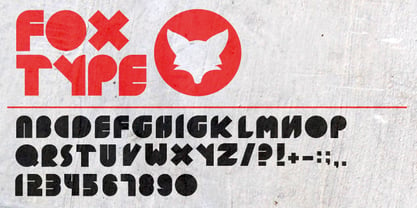
- Forte by Monotype,
$29.99 Forte was designed by the Austrian commercial artist by Carl Reissberger who was trained as a compositor and later taught typography and drawing in Vienna. The idea for the Forte script font came from the study of plants, individual letter forms being inspired by the long stems and furry heads of the reed. Slightly inclined, it gives the impression of having been made with a bold brush or marker, and can therefore be used in work that requires an informal appearance. Forte is a strong design which contrasts well with sans serif faces and classical modern types. Use the Forte font in advertising, flyers and labels.
 - BOT by fontkingz,
$19.00The BOT font package includes two character sets, BOT-Regular and -Stencil. The futuristic looking characters are designed to work in both large scale and small sizes; it works very well as a comfortable, readable lettering on machines of any kind as much as in print and screen publications. In addition, the BOT-Stencil letters can easily be cut out and work as a template for painting type on any surface. - Fits by DearType,
$40.00 Fits is a modern version of the versatile vintage style script. It's clean, legible and easy to use. Fits was meant to be used as an everyday workhorse font, thus its uses are endless - from websites and signage to merchandise and editorial designs. It looks great on product packaging and menus, being easily readable from afar. It has some initial forms and ligatures, as well as fancier alternates for the capital letters (in case you want to spice things up a bit). Unlike its predecessor, BeachBar, Fits has more basic letter shapes which makes it the perfect script for most day-to-day design applications - think apps, websites, merchandise, posters and cards, blog titles, t-shirts, branding and animation projects, etc. As promised, Fits comes in seven weights for a different impact and with a neat set of Cyrillic letters. All in all, Fits is a simple and workable script that will fit most design tasks perfectly.
 - Dot by T-26,
$19.00 - Motting by Zane Studio,
$15.00 INTRODUCE ! Motting script - a new modern calligraphy font, fresh, cute, eye-catching, with a joyful heart. Great for greeting cards, branding materials, business cards, quotes, posters and more! Motting script too - includes lots of alternate characters. Encoded with Unicode PUA, which allows full access to all additional characters without any special design software. Mac users can use Font Book. Windows users can use the Character Map to view and copy one of the additional characters to paste into your favorite text editor. For people with opentype-enabled software: Alternate can be accessed by turning on the "Alternate Styles" and "Ligature" buttons on Photoshop's Character panel, or through any software with a glyph panel, e.g. Adobe Illustrator, Photoshop CC, Inkscape. Files include: - Motting script. OTF - Motting script. TTF Thank you for buying!
 - Jot by Typadelic,
$19.00A playful slab-serif font. This typeface is versatile enough to be used in any type of design work, be it serious or fun. - Mots by Eurotypo,
$22.00
- Rot by MKGD,
$13.00 Rot is clunky, clumsy, and utilitarian. It comes straight from a second rate oracle’s prognostications of a not-so-distant dystopian future. A place where film noir meets twenty first century computer cards; and rainy melancholy nights meet global warming. It speaks of a world that welcomes everyone; provided that they are romantically inclined to living life at the short end of the stick. Metaphorically, Rot is a shot of hard liquor served in a dirty glass. Rot has a glyph count of 388 and supports the following languages Afrikaans, Albanian, Asu, Basque, Bemba, Bena, Bosnian, Catalan, Chiga, Colognian, Cornish, Croatian, Czech, Danish, Embu, English, Esperanto, Estonian, Faroese, Filipino, Finnish, French, Friulian, Galician, German, Gusii, Hungarian, Icelandic, Indonesian, Irish, Italian, Kabuverdianu, Kalaallisut, Kalenjin, Kamba, Kikuyu, Kinyarwanda, Latvian, Lithuanian, Low German, Lower Sorbian, Luo, Luxembourgish, Luyia, Machame, Makhuwa-Meetto, Makonde, Malagasy, Malay, Maltese, Manx, Meru, Morisyen, North Ndebele, Norwegian Bokmål, Norwegian Nynorsk, Nyankole, Oromo, Polish, Portuguese, Romanian, Romansh, Rombo, Rundi, Rwa, Samburu, Sango, Sangu, Scottish Gaelic, Sena, Shambala, Shona, Slovak, Slovenian, Soga, Somali, Spanish, Swahili, Swedish, Swiss German, Taita, Teso, Turkmen, Upper Sorbian, Vunjo, Walser, Zulu
 - Foto by T-26,
$19.00 - Dot To Dot by A New Machine,
$9.00 This font is for parents and educators that want to easily be able to print out the alphabet in order to have their child or student then trace them. This eliminates the need for creating the dotted lines by hand and lets the user type out exactly what letters they need instead of relying on pre-made charts. The font is upper and lowercase letters and numbers only - no punctuation. Comes in Regular and Guides (get both for the same price as one) which draws guidelines with the letters. Best when used at a large point size.
 - Do not eat this Fat - Unknown license

- Exit font (for a film) - Unknown license

- Is Not A Brazilian Font by Intellecta Design,
$17.95 an art deco font based on brazilian Rio's lettering old publish lettering style
 - roinert - Personal use only

- Le Monde Livre Classic Std by Typofonderie,
$59.00 A Renaissance style typeface in 4 series Le Monde Livre Classic works beautifully on text and titling settings. Designed as an extension of Le Monde Livre, this family distinguishes itself by its historical forms and by its numerous stylistic effects. Le Monde Livre Classic’s italics follow the models of the Renaissance and feature italic capital and lowercase swashes. Le Monde Livre Classic works beautifully for book typography, magazine settings from text to display. Le Monde Livre Classic revisited Type Directors Club .44 1998 European Design Awards 1998
 - Iwata News Gothic NK Std by IWATA,
$199.00 数多くの新聞社で使われてきた伝統ある「岩田新聞呉竹体」を再現した「イワタ新聞ゴシック体」と、かなを現代風にアレンジした「イワタ新聞ゴシック体新がな」があります。
 - Iwata News Mincho NK Std by IWATA,
$199.00 数多くの新聞社で使われてきた伝統ある「岩田新聞明朝体」を再現した「イワタ新聞明朝体」と、かなを現代風にアレンジした「イワタ新聞明朝体新がな」があります。
 - M XiangHe Hei SC Std by Monotype,
$187.99 The M XiangHe Hei Simplified Chinese typeface merges traditional brush strokes with modern letterforms to carefully balance traditional calligraphy with humanist design. Named for the smooth movements of a flying crane, the M XiangHe Hei typeface is designed to glide across the page, and features strokes that are partly derived from the Kaishu calligraphic style – an everyday script which dates back hundreds of years. M XiangHe Hei SC features Neue Frutiger for its Latin glyphs, and works harmoniously Neue Frutiger World and Monotype’s CJK typefaces: Tazugane Gothic (Japanese) and Seol Sans (Korean). M XiangHe Hei SC is a great choice for global brands using sans serif Latin typefaces looking to maintain their visual identity, and communicate with a consistent tone of voice with Simplified Chinese. The M XiangHe Hei SC Std fonts have over 8,000 glyphs, and support the GB2312 character set for Simplified Chinese.
 - Do not eat this Fat Italic - Unknown license


