10,000 search results
(0.053 seconds)
- Vermicello by ParaType,
$30.00
- Ambassador by Juraj Chrastina,
$39.00
- Poetry Darling by Ergibi Studio,
$15.00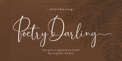
- Bethany Elingston by Attract Studio,
$20.00
- Lalola by Type-Ø-Tones,
$60.00
- Czerny by Solfege,
$26.00
- Armadura by Graviton,
$12.00
- Aequitas by Fenotype,
$25.00
- Dot Script by Cruz Fonts,
$32.00
- Boott Stitch by Aboutype,
$24.99 - Eslava by Graviton,
$12.00
- TD Beta by Inusentes Catapusan,
$9.00
- Tapas Signpainting by Cifonts,
$50.00
- Matroska by Brainware Graphic,
$12.00
- DC Inflate by CrazyFully,
$9.99
- Athletic Dept by Hustle Supply Co,
$15.00
- Lisboa Swash by Vanarchiv,
$45.00
- ITC Outback by ITC,
$29.99 - SK Shriftovik by Shriftovik,
$32.00
- Benetti Grotesk by Craft Supply Co,
$15.00
- Union Station by Matteson Typographics,
$19.95
- Beuys by Jan Eloy Gabriel,
$9.99
- Mosco by ATK Studio,
$15.00
- Vorringfossen by ErlosDesign,
$17.00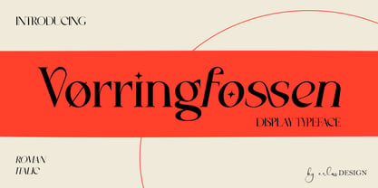
- Erigo by Neoflix Studio,
$25.00
- Kargert by Oleg Gert,
$30.00
- Masyte by holyline design,
$17.00
- RoundCut by Fábio Mansos,
$23.00
- LU LU by Design by Pascal,
$20.00
- Movement - Personal use only

- Vineyard - 100% free

- The Rio Lobo - Unknown license

- Caslon Initials - Unknown license

- Bubble Driving - 100% free

- A Cuchillada - Personal use only

- GIANTS ITALIC PERSONAL USE - Personal use only

- Mexcellent - Unknown license

- Equestria_Cyrillic - Personal use only

- Flying Saucer - 100% free

- Hotel Coral Essex - Personal use only


