10,000 search results
(0.053 seconds)
- DIN 1451 Mittelschrift by URW Type Foundry,
$35.99
- DIN 1451 by Linotype,
$40.99
- Alte DIN 1451 Mittelschrift gepraegt - 100% free

- DIN 1451 Engschrift by URW Type Foundry,
$35.99 - EF DIN 1451 by Elsner+Flake,
$35.00 - DIN 1451 Paneuropean by Linotype,
$92.99 - Engschrift DIN 1421 by URW Type Foundry,
$35.00
- Mittelschrift Austria by URW Type Foundry,
$35.00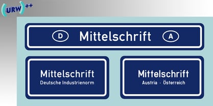
- DIN 1451 fette Breitschrift 1936 - 100% free

- Bolded by We Make Font,
$16.00
- Bolde by Figuree Studio,
$18.00
- 1456 Gutenberg by GLC,
$38.00
- 1491 Cancellaresca by GLC,
$38.00
- 1651 Alchemy by GLC,
$38.00
- Vialog 1450 by Linotype,
$40.99 - DIN Schablonierschrift - Unknown license

- Normalise Din by Mecanorma Collection,
$45.00 - FF DIN by FontFont,
$104.99
- DIN 2014 by ParaType,
$47.00
- Din Condensed by ParaType,
$30.00
- URW DIN by URW Type Foundry,
$49.99
- DIN Next by Monotype,
$56.99
- Karvwood bold - Personal use only

- White Bold - Unknown license

- Goulong Bold - Unknown license

- Chopin-Bold - Unknown license

- Belta Bold - Personal use only

- Writers bold - Unknown license

- Helena-Bold - Unknown license

- TypoLatinserif-Bold - 100% free

- Pullchain Bold - Personal use only

- Boneribbon Bold - Unknown license

- Charlemagne Bold - Unknown license

- Bamf Bold - Unknown license

- Lein Bold - Unknown license

- Prescript Bold - Unknown license

- Present Bold - Unknown license

- Chizzler Bold - Unknown license

- Zado Bold - Unknown license

- Alako-Bold - Unknown license


Page 1 of 250Next page