10,000 search results
(0.037 seconds)
- Pacioli by MADType,
$29.00 This font is based on an alphabet published by Luca Pacioli in his 1509 mathematical treatise De divina proportione. In this book, Pacioli describes how to build the Roman alphabet geometrically using lines, squares and circles. Pacioli was not the first or the last man in his era to describe the building of letters mathematically. Felice Feliciano did this before Pacioli, and Albrecht Dürer further developed these forms years after. According to Pacioli, the thick strokes should be 1/9th of the height, and the thin strokes should have 1/2 the weight of the thick strokes. I felt that this beautiful alphabet needed to be restored to its full geometric glory and set out to construct an accurate replica using Pacioli's instructions. Included in the font you'll find the letters that have the grid overlay and also the letters without the grid. The letters J, W, U, and Z were not included in the book, so I have created my own versions of these characters that fit into Pacioli's grid. Pacioli shows two different Os in the book, so I have included the second O as well as a second J, Q, and Z as OpenType stylistic alternates. Also included in the font are border patterns and a fleuron taken from the cover of the book.
 - Chanson De Paris JNL by Jeff Levine,
$29.00 A couple of pieces of sheet music from France [circa 1925] offered the inspiration for Chanson De Paris JNL (Song of Paris), which is available in both regular and oblique versions. This hand lettered Art Nouveau style features a unique take on thick-and-thin lettering which foreshadows the Art Deco typefaces to come during the 1930s.
 - Show Card Pen JNL by Jeff Levine,
$29.00 The 1920 edition of “How to Paint Signs and Sho’ Cards” by E. C. Matthews offered a number of examples of then-modern lettering styles for sign painters and show card writers. A bold display alphabet made with a round lettering nib is now available as Show Card Pen JNL, in both regular and oblique versions.
 - Unusually Deco JNL by Jeff Levine,
$29.00 The hand lettered words “Pere Noel” under a vintage French magazine’s photo of Santa with two bikini-clad beauties inspired the digital version of this quirky, condensed type style. Unusually Deco JNL is available in both regular and oblique versions From Wikipedia: “Père Noël “Papi Christmas”, sometimes called ‘Papa Noël’ (“Daddy Christmas”), is a legendary gift-bringer at Christmas in France and other French-speaking areas, identified with the Father Christmas and/or Santa Claus of English-speaking territories. Though they were traditionally different, all of them are now the same character, with different names, and the shared characteristics of a red outfit, workshop at the North Pole/Lapland, and a team of reindeer.”
 - Twentieth Century by Pelavin Fonts,
$20.00 Twentieth Century was designed for the cover of 20th Century French Poetry and was drawn with pure geometric shapes. It is the distillation of a broad variety of styles loosely known as Art Deco but, also categorized under such terms as Moderne, Streamline, Machine Age, Futurist, 70s Art Deco, Memphis among others. If there were a source in particular that I would cite as my inspiration, however, it would definitely be the work of Frank Lloyd Wright. I mean, look at the "W" for cryin' out loud!
 - Gibon by Juraj Chrastina,
$29.00 Gibon draws inspiration from the fascinating comic book universe, inhabited not only by many legendary superheroes, monsters and superbadass antiheroes, but also by its own legendary typefaces. Every cartoonist and hand letterer needs a pencil, a T-square and on and on. For digital lettering, books Gibon is an option. This handy toolkit helps you easily letter your comic strips, but even if you have nothing to do with cartooning, this bundle can simply add some comic book feel to your design or make some noise with layered sound effects. The basic font for speech balloon inking is Gibon Lettering, while Gibon Bold and Heavy let you emphasize certain text. Gibon Bold is further developed as a multilayer type where different styles are designed to be overlaid on top of each other, letting you work with built-in shadows, 3D effects and outlines to create striking SFX. Gibon Balloons offers different types of layered speech balloons and a few halftone patterns. The OpenType contextual alternate feature is set to automatically apply the random effect using two sets of glyphs. Traditionally, comic books are lettered in caps only, which explains why Gibon is an all caps font. To easily access alternate characters they are encoded as lowercase letters. For example, type the uppercase “I” to access the crossbar “I” and the lowercase “i” to access the crossbar-less “I”. Turn on stylistic set number one to use only crossbar-less “I”.
 - Lyodra by Putracetol,
$16.00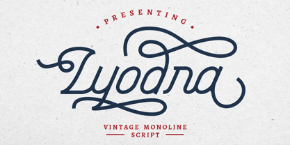 Lyodra is a vintage monoline script typeface. This font is inspired from a modern, vintage style, with added flourishes to add elements of beauty. It includes OpenType features with a lot of alternates to give you different options in lettering. This font is also includes multi-language support. Lyodra is perfect for vintage design, badges, logos, t-shirts, posters, branding, packaging, signage, book cover and so much more!
 - Wallet by Fontforecast,
$19.00 Wallet is an expressive handwritten font with loads of personality, suitable for many different projects. It comes in three styles: Felt, Felt bold and Chalk. Wallet has 391 glyphs and supports multiple languages. Opentype features, such as contextual alternates, for replacing beginning and ending glyphs as you type and double letter ligatures are also included. To make full use of its potential Wallet requires an opentype-savvy application.
 - Allioideae by URW Type Foundry,
$49.99 This fine lined display type face was named Allioideae because of the ascenders of the lower cases. They are rising upright with a single stroke and are ending - depending on the font style - into a spherical blossom. The name was chosen concerned to the plant allium, that forms an umbel at the top of a leafless stalk, when it is blooming. Allioideae is the name of a subfamily of monocot flowering plants in the family Amaryllidaceae. The name is derived from the generic name of the type genus, Allium. The wide and round capital letters are showing a nice contrast to the lower cases and giving the font a kind of female feeling. That provides a functional and lovely use in headlines for all beauty and cosmetics issues.The typeface appears in 4 different styles. a plain style – Allioideae, a stencil style - Allioideae Stencil, a (dotted) style for both - Allioideae Dot and Allioideae Stencil Dot. It supports multi language as it covers all the latin diacritics and a cyrillic character set. Lots of numbers as monospaced, lining figuers, old styles, sub- and superscript and many fractions in two different styles are giving a nice finish to that font. Also some matching ornaments are included.
 - 1584 Pragmatica Lima by GLC,
$42.00 This family was created from the set of font faces used in Lima (Peru) by Antonio Ricardo in 1584 for the first publication ever printed in Southern America: a four-page leaflet in Spanish entitled "Pragm·tica sanciÛn" with information about the new Georgian calendar of 1582 which had not yet been communicated to the colonies. In our two styles (Regular & Italic), font faces, kernings and spacing are as close as possible to the original. This Pro font covers Western, Eastern and Central European languages (including Celtic), Baltic and Turkish, with standard and “long s” ligatures in each of the two styles. A,B,D,E,F,M,N,P,R,V,W swashed capitals in the italic style.
 - VTCTattooScriptTwo - Personal use only

- Goth Stencil - Personal use only

- SF Wonder Comic Inline - Unknown license

- Grunge - Unknown license

- OldStyle 1 - Unknown license

- Knife Fight - Personal use only

- Notepad - Unknown license

- KometenMelodie1 - Unknown license

- TypeWritersSubstitute-Black - 100% free

- Violitta by Arendxstudio,
$15.00 Violitta is an elegant minimalist signature handwritten font package with a personal charm. With a style that I feel is the first time being blended with a different brush so it has a natural hand. Violitta Regular contains upper and lower case letters, numbers and various complete signs. Violitta Minimalis includes alternative characters, with capital letters and small that is completely new.
 - Ragnarock by Good Java Studio,
$20.00 Ragnarock is born from bold and fun style fonts. With many different swashes and alternate letters you need for the great work ever. That's available on other file from letter A-Z and a-z. Versatile for design poster, logo, branding, label, quote, headline profile, banner, t-shirt design, packaging, magazine, brochure, and many more your amazing work with this fonts.
 - Blaq by Resistenza,
$39.00 Inspired by Henry W. Troy, BLAQ is a new version of Trojan Text not available as font. Is an ornamental blackletter alphabet. Works great in headlines and other ‘masculine’ like design settings. The Victorian Gothic or Neo-Gothic is an architectural movement that began in the 1740s in England. Its popularity grew rapidly in the early nineteenth century. The revived Gothic style was not limited to architecture. We recommend to combine Blaq with: Turquoise Nautica
 - Crispy Yellow by Bogstav,
$14.00 It’s handmade, organic, all-caps and crispy! Just like a tasty treat or a lovely cake! I’ve added 5 slightly different versions of each letter, and they cycle as you type (no obvious repeating letters!) Of course, it’s multilingual as well!
 - KlipJoint by Ingrimayne Type,
$14.95 KlipJoint is a novelty font in which all the characters are formed from paper clips. It does not have a true set of lower case letters, but in their place is a second and often different set of upper-case letters.
 - Grovflab by Bogstav,
$17.00 Serif meets grafitti and comic. It's bound to be wild! Comes with 4 different versions of each lowercase letter along with some fancy swashes!
 - Anatole France by Ingo,
$36.00 handwritten decorative variable font A few fonts already exist which have been drawn in accordance with the exact same principles. But these are just drawn - only drawn. The ANATOLE FRANCE retains the hand script character in spite of its stringent composition. An old portfolio of script patterns from the 1920s or 1930s, which appeared in the Georg D. W. Callwey Publishing House in Munich, includes among its pages one with a handwritten poster script, as was very typical for the 1920s. To begin with, there is the emphasized decorative character, which stands out due to stressing the stems. Next, the attempt to portray the character forms with the help of a few but always recurring basic elements is driven to the limits. Theoretically speaking, that which should have led to a contrived, geometrically determined type, obtains a likeable and pleasant look through the ductus of the manually guided brush. The classic version of ANATOLE FRANCE includes 5 fonts: Light, SemiLight, Normal, SemiBold, Bold. The variable font allows seamless font weights from 300 (Light) to 700 (Bold). Alternate letterforms are available through the appropriate OpenType features: style set 1 (O Q V) style set 2 (v w)
 - Modal Stencil by Schriftlabor,
$42.00 Modal Stencil is the companion to Modal type family. It brings an extra expression for different uses. It can be used for Display better than Modal. It has all the styles that Modal so it can be used together harmoniously.
 - Traiectum by Hanoded,
$15.00 Traiectum is the old Roman name for the city of Utrecht (in The Netherlands). When I started working on this font, I wanted to give it a Latin name and Traiectum sounded good! Traiectum is a hand drawn font with a regal and messy look. It was based on Goudy Old Style, a classic old-style serif typeface created in 1915 by Frederic W. Goudy. Traiectum is a multilingual, all caps font and I am sure you’ll find lots of uses for it. The city it was named after, Utrecht, is actually very nice! You should visit one day!
 - Acherus Feral by Horizon Type,
$30.00 Acherus Feral is sharpened version of Acherus Grotesque. In this new version all sharp edges are flattened and rounded corners are sharpened. Alternative character "G" and optional "t" character have been added. Some of the characters like "A,K,M,N,Q,R,V,W,Z,v,w,z" have been changed completely for the stability of the typeface, in this way it looks more confident and serious. As you can see on the banners, Feral is excellent choice for many platform needs. For further information please check the pdf specimens. Behance Pdf Specimen (White) Pdf Specimen (Black)
 - Porceleina by PizzaDude.dk,
$20.00 Porceleina is elegant, what more can I say? This handmade and handdrawn font comes with a heavy loadful of diacritics - and the Opentype contextual alternates makes sure that the font cycles between the six different...yes SIX different...versions of each letter from a-z! That's quite awesome, if you ask me!
 - Plain Talk JNL by Jeff Levine,
$29.00 Plain Talk JNL is similar to Eckhardt Centerline JNL, but lacks the thin inline lettering and has a different A and G. The hand-lettered look of this font makes it perfect for titling applications.
 - Congratulatory Latin by Dmitriy Shchetinskiy,
$19.00 Congratulatory font consist of 36 calligraphic latin greetings letterings for different event. Letterings are original and handwritten. This font makes it possible to use high quality calligraphy in your projects - greeting cards, invitation cards etc.
 - MWaKomia - Unknown license

- Disposable by PizzaDude.dk,
$20.00 Disposable is somewhat similar to some letters that are about to disintegrate. The letters are a little worn and give a good impression of something eco or organic. I've created 6 different versions of all the letters, just so your text will look even more organic and handmade!
 - Beauty Handwriting by Nirmana Visual,
$22.00 Beauty Handwriting is a Natural handwriting modern calligraphy font. full set of lowercase and uppercase letters, numerals and punctuation, multilingual symbols, lowercase beginning and ending swashes. 80 ligatures giving realistic hand-lettered style. Beauty Handwriting offers beautiful typographic harmony for a diversity of design projects, including logos & branding, social media posts, advertisements & product designs.
 - Random Thoughts by PizzaDude.dk,
$20.00 Random Thoughts is a selection of of quite simple handmade capital letters. They are legible, almost mono-lined, handmade and they are a bit jumpy - but never the less, they suit a headline that needs a catchy look very fine! I've included 4 different versions of each letter. One lowercase, one uppercase and two contextual alternates. These 4 different versions automatically cycle as you type, leaving your text quite random - but still very clear and legible! And, of course, there is multilingual support!
 - Knoedel by PabType,
$12.00 Knoedel is a display typeface with three front-weights: light, regular and bold. Although a conjunction of different styles were a reference during the design process; the art deco style left a more noticeable influence in the final design. Knoedel, also has clear references to geometric and slab serif fonts. The design is intended to be applied on headlines or short text fragments. Knoedel offers full coverage for all languages using Latin alphabet: whole Europe, America, Oceania and on a big number of African and Asian countries. Besides the standard ligatures, Knoedel, additionally, has more than 200 discretionary ligatures and a generous number of borders and ornaments. Knödel (Knoedel) is a traditional dish from Austria and the southeast of Germany; made of dumplings of different ingredients usually boiled in salted water. It is not high-end cuisine but still, it accomplishes its aim of soothing hunger.
 - Vecmetry by Velvele,
$10.99 This font is more than just letters, it’s inspired by VECTOR ART. It’s name, VECMETRY' comes from the combination of vector and geometry, that’s why it keeps the most basic elements of design: circle, square and triangle. Vecmetry family has 4 LAYER ABLE FONTS and offers endless combinations; and this makes it especially perfect for headlines and logos. Besides, it supports 5 different languages: ENGLISH, ESPAÑOL, FRANÇAIS, ITALIANO and TÜRKÇE. _(189 glyphs)_
 - Cruickshank ML by HiH,
$12.00 Cruickshank is a decorative typeface from the late Victorian period. The upper case includes several letters with swash strokes, extending well below the baseline, as found in the original design. Alternatives to the swash caps are provided. The lower case contains small caps of simpler design. The face was designed by William W. Jackson and released by MacKellar, Smiths and Jordan Type Foundry of Samson Street, Philadelphia, Pennsylvania in 1886. MS&J was founded originally as Binny & Ronaldson in 1796 and later known as The Johnson Type Foundry. Cruickshank has a strong late Victorian flavor without the extravagance of so many fonts of the period. In its simplicity and clarity, it may be seen as a precursor to the Art Nouveau style that would develop a decade later.
 - Walbaum Antiqua Pro by RMU,
$40.00 Walbaum Antiqua Pro is an RMU redesign of a German font classic, with three different number forms and small caps throughout all font styles.


