10,000 search results
(0.033 seconds)
- FS Industrie Variable by Fontsmith,
$279.99Changing nature of work FS Industrie is an extraordinarily versatile new type system, with 70 variants built around five different widths and seven different weights. Type in the future will be increasingly variable, and FS Industrie is specifically designed to address the changing needs of brands. As more of the things we make exist primarily in a digital space, so our need to create type that can adapt within that space grows. It is the spirit of variable design, adaptation and flexibility that drove us to create FS Industrie. A typeface for future work in a future world. FS Industrie is a response to the changing nature of type, for brands that are responding to the changing nature of work. Industrial style Stylistically, FS Industrie feels direct and simple without sacrificing its humanity. It takes inspiration from German fonts of the 1930s, with their roots in manufacturing and signage. A classic sense of functional utility combined with a progressive view of where type is heading. Expressions in width A fundamental challenge with variable type is to ensure that craft and precision is preserved at every interval. Each width and weight is drawn by hand, with subtle variations in terminals and angles as you progress through the system. This ensures each variant can play to its unique strengths, while also pairing perfectly with its siblings. From the closed terminals of the Condensed and the open terminals of the Extended. FS Industrie is a design system that maintains a practical, grounded and robust tone throughout every variable style. Variable nature The 70 styles offer a range of expression. Each width contrasts with the next to clearly define typographic roles in graphic layouts. Every glyph is crafted with adaptability and scalability in mind, creating a pliable design space for the user. The proportions of each letterform flex as weight scales up, stem weights increase as letter width broadens. These subtle design changes create an optically consistent visual impression. - FS Industrie by Fontsmith,
$50.00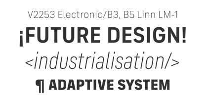 Changing nature of work FS Industrie is an extraordinarily versatile new type system, with 70 variants built around five different widths and seven different weights. Type in the future will be increasingly variable, and FS Industrie is specifically designed to address the changing needs of brands. As more of the things we make exist primarily in a digital space, so our need to create type that can adapt within that space grows. It is the spirit of variable design, adaptation and flexibility that drove us to create FS Industrie. A typeface for future work in a future world. FS Industrie is a response to the changing nature of type, for brands that are responding to the changing nature of work. Industrial style Stylistically, FS Industrie feels direct and simple without sacrificing its humanity. It takes inspiration from German fonts of the 1930s, with their roots in manufacturing and signage. A classic sense of functional utility combined with a progressive view of where type is heading. Expressions in width A fundamental challenge with variable type is to ensure that craft and precision is preserved at every interval. Each width and weight is drawn by hand, with subtle variations in terminals and angles as you progress through the system. This ensures each variant can play to its unique strengths, while also pairing perfectly with its siblings. From the closed terminals of the Condensed and the open terminals of the Extended. FS Industrie is a design system that maintains a practical, grounded and robust tone throughout every variable style. Variable nature The 70 styles offer a range of expression. Each width contrasts with the next to clearly define typographic roles in graphic layouts. Every glyph is crafted with adaptability and scalability in mind, creating a pliable design space for the user. The proportions of each letterform flex as weight scales up, stem weights increase as letter width broadens. These subtle design changes create an optically consistent visual impression.
 - Slightly Hollow - Unknown license

- Excelsis by Solotype,
$19.95This font began life as a metal type called Duerer, from the Boston Type Foundry about 1890. A wood type maker copied it, and that's where we got it (in Guadalajara, Mexico, already! Some people travel to see the sights; we travel to collect type.) - Chalk Hand Marker by TypoGraphicDesign,
$19.00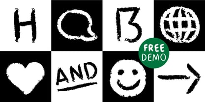 The typeface Chalk Hand Marker is designed from 2019 for the font foundry Typo Graphic Design by Manuel Viergutz. The rough sans-serif display typeface with 4 font styles (Reg, Bold, Caps, Invert) is inspired by handwriting. 634 glyphs included plus 150+ decorative extras like icons, arrows, dingbats, emojis, symbols, geometric shapes, catchwords, decorative ligatures (type the word #LOVE for ❤️or #SMILE for
 - Sutro Initials by Parkinson,
$20.00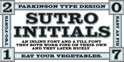 A two-font chromatic (or layered) set. The Primary font, which is the old Sutro Inlined Initials. Salvaged from the wreckage of my Type1 font library, the inlined initials have been in the shop for some repairs and detailing. I just added the fill font to support the inlined version. Each font works on it’s own but they work very well together. Caps only. Open Type.
 - Knitting And Sewing Doodles by Outside the Line,
$19.00Knitting & Sewing Doodles are just that. If you type all caps you get 15 knitting icons and lower case is 15 sewing doodles. Knitting items include yarn, knitting, needles, ball winder, spinning supplies, stitch counter, etc. Sewing machine, buttons, thread, pin cushion, bobbin, thimble and needles, scissors, label, tape measure, darning egg, zipper, seam ripper, and pins, all in the Outside the Line style. - Christian Crosses IV - Unknown license

- Willow by Adobe,
$29.00Willow is an Adobe Originals typeface designed in 1990 by Joy Redick for the Adobe Wood Type series. Willow is a condensed typeface modeled on nineteenth-century wood types known as Clarendons (wood type Clarendons do not resemble the English metal types of that name). Clarendon condensed faces were originally so well-designed that words or a line of display type have an even color that is remarkable for wood types. Taken from proofs of type in the Rob Roy Kelly Collection housed at the University of Texas at Austin, Willow can be used for display work such packaging, advertising, and posters. - Pasión Acústica - Personal use only

- Gothic Birthday Cake - 100% free

- Mirkwood Chronicle - 100% free

- Anfalas - 100% free

- Exo - 100% free

- Lady Rene by Sudtipos,
$59.00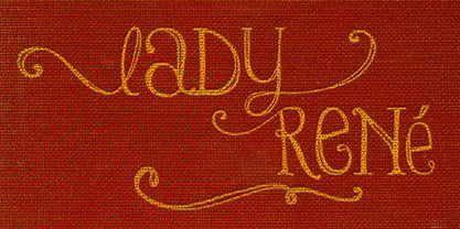 Looking back on my production to date, neither so little nor so large, it does not come as a surprise to find myself now introducing Lady René. A brief review of my career would read as follows: graphic designer graduated from Buenos Aires University, a 10-year professorship in Typography in the same institution, an illustrator in the making. For almost 15 years now my work has focused on the design of editorial pieces, predominantly books and CD sleeves. Typography proper has always been central to my research projects. All my obsessions eventually embodied as much the search for a perfect, spotless text as for a daring and provoking one. In my view, "how-to-say-something" ranks highest amongst a graphic designer’s responsibilities. It was in this vein that I called in the written word to illustrate, to draw, to narrate. Why not reverse the saying and proclaim that “a word is worth a thousand images”? If so, one single word could trigger endless meanings, associations, ideas, and memories in every reader’s mind. Language, we know, has a strong power and is a living expression of a culture. In my illustrations, letters and drawings reunite in one synergy said and unsaid, the finiteness of the message and the freedom of the free reading. And this is how and when, Lady René, my first born type font sees the light of day conceived out of a love of illustration and a reverence for the written word, recalling the whimsicality of the handmade drawing and reflecting its sensitive, warmth and spontaneity. Enabled by the characteristics of Open Type and the hard, outstanding work of designer Ale Paul, Lady René succeeds in composing texts in a simple, organic way by means of its contextual and stylistic alternates, swash characters, ligatures and connecting words. A bundle of decorative miscellanea completes the set of signs, enabling the user considerable freedom to create new typographic landscapes. Lady René is then prepared, very much like a character in a short story, to come to life in the reader’s mind. I expect you will enjoy her as much as I did creating her. Laura Varsky
 - Aracne Ultra Condensed Regular is a distinctive typeface designed by Antipixel, an entity known for its unique and versatile font offerings. This particular font stands out due to its ultra-condensed...
- Scalactic J - Unknown license

- FF World by FontFont,
$30.99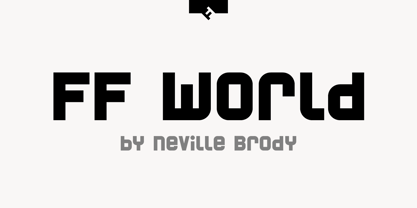 British type designer Neville Brody created this display FontFont in 1993. The family contains 3 weights and is ideally suited for poster and billboards and sports. FF World provides advanced typographical support with features such as ligatures. It comes with proportional lining figures.
 - Fresh Orange by Lettersams,
$12.00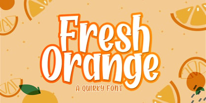 Fresh Orange is a type of font that presents a unique style for every design project such as cartoons, comics, poster designs, and so on. Fresh Orange has two styles: regular and extrude, which will create a great layered look when combined.
 - Bank Gothic by ParaType,
$30.00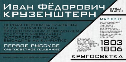 Designed at American Type Founders in 1930-33 by Morris F. Benton. An all-capital sans serif featuring squared-off letters with rounded corners. For use in advertising and display typography. Cyrillic version was created at ParaType by Tagir Safayev in 1997.
 - FF A Lazy Day by FontFont,
$30.99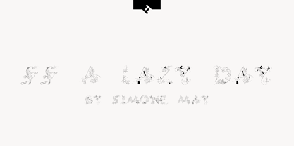 German type designer Simone May created this display FontFont in 1995. The font is ideally suited for festive occasions and poster and billboard projects. FF A Lazy Day provides advanced typographical support with features such as ligatures and comes with tabular lining figures.
 - Vario by Linotype,
$29.99Vario is a bold brush-based design. Created by the renowned type designer and calligrapher, Hermann Zapf, Vario offers superb emphasis for use in headlines and displays. It is availble in both regular and italic styles. Vario was first produced in 1982. - FF Tokyo by FontFont,
$30.99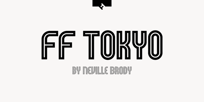 British type designer Neville Brody created this display FontFont in 1993. The family contains 4 weights and is ideally suited for poster and billboards and sports. FF Tokyo provides advanced typographical support with features such as ligatures. It comes with proportional lining figures.
 - Betm by Typesketchbook,
$39.00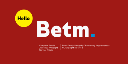 Betm is a geometric sans-serif font family created by Chatnarong Jingsuphatada (a Thai type designer) and published by Typesketchbook. Inspired by clean modern and, somewhat, mild geometric lines, Betm comes in 10 very useful weights along with complementary italics. You’ll love Betm!
 - Polla - Unknown license

- Korean Calligraphy - 100% free

- STEAK - Personal use only

- whatever - Unknown license

- TRASHED - Unknown license

- Avain - Personal use only

- screamo - Unknown license

- anthem - Unknown license

- whatever - 100% free

- AnthologY - Unknown license

- junkohanhero - Unknown license

- Mohawk - Unknown license

- ympyroity - Unknown license

- hardcorium - Unknown license

- Banana Yeti by Zetafonts,
$29.00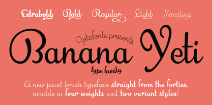 Banana Yeti is a brush script typeface with a condensed vertical slant, inspired by a handmade sample drawn by the calligrapher Ross Frederic George and depicted in Speedball 1947 Textbook Manual. Banana Yeti has a vintage brush script look, perfect for food packaging, display and logo design and period advertising. The original design has been completely reworked and extended by the Zetafonts Masterclass 2016 Team to provide three lighter weights, and a monoline variant, as well as to produce an extended character set with open type support for ligatures, alternates, European languages and ending swashes. Banana Yeti covers over 40 languages that use the Latin alphabet, with a full range of accents and diacritics. It comes in four weights plus a special monoline weight. Banana Yeti makes full use of Open Type ligatures to provide swashes, arching letters and a wide array of ligature characters for a more handmade, natural look. Swashes can be accessed through glyph palette or by typing one to six underscores after the letter. Typing an underscore before a phrase creates arching text; close arch with another underscore. Variant ampersands can be accessed through glyph palette or by typing multiple ampersand characters. Take care: open type features are developed using open type technology, fully compatible with Adobe software and major design softwares and OS, but not supported by every software. Check before buying!
 - Trivia Sans by Storm Type Foundry,
$39.00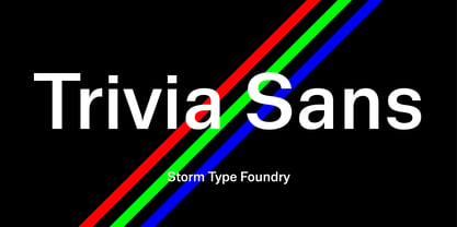 When looking for a neutral typeface with no historic reminders, we always end up with notorious designs made about 60 years ago. It’s a part of the whole Trivia type system. To our surprise, there are still people who can’t distinguish three basic latin type categories. The present font family has been created for them. A simple typographic Trivia: three ways to look at printed word, three fonts to design anything from business card to a billboard, three tunes for endless variations.



