2,677 search results (0.012 seconds)
  1. WedDing - Unknown license
  2. MacKeyCaps - Unknown license
  3. Il Tempo Gigante - Unknown license
  4. Small Talk - Unknown license
  5. Small Talk - Unknown license
  6. Shrapnel - Personal use only
  7. Amy by AVP, $19.00
    Developed from the simplest possible curves, Amy is a wide hand lettered style with tall straight ascenders and generously looped descenders. The capitals are centred horizontally with the lower case. A handful of ligatures helps copy to flow for easy reading and optional proportionally spaced numerals make the font suitable for quite lengthy chunks of copy.
  8. Binary - Unknown license
  9. Harrington - Unknown license
  10. New World Vibes - Unknown license
  11. Radioactive - Unknown license
  12. Small Talk - Unknown license
  13. Dabble(eval) - Unknown license
  14. Hypernium(eval) - Unknown license
  15. Small Talk - Unknown license
  16. Isterburk - Unknown license
  17. Bodoni Slapp - Unknown license
  18. Small Talk - Unknown license
  19. Small Talk - Unknown license
  20. Sensory Input - Unknown license
  21. Bamberg by Solotype, $19.95
    A compressed wood poster type from the mid-1800s. Certainly handy for excessive copy on a single line.
  22. Banjax by Monotype, $25.99
    Banjax is a humanist sans serif typeface, designed to be highly versatile and efficient in both print and digital environments. The extreme weights are perfect for display purposes, with the central core weights ideal for body copy. While Banjax has a branding focus, it would be suitable for pretty much any text application in any Latin language. See more detailed examples here. Distinguishing features include a large x-height, short descenders, distinctive asymmetrical contrast, angled terminals, squared dots and punctuation, and maybe a little flair here and there to enhance this typeface’s personality. Overall, Banjax makes for a pleasant reading experience with enough nuances to make it an ideal choice for branding purposes. Key features: 9 weights in Roman and Italic Small Caps, Petite Caps and 3 Alternates Latin Extended and Basic Greek glyphs 1100 glyphs per font.
  23. Calzone by Studio 85 Design, $12.99
    The Calzone Family is display typeface inspired by the many neighborhood pizza and local eateries with hand painted menus. The font is cozy and fun, like your favorite comfort food. All of the typefaces include standard ligatures, currencies, ampersands and footnotes consistent with the design. Calzone regular includes upper and lower case type, great for body copy. Calzone Caps is a heavy, stylized uppercase. Calzone Lower is a light, stylized lowercase. Included with Calzone Caps and Calzone Lower are a full set of alternate letters for variation to enhance your design and give it an informal feel. The Calzone Family is well suited for an informal look and feel. Alternate characters offer many opportunities to be creative with your designs. The Calzone Family is great is for menus (of course), apps, games, video, animation, packaging, child oriented design, presentations and anything fun.
  24. Bit Part JNL by Jeff Levine, $29.00
    Bit Part JNL is an extra condensed monoline sans serif typeface that's well suited for movie credits, disclaimers and other forms of tight-fit word copy. Inspired by just the numbers "65" on the cover of a 1965 high school yearbook, this retro font will fit a lot of copy into a small area. The typeface is available in regular and oblique versions.
  25. Iso 2.0 - Personal use only
  26. Courtesy Script Pro by Sudtipos, $59.00
    As in Victorian times, the precious, hand-lettered look of custom stationery is back in vogue. Enter Courtesy Script, an original creation by Alejandro Paul. Courtesy captures the elegance and propriety of finely practiced Spencerian penmanship, in particular the Zanerian school. Its lowercase is notably understated, a simple monoline with very wide connections that ease readability. In the capitals, Courtesy adds variety in both the weight of the strokes, and in degrees of flourish — from merely fancy to over-the-top engrossery. Based on an alphabet found in a 19th-century penmanship journal, Ale created hundreds of additional, stylistically complementary letterforms. Alternate capitals and lowercase letters, swashed lowercase forms, and ending and ornamental swashes; numerals, punctuation, and non-English and accented characters. With virtually endless ways to customize its use, Courtesy helps designers create fluid, signature looks on stationery and invitations, book covers, fashion layouts, and packaging.
  27. WEAR FAT SHIRT by TypoGraphicDesign, $15.00
    CONCEPT/ CHARACTERISTICS A display font that allows you to »Kleckern und Klotzen« (modified German proverb »to not take half-measures«) The fat and square character to the font, a bold and loud statement. The motto is square, practical, fat. The font styles ranging from high-contrast line difference "beanpole" over mediocrity "slim" to the fattest and blackest "okay" style. A font with humor ^^ APPLICATION AREA The modern, square lightweight »Fat Wear Shirt« would be happy as a display typeface in headline size on the following areas and would find this very real bold: Edi­to­rial Design (Maga­zine or Fan­zine) or Web­de­sign (Head­line Web­font for your web­site), party flyer, movie pos­ter, music pos­ter, clothing, fashion, t-shirts, music covers or web­ban­ner. And and and… TECHNICAL SPECIFICATIONS Head­line Font | Dis­play Font | Fat Techno Font »Wear Fat Shirt« Open­Type Font (Mac + Win) with 3 styles (okay, slim, beanpole) & 268 gly­phs. Alter­na­tive let­ters and liga­tures (with accents & €) Desk­top Font (.otf) + Web Font (.svg, .eot, .woff) KONZEPT/BESONDERHEITEN Eine Display-Schrift bei der Kleckern und Klotzen erlaubt ist! (Verändertes deutsches Sprichwort »nicht kleckern sondern klotzen«) Der fette und eckige Charakter verleihen der Schrift eine plakative und laute Aussage. Das Motto lautet quadratisch, praktisch, fett. Die Schriftschnitte reichen von kontrastreichen Linienunterschied »beanpole«, über mittelmaß »slim« bis zum fettesten und schwärzesten »okay« Style. Eine Schrift mit Humor ^^ EINSATZGEBIETE Das moderne, quadratische Leichtgewicht »Wear Fat Shirt«, würde sich als Aus­zeich­nungs­schrift in Head­line­größe über fol­gende Ein­satz­ge­biete sehr freuen und fände dies echt fett: Logos/Wortmarken aller Art, Flyer für fast jede Party, Plat­ten ­Co­ver, CD-Cover und Icon Design, Pla­kat­ De­sign, Kleidung, T-Shirts, Comics und Gra­phic­no­vels, Game– und Video­spiel Design aller Gen­res, als Head­line­schrift für print und digi­tale Maga­zine, Bücher und Web­sei­ten u.v.m. TECHNISCHE INFORMATIONEN Head­line Font | Dis­play Font | Fat Techno Font »Wear Fat Shirt« Open­Type Font (Mac + Win) mit 3 Schrift­schnit­ten (okay, slim, beanpole) & 268 Gly­phen. Inkl. dia­kri­ti­sches Zei­chen, alter­na­tive Buch­sta­ben, Liga­tu­ren & €. Desk­top Font (.otf) + Web Font (.svg, .eot, .woff)
  28. Underwood1913 - Personal use only
  29. Ugly Face - Unknown license
  30. Neisya by Phoenix Group, $13.00
    Neisya is a handwriting font with a relaxed and cozy theme, Neisya is closely related to calm and philosophy.
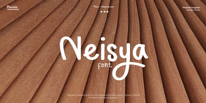
  31. Grill Sans - Unknown license
  32. Kantor - Unknown license
  33. Kantor Ligatures - Unknown license
  34. Sidewinder JNL by Jeff Levine, $29.00
    Sidewinder JNL is based on ultra-compressed serif wood type and is perfect for fitting long copy into limited space.
  35. Brookhurst JNL by Jeff Levine, $29.00
    Brookhurst JNL has strong Art Deco influence, and features an ultra-compressed width to set copy into a tighter space.
  36. Ink Spots JNL by Jeff Levine, $29.00
    For decades, spot illustrations - whether by hot type, photoengraving, clip art or (in later years) digital means provided decorative and often lighthearted breaks in reading printed copy. This collection of twenty-six cartoon images has been meticulously re-drawn in digital format from 1920s-1930s era source material. By adding a simple caption underneath a design, your ad copy can be enhanced with these wonderful period pieces.
  37. Delphin No2 by URW Type Foundry, $35.99
    Delphin is a calligraphic font with upright capitals and slightly inclined lowercase. Delphins ascenders are tall and a number of letters have tails which descend below the baseline. Delphin is a useful face in advertising for short texts and display. Delphin is a trademark of Linotype Corp. and may be registered in certain jurisdictions in the name of Linotype Corp. or its licensee Linotype GmbH.
  38. Poster Compressed by Arkitype, $15.00
    Poster compressed is a display font made specifically for editorial and posters. This font has a super compressed character set and super tight kerning to match! This gives you the ability to create large headlines and copy for bold typographic posters and editorial pieces. This font packs punch when it comes to large copy lines and you're going to want it in your font arsenal.
  39. Underground - Unknown license
  40. Nora - Unknown license
Looking for more fonts? Check out our New, Sans, Script, Handwriting fonts or Categories
abstract fontscontact usprivacy policyweb font generator
Processing