3,678 search results (0.024 seconds)
  1. Roylands Font Duo by Panatype Studio, $9.00
    Royland Font Duo is a mathing pair of fonts, inspired by a simple yet elegant vintage graphic design, carefully crafted, and opentype features to support is perfect for graphic design needs.
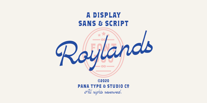
  2. TSF et Compagnie Tryout - Unknown license
  3. Pavement - Unknown license
  4. a Morris line - Unknown license
  5. Captain Kidd Demo - Unknown license
  6. PeggyFont - Unknown license
  7. Prefix - Unknown license
  8. Baskerville by Bitstream, $29.99
    John Baskerville spared no effort to create the ultimate typographic book. He prepared deep black inks and smoothed paper to show to full effect the letters that he had John Handy cut from his own brilliant designs, based on a lifetime of calligraphy and stonecutting. Punches and matrices survive at the Cambridge University Press. The present design is an accurate recutting, with particular attention to George W. Jones’ revision from the metal of Baskerville’s English (14pt) roman and italic in 1929 for Linotype & Machinery Ltd; Mergenthaler Linotype imported this design to the USA two years later.
  9. Whitenights by Linotype, $29.99
    Whitenights is a contemporary text family, which was developed by the prolific Swedish typographer Lars Bergquist in 2002. Containing five weights (11 different fonts total), this family contains every tool you need to set splendid text. The base font of the family is Whitenights Regular, a reliable face designed in the old style manner. It ships in OpenType format, with old style figures. Whitenights Ligatures Regular is a supplementary font, which contains many extra ligatures (e.g., ffb, ffk, tt, and fj) whose use will improve the color" of a page of text set in Whitenights Regular. Whitenights Regular may be accented by combination with Whitenights Small Caps, Whitenights Italic, Whitenights Bold, and/or Whitenights Bold Italic. The Whitenights Italic, Bold and Bold Italic styles all have supplementary Ligature fonts available for purchase, similar to the Whitenights Ligatures Regular face described above. For larger, headline text, the specially designed Whitenights Titling is quite useful. This titling font has been optically redrawn and respaced for use in large sizes. Naturally, it has its own supplementary Ligature font as well. In books, magazines, and newsletters this font is a great display companion to the rest of the Whitenights family. Its use in conjunction with the text faces will make your typographical compositions more sophisticated. Last but not least in the Whitenights family is Whitenights Math, which contains many additional mathematical and logical glyphs not found in a standard font's character set. Used together, the above 12 styles can set almost any text or math-based document. The entire family is included in the Take Type 5 collection from Linotype GmbH."
  10. Queer Theory RegularTrial - Unknown license
  11. King Xmas Trial - Unknown license
  12. Dalek - Personal use only
  13. FF Chemo by FontFont, $41.99
    German type designer Critzla created this display FontFont in 1997. The family has 11 weights, and is ideally suited for music and nightlife. FF Chemo provides advanced typographical support with features such as ligatures and case-sensitive forms. It comes with proportional oldstyle figures.
  14. Airiest by Gassstype, $23.00
    Hello Everyone, introduce our new product Airiest It Is Simple Handwriting Font with a natural feel. This handmade font will make your design has a beautiful natural touch for each details. It is perfect for any design You can activate 11 Ligature glyphs OpenType panel.
  15. Punto Poly by Fontador, $24.99
    Punto Poly is the layered type system of Punto for cromatic typesetting. Endless effects can be created by 11 stackable layers and different colors. The dots of Punto Poly are not made up of grid-based dots, they are optical corrected and there is always the same distance between the dots, with the aim to create more harmonic letterforms. The dots also vary gradually in size to reflect the thickening and thinning of strokes, giving the letterforms a sophisticated overall look. Punto Poly comes up with 11 layer system and is perfectly suited for logos, posters, brands and magazines. The language support includes Western, Central and Eastern European character sets, as well as Baltic and Turkish languages.
  16. Tuffy - 100% free
  17. Tuffy - 100% free
  18. Toronto Gothic by E-phemera, $12.00
    Toronto Gothic was developed from a headline in a 1920s issue of the Toronto Star. In a previous life, it was probably Condensed Titling Gothic #11, but in this form its rounded corners and irregular lines are meant to make it look worn from years of use.
  19. Cryptolucre by Otto Maurer, $15.00
    Cryptolucre is a font specifically for all crypto currencies like Bitcoins, Litecoins, Ethereum, Ark, Siacoin, Golem and what else is there. The icon version includes some existing currency logos and newly invented currency logos. The sans serif font comes in 11 font styles with 1 graphic font.
  20. Standing Miracle by Yumna Type, $16.00
    Standing Miracle is a beautiful script font with a natural and unique design will make your project more beautiful and powerful. The font is suitable for your branding project and any design. Features: Multilingual Support PUA encoded 11 Alternates 6 Ligatures 52 Swashes Design by Yumnatype
  21. Classic Clips JNL by Jeff Levine, $29.00
    During the years of physically doing camera-ready paste-up work before the advent of the digital age, clip art books dominated the way stock art was added to a print project. Clip art books were eventually replaced by clip art CDs, DVDs and online download sites, just as the books themselves had replaced the stock photo engravings of the letterpress era. With the kind permission of Graphic Products Corporation, Jeff Levine Fonts offers up a sampling of images found within the pages of Graphic Source clip art books; aptly entitled Classic Clips JNL.
  22. Omniscript by AVP, $24.95
    Omniscript is a confident hand-lettered script without self-conscious style or idiosyncrasy. Four weights together with monospaced numerals and math symbols make it ideal for architects and engineers. The fonts support all Latin-based languages.
  23. Seeds Cyr - Unknown license
  24. Parador Tryout - Unknown license
  25. Mariette Tryout - Unknown license
  26. Mechanical Fun - Unknown license
  27. Pea Courtney - Personal use only
  28. Screwball - Unknown license
  29. Mang by MADType, $21.00
    Mang is an 11 point (or 22 pt or 44 pt etc.) bitmap font that was originally designed for a poetry piece in Born Magazine. It is slightly quirky but works well as a text face. You can use it for screen resolution or print designs as it includes outlines.
  30. Willson by Din Studio, $29.00
    Say hello to Willson - Clean Serif Font, Willson designed with a modern and clean style. It's suitable for branding, logo, printing and many other designs. Included: Willson (otf) Features: Accents (Multilingual characters) 6 Alternates 11 Ligatures PUA encoded Numerals and Punctuation (OpenType Standard) Thanks for visiting and purchasing my font!
  31. Chumpsy by PizzaDude.dk, $17.00
    Chumpsy is clumsy - I did my best to make an awkward and bouncy hand-written font that was funky, but still legible. I added 11 slightly different versions of each lowercase letter, which automatically cycle as you type, or you can manually choose the one that suits you the best.
  32. Golden Decades by Dharma Type, $19.99
    Back to the basics. In the last ten years, type design has been confronting chaotic scene. The font market is flooded with a mixture of wheat and chaff and typography becomes increasingly complex. But one golden straight path exists. The path began from the industrial revolution, passing through swiss style, now we walk along the path as a matter of course. It is sans-serif. The decades from the Swiss style, namely "less is more age" to the contemporary basic style "Less, but better age", we call it golden decades. In those decades, type design met modernism. Go back to a theory in the golden decades, we redesigned new geometric, minimal sans-serif. Less is more and better. We added cool and calm spices to the modernism in the golden decades. As a result, letterform has a contemporary, sharp, and neutral atmosphere, and geometric rounded bowls and counters create a nice rhythm. Golden Decades consists of 8 weights and their matching Italics for a wide range of usages. Farther, Golden Decades is supporting international Latin languages and basic Cyrillic languages including Basic Latin, Western Europe, Central and South-Eastern Europe. Also, Golden Decades covers Mac Roman, Windows1252, Adobe1 to 3. This wide range of international characters expands the capability of your works. Lowercase "a" has OpenType stylistic alternate for advanced typography.
  33. Peanuts - Unknown license
  34. Tall Paul - Unknown license
  35. KleinsAmazon - 100% free
  36. Pea Katie Shea - Unknown license
  37. stamPete - Unknown license
  38. 1610_Cancellaresca_lim - Unknown license
  39. 2011 Slimtype by GLC, $42.00
    This light manual font, with two styles, is a looking like slab serif or typewriter pattern. It is containing Western and Northern European, Icelandic, Baltic, Eastern, Central European and Turquish specific characters, plus old style numerals, ct, st and f standard ligatures. The two styles are both legible from 10-11 pts.
Looking for more fonts? Check out our New, Sans, Script, Handwriting fonts or Categories
abstract fontscontact usprivacy policyweb font generator
Processing