5,384 search results
(0.013 seconds)
- Tatida! - Personal use only

- Mariette Tryout - Unknown license

- Freemason - Unknown license

- Systematic J - Unknown license

- Gargantua Demo - Unknown license

- Freeze! - Unknown license

- koobz - Personal use only

- Stationery Department JNL by Jeff Levine,
$29.00 A 1940s-era package of "Herald Square" carbon paper sold by the F.W. Woolworth 5 & 10 cent stores offered up the hand lettered Art Deco design of Stationery Department JNL.
 - Flat10 Holy by Dharma Type,
$14.99 Super decorative wood type looking pixel font which has mysterious, elegant and gorgeous impressions. This 8-bit pixel font is designed with respect for 80s game designers and the pixel font pioneers in middle 90s. Use at size 10 pixels or multiples of 10 and anti-alias off is recommended. List of our Pixel Font Project. ·Flat10 Antique ·Flat10 Artdeco ·Flat10 Arts&Crafts ·Flat10 fraktur ·Flat10 Holy ·Flat10 Holly ·Flat10 Segments ·Flat10 Stencil ·Flat20 Gothic ·Flat20 Headline ·Flat20 Hippies ·Flat20 Streamer ·Behrensmeyer Vigesimals ·Civilite Vigesimals
 - Flat10 Holly by Dharma Type,
$14.99 Very decorative pixel font which has organic and soft impressions. The best pixel font for Christmas. This 8-bit pixel font is designed with respect for 80s game designers and the pixel font pioneers in middle 90s. Use at size 10 pixels or multiples of 10 and anti-alias off is recommended. List of our Pixel Font Project. ·Flat10 Antique ·Flat10 Artdeco ·Flat10 Arts&Crafts ·Flat10 fraktur ·Flat10 Holy ·Flat10 Holly ·Flat10 Segments ·Flat10 Stencil ·Flat20 Gothic ·Flat20 Headline ·Flat20 Hippies ·Flat20 Streamer ·Behrensmeyer Vigesimals ·Civilite Vigesimals
 - Pricetag - Personal use only

- LaPointe's Road¼ - Personal use only

- Gridlock'd - Unknown license

- typo3 - Unknown license

- OldStyle 1 - Unknown license

- Borracho - Personal use only

- Stencil Gothic BE - Unknown license

- Tatida! - Personal use only

- Retroheavyfuture - Unknown license

- Spider Web Block - Unknown license

- Barf At The Supermarket - Unknown license

- KR Valentine Heart - Unknown license

- Tatida - Personal use only

- LE Genoss by Attype Studio,
$18.00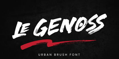 le Genoss is urban brush font inspired by real brush calligraphy with real texture. What's included: - le Genoss.otf - 10 Swashes - Ligatures - Multilingual Support --- Hope you enjoy with our font! Attype Studio
 - Ninfa Serif by dooType,
$22.00 Using the genetic inheritance of semi-serif typeface Ninfa, designed in 2008, Ninfa Serif has 10 styles and designed to fulfill all needs in the design of text - books and magazines.
 - Marlita by Abo Daniel,
$13.00 Marlita is a carefully made script, great for quotes, branding, packaging, wedding card, advertising, and more. It comes with 10 variations of ampersands as well as various titling and ending swashes.
 - Velvenda Megablack - 100% free

- Ace Crikey - Unknown license

- Sharka by PeGGO Fonts,
$10.00 Sharka is heavy sharp condensed system of 7 display typefaces widths, plus 7 italics and 7 alternative version on each family member, inspired on dangerous personality and aggressive reputation of the great white shark, it was thought to create the feel of high impact, high risk action on extreme situations, polemic public scandals, financial advertisement alert, the italic version specially creates the feel of velocity, powerful mechanical energy and related similar topics. Recommended to use in big headlines, magazine covers, advertisements, robust public visual calls, but also, if it applied with good taste and good typographical skills, could be a good choice not only for prints but also for web and digital media devices.
 - Bergsland Round by Hackberry Font Foundry,
$24.95 This is a version of the Bergsland Fashion stylized sans serif font family that is very high-waisted and sleek with rounded terminals called Bergsland Round. Round is my favorite out of the group as it is looser and friendlier. This four-font set has a Regular and a Black plus the italics. The stroke is only slightly modulated. The letterforms are higher, with a more open aperture, and sprinkled with breaks to add light and sparkle. This an attempt at a readable sans serif for text. It has many OpenType features and 465 characters per font: Caps, lower case, small caps, old style figures, numerators, denominators, accents characters and so on.
 - Village Green JNL by Jeff Levine,
$29.00 Village Green JNL is based upon a font called “Giraffe Extended” from the 1892 edition of the MacKellar, Smiths & Jordan type specimen book, and is available in both regular and oblique versions. Its Art Nouveau styling can also fit well with 1960s counter-culture revival projects. According to Wikipedia “A village green is a common open area within a village or other settlement. Historically, a village green was common grassland with a pond for watering cattle and other stock, often at the edge of a rural settlement, used for gathering cattle to bring them later on to a common land for grazing. Later, planned greens were built into the centres of villages.”
 - VLNL Hollandsche Nieuwe by VetteLetters,
$20.00 Raw herring is the Dutch sashimi. Every year at the beginning of the summer a new batch of freshly caught herring arrives at Holland’s quays. Fishing boats actually race each other to be the first boat bringing it home. The fresh herring is called ‘Hollandsche Nieuwe’ (Holland’s new). This typeface, designed by Donald Roos, is based on the typography of Dutch fish shops and stalls. Inspired by lettering from the 30’s and 40’s, infused with some ‘techno’ flavour, Hollandsche Nieuwe is the brand new fresh fishy type flavor on your computer! It is traditionally eaten with sliced onions and pickles. Simply pick up the fish by the tail, open your mouth and take a bite! Enjoy!
 - M Razor HK by Monotype HK,
$523.99 M Razor is so called ""neo Sung-style"" typefaces. Crossbars (橫) and stems (豎) are orthogonal and upright. Their entry and finial points are squarish, parallel without flare. Contrast of strokes is extremely high. This creates sharpness, stiffness in the midst of elegance of Sungti. Even distribution of space, careful positioning, size and proportion of radicals create a slightly expanded, opened and balanced construction. Zhonggong are slightly expanded, its relatively less inter-character spacing makes the line of text better coupled and aligned. Its features and construction create a feel of wholesome, elegance with contrasting sharpness and stiffness. It is best suited for casual, creative display eye-catching text, set upright (non-slanted), non-condensed.
 - Mesquite by Adobe,
$29.00Mesquite is a narrow Tuscan-style typeface designed at Adobe in 1990. Like older Tuscans from the 19th Century, Mesquite has elaborate, creative serif treatments-although the serifs are so unique that it is difficult to call them serifs anymore, they are more like pointy finials. A convex-concave-convex ornamental feature appears on the middle of each vertical and diagonal stroke. Together with the serifs" at the tops and bottoms of each stroke, this feature creates a "tri-band" pattern over text set in Mesquite. Mesquite is not a text face. Aside from its narrowness and decorative qualities, Mesquite has no lowercase. The font's uppercase glyphs have been directly copied and placed in the lowercase range." - Andron 2 ABC by SIAS,
$44.90 Andron 2 ABC is a product developed especially for children’s literature. It is an ideal choice for primers and other books for the age when children are learning to read. The typeface has the same peak typographic quality as any other font of the praised Andron series—the very best is just good enough for our kids, is it not? As a difference from the normal glyph set (as in Andron 1 Latin or Andron Mega), the letters a, g and y have those simpler single-story shapes that resemble the forms usually taught in writing, which are sometimes called infant letterforms. Now, Andron 2 ABC is available in a full four-font family set.
 - Mene One Mexicali by Handselecta,
$38.00This style mimics the flare or upward fade that comes with the use of a spray paint can, as the tops of the letters flare, and become wider. An original font style, named after the border town of Mexicali, this font style falls under the larger umbrella of what is called Cholo-graffiti style. Originally from New Jersey, MENE has made his home in, New York City. He had a brief albeit satisfying career of street bombing in the late 90s that saw its end with a brief encounter with the Vandal Squad. Now a family man, Mene has dedicated himself to the preservation and education of style in its many forms. - Aureata by preussTYPE,
$30.00 Whenever I've stayed in Munich my friend Michael Bundscherer and I go on a typographical expedition. When we talk about that, we remember the bygone world of sign painter. On one of the facades of a furniture shop in Munich, you can discover the lettering of the name in golden letters. This one convinced us because of the simple elegance Art Deco. These letters on the facade are in any case the character set, which forms the basis of this document. The missing (especially the lowercase letters and the numbers) were modeled. The "OPEN" called version tries to replicate the 3-D effect. The font is particularly suitable for shorter texts and headlines.
 - Vagodha by Sronstudio,
$23.00 Introducing "Vagodha" a captivating retro reverse contrast script font that brings a unique and striking visual appeal to your designs. Inspired by vintage aesthetics, this font features an intriguing twist with its reverse contrast, where the thin strokes are replaced by thick ones and vice versa. The result is a font that effortlessly stands out and grabs attention. With its bold and dramatic letterforms, "Vagodha" adds a touch of retro charm and edginess to your projects. Whether you're designing logos, headlines, posters, or any creative work that calls for a standout retro style, this font will make a bold statement. Features: Uppercase and lowercase letters Alternates Letter Ligatures Multilingual, numerals, and punctuation Thank You!
 - PKG Roman Capitals by Posterizer KG,
$19.00 PKG Roman Capitals is one more of Posterizer KG calligraphic fonts, based on Roman Square Capitals letterforms, also called Capitalis Monumentalis, Inscriptional Capitals, Elegant Capitals and Capitalis Quadrata from (about) 2nd century A.D. All graphemes are taken from calligraphic pages written with brush on traditional calligraphic stile, inspired by epigraphic monuments from the Roman Pantheon, Trajan’s Column, and the Arch of Titus. PKG Roman Capitals font is good guides for any who want to study the beautiful proportions of Roman Capitals. In practice, it can be useful for calligraphic sketches and imitation of Roman (European) historical manuscripts. Font contains good stylistic, morphological and metrical balanced Capitals, Small Caps and all the Latin and Cyrillic glyphs.
 - Bookkeeping JNL by Jeff Levine,
$29.00 The extra bold version of R. Hunter Middleton's "Karnak" (produced in 1936 for Ludlow) served as the model for Bookkeeping JNL and is a companion to Bookkeeper JNL (the light weight version of this type design). Middleton based his "Karnak" family of typefaces on the geometric slab-serif "Memphis", which was designed in 1929 by Dr. Rudolf Wolf and released originally by the Stempel Type Foundry of Germany. According to Wikipedia, "Karnak" "was named after the Karnak Temple Complex in Egypt, in reference to the fact that early slab serifs were often called 'Egyptians' as an exoticism by nineteenth-century type founders." Bookkeeping JNL is available in both regular and oblique versions.


