The AB Barberian font, crafted by the creative minds at Redfonts, is a distinct and character-rich typeface that effortlessly captures the essence of calligraphic flair combined with modern typograph...
Argor Got Scaqh, created by Jean-Pierre Mallaroni, is a font that captivates with its gothic charm and historical elegance. This particular typeface is an embodiment of artistic craftsmanship, blendi...
Scrypticali Normal is a font that weaves an enchanting spell on any canvas it graces. Evoking a blend of ancient mystique and modern elegance, this typeface seems to dance between the realms of magic...
Delizioso is a captivating font created by Studio Kmzero, an apt name that translates from Italian to "delicious," perfectly capturing the essence and appeal of this typeface. This font is a blend of...
Ah, Urban Brigade, the font that struts down the street of typography like it owns the place. Imagine, if you will, a graffiti artist and a highly disciplined calligrapher had a love child; Urban Bri...
DreamerOne is not just a font; it’s a journey into the world of imagination and elegance, tailor-made for those who love to infuse their creations with a sense of wonder and aspiration. Its unique ch...
Old Script is a font that transports the reader back to a time when penmanship was an art form, and every letter was crafted with meticulous attention and grace. Imagine the elegant swirls and the re...
RePublic by Suitcase Type Foundry, $75.00 In 1955 the Czech State Department of Culture, which was then in charge of all the publishing houses, organised a competition amongst printing houses and generally all book businesses for the design of a newspaper typeface. The motivation for this contest was obvious: the situation in the printing presses was appalling, with very little quality fonts existing and financial resources being too scarce to permit the purchase of type abroad. The conditions to be met by the typeface were strictly defined, and far more constrained than the ones applied to regular typefaces designed for books. A number of parameters needed to be considered, including the pressure of the printing presses and the quality of the thin newspaper ink that would have smothered any delicate strokes. Rough drafts of type designs for the competition were submitted by Vratislav Hejzl, Stanislav Marso, Frantisek Novak, Frantisek Panek, Jiri Petr, Jindrich Posekany, and the team of Stanislav Duda, Karel Misek and Josef Tyfa. The committee published its comments and corrections of the designs, and asked the designers to draw the final drafts. The winner was unambiguous — the members of the committee unanimously agreed to award Stanislav Marso’s design the first prize. His typeface was cast by Grafotechna (a state-owned enterprise) for setting with line-composing machines and also in larger sizes for hand-setting. Regular, bold, and bold condensed cuts were produced, and the face was named Public. In 2003 we decided to digitise the typeface. Drawings of the regular and italic cuts at the size of approximatively 3,5 cicero (43 pt) were used as templates for scanning. Those originals covered the complete set of caps except for the U, the lowercase, numerals, and sloped ampersand. The bold and condensed bold cuts were found in an original specimen book of the Rude Pravo newspaper printing press. These specimens included a dot, acute, colon, semicolon, hyphens, exclamation and question marks, asterisk, parentheses, square brackets, cross, section sign, and ampersand. After the regular cut was drafted, we began to modify it. All the uppercase letters were fine-tuned, the crossbar of the A was raised, E, F, and H were narrowed, L and R were significantly broadened, and the angle of the leg and arm of the K were adjusted. The vertex of the M now rests on the baseline, making the glyph broader. The apex of the N is narrower, resulting in a more regular glyph. The tail of Q was made more decorative; the uppercase S lost its implied serifs. The lowercase ascenders and descenders were slightly extended. Corrections on the lower case a were more significant, its waist being lowered in order to improve its colour and light. The top of the f was redrawn, the loop of lowercase g now has a squarer character. The diagonals of the lowercase k were harmonised with the uppercase K. The t has a more open and longer terminal, and the tail of the y matches its overall construction. Numerals are generally better proportioned. Italics have been thoroughly redrawn, and in general their slope is lessened by approximatively 2–3 degrees. The italic upper case is more consistent with the regular cut. Unlike the original, the tail of the K is not curved, and the Z is not calligraphic. The italic lower case is even further removed from the original. This concerns specifically the bottom finials of the c and e, the top of the f, the descender of the j, the serif of the k, a heavier ear on the r, a more open t, a broader v and w, a different x, and, again, a non-calligraphic z. Originally the bold cut conformed even more to the superellipse shape than the regular one, since all the glyphs had to be fitted to the same width. We have redrawn the bold cut to provide a better match with the regular. This means its shapes have become generally broader, also noticeably darker. Medium and Semibold weights were also interpolated, with a colour similar to the original bold cut. The condensed variants’ width is 85 percent of the original. The design of the Bold Condensed weights was optimised for the setting of headlines, while the lighter ones are suited for normal condensed settings. All the OpenType fonts include small caps, numerals, fractions, ligatures, and expert glyphs, conforming to the Suitcase Standard set. Over half a century of consistent quality ensures perfect legibility even in adverse printing conditions and on poor quality paper. RePublic is an exquisite newspaper and magazine type, which is equally well suited as a contemporary book face.
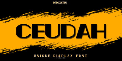
Ceundah font is inspired by thick and thin Hand Sketches. This font can be used for film titles, magazine titles, newspaper front pages, billboards, or company brands.
The Blantick Script, crafted by the talented Ardian Nuvianto, is a captivating font that exudes elegance and charm. This remarkable script font stands out for its fluidity and seamless connectivity b...
Kingthings Versalis is a font that truly captures the essence of elegance and historical depth. Created by the font designer, Kingthings, this typeface draws inspiration from the intricate and ornate...
The Renaiss-Italic font by Manfred Klein is a graceful and elegant typeface that appears as if it has been plucked directly from the pages of history, yet it retains a refreshing modern twist that ma...
The Asrafel font, crafted by the talented David F. Nalle in the late 20th century, is a remarkable creation that beautifully bridges the gap between history and modernity. This font takes its name fr...
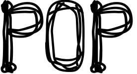
Searching for a font that resembled true children's handwriting, this font's creator designed a font from his own first grade penmanship assignments. Ideal for anything related to children.
Brannboll Fet, a creation of the talented Swedish typeface designer Måns Grebäck, is a striking font that seamlessly bridges the gap between vintage charm and contemporary flair. Known for his master...
Angryblue is not just a font; it's a powerful statement wrapped in the attire of typographic artistry, courtesy of the creative mind behind the brand, Angryblue. Imagine if a rebellious punk rocker, ...
Imagine a font that strides into the room with the confidence of a heavyweight champion, yet possesses the gentle touch of a calligrapher. That's Tabarra Black by deFharo for you. Crafted by the tale...
Ah, the font Precious by Bolt Cutter Design, it's quite an artistic gem! Imagine a font that dances between elegance and whimsy, that's Precious for you. It's not just a name; it's a perfect descript...
The Ginga> font, created by the talented Billy Argel, is an embodiment of creativity and flair that effortlessly captures attention. Designed with a unique blend of street art influence and elegant c...
Arabolical, designed by BenTagain, is a striking font that stands out for its unique blend of traditional Arabic calligraphic art and modern design elements. This font is a visual feast, merging the ...
The Mordred font, crafted by the talented Paul Reid, is a unique and expressive typeface that captures the essence of medieval times with a modern twist. Named after the notorious character from Arth...
Velour is a distinctive and elegant typeface that gracefully walks the line between contemporary innovation and classical formality. Its creation is a testament to the meticulous craftsmanship in fon...
Welcome, typographic enthusiast! Bask in the boldness of Prescript Bold, the font that decided "subtle" was a word best left in the dictionary, untouched. Picture the confident brushstrokes of an elo...
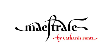
Maestrale is a paradigm-breaking new take on calligraphy, built around a compact, serif-style core and outrageously long, flamboyant extenders. At large sizes, its confident, charismatic lettershapes are ideally suited for branding and decorative uses, whereas longer texts at smaller sizes naturally weave themselves into a flowing texture. The font comprises 1299 glyphs, including many stylistic alternates, ligatures, small capitals, and initial, terminal, and linking forms, and offers extensive OpenType programming to support them. The calligraphic form of Maestrale is complemented by a matching text font (Maestrale Text) with short extenders, available in three cuts (a serif-style Roman, an upright Cursive, and a tilted Italic). Maestrale is all about the lowercase; its capitals are deliberately understated so as not to steal the limelight. In fact, the font works very well when set exclusively in lowercase. Maestrale�s small capitals are fitted into the core space of the lowercase, allowing them to be freely interspersed with lowercase characters. Alternately, an OpenType feature is available to replace a and e in small-caps text with their lowercase equivalents for a fresh unicase look. Since alternates and ligatures play such an important role, Maestrale offers three different modes of use. The most straightforward approach is simply to start typing using Maestrale Pro � the extensive OpenType programming will ensure that collisions between extenders are avoided and attractive ligatures are substituted for common glyph combinations. A more interactive approach is provided by the font Maestrale Manual, which allows the user to manually select alternate forms and ligatures even in typographically unsavvy applications, such as PowerPoint (as long as standard ligatures are supported). Stylistic alternates are simply represented as ligatures of their base forms with one or more instances of the rarely-used by easily-accessed characters "~" (ASCII tilde) and "`" (spacing grave accent); linking forms are built with �_� (underscore), multi-character ligatures with "|" (pipe), and initial and terminal forms with the �less than� and �greater than� characters. For instance, the Maestrale wordmark in the posters above was simply typeset with the string (`ma`est|r_a```l```e)| in Maestrale Manual (The parentheses represent �less than� and �greater than� characters here.) Feel free to type this string into the test line below and see what happens! Make sure Standard Ligatures are enabled. An instruction sheet listing all alternate forms and their accessibility is available from the Gallery tab on this page. The third mode of usage is aimed at professional designers, who make use of sophisticated software with extensive OpenType support. These power users are advised to use the font Maestrale Pro again, where all glyphs are accessible as stylistic alternates. Maestrale Text is a less extravagant but more versatile variation on the design of Maestrale, replacing Maestrale�s swashes with efficiently compact extenders. It is intended to serve as a perfectly matching text companion to Maestrale calligraphy, but constitutes a full-fledged typeface in its own right. It is equally at home at display sizes as it is in pull quotes, titles, and high-impact blocks of text. Maestrale Text comes in three complementary faces: A serif-style Roman, an upright Cursive, and a tilted Italic. Maestrale is the Italian word for �masterful�. It is also the traditional Italian name for the northwesterly mediterranean wind, better known by its French name, Mistral. Acknowledgements: I am grateful to the helpful souls on the Typophile forums for extensive feedback and encouragement on Maestrale, and to the TypeDrawers forum for feedback on Maestrale Text. This font is dedicated to Simone.
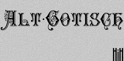
Alt-Gotisch Verzierte is a typeface of decorative initials that is Victorian in style and bears a close family resemblance to the many ornamental tuscans cut throughout the nineteenth century by British foundries. Instead of the bifurcated terminals of the archetypical tuscan (see Figgins Tuscan by HiH or Stereopticon by Dan X. Solo), these letters display what Nicolete Gray might call a “wedge and bite” design -- as if they started with the wedge serif of a latin form and someone came along and took a perfectly round bite out of the wedge. We need not dwell on the lack of teeth marks. The calligraphic curls and flourishes are often graceful, sometimes a bit contrived, but always complex. There is a busyness that marks the style of the period. If you ever see an old photograph of a well-appointed Victorian parlor, you will recognize that same quality of busyness. Overdone is a word that frequently comes to mind. Alt-Gotisch Verzierte means “adorned or decorated old gothic.” The typeface is attributed by Alexander Nesbitt to an unidentified German foundry of the nineteenth century (Decorative Alphabets and Initials, Dover, New York 1987, plate 92). The designer is unknown. Our font is supplied with a lower case that is similar to the upper case, but is 15% shorter and is simplified by the omission of the decorative vines. For the lower case, alternate letters A, E, & T; and ligatures LE, OT & LY have been supplied. In addition, a few small decorative vines were planted here and there for optional use. An accented upper case is not part of the original design and is not here supplied. This design is also seen under the name “Sentinel” -- as always, it is worthwhile to compare the completeness of the character set and the faithfulness of the rendering. We believe you will agree that we provide a balance of quality and value that is unmatched in the contemporary marketplace. Alt-Gotisch Einfach is a simplified version of Alt-Gotisch Verzierte. The vine-less lower case of the Verzierte font is the upper case in Einfach. For a lower case for Einfach, the letters were further simplified by stripping away the three-dimensional outline, down to the bare bones and bites, as it were. Einfach, in fact, means “simple” or “plain.” It is interesting to note that this bare bones & bite lower case bears (I have a special license to use two homonyms in the same sentence) a striking resemblance to the 15th & 16th century ornamental letters from Westminster Abbey shown in Plate 47 of Alexander Nesbitt’s Decorative Alphabets and Initials (Dover, New York 1987).
The Rodrigues PERSONAL USE ONLY font, designed by the renowned typographer Måns Grebäck, is a testament to his craftsmanship in creating visually compelling and unique typefaces. This font captures a...
Monofur is a distinctive font in the realm of monospaced typefaces. Unlike traditional monospaced fonts that prioritize uniformity and simplicity, Monofur emphasizes character and readability with it...
Bestermind, created by Thirtypath Studio, epitomizes modern elegance and artistic expressiveness, embodying a blend of classic charm and contemporary flair. Bestermind dives into the world of typogra...
Impregnable Personal Use Only by Måns Grebäck is a font that catches the eye with its elegant and distinctive character. Designed by the talented calligrapher and type designer Måns Grebäck, who is r...
Cienfuegos is a compellingly unique typeface designed by deFharo, a Spanish typeface designer renowned for his creativity and diverse range of fonts. With its roots deeply embedded in typography's in...
The Angelique Rose font, crafted by the talented type designer deFharo, stands as a whimsical and enchanting script font, capturing the essence of hand-written elegance with a modern twist. Its desig...
Oliandre Demo, designed by Katario Studio, is a font that effortlessly captures the essence of modern sophistication and artistic expression, blended with a hint of whimsicality. This distinctive fon...