10,000 search results
(0.068 seconds)
- Tale by Suomi,
$25.00 Tale is an experiment to convert the script-style calligraphy into bitmap format. The two variants have the same dimensions, but (as the naming suggests), Forty has double amount of pixels in it when compared to Twenty. Both variants have hand made bitmaps to compliment these correlating point sizes, and you can always get the appropriate bitmaps by multiplying by two.
 - Faithful Colony by Creativemedialab,
$20.00 Faithful Colony is a modern, elegant, classic typeface with a timeless look. It comes with seven weights ranging from thin to black, matching italics, and a variable format. Faithful Colony is perfect for fashion-related concepts, Luxury and Elegant design, Classy or high-end branding, logo, and many more. Try to combine the regular and italic styles for a modern and elegant look.
 - Bix Metric by S6 Foundry,
$20.00 Bix Metric is a stylistic display font developed within a set grid. The mono-spaced first set of the family comes in 3 styles in both upper and lowercase glyphs allowing mixing of infinite combinations. Perfectly suited for headlines, large-format prints, brand identities, social media, advertising, editorial design, posters, magazines, logos, headings, digital and more. With multi-language support.
 - Moyenage by Storm Type Foundry,
$55.00Blackletter typefaces follow certain fixed rules, both in respect to their forms and to the orthography. Possibly, they were a reaction to the half-developed Carolingian minuscule which was soon to end in the Latin script. Narrow, ordered script was to replace the round, hesitant and shattered shapes of letters in order to simplify writing, to unify the meaning of individual letters, and to save some parchment, too. Opposed to the practice common in monasterial scriptoriums where Uncial, Irish and Carolingian inspiration flew freely and as a result, the styles of writing differed in each monastery, the blackletter type was to define one, common standard. It was to express spiritual verticality, in perfect tune with the architecture of the Gothic era. Typography became an integral part of the overall style of the period. The pointed arch and the blackletter type were the vanguard of the spectacular transformation from the Middle Ages towards the modern era, they were a celebration of a time when works of art were not signed by their makers yet. Some unfortunate souls keep linking blackletter solely with Germany and the Third Reich, while the truth is that its direct predecessor, the Gothic minuscule, evolved mostly in France. Even Hitler himself indicated blackletter type obsolete in the age of steel, iron and concrete – thus making a significant contribution to the spreading of the Latin script in Germany. Once we leave our prejudice aside, we find that the shapes of blackletter type have exceptional potential, unheard of in sans-serif letterforms. The lower case letters fit into an imaginary rectangle which is easily extended both upwards and sideways. In its scope and in the name itself, the Moyenage type family project is to celebrate the diversity of the Middle Ages. I begun realizing the urge to design my own blackletter when visiting the beer gardens of Munich and while walking through the villages of rural Austria. The letters from the notice boards of inns are scented with spring air, with the flowers of cudweed, with white sausage and weissbier. The crooked calligraphic hooks and beaks seem to imitate the hearty yodeling of local drinkers and the rustle of the giant skirts of girls who distribute the giant wreaths of beer jugs. Moyenage is, however, a modern replica of blackletter, so it contains some otherwise unacceptable Latin script elements in upper case. I chose these keeping the modern reader in mind, striving for better legibility. The font is drawn as if written with a flat pen or brush, and with the ambition to, perhaps, serve as a calligraphic model. In medium width, the face is surprisingly well legible; it is perfect for menus as well as posters and CD covers for some of the heavier kinds of music. It has five types of numerals and also a set of Cyrillic script, symbolising the lovelorn union of Germans and Russians in the 20th century. Thus, it is well suited for the setting of bilingual texts of the German classic literature, which, according to the ancient rules, must not be set in Latin script. - As of my last update in April 2023, "Paul6" does not appear to be a widely recognized or documented font within the typographic community or among the standard collections from major type foundries. ...
- The Thief Bird by Lemur,
$14.00 The Thief Bird is an informal grotesque font. Although informal and grotesque may seem to be two quite different ideas, we have to dig into the origin of this typeface in order to understand the matter. The concept behind The Thief Bird was inspired by the adaptation that the vintage sign painters made when they took the grotesque style characters they saw in newspapers and magazines and reproduced them using a brush, aiming to make the prices of the products displayed on wooden boards stand out, as opposed to highlighting large headlines (such as the idea behind fonts like Franklin Gothic). The Thief Bird takes the language from sign painters and turns it into a font --this time around not aiming to set prices but to bring children stories to life. Thus, some legibility features from grotesque fonts were mixed with the brush calligraphy to add grace and zest to a font intended for children. The Thief Bird is a playful display font, with cheerful ligatures and alternate characters. It is really attractive for setting short paragraphs that tell stories for little people. The Thief Bird has one single weight and it’s ideal to be used in storybooks, candy packaging, films, toys, logos, labels, etc. The font has an extended set of 643 characters supporting 219 Latin languages. It has a complete set of small caps, sensitive cases, more than 30 pairs of ligatures, alternate characters and much more. This cool, informal and laid back typeface will be the perfect match for illustrations of fairy tales, comics for children and any product or publishing for the little ones. The Thief Bird supports this languages: Abenaki, Afaan Oromo, Afar, Afrikaans, Albanian, Alsatian, Amis, Anuta, Aragonese, Aranese, Aromanian, Arrernte, Arvanitic (Latin), Asturian, Atayal, Aymara, Bashkir (Latin), Basque, Bemba, Bikol, Bislama, Bosnian, Breton, Cape Verdean Creole, Catalan, Cebuano, Chamorro, Chavacano, Chichewa, Chickasaw, Cimbrian, Cofán, Corsican Creek,Crimean Tatar (Latin),Croatian, Czech, Dawan, Delaware, Dholuo, Drehu, Dutch, English, Estonian, Faroese, Fijian Filipino, Finnish, Folkspraak, French, Frisian, Friulian, Gagauz (Latin), Galician, Ganda, Genoese, German, Gikuyu, Gooniyandi, Greenlandic (Kalaallisut)Guadeloupean, Creole, Gwich’in, Haitian, Creole, Hän, Hawaiian, Hiligaynon, Hopi, Hotcąk (Latin), Hungarian, Icelandic, Ido, IgboI, locano, Indonesian, Interglossa, Interlingua, Irish, Istro-Romanian, Italian, Jamaican, Javanese (Latin), Jèrriais, Kala Lagaw Ya, Kapampangan (Latin), Kaqchikel, Karakalpak (Latin), Karelian (Latin), Kashubian, Kikongo, Kinyarwanda, Kiribati, Kirundi, Klingon, Ladin, Latin, Latino sine Flexione, Latvian, Lithuanian, Lojban, Lombard, Low Saxon, Luxembourgish, Maasai, Makhuwa, Malay, Maltese, Manx, Māori, Marquesan, Megleno-Romanian, Meriam Mir, Mirandese, Mohawk, Moldovan, Montagnais, Montenegrin, Murrinh-Patha, Nagamese Creole, Ndebele, Neapolitan, Ngiyambaa, Niuean, Noongar, Norwegian, Novial, Occidental, Occitan, Old Icelandic, Old Norse, Oshiwambo, Ossetian (Latin), Palauan, Papiamento, Piedmontese, Polish, Portuguese, Potawatomi, Q’eqchi’, Quechua, Rarotongan, Romanian, Romansh, Rotokas, Sami (Inari Sami), Sami (Lule Sami), Sami (Northern Sami), Sami (Southern Sami), Samoan, Sango, Saramaccan, Sardinian, Scottish Gaelic, Serbian (Latin), Seri, Seychellois Creole, Shawnee, Shona, Sicilian, Silesian, Slovak, Slovenian, Slovio (Latin), Somali, Sorbian (Lower Sorbian), Sorbian (Upper Sorbian), Sotho (Northern), Sotho (Southern), Spanish, Sranan, Sundanese (Latin), Swahili, Swazi, Swedish, Tagalog, Tahitian, Tetum, Tok Pisin, Tokelauan, Tongan, Tshiluba, Tsonga, Tswana, Tumbuka, Turkish, Turkmen (Latin), Tuvaluan, Tzotzil, Uzbek (Latin), Venetian, Vepsian, Volapük, Võro, Wallisian, Walloon, Waray-Waray, Warlpiri, Wayuu, Welsh, Wik-Mungkan, Wiradjuri, Wolof, Xavante, Xhosa, Yapese, Yindjibarndi, Zapotec, Zulu, Zuni.
 - Decked Out NF by Nick's Fonts,
$10.00Inlines that go over, under sideways, down! Deck out your headlines in grand style with this unusual inline face, based on Dektiv, a seventies-style classic from "Homage to the Alphabet." Both versions include the complete Latin 1252, Central European 1250 and Turkish 1254 character sets, as well as localization for Moldovan and Romanian. - Grieshaber Monos NF by Nick's Fonts,
$10.00 The name says it all: here's a faithful revival of a Schelter und Geiseck release from 1911, designed by Moritz Greishaber and originally called Monos. Although it predates the Art Deco era, it has a Deco vibe. Both versions of this font support the Latin 1252, Central European 1250, Turkish 1254 and Baltic 1257 codepages.
 - Posh Soiree NF by Nick's Fonts,
$10.00The American Type Founders 1923 Specimen Book and Catalogue called the inspiration for this typeface Engravers Text; it could easily be called elegant, enchanting and erudite, as well. The inline version of this font includes the complete 1252 Latin and 1250 Central European character sets; the Solid version includes the Turkish 1254 set in addition. - Maxed Out NF by Nick's Fonts,
$10.00 This family of faces is based on the series Riverside Drive, designed by Peter Max for Photo-Lettering Inc. in the early 1970s. However, several letters have been altered to maintain design consistency and to improve legibility. Both versions of this font support the Latin 1252, Central European 1250, Turkish 1254 and Baltic 1257 codepages.
 - Habana Sweets NF by Nick's Fonts,
$10.00A typeface from the 1873 Miller & Richard of Glasgow specimen book of 1873 named Cuban provided the inspiration for this festive face. Its graceful curves and open stance gently whisper nostalgia, with traces of both the quaint and the exotic. Both versions contain the complete Latin 1252, Central European 1250 and Turkish 1254 character sets. - White Glory by Yumna Type,
$16.00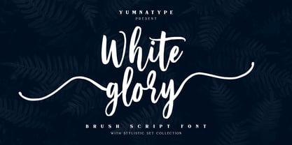 White Glory is a beautiful brush font. The texture from this natural brush font will make your design more beautiful and powerful. This font is suitable for any design like branding, quotes, t-shirt printing and more. Features: Accents (Multilingual Characters) 104 beautiful stylistic alternates PUA encoded Numerals and punctuations (OpenType standard) Design by yumnatype
 - Doright Black NF by Nick's Fonts,
$10.00 This typeface takes its design cues from Dudley Upright, a Dan X. Solo find from the sixties. This version is considerably wider than the original, which increases its legibility while retaining its flower-power vibe. Both flavors of this font feature the 1252 Latin, 1250 Central European, 1254 Turkish and 1257 Baltic character sets.
 - Jacopo Mediaeval NF by Nick's Fonts,
$10.00This stately typeface takes its inspiration from Erbar Medieval, designed by Jakob Erbar for the Ludwig & Mayer foundry of Frankfurt am Main, released in 1914. Equally at home in headlines or text blocks, this face is both elegant and inviting. Both versions contain the complete Latin 1252, Central European 1250 and Turkish 1254 character sets. - Bistern by Letterhend,
$19.00 About the Product Bistern is a typeface which is inspired by vintage lettering sign and art. While this font has a victorian touch, it still looks bold and solid. Very suitable for for headline, logotype, apparel, invitation, branding, packaging, advertising etc with old school / retro theme. This typeface contains with beautiful decorative ornaments in vector format that ready to use to create a vintage lettering in sec. It also comes in uppercase, lowercase, punctuations, symbols & numerals, stylistic set alternate, ligatures, etc also support multilingual and already PUA encoded. Features : ornaments in vector format uppercase & lowercase numbers and punctuation multilingual alternates and ligatures swashes PUA encoded We highly recommend using a program that supports OpenType features and Glyphs panels like many of Adobe apps and Corel Draw, so you can see and access all Glyph variations. How to access opentype feature : letterhend.com/tutorials/using-opentype-feature-in-any-software/
 - Yahoo - Unknown license

- doctorBob - Unknown license

- Downcome - 100% free

- Burris - Unknown license

- Nu School Munitions - Unknown license

- WW1 A - Unknown license

- Swatch it - Unknown license

- GearBox - Unknown license

- BattleLines - Personal use only

- Avatar - Unknown license

- Christa - Unknown license

- Baklava - Unknown license

- Chaiee - Unknown license

- Hendershot - 100% free

- bobTag - Unknown license

- ZeroHour - Unknown license

- KAStorm - Unknown license

- Facelift - Unknown license

- Manga Temple - Personal use only

- Cancontrol - Unknown license

- Sweden Funkis Straight - Unknown license

- Shirt - Unknown license

- analog - Unknown license

- crappyJoe - Unknown license

- Babelfish - Unknown license


