10,000 search results
(0.032 seconds)
- Scoglietto - Unknown license

- Blue Highway D Type - Unknown license

- Tristan - Unknown license

- M+ 2c - Unknown license

- Chachie - Personal use only

- Fudd - Unknown license

- Bulka - Unknown license

- Donaire Black - Personal use only

- Dream Orphanage by Typodermic,
$11.95 Welcome to Dream Orphanage, a typeface that will bring warmth and personality to your design projects! With its tidy and friendly sans-serif style, Dream Orphanage is a high-quality reconstruction of the beloved 1990s typeface, Dream Orphans. But we didn’t stop there. We’ve included an alternative style of “g” in OpenType-capable apps, giving you even more creative freedom to make your designs stand out. And with seven weights and italics to choose from, you’ll have no shortage of options to craft the perfect look for your project. Whether you’re designing a greeting card for a loved one, a website for a small business, or anything in between, Dream Orphanage will bring a touch of charm and friendliness that will capture the hearts of your audience. So don’t wait—start creating today with Dream Orphanage! Most Latin-based European writing systems are supported, including the following languages. Afaan Oromo, Afar, Afrikaans, Albanian, Alsatian, Aromanian, Aymara, Bashkir (Latin), Basque, Belarusian (Latin), Bemba, Bikol, Bosnian, Breton, Cape Verdean, Creole, Catalan, Cebuano, Chamorro, Chavacano, Chichewa, Crimean Tatar (Latin), Croatian, Czech, Danish, Dawan, Dholuo, Dutch, English, Estonian, Faroese, Fijian, Filipino, Finnish, French, Frisian, Friulian, Gagauz (Latin), Galician, Ganda, Genoese, German, Greenlandic, Guadeloupean Creole, Haitian Creole, Hawaiian, Hiligaynon, Hungarian, Icelandic, Ilocano, Indonesian, Irish, Italian, Jamaican, Kaqchikel, Karakalpak (Latin), Kashubian, Kikongo, Kinyarwanda, Kirundi, Kurdish (Latin), Latvian, Lithuanian, Lombard, Low Saxon, Luxembourgish, Maasai, Makhuwa, Malay, Maltese, Māori, Moldovan, Montenegrin, Ndebele, Neapolitan, Norwegian, Novial, Occitan, Ossetian (Latin), Papiamento, Piedmontese, Polish, Portuguese, Quechua, Rarotongan, Romanian, Romansh, Sami, Sango, Saramaccan, Sardinian, Scottish Gaelic, Serbian (Latin), Shona, Sicilian, Silesian, Slovak, Slovenian, Somali, Sorbian, Sotho, Spanish, Swahili, Swazi, Swedish, Tagalog, Tahitian, Tetum, Tongan, Tshiluba, Tsonga, Tswana, Tumbuka, Turkish, Turkmen (Latin), Tuvaluan, Uzbek (Latin), Venetian, Vepsian, Võro, Walloon, Waray-Waray, Wayuu, Welsh, Wolof, Xhosa, Yapese, Zapotec Zulu and Zuni.
 - Toxigenesis by Typodermic,
$11.95 Inspired by the sleek lines of consumer electronics and the bold shapes of automobile design, Toxigenesis is the ultimate typeface for conveying a sense of scientific and industrial power. With its wide, plastic letterforms, Toxigenesis commands attention and exudes confidence, making it the perfect choice for any high-tech design project. Whether you’re designing the next generation of consumer electronics, presenting cutting-edge scientific research, or creating sleek industrial products, Toxigenesis is the font you need to make your message stand out. Available in five weights and italics, Toxigenesis gives you the flexibility to create powerful, attention-grabbing designs that convey your message with clarity and style. Most Latin-based European, Vietnamese, Greek, and most Cyrillic-based writing systems are supported, including the following languages. Afaan Oromo, Afar, Afrikaans, Albanian, Alsatian, Aromanian, Aymara, Azerbaijani, Bashkir, Bashkir (Latin), Basque, Belarusian, Belarusian (Latin), Bemba, Bikol, Bosnian, Breton, Bulgarian, Buryat, Cape Verdean, Creole, Catalan, Cebuano, Chamorro, Chavacano, Chichewa, Crimean Tatar (Latin), Croatian, Czech, Danish, Dawan, Dholuo, Dungan, Dutch, English, Estonian, Faroese, Fijian, Filipino, Finnish, French, Frisian, Friulian, Gagauz (Latin), Galician, Ganda, Genoese, German, Gikuyu, Greenlandic, Guadeloupean Creole, Haitian Creole, Hawaiian, Hiligaynon, Hungarian, Icelandic, Igbo, Ilocano, Indonesian, Irish, Italian, Jamaican, Kaingang, Khalkha, Kalmyk, Kanuri, Kaqchikel, Karakalpak (Latin), Kashubian, Kazakh, Kikongo, Kinyarwanda, Kirundi, Komi-Permyak, Kurdish, Kurdish (Latin), Kyrgyz, Latvian, Lithuanian, Lombard, Low Saxon, Luxembourgish, Maasai, Macedonian, Makhuwa, Malay, Maltese, Māori, Moldovan, Montenegrin, Nahuatl, Ndebele, Neapolitan, Norwegian, Novial, Occitan, Ossetian, Ossetian (Latin), Papiamento, Piedmontese, Polish, Portuguese, Quechua, Rarotongan, Romanian, Romansh, Russian, Rusyn, Sami, Sango, Saramaccan, Sardinian, Scottish Gaelic, Serbian, Serbian (Latin), Shona, Sicilian, Silesian, Slovak, Slovenian, Somali, Sorbian, Sotho, Spanish, Swahili, Swazi, Swedish, Tagalog, Tahitian, Tajik, Tatar, Tetum, Tongan, Tshiluba, Tsonga, Tswana, Tumbuka, Turkish, Turkmen (Latin), Tuvaluan, Ukrainian, Uzbek, Uzbek (Latin), Venda, Venetian, Vepsian, Vietnamese, Võro, Walloon, Waray-Waray, Wayuu, Welsh, Wolof, Xavante, Xhosa, Yapese, Zapotec, Zarma, Zazaki, Zulu and Zuni.
 - Confab by Typodermic,
$11.95 Introducing Confab, the futuristic typeface that will revolutionize the way you communicate. Crafted with pure geometric forms, this unique font is a testament to the power of technology and design. With its technical letterforms and stark appearance, Confab is more than just a font—it’s a statement. Whether you’re designing a sleek logo or crafting a cutting-edge ad campaign, this font will lend an unfamiliar voice to your message. Imagine your words soaring across the digital landscape, leaving a lasting impression on your audience. Confab makes it possible with its bold, innovative design and stunning visual impact. So why settle for ordinary when you can elevate your message with Confab? Try it today and experience the power of typography in a whole new way. Most Latin-based European writing systems are supported, including the following languages. Afaan Oromo, Afar, Afrikaans, Albanian, Alsatian, Aromanian, Aymara, Azerbaijani, Bashkir (Latin), Basque, Belarusian (Latin), Bemba, Bikol, Bosnian, Breton, Cape Verdean, Creole, Catalan, Cebuano, Chamorro, Chavacano, Chichewa, Crimean Tatar (Latin), Croatian, Czech, Danish, Dawan, Dholuo, Dutch, English, Estonian, Faroese, Fijian, Filipino, Finnish, French, Frisian, Friulian, Gagauz (Latin), Galician, Ganda, Genoese, German, Gikuyu, Greenlandic, Guadeloupean Creole, Haitian Creole, Hawaiian, Hiligaynon, Hungarian, Icelandic, Igbo, Ilocano, Indonesian, Irish, Italian, Jamaican, Kaingang, Kanuri, Kaqchikel, Karakalpak (Latin), Kashubian, Kikongo, Kinyarwanda, Kirundi, Kurdish (Latin), Latvian, Lithuanian, Lombard, Low Saxon, Luxembourgish, Maasai, Makhuwa, Malay, Maltese, Māori, Moldovan, Montenegrin, Nahuatl, Ndebele, Neapolitan, Norwegian, Novial, Occitan, Ossetian (Latin), Papiamento, Piedmontese, Polish, Portuguese, Quechua, Rarotongan, Romanian, Romansh, Sami, Sango, Saramaccan, Sardinian, Scottish Gaelic, Serbian (Latin), Shona, Sicilian, Silesian, Slovak, Slovenian, Somali, Sorbian, Sotho, Spanish, Swahili, Swazi, Swedish, Tagalog, Tahitian, Tetum, Tongan, Tshiluba, Tsonga, Tswana, Tumbuka, Turkish, Turkmen (Latin), Tuvaluan, Uzbek (Latin), Venda, Venetian, Vepsian, Võro, Walloon, Waray-Waray, Wayuu, Welsh, Wolof, Xavante, Xhosa, Yapese, Zapotec, Zarma, Zazaki, Zulu and Zuni.
 - Beatarisa by Phoenix Group,
$7.00 Beatarisa is inspired by my handwriting. This font is feminine and playful, you can use it in various categories including making banners and posters etc. The name "Beatarisa" derived from Hawai language and means "he who brings happiness". We hope this font can be a source of happiness for everyone who uses it.
 - Roughwork by Scriptorium,
$18.00Roughwork was developed in response to repeated requests for a set of initials which looked like sketches of a font in development. So we took our True Golden font and reverse-engineered the lines and arcs needed to define the character shapes and the result has the look of original typeface drawings. - Recons by Almarkha Type,
$25.00 Our new product Rekons - Sport Display, inspired by the title of the sports poster and We make it very energetically. Rekons font with strong and challenging nuances. very suitable for the title, typography, clothes, Poster, magazines, brochures, packaging,Websites and much more for your design needs, making your designs more modern and professional.
 - Raguki by Saga Studio,
$20.00 Raguki is a sans serif display font with a modern and unique style. Aesthetic letterforms with stylistic ink traps make this font have bags of personality. Raguki has open-type features (salt and ss01) that enable the user to transform the letterforms to create different designs. We hope you enjoy it. Saga Studio
 - Anzura by Mightyfire,
$10.00 Anzura is a decorative font that can be used for book title, logo brand, poster and many more. The looks is vintage classic yet clean, with a little decoration on each letter. We have two styles, Anzura Regular and Anzura Shadow. Both are beautiful! Enjoy in cooking something creative with Anzura font! :)
 - Fastbrag by Konstantine Studio,
$17.00 Fastbrag was inspired by the vintage sign painting culture in the early 1900s. We talk about visuals from the building-sized messages, billboards, storefronts, windows, doors, and menus. A shot to deliver the heritage and historical vibes of storytelling, and branding. To give a strong persona and character to your graphic design projects.
 - Rochalle by Liartgraphic,
$20.00 Meet our newest product, this product we call Rochalle font. Rochalle font is a cute typeface font A little unique and firm touch. The Rochalle font is great to use on: fashion magazines, logos, and photography, landing pages, flyers, What is included? -multilingual support - alternative - . fastener Thank you, greetings Ali Sifak Muftar
 - Nuff Said by Comicraft,
$19.00Comicraft's President and Tiger Rank-and-File (recently demoted from First Tiger for kissing a girl) stayed up all night with a big box of crayons and created a unique series of illustrations which, we confidently predict, will be widely known as the last word in comic book lettering fonts... 'NUFF SAID! - Palm Honey by PeachCreme,
$19.00 We were quite often asked to create heart font with modern letters, stepping back a little from a calligraphic look (Hi, Sophia Ronald!) Palm Honey beautifully works for modern wedding stationery projects. Palm Honey has beginning lowercase, ending lowercase, connecting heart lowercase alternates. You can test your custom text in the box above!
 - Green Nature by ZetDesign,
$10.00 We're introducing our new product that we named Green Nature..... this font is inspired by leaves, so it gives a beautiful and natural impression. This font is very suitable for clothing, logos, magazines, banners, etc. With natural touch, this font is the best choice for your natural business. Files included: green nature.otf
 - DonJulio by Autographis,
$39.50 DonJulio is a handwritten most-of-the-time connecting script, that dates back to the 1930s in Germany. We tried to keep it as true to the original as possible, conserving the shaky and uneven appearance of those days. DonJulio can be mixed together with its very embellished sister font Donna Julia.
 - Jesitta Signature Swash by Mega Type,
$10.00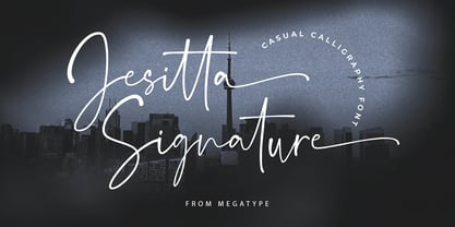 Jesitta Signature Font is a modern and elegant signature style script font with magical ink strokes. Jesitta Signature is a great choice for watermarks on photography, advertising, logos & branding, watermarks, weddings, invitations, product design, labels and other design projects. Please contact us if you have any questions, we are happy to help you!
 - Dolcissimo by Resistenza,
$39.00 Dolcissimo is a sans serif typeface with a geometric skeleton that has been built drawn by hand which makes it a friendly typeface. This font has more than 28 decorative styles, that can be overlapped, because Dolcissimo is a layered font. We highly recommend to use Dolcissimo for packaging design, logo branding, ads.
 - Ettielier by Ettie Kim Studio,
$175.00 We are so pleased to introduce Ettielier, a refined, full-featured calligraphy font by Ettie Kim Studio. This fully unicode-mapped, high-powered font comes with multilingual support and 500+ characters, including stylistic alternates, double-letter ligatures, and swashes to achieve an authentic handwritten look that mimics Ettie Kim’s signature calligraphy style.
 - Malkuns by Gartype Studio,
$15.00 Hello buddy ! This time we will introduce to you Malin Kundang ! Malin Kundang comes with a lot of Alternate to make your design more cool and of course come with Multilingual characters. This Font that are suitable for many of your needs such as book covers, titles, logos, letterheads, quotes, posters, etc
 - Convero by Liartgraphic,
$30.00 How are you guys doing ? i’m sure that’s nice! Meet our newest product, we call this product Convero font. Convero font are cute typeface font Whit a uniqe touch and assertive Convero font is very nice to use on: fashion magazine, logos, ,and photography, landing page, fliyer, What’s includes - multilingual support - alternate - ligature
 - Laca Pro by Nova Type Foundry,
$52.99 Laca Pro now supports Greek and Cyrillic scripts. The letter shapes capture the playful spirit of Laca. The added language support brings even more usefulness for the use of Laca for branding, editorial and other projects. Communication is one of our passions, by supporting other scripts we want to create better communication.
 - Bodoni by Bitstream,
$29.99 Morris Fuller Benton started the Bodoni revival with this version for ATF in the early years of the 20th century. We consider it the first accurate revival of a historical face for general use. Sturdy and a little mechanical in the 19th century tradition, this is the Bodoni series familiar to us all.
 - Naroline by Graptail,
$15.00 Naroline is a typefaces with a strong characteristic. The ideas are from Art Nouveau era, explore some of other art era and combining them into strong characteristic Naroline. The final fonts are looks Classic yet Modern, like what we do on the preview above, how the fonts can "stands" within your design.
 - Meltdown by Comicraft,
$19.00 Misshapen Muck Monster Mutations are on the loose... Their creepy hyper-irradiated bodies have emerged from the blasted desolate wastes of The Forbidden Zone! Could this be Doomsday... or did we just leave one of our typefaces on the radiator? Either way, Meltdown is the perfect font for monstrous inhuman atrocities everywhere.
 - Kavarian Serif by Maulana Creative,
$15.00 Kavarian Serif is a handmade Modern Elegant Serif Handmade Typeface, which is combining modern and classic typography with some awesome alternates. Yes we went back to early 1800s, to bring classic touch on this decade. Ligatures: - va ri sn ti gi Font Include: - Ligatures - Multi-lingual support Thanks for use this font. MaulanaCreative.
 - Estienne by Solotype,
$19.95Many fonts have carried this name. Ours goes back to just before 1900 in France. This general style had considerable popularity among job printers all over Europe. We have even seen it used for name imprints on medical school diplomas, which seems a bit grotesk. Surely you can do something better with it. - Sugary Pancake by Hanoded,
$15.00 Sugary Pancakes - ahh, my kids love them. We don't make them too often, as they are 'energetic' enough as it is. This calorie-rich font is ideal for Children's Books and posters: it is fun, bouncy, very legible and full of character. Comes with a topping of diacritics and a stack of happiness.
 - Creepy Crawly by Comicraft,
$19.00There are worms in the earth, hairy bugs under the bed and strange bloodshot eyeballs peering at you from out of the closet. Lilou's Creepy Crawly font is perfect for scaring away Trick-or-Treaters, just install our font and print out your signs with the legend: WE EAT LITTLE CHILDREN HERE! - Lyra by Canada Type,
$39.95 Lyra is an Italian Renaissance script that might have developed if metal type had not broken the evolution of broad pen calligraphy. It lies in the area between the humanist bookhand and the chancery cursive, combining the fullness and articulation of the Roman letters with a moderate italic slant and condensation. A steep pen-angle allows use of a broader pen relative to the x-height, giving the letters more contrast with light verticals and heavy curves. Lyra embodies the Renaissance spirit of refining technical advances of the late middle ages with reintroduction of ancient classical principles. Based on the moving penstroke with constantly changing pen-angle, it brings the vitality of handwriting to the ordered legibility of type. Lyra is a formal italic, too slow for copying books. By eliminating the element of speed, digital technology opens up a new level of calligraphy, bringing it into the sphere of typography as would naturally have happened if metalworkers had not controlled the process. If classical Western traditions are respected, digital calligraphy has the potential to recapture the work of the past and restart its stalled evolution. There is of course no substitute for the charm of actual writing, with each letter made for its space; but the tradeoff is for the formal harmony of classical calligraphy as every curve resonates in tune with every other. This three-weight font family marks Philip Bouwsma's much-requested return from a three year hiatus. It also reminds us of his solid vision in regards to how calligraphy, typography and technology can interact to produce digital beauty and vesatility. Each of the three Lyra fonts contains almost three character sets in a single file. Aside from the usual wealth of alternates normally built into Bouwsma's work, Lyra offers two unique features for the user who appreciates the availability of handy solutions to subtle design space issues: At least three (and as many as six) length variations on ascending and descending forms, and 65 snap-on swashes which can be attached to either end of the majuscules or minuscules. The series also offers 24 dividers and ornaments built into each weight, and a stand-alone font containing 90 stars/snowflakes/flowers, symmetric contstructs for building frames or separators, masking, watermarking, or just good old psychedelia.
 - Ah, the Art-Nouveau 1895 font, a typeface that whispers of a bygone era, as if it was plucked right out of a Parisian cafe where the clientele discuss philosophy and the latest Toulouse-Lautrec. Desi...
- BD Megalona by Balibilly Design,
$25.00 The fundamental in creating this typeface is the implementation of our interest in typography over the past year. Inspired by the elegance, consistency, and hard work of Times New Roman pull up our minds to a daunting blank canvas and began to think about what we had to do to take this idea even further. Whatever comes to our mind and when it is poured out, it will certainly remain within the rules of the letterforms. This typeface is created by a careful approach, consisting of 28 fonts 13 weights with matching true italics forms. Feature an extended charset of over 1800 glyphs, covering 219 languages using Latin, Cyrillic (basic to extended), and Greek alphabets. Included advanced open type features like stylistic alternates, terminal form, swash, discretionary ligatures, ordinals, small caps, positional numbers, fractions, and case-sensitive forms. BD Megalona provides a range of choices that will give luxury vibes in symmetrical layouts with selective deviations, and work well in a stylish look for your typographic project. This is a complete package of problem solvers perfectly suited for body text and high-impact headlines. Advance open-type features definitely stunning on logos, branding, magazines, website, etc. BD Megalona is our ego in expression that aims to supply the necessity of design nowadays while still in the corridors of the glory of past traditions as a source of our inspiration. We would like to show you a SHORT FILM about the process of designing BD Megalona Font Family, Click Here!!!
 - Obvia Wide by Typefolio,
$29.00 'Obvia' appeared as a result of direct observation on typefaces classified as geometric and the plan to explore for the first time width axes Condensed, Narrow (soon), Normal and new Wide and Expanded. The idea behind 'Obvia's design was to create a distancing from geometrically pure shapes, in this case, square shapes. Then some details were added, such as subtle inktraps, concave endings of the stems and carefully drawn alternate characters, giving a 'geohumanist' tone to the font. This first family of 'Obvia' has 9 weights ranging from Thin to Black, delivering a strong typographic identity, from the paper to the pixel.
 - 1786 GLC Fournier by GLC,
$38.00This family was inspired by numerous documents and books printed in Paris during the end of the 1700s. Mainly, documents printed by P.G. Simon & N.H. Nyon, “Printers of the parliament” were used for the Normal and italic styles and “Caps”. “Titling” characters were coming from a collection of hymns printed by Nicolas Chapart. In France these Fournier characters, as Baskerville in Great Britain, were the most often in use in the late 1700s, just before the Didot designs. This font supports strong enlargements, specially the capitals of “Caps” file and “Titling”, remaining very smart, elegant and fine.


