7,402 search results (0.024 seconds)
  1. Sholom - Unknown license
  2. Keetano Gaijin - 100% free
  3. FrenchCurve - Unknown license
  4. Fu Manchu - Unknown license
  5. TokyoSoft - Unknown license
  6. GujaratiRajkotSSK - Unknown license
  7. DomoAregato - Unknown license
  8. Yoshitoshi - Personal use only
  9. Chang and Eng - Unknown license
  10. Tecnojap - Unknown license
  11. Year 2000 Replicant - Personal use only
  12. DevanagariDelhiSSK - Unknown license
  13. PavementKana - Unknown license
  14. GoJuOn - Unknown license
  15. Talismanica - Unknown license
  16. devanagarish - Unknown license
  17. Back In The USSR DL - Personal use only
  18. KR Back To School Dings - Unknown license
  19. KR Back On The Farm - Unknown license
  20. Beast Impacted - Unknown license
  21. Albany by Monotype, $29.99
    Albany, from Monotype Imaging, is a typeface family whose fonts have the same metrics as Arial. However, in contrast to Arial or Helvetica, Albany's letterforms are more open, with more generous apertures and counters. Also, punctuation is not square, as in Arial, but round
  22. Nowie Vremena by ABSTRKT, $30.00
    Nowie Vremena is a sequel to a previously released Vremena Grotesk, a sans serif typeface, inspired by Arial’s apalling combination of grubby tidiness. The sequel travels back in time and explores Arial’s elder brothers and some 19th century sans serifs, through initial concept of hectic neutrality.
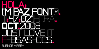
  23. Paz by Sudtipos, $29.00
    Paz, a squarish 4-weight industrial family, ranging from extreme hairline to black. It is ideal for editorial headlines where type plays a major role in the overall design. The fonts were designed by Ariel Di Lisio and digitized by Alejandro Paul.
  24. Ming Imperial - Personal use only
  25. Kleinsan - Unknown license
  26. BengaliDhakaSSK - Unknown license
  27. Ionic bond - Unknown license
  28. Orchidee - Unknown license
  29. kaden - Unknown license
  30. Ming Gothic JJCR - Personal use only
  31. ZRex - Unknown license
  32. Deco Pennant Initials JNL by Jeff Levine, $29.00
    Online auctions continue to be a surprising wealth of font design inspiration. In this instance, a number of silk embroidered Art Deco initials inside inverted triangles inspired Deco Pennant Initials JNL. The uppercase version is white lettering on a black background – similar to the originals. On the lowercase keys is a set of initials that are black on white with a black border. Since the inverted triangles resemble pennants, there’s a solid black blank on the left parenthesis key and a outlined blank one on the right parenthesis key. In this way, the initials could be used for monograms or interspersed with the blanks to form short banner messages.
  33. Bou College - Personal use only
  34. Angel Tears - Personal use only
  35. Harb - Unknown license
  36. Ming Gothic JJCR - Personal use only
  37. Tantrum Tongue - Unknown license
  38. Freshman - 100% free
  39. Ongunkan Phoenician by Runic World Tamgacı, $50.00
    Phoenician/Canaanite The Phoenician alphabet developed from the Proto-Canaanite alphabet, during the 15th century BC. Before then the Phoenicians wrote with a cuneiform script. The earliest known inscriptions in the Phoenician alphabet come from Byblos and date back to 1000 BC. The Phoenician alphabet was perhaps the first alphabetic script to be widely-used - the Phoenicians traded around the Mediterraean and beyond, and set up cities and colonies in parts of southern Europe and North Africa - and the origins of most alphabetic writing systems can be traced back to the Phoenician alphabet, including Greek, Etruscan, Latin, Arabic and Hebrew, as well as the scripts of India and East Asia. Notable features Type of writing system: abjad / consonant alphabet with no vowel indication Writing direction: right to left in hortizontal lines. Sometimes boustrophedon. Script family: Proto-Sinaitic, Phoenician Number of letters: 22 - there was considerable variation in their forms in different regions and at different times. The names of the letters are acrophonic, and their names and shapes can be ultimately traced back to Egyptian Hieroglyphs. For example, the name of the first letter, 'aleph, means ox and developed from a picture of an ox's head. Some of the letter names were changed by the Phoenicians, including gimel, which meant camel in Phoenician, but was originally a picture of a throwing stick (giml).
  40. Yaroslav - Unknown license
Looking for more fonts? Check out our New, Sans, Script, Handwriting fonts or Categories
abstract fontscontact usprivacy policyweb font generator
Processing