10,000 search results
(0.009 seconds)
- Ares by Adam Jagosz,
$15.00 Ares is a crisp all-caps display typeface suitable for sci-fi logos and titles. It owes its peculiar futuristic vibe to angular, top-heavy letters that hang from the cap-height instead of sitting on the baseline. The typeface consists of six subfamilies available in 10 weights, as well as as two variable fonts of three axes: Weight [wght], ranging from 1 to 1000, Mid-height [MHGT], ranginf from 0 to 1000, Tracking [TRAK], ranging from 0 to -40. The mid-height axis affects the typeface's waistline, including crossbars, and divides the fonts into three subfamilies: Ares Lo, Ares, and Ares Hi. These three families are solid-stroked, and the other three families are their stencil-stylized counterparts: Ares Broken Hi, Ares Broken, and Ares Broken Lo. The tracking axis is only available in the variable versions, and proportionally affects the kerning, thus helping set the type more tightly without effort. Ares supports a wide range of Latin-based orthographies, including not only European, but also Vietnamese as well as major African languages like Hausa, Fula or Ewe.
 - Bogie Bogie by Dumadi,
$20.00 Bogie Bogie – Logo Typeface A special font for the company logo and the logo of the project you are working on will certainly make it easier to create a logo. so for those of you who are still starting a business, this font will be very suitable for your identity and you will not bother anymore to create a logo. Bogie Bogie is perfect for logo designs, electronic logos, drone logos, smartphone logos, computer brand logos, camera logos, and other logo logos. What’s Included : + Standard glyphs + Multilingual Accent + Works on PC & Mac, Simple installations Accessible in Adobe Illustrator, Adobe Photoshop, Adobe InDesign, even work on Microsoft Word. PUA Encoded Characters – Fully accessible without additional design software. Fonts include multilingual support + Image used: All photographs/pictures/vectors used in the preview are not included, they are intended for illustration purposes only. Thanks
 - Typoskript AR by ARTypes,
$35.00Typoskript AR is based on a metal type which was produced in 1968 by VEB Typoart, Dresden, from a design of the German calligrapher and lettering artist Hildegard Korger. It bears all the qualities of the artist’s inimitable style which will be immediately recognizable to anyone who’s familiar with her Handbook of Type and Lettering (Lund Humphries, 1992) (Schrift und Schreiben, Leipzig, Fachbuchverlag, 1971). The ARTypes transcription retains the roughness of the artist’s pen on paper as it was featured in the original type, as well as the letterfit, ch, ck and f-ligatures. ARTypes have supplied the font with all the standard accents, monetary signs, etc. The original qu logotype is provided as an alternative letter. A printable .pdf specimen of the type can be downloaded from the gallery. - Amati AR by ARTypes,
$35.00Based on the 60-point Amati designed by Georg Trump and issued by C. E. Weber (Stuttgart) in 1953. - Diethelm AR by ARTypes,
$35.00 Based on the 10- and 36-point Diethelm-Antiqua types designed by Walter Diethelm and issued by Haas (Münchenstein) 1948-51. DiethelmAR™ series text-size fonts are based on the 10-point designs. Eastern European accents, swash capitals, alternative figures and small capitals are available. The DiethelmARd fonts are based on the 36-point (dreicicero) designs. OpenType fonts are available individually or in two packages: text fonts (with EE accents, small capitals) and display fonts.
 - Ars Nova by PintassilgoPrints,
$24.00 Ars Nova is an up-to-date incarnation of the Art Nouveau flair. Suited for striking typographic effects. Suited for some nostalgic pleasure. Specially suited for creative minds. Cheers!
 - Ar Rayyan by LetterStock,
$20.00 Ar Rayyan Ar Rayyan is a decorative font that was inspired by middle east style design that i saw online, and it was crafted by hand to add a natural handmade feeling and i make it clean with pentool. If you looking for decorative font with middle east tyle for your title or even branding and logotype, Ar Rayyan is a great choice for that purpose. Opentype features: Ar Rayyan font is very good looking in logotype, labels, decorative lettering, playful design, product packaging, invitation titled, advertising and others. This decorative font works with folowing languages: Afrikaans, Albanian, Asu, Basque, Bemba, Bena, Chiga, Cornish, Danish, English, Estonian, Filipino, Finnish, French, Friulian, Galician, Gusii, Indonesian, Irish, Italian, Kabuverdianu, Kalenjin, Kinyarwanda, Low German, Luo, Luxembourgish, Luyia, Machame, Makhuwa-Meetto, Makonde, Malagasy, Malay, Manx, Morisyen, North Ndebele, Norwegian Bokmål, Norwegian Nynorsk, Nyankole, Oromo, Portuguese, Romansh, Rombo, Rundi, Rwa, Samburu, Sango, Sangu, Scottish Gaelic, Sena, Shambala, Shona, Soga, Somali, Spanish, Swahili, Swedish, Swiss German, Taita, Teso, Vunjo, Zulu. Thank you for using this font. LS
 - Graphique-AR by ARTypes,
$35.00Graphique-AR is a digital version of a type designed by Hermann Eidenbenz and issued by the Haas foundry in 1946. - Gravur-AR by ARTypes,
$35.00Gravur-AR is a digital version of a type designed by Georg Trump and issued as Trump-Gravur by Weber in 1960. - Troyer AR by ARTypes,
$30.00The Troyer AR ornaments are based on the first series of ornaments designed for American Type Founders by Johannes Troyer (1902-69). They were cast in 36 and 48 point in 1953 by ATF who said that they ‘mark a distinct and refreshing departure from the motif of earlier ornaments, and add a crisp touch to your finer printing’. Kenneth Day, in The Typography of Press Advertisement (1956), found them 'clean-cut and bright and clearly showing their calligraphic origins . . . useful for single decorative touches'. - BONES - Unknown license

- Bonk - Unknown license

- Bonding by Arendxstudio,
$15.00 Bonding Font that has a distinctive character that is very thick and elegant to use Bonding is a relaxed and flowing Handwritten Font. Incredibly versatile, this font fits a wide pool of designs, elevating them to the highest levels. Add this font to your favorite creative ideas and notice how it makes them come alive! Features : • Character Set A-Z • Numerals & Punctuations (OpenType Standard) • Accents (Multilingual characters) • Ligature Multilingual Support : Afrikaans, Albanian, Asu, Basque, Bemba, Bena, Catalan, Chiga, Cornish, Danish, English, Estonian, Faroese, Filipino, Finnish, French, Friulian, Galician, German, Gusii, Icelandic, Indonesian, Irish, Italian, Kabuverdianu, Kalenjin, Kinyarwanda, Low German, Luo, Luxembourgish, Luyia, Machame, Makhuwa-Meetto, Makonde, Malagasy, Malay, Manx, Morisyen, North Ndebele, Norwegian Bokmål, Norwegian Nynorsk, Nyankole, Oromo, Portuguese, Romansh, Rombo, Rundi, Rwa, Samburu, Sango, Sangu, Scottish Gaelic, Sena, Shambala, Shona, Soga, Somali, Spanish, Swahili, Swedish, Swiss German, Taita, Teso, Vunjo, Zulu There it is! I really hope you enjoy it
 - Bohy by wkklee,
$25.00Bohy was a candidate when it was felt there was a need for a "house font" to start a design service. Its readability can be relied on to clearly display the most creative or obscured names, yet the adherence to a chosen system of construction to achieve this consistency also make the Bohy characters stubbornly distinguishable from most other font sets if you were to group it under geometric, or technical typeface, or some other categories it should belong (it is considered more constructivist, not humanist, etc...). - Bondie by Craft Supply Co,
$17.00 Bondie – Condensed Sans Serif is an Elegant Condensed sans serif with solid font files. it is based on the compact solid font, by combining a variety of styles. Suitable for Logo, greeting cards, quotes, posters, branding, name card, stationary, design title, blog header, art quote, typography
 - Bosis by Monotype,
$29.99
- Boxy by Hackberry Font Foundry,
$24.95 In my on-going quest for display fonts to be used with my books and on my book covers, I decided I need a squared sans serif. I started the build off of Fiscal, a font I designed back in 2006. I never liked the font, plus my tastes have changed. So, I opened it, made it narrower, increased the x-height, and various stuff like that. I made it much heavier—an ended up with Boxy. Then my brain slapped me and said, "Why don't you make a sorta modern version?" So, I did and decided to call that style Chic. But then I wanted a thin version also. Fiscal was always too heavy and ponderous for me. So, I made the Thin style. Finally, I felt I needed an italic of Chic. OpenType features didn't seem to work well with the family, so all I added was oldstyle figures. So, I ended up with another of my unique families—with two unmodulated fonts: Thin and Medium, and two modulated fonts: Chic and Chic Italic. But, I'm pleased with it. My hope is that you will like it also.
 - Body by Zetafonts,
$39.00 Body graphic project at Behance Body is a type family designed for Zetafonts by Cosimo Lorenzo Pancini with Andrea Tartarelli. Conceived as a contemporary alternative to modernist superfamilies like Univers or Helvetica, Body tries to maximize text readability while providing a wide range of options for the designer. It comes in two variants (Body Text and Body Grotesque), each in four widths and four weights: regular and bold for basic typesetting, light and extrabold for display use. Body Grotesque applies to the sans serif modernist skeleton little imperfections and quirks inspired by our research in early 20th century type specimens. Curves are slightly more calligraphic and a light inverse contrast is applied to bold weights, giving the typeface a slight vintage appearance in display use. Body Text, on the contrary, challenges the modernist aesthetics maximizing horizontal lines and using open terminals for letters like “s” and “a” that appear normally dark in modernist grotesques. For both variants, the normal width family is slightly condensed in an effort to maximize space usage; the Slim width is provided for extremely dense texts or side notes while the Fit width is optimized for display usage as in logos, headings or titles. The Large width manages to look elegant in its light weight while becoming a valid heading or subtitle font in its extrabold weights. All the 64 fonts in the Body superfamily include a complete latin extended character set with small caps for over 70 languages, Russian cyrillic, open type positional numbers, stylist sets and alternate forms.
 - Ebony by TypeTogether,
$35.00 Some typefaces need time to ripen; Burian and Scaglione made the first sketches for Ebony back in 2008, but it took a few years of maturing in a drawer to be developed into a multi-functional type family. While keeping in tune with TypeTogether’s focus on complex typographic structures needed for magazine, newspapers and books —whether printed or digital—, Ebony goes far beyond editorial use and promises great performance in branding and advertising. The range of dark weights with taut and powerful curves can boost any headline, while the lighter styles create an approachable and clean feel in blocks of continuous text. Ebony does not fall short on aiding legibility either; letterforms have a distinct direction of ductus and features like the top serif on ‘l’ help making them clearly distinguishable from each other. It is a type family that cleverly seeks a balance between the openness and legibility of humanist sans serifs and the striking and more regularised character of grotesques. The letter-shapes feature generous counters and open terminals with crisp angles, and daringly grow both in colour and width as the fonts get bolder. Infused with this strength, Ebony also shows a quirky side in some of her shapes; the vertical fractions, the at-symbol, the old-style numbers, … The predominantly slanted style of the italics is broken up in some letterforms, such as ‘a e f l’, that are more in line with a classic cursive appearance. This, together with a forceful italic angle, ensure a change in texture within a block of text, despite sharing the same letter weight and width with the uprights. With 18 styles, tending towards the heavier part of the weight-spectrum, this face has a powerful quality!
 - Bond by 4RM Font,
$10.00 Its very simple form is the hallmark of this font, the bond font is a simple styled font but still has an aesthetic value, this font is suitable for use in simple themed designs.
 - Bones by Gravual,
$39.00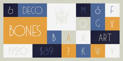
- Bokis by Sign Studio,
$10.00 Bokis is a sans serif family that has simple and strong characters. This font will provide a confident and impressive base headline to any of your designs. Balance on each side is well maintained. It's ideal for headlines, titles, posters, branding, and logotypes that require big impact.
 - Beni by Nois,
$18.00 Beni is a bold & strong sans serif font family beautifully crafted to perform in short headlines in posters or contemporary interface design. Each character has been optically adjusted for maximum effect in the space between; as such, this is a strong contender for movie posters, titling, album artwork, and any design project that needs a clean sans serif that makes an impact wherever it is applied. This type family is available in four unique weights that stand well apart from one another in visual style. Beni Light is the runway model of the family, standing with a narrow posture and towering height. It’s a fantastic choice for conveying a message in a limited horizontal space. Beni Regular and Beni Bold are shorter in stature but both pack a punch, carrying bold strokes that speak with confidence and offer great legibility. The heaviest of the heavy, Beni Black is the super-bold, go-to type design for projects that need an impossibly strong type design at the helm. Beni extends multilingual support to Basic Latin, Western European, Euro, Catalan, Baltic, Turkish, Central European, Pan African Latin, Igbo Onwu, and Basic Greek for design projects intended for an international audience.
 - Lonie by Par Défaut,
$35.00 Lonie is sans serif font family (include 5 weight, italic and variable) It contains more than 1200 characters including the Latin, Cyrillic and Greek alphabet There are also 15 OpenType features (Superior; Inferior; Numerator; Denominator; Fraction; Tabular Lining; ;OldStyle Figure; Small Capital; Small Capitals from Capitals; Contextual Alternate; Case Sensitive; Ordinals; Access All Alternates; Stylistic Set).
 - Bowie by Latinotype,
$19.00 The name of this typeface comes from the surname of James (Jim) Bowie, American pioneer and inventor of the famous Bowie knife. This is exactly what inspired English rockstar David Jones to change his stage name to David Bowie. Bowie is thenew font by Bercz and Latinotype Team. The typeface is a type system that reflects a strong personality, an urban feel and an unprejudiced style. Bowieis well-suited for publishing projects, branding and packaging. This font family is composed of three sections: a group of sharp-shaped uppercase fonts (smallcaps and all caps) in 5 weights, each with matching regular/back slant italics,providing users with 15 different styles for multiple combinations; a set of script catchwords and eclectic sets of dingbats and flags that communicate the blue-sky thinking and feel of the project. Bowie —a collaborative project between Bercz and Latinotype Team—was developed by Leonidas Loyola, Valentina Vega, Rodrigo Fuenzalida, César Araya and Bruno Jara, under the supervision of Dany Berczeller, Daniel Hernández y Luciano Vergara.. Bowie consists of 5 weights, ranging from Thin toBlack, and comes with a 439-character set that supports 206 languages.
 - Koni by Anastasia Kuznetsova,
$17.00 Get to know the beautiful natural and neat font "Koni"! This beautiful neat retro sans-serif font with imperfect ink edges and a little sloppy shading is inspired by nature. This is a textured font in vintage style with capital letters. The letters here are clearly distinguishable, and interesting touches give it uniqueness. Eco-friendly fashion takes into account the health of consumers, the health of the planet. The font "Koni" is perfectly combined with any stylized graphics, watercolors, and also looks great on its own as part of a minimalist design. Play with letters to get different effects. Great for branding, invitation design, packaging design, quotes, label design and more. Font features: - A-Z; character set a-z; - 1 language (English); - numbers and punctuation marks, symbols. Fonts can be opened and used in any software that can read standard fonts, even in MS Word. No special software is required, and to get started. It is recommended to use it in Adobe Illustrator or Adobe Photoshop Made with love and magic ♡ Thank you for checking this out and feel free to write me a message if you have any questions! ~ Anastasia
 - Bonning by Greater Albion Typefounders,
$8.95 Bonning is a Roman face full of the spirit of the 1920s. It was inspired by a (real)estate agent's For Sale board seen in an old sepia photograph from that era and combines visual flair and period with good clear legibility. A range of Opentype features including alternate forms, old style numbers and fractions, as well as discretionary and standard ligatures are included. Three weights are offered, including a shadowed black form are offered, all in a choice of three widths. It's the ideal face for signage with a period feel, as well as posters, headings and feature paragraphs.
 - Ony by Cuda Wianki,
$20.00 Ony font was made by cutting letters in cardboard and printing them on paper. This non-perfect printing was used to get heavy, dirty letters. Font has alternate characters so it can imitate real printed words.
 - You Are Loved - Personal use only

- we are alien!! - Unknown license

- Girls are Weird - Unknown license

- Sharpies Are Fun - 100% free

- People Are People - 100% free

- pills are good - Unknown license

- You are Superb by DainType,
$15.00 Nicely scribbled script font. It has a masculine, wild and wild mood. It also has a feeling of being torn. It is good when you want to use a lively atmosphere because of the fast flow of strokes. It is good to use when you want a cool and striking design such as a bromide for a rock festival, an album cover for music, a beer package, or a beer logo.
 - We Are Allstar by Gilar Studio,
$16.00 Introducing " We Are Allstar - Trio Playfull Fonts " We Are Allstar a Handwritten Display Font With 3 Style (Regular,Outline and Shadow) You Can Mix And Match for Your Awesome Project This fonts is ideal for crafting, branding and decorate your any project. This fonts are perfect for wedding invitation or your blog. Also with their help, you can create a logo or beautiful frame for your home. Or just use for your business, book covers, stationery, marketing, magazines and more. FEATURES : Uppercase & Lowercase Number & Punctuation More than 251 of glyphs Multilingual Language PUA Encode 27 Ligatures Alternate 7 OpenType features were detected in the font (aalt dlig frac liga ordn salt sups kern) Support for 67 languages detected The alternative characters were divided into several Open Type features can be accessed by using Open Type savy programs such as Adobe Illustrator, Adobe InDesign, Adobe Photoshop Corel Draw X version, And Microsoft Word. And this Font has given PUA unicode (specially coded fonts). so that all the alternate characters can easily be accessed in full by a craftsman or designer. Check my other Font here : https://gilarstudio.com/ Thanks and happy designing :-)
 - Freundschafts-Antiqua AR by ARTypes,
$35.00Freundschafts-Antiqua AR is based on a 20th-century German type design. Freundschafts-Antiqua (which was also called Chinesische Antiqua) was designed by the Chinese calligrapher Yü Bing-nan when he was a student at the Hochschule für Grafik und Buchkunst at Leipzig in 1960. It was cast in 1964 by VEB Typoart, Dresden, in 9-pt and 28-pt (Didot). The design combines the best German traditions with the Chinese bamboo pen. It is a unique, wholly modern, yet quiet and dignified typeface which is well suited for text-setting in many sizes. The original design was carefully crafted with all non-kerning letters (none of the letters overhangs its side-bearings); the lower-case f was designed so that no ligatures were needed. The AR fonts include the type's ch and ck logotypes, monetary signs and all the standard accents. The letterfit of the original design is retained and, as can be seen in the attached printable .pdf, text composed at normal sizes is very agreeable indeed. Freundschafts-Kursiv AR A features old-style (non-lining) figures and 'kerning' letters; Freundschafts-Kursiv AR B contains lining (cap-height) figures and all non-kerning letters following the original design of the face. - Ornaments 6 AR by ARTypes,
$30.00Ornaments 6 are based on designs for the Curwen Press by Edward Bawden and Percy Smith. - We Are Happy by Seemly Fonts,
$14.00 We Are Happy is a cute and simple lettered handwritten font that can be used for all chalkboard quotes or teaching material! Its authentic look will add a personal and realistic feel to your designs.
 - Ornaments 1 AR by ARTypes,
$30.00Ornaments 1 are from designs from 18th and 19th Cent. founders descended to Stephenson Blake.


Page 1 of 250Next page