10,000 search results
(0.239 seconds)
- KG Flavor and Frames - Personal use only

- Zapped Sticks - Personal use only

- Aracne Regular - Personal use only

- jano - Unknown license

- MKAbelRough-random - 100% free

- Easter Joy - Personal use only

- AB Barberian - 100% free

- KR Butterfly Two - Unknown license

- Moondog Fifteen - Unknown license

- Deco Freehand - Unknown license

- Doggon - Personal use only

- Crushed Out Girl - Unknown license

- brunoBook - Personal use only

- Hoshi Font - Unknown license

- BN BenWitch Project - Unknown license

- KR Hunnybee - Unknown license

- CelticHand - Unknown license

- Aesop by Fine Fonts,
$29.00 Aesop was developed from some book jacket lettering drawn by Michael Harvey for an edition of Aesop’s Fables by a master Japanese Artist. It is based upon a pen-drawn script, and is characterised by a lively sense of movement and grace. Aesop Plus, being an OpenType font, contains many alternative characters and additional ligatures which can be automatically substituted to enhance the liveliness of set text, where the application in which it is used, permits.
 - Quirky Sands by Angie Makes,
$20.00 Quirky Sands lives up to its name. This fun, hand-drawn, handmade ampersand font is a sure fit for save the dates, wedding invitations, and other fun design projects requiring a quirky & sign. The uses for these little “sands” are virtually endless! Included are 57 different ampersands with a unique, imperfectly handmade feel. These pair well with Fonted House’s Canoe font and other hand-drawn typefaces. Perfect to add that hand lettered touch to your next design project.
 - Oilvare by Adam Ladd,
$25.00 Oilvare is a hand-drawn, layered typeface inspired by vintage painted signs and oil cans. While sturdy, it also has a softer side—wide proportions, oval-inspired forms, curled angle strokes, and a medium contrast all help give it a little bit of distinction from the typical sans serif. Mix, match, and layer the styles to your liking. Carefully drawn, when you enlarge the typefaces, the subtle irregularities become more apparent and harken to hand lettering of the past.
 - Cooper Nouveau by House Industries,
$33.00 Few fonts reach cult status. Despite its ubiquity—and perhaps because of its lack of subtlety—for a hundred years Cooper continues to draw the faithful. It’s even come to define an entire typographic genre and recently starred in its own documentary. Cooper Nouveau is Dave West’s imaginative contribution to the Cooper oeuvre. Drawn in 1966, Nouveau refreshes Oswald Cooper’s original italic with an energetic pitch, simplified contours, and a plump friendly figure. Uniform strokes and generous curves push the font’s playful personality and springy silhouette even further. A selection of swashed characters and ligatures offers options for lively logos and strong captions. While Cooper Nouveau looks laid-back and easy-going, it’s more than capable of pulling it’s own typographic weight. Put it to work where relaxed needs to project confident. Set Nouveau large for eye-magnet posters, packaging, and advertisements. Maximize its youthful energy for kids’ themes, craft action, and apparel bounce. Or set it alongside a master like Benguiat Buffalo or Chalet to show how Cooper Nouveau can communicate on paper and screens with an inherent ability to speak the language of style in many tongues. But like any cult icon: beware! Cooper has a way of setting the needle, and Nouveau just may become your go-to design fix. FEATURES ALTERNATES: Cooper Nouveau contains several alternate characters, which add flair to your designs and can help solve spacing issues LIGATURES: Many letter combinations in Cooper Nouveau form a ligature to solve spacing issues and produce more pleasing designs. COOPER NOUVEAU CREDITS Typeface Design: Dave West Digitization: Dave Foster Typeface Direction: Ben Kiel, with Ken Barber Like all good subversives, House Industries hides in plain sight while amplifying the look, feel and style of the world’s most interesting brands, products and people. Based in Delaware, visually influencing the world.
 - Architect by Funk King,
$5.00 Architect is inspired by blueprints and technical drawings. This is an outline font.
 - Hadriano by Monotype,
$29.99When traveling in Paris, American designer Frederic W. Goudy did a rubbing of a second century marble inscription he found in the Louvre. After ruminating on these letterforms for several years, he drew a titling typeface in 1918, all around the letters P, R, and E. He called the new face Hadriano" as that name was in the original inscription. Robert Wiebking cut the matrices, and the Continental Typefounders Association released the font. Goudy designed a lowercase at the request of Monotype in 1930, though he didn't really like the idea of adding lowercase to an inscriptional letterform. The lowercase looks much like some of Goudy's other Roman faces. Compugraphic added more weights in the late 1970s, and made the shapes more cohesive. Hadriano has nicely cupped serifs and sturdy, generous body shapes. Distinctive individual letters include the cap A and Q, and the lowercase e, g, and z. Hadriano™ is an excellent choice for impressive headings and vigorous display lines." - 1634 René Descartes by GLC,
$38.00 This font was inspired by the well-known philosopher René Descartes' hand writing. In 1634, from Amsterdam, he wrote a famous letter to his friend Mersenne, a great scientist monk, in which he spoke about Gallileus works. The greatest part of our glyphs is based on this document. We have added some letters Descartes himself didn't use, like modern s and j (he used exclusively s long and i instead of j). A lot of ligatures and alternates are enriching the font, giving a better appearance of real handwriting.
 - Magedo by Craft Supply Co,
$20.00 Introducing Magedo Vintage – Fluid Font Looking for a font that’s both fluid and exudes vintage charm? Look no further than Magedo Vintage – Fluid Font. This versatile typeface offers a blend of modern fluidity and classic vintage aesthetics display that will elevate your designs to the next level. Fluid Elegance Magedo Vintage boasts a fluidity that adds a touch of sophistication to your projects. Its smooth curves and flowing lines make it perfect for logos, headings, and invitations, creating a sense of dynamic movement that captures attention. Rustic Hand-Drawn Appeal Embrace the hand-drawn trend with Magedo Vintage. Its rustic, imperfect strokes give your text a unique character and a cozy, artisanal feel. Whether you’re designing a rustic wedding invitation or a quaint cafe menu, this font adds that charming touch. Timeless Stamp Effect Magedo Vintage also offers a stamp-like effect, reminiscent of classic imprints. This effect adds a sense of authenticity and nostalgia to your designs, making it ideal for vintage-themed posters, packaging, and labels.
 - Green Fairy by Maria Montes,
$39.00 Green Fairy is a chromatic font family highly ornamented for display purposes. Green Fairy’s characters have been specifically designed to accommodate its loops and ornaments following a modern typeface structure. Green Fairy has four chromatic weights: 1. Green Fairy Outline 2. Green Fairy Dots 3. Green Fairy Stencil 4. Green Fairy Full The outline weight has been created as the base or structure for the other weights. You can combine these weights as well as add colours to obtain multiple effects and type styles. Green Fairy has also three combined weights (combos) to simplify your work flow, for these occasions when you only want to use one single colour in your font: 5. Green Fairy Dots Combo 6. Green Fairy Stencil Combo 7. Green Fairy Full Combo GREEN FAIRY ORIGINS The origin of this typeface is the lettering I designed in October 2015 as part of my illustrated cocktail artwork called “Absinthe. La Fée Verte (The Green Fairy)”. Originally, this lettering only featured eight letters “AB·SINTHE” vector drawn in Illustrator. Right after creating the full-colour artwork, I designed a fountain-letterpress print version of it, in collaboration with Ladies of Letters, A.K.A. Carla Hackett and Amy Constable from Saint Gertrude Fine Printing. At the beginning of 2016 –and thanks to the project @36daysoftype– I found the motivation, and most importantly the deadline, to draw the rest of the twenty-six letters of the uppercase alphabet using Illustrator. I started 2017 having my first two calligraphy courses sold out, so I took this amazing opportunity to devote myself to Green Fairy for a few months. In February 2017, I purchased the font software Glyphs and I started to re-draw all twenty-six letters of the uppercase alphabet again. PRODUCTION PROCESS Green Fairy started being one weight, but quickly turned into a layered/chromatic font. Things were going more or less fine till I arrived to the Dots weight: 1) I started drawing squares following a grid; 2) Then, the squares turned into diamonds following the same grid; 3) Then, the grid wasn’t working so well on the round letters so I tried randomising the position of the diamonds but it didn’t work; 4) So I went back to the grid, and this time scaled down the size of the diamonds creating a visual half-tone effect. I spent over four weeks working on the Dots weight and I felt like I was in the middle of a very long tunnel and I couldn’t see the light at the end. I encountered many other problems along the way but by June 2017, I felt I was back on track again. I kept working, tweaking, re-drawing and re-adjusting, and then the diacritics came on board… And then more re-drawing, re-tweaking, re-adjusting and then numbers… And then spacing, symbols, and currencies… And then more spacing, kerning, contextual kerning for triplets… In September 2017 I told myself “that’s it, I’m going to finish it now!” But guess what? More re-tweaking, testing, hinting, testing, rendering, testing… For those of you not familiarized with typeface design, it is extremely time consuming and it requires a lot of hard work, focus and determination. This project could not have been possible without the help of these generous professionals: Jose Manuel Urós, typeface designer based in Barcelona and my teacher twice in the past; Jamie Clarke, freelance letterer and typeface designer who has released a couple of chromatic fonts recently; Troy Leinster, Australian full-time typeface designer living and working in New York City; Noe Blanco, full-time typeface designer and hinting specialist based in Catalonia; And Nicole Phillips, typographer currently relocating from Australia to New Zealand. To all of you: THANK YOU VERY MUCH!
 - Nuku Nuku - Unknown license

- Janda Hide And Seek - Personal use only

- Smiley Font - Unknown license

- Badgery - Unknown license

- Oohlalalulucurvy - Unknown license

- DavysRibbons - Unknown license

- Mail Ray Stuff - Unknown license

- Kicking Limos - Unknown license

- KR Katlings - Unknown license

- Choir by Linecreative,
$16.00 Choir is a modern sans serif font. Each letter consists of three combined lines that connect together like a maze. This font is suitable for logos, business cards, magazines header, Flyer Titles, or large-scale oven artworks.
 - Happy Sparkle by Letterhend,
$15.00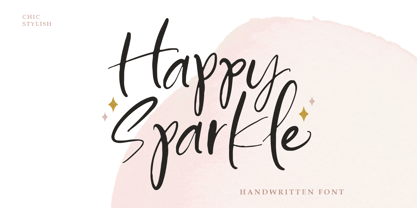 Introducing, Happy sparkle! a happy handwritten font that will bring your design into a happy and fun mood. this font is perfect for branding, packaging, logotype, headline, wedding invitation, etc. Features : - uppercase & lowercase - numbers and punctuation - multilingual - alternates and ligatures - swash - PUA encoded We highly recommend using a program that supports OpenType features and Glyphs panels like many of Adobe apps and Corel Draw, so you can see and access all Glyph variations.
 - Holymore by Letterhend,
$19.00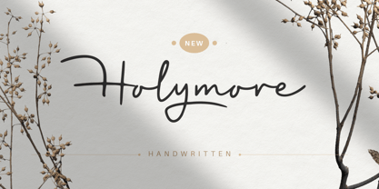 Introducing, Holymore! a handwritten font that will bring your design into a natural looking with its handwritten touch. this font is perfect for branding, packaging, logotype, headline, wedding invitation, etc. Features : uppercase & lowercase numbers and punctuation multilingual alternates and ligatures swash PUA encoded We highly recommend using a program that supports OpenType features and Glyphs panels like many of Adobe apps and Corel Draw, so you can see and access all Glyph variations.
 - Mantana by Anomali Creative,
$10.00 Mantana - Retro Vintage DIsplay font is an old style serif font, its funky, round, hight-contrast and bold shape with a retro touch is perfect for displayed, head text, logotype and many more. Mantana - Retro Vintage DIsplay font comes with stylishtic alternates and ligatures. We highly recommend using a program that supports OpenType features and Glyphs panels like many of Adobe apps and Corel Draw, so you can see and access all Glyph variations.
 - Natural Horizon by Mevstory Studio,
$25.00 Natural Horizon is a typeface that has a vintage, bold, clean, simple look. The basic shape of this typeface arranged side by side with simple, unique joints and accents. Perfect for logo, brand and apparel projects. Gatka Typeface Include : Letters Alternates Numeral Multilingual Support We highly recommend using a program that supports OpenType features and Glyphs panels like many of Adobe apps and Corel Draw, so you can see and access all Glyph variations.


