10,000 search results
(0.039 seconds)
- Notes and Quotes by Ana's Fonts,
$14.00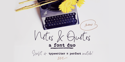 Notes And Quotes is a font duo that includes a bold typewriter font and a casual script font. The contrast between the fonts makes it a striking pair, perfect for logotype design, modern branding and packaging, quotes and social media posts. Notes And Quotes includes 6 fonts: a handwritten script font with a slant alternative and a bonus set of handwritten doodles (underlines, circles, words and short sentences, etc) a bold typewriter font with a "jumpy" alternative and a set of bonus misprints and grungy elements
 - Five Star Final by Solotype,
$19.95Introduced by the American Type Founders Co. at the time of the Spanish American War and advertised as suitable for "War Scare Headlines"! Used by many papers for years after because the narrow type was suitable for narrow single column heads. - Farquharson by Quadrat,
$25.00Farquharson is an all-caps display face, adapted from an early American woodtype, and designed especially for use in the book Charlie Farquharson’s Unyverse. The complete family consists of two fonts: a regular version and a stencil version. Alternate versions with slightly elongated feet are provided for A, H, K, M, N and R. Very eccentric, it is best used in small doses. - Mencken Std by Typofonderie,
$59.00 An American Scotch remixed in 27 fonts Mencken has twenty seven styles, divided into three widths, three optical sizes, romans and italics. Generally, optical size typeface families belong to a same common construction. It falls into the same category of type classification, while presenting different x-heights or contrasts. Mencken is unique because it is designed according to different axis and optical sizes. Firstly, Mencken Text is a low-contrast transitional typeface, designed on an oblique axis, asserting horizontal with featuring open counters. Its capitals follow Didots to better harmonize the rest of the family. On the other side of the spectrum, Mencken Head (and narrow variations) is designed on a vertical axis, high contrast, in a contemporary Didot style. The Mencken is therefore a typeface answering to different sorts of uses, whose design is different according to its uses: from oblique axis in small size to vertical axis in large sizes. Vertical proportions (x-height, capitals height, etc.) were calibrated to be compatible with many Typofonderie typeface families. Lucie Lacava and I followed the idea launched by Matthew Carter few years ago for some of his typefaces intended for publications. From Baltimore Sun’s project to Typofonderie’s Mencken It is a bespoke typeface for American newspaper The Baltimore Sun started at the end of 2004 which marks the beginning of this project. The story started with a simple email exchange with Lucie Lacava then in charge of redesigning the American East Coast newspaper. As usual, she was looking for new typeface options in order to distinguish the redesign that she had started. At the time of its implementation, a survey of the newspaper’s readers has revealed that its previous typeface, drawn in the mid-1990s, was unsatisfactory. The Mencken was well received, some reader responses was particularly enjoyable: “It’s easier to read with the new type even though the type is designed by a French.” Why it is called Mencken? The name Mencken is a tribute to H. L. Mencken’s journalistic contributions to The Sun. According to the London Daily Mail, Mencken ventured beyond the typewriter into the world of typography. Because he felt Americans did not recognize irony when they read it, he proposed the creation of a special typeface to be called Ironics, with the text slanting in the opposite direction from italic types, to indicate the author’s humour. Affirming his irreverence, the Mencken typeface does not offer these typographic gadgets. Henry Louis Mencken (1880 — 1956) was an American journalist, satirist, cultural critic and scholar of American English. Known as the “Sage of Baltimore”, he is regarded as one of the most influential American writers and prose stylists of the first half of the twentieth century. He commented widely on the social scene, literature, music, prominent politicians and contemporary movements. Creative Review Type Annual 2006 Tokyo TDC 2018
 - Habana by Vladislav Ivanov,
$15.00This font opens a new era of typewriting and type design. At first sight, the font seems creepy, but it has a deep connection with some urban motives in its tune. - Liliming by Cubo Fonts,
$25.00 That font was designed for Liliming, a famous Shanghainese feminine fashion brand. As the brand itself, it shows a solid background - a former typewriter machine feeling - and a fresh creative touch.
 - Courier by ParaType,
$30.00Designed at ParaType in 1990 by Tagir Safayev. Based on Courier typewriter face of International Business Machines, 1956, by Howard Kettler. The decorative styles were added in 1997 by Alexander Tarbeev. - LD Santa Fe by Illustration Ink,
$3.00Celebrate the old American West with LD Santa Fe. - Acre by Jonathan Ball,
$24.00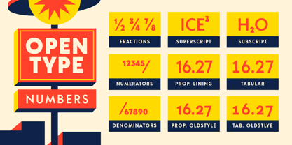 Acre is a geometric sans-serif type family of eight weights that's both inspired by and named after my great grandfather, Tex Acre. Tex was an artist and sign maker whose handcrafted signs illuminated the roadsides of the American Midwest and typified mid-century Americana. Acre is a tribute to him, his work, and many of my favorite early 20th century geometric typefaces. With eight weights ranging from Thin to Black, Acre is an extremely versatile family that can be used for display, text, or anything in between. Acre offers full European language support plus many OpenType features such as tabular and oldstyle figures.
 - Courier New OS by Monotype,
$50.99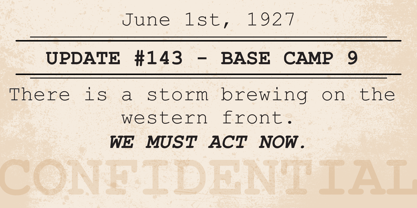 Designed as a typewriter face for IBM, Courier New was re drawn by Adrian Frutiger for IBM Selectric series. A typical fixed pitch design, monotone in weight and slab serif in concept.
 - Foundry Dit by The Foundry,
$50.00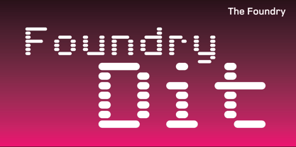 Foundry Dit is created with a common horizontal dash grid structure for accurate layering when characters are superimposed. Foundry Dit functions as a legible correspondence font, with a ‘typewriter’ feel. Foundry Dit’s companion family Foundry Dat has an integrated background grid. Each family contains: light, regular, medium and bold weights. Foundry Dat comes with a series of dashes to extend the grid. Characters can also be offset to make different patterns – in the process becoming images – a graphic language with total integration of form and function.
 - Agger serif by S6 Foundry,
$29.00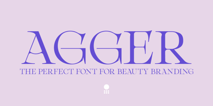 Agger is a contemporary serif typeface featuring large open counters, curved, round forms, creating a modern and elegant glyph set. The extreme contrast between thick and thin strokes gives Agger a harmonic and stylish look. Designed with an elegance to the letterforms, the font is adapt for the beauty and the cosmetic industry, giving each project a unique style and feel. Agger is perfectly suited for editorial design, branding, magazines, logos, headings, and more. The family Latin supports Western, Central, South Eastern, South American, Oceanian, Pan African, Vietnamese, and Sámi.
 - QuickType by Wiescher Design,
$39.50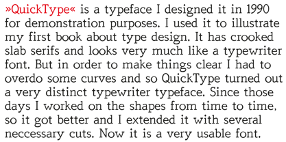 QuickType is a typeface I designed for demonstration purposes. I used it to illustrate my first book about type design. It has crooked slab serifs and looks very much like a typewriter font. But in order to make things clear I had to overdo some curves and so QuickType turned out a very distinct typewriter typeface. Since those days I worked on the shapes from time to time, so it got better and I extended it to include several neccessary cuts. Now it is a full fledged very usable font. Yours very quick Gert Wiescher.
 - Olivita by Plau,
$49.00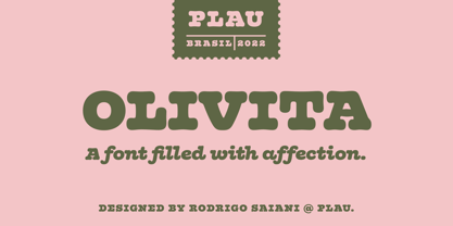 Innocent until proven otherwise, Olivita is a heavyweight interpretation of the Typewriter genre. Typewriter fonts have captivated generations of designers and found its way into infinite applications, including Milton Glaser’s classic I heart NY logo. Olivita is a fat-face take on the same idea. There’s a lot to negotiate in making type as bold as possible, with shapes having to contort and distort in order to make a cohesive whole. The x-height is tall yet ascenders and descenders are long. Super size it and see the rich, creamy texture come forward.
 - Ollivette Elite by Chank,
$59.00Fly your inner geek flag with this cool new "Eleet" typewriter font. It's kinda like a wonky internet translator that converts normal text into leet-speak, so you can exchange encoded love notes with cyber-hackers and goofy-gamers. The actual glyphs in this font are interchangeable with the more logical Ollivette typewriter font, but here the characters have all been moved around to create stylized interpretation of similar glyphs. So "ELEET" could also be typed "31337". Except you don't have to think about it. Get it? Got it? Good! 3NJ0¥ TH15 ƒØÑ+ & U53 !† 0FT3N. - EDGE - 100% free

- Xirod - Unknown license

- Hexa - Personal use only

- digi - Unknown license

- ChickenScratch AOE - Unknown license

- !Y2KBUG - Unknown license

- Sunspots AOE - Unknown license

- Tech Angels - Unknown license

- Black Drum by Coniglio Type,
$19.95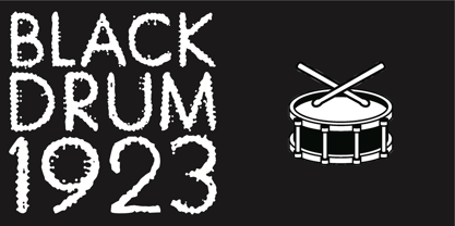 Black Drum is a rare revival typewriter face, made digital from analog samples gathered with great care by Coniglio Type. A time and place; type and life. Black Drum is contemporary designer type, made from the struck steel hammers of an Art Deco Period san serif face transferred from a mechanical 1926 custom editor Royal Portable typewriter. Anna Conroy of Type Heritage, LLC, Philadelphia comments on Black Drum and its new place in time today: “Wow! nice lookin’ face Joseph! —Perfect, somewhere between Cable; [Rudolph Koch, 1927] (which was about the first transatlantic telegraph cable) with its raised x-height; and Futura [Paul Renner, 1928]. Yup, it has that great “Monopoly Game” question mark -- and all on a period-piece typewriter! You should have no trouble grafting that sorely needed Euro symbol.” –And he very well did! Author: Joseph Coniglio Producer: Coniglio Type MyFonts debut: October 2021
 - Talsmann NF by Nick's Fonts,
$10.00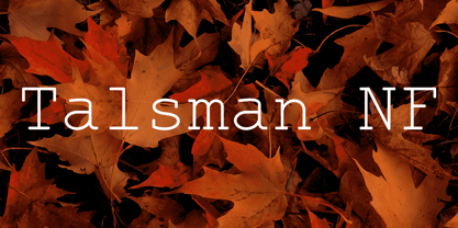 Plain and simple, here's a faithful reproduction of the Advocate font for IBM Selectric typewriters from the 1960s. Both versions support the Latin 1252, Central European 1250, Turkish 1254 and Baltic 1257 codepages.
 - News Gothic by Linotype,
$40.99News Gothic was created by Morris Fuller Benton in 1908 and presented by the American font foundry American Typefounders. Despite, or perhaps because of, the font’s unconventional relationships in proportion and form, News Gothic has long been a popular typeface for almost any use. - Care Bear Family - Unknown license

- MonospaceTypewriter - 100% free

- SF Espionage Light - Unknown license

- Colonial Press by Simeon out West,
$25.00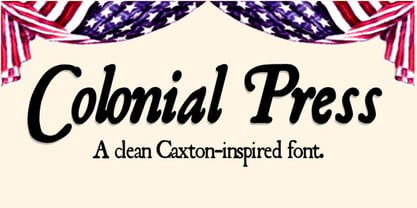 Colonial Press is a font based on serif typefaces designed by William Caslon I (1692-1766) and various revivals thereof. Caslon is cited to be the first original typeface of English origin, but some type historians point out the close similarity of Caslon's design to the Dutch Fell types, presumed to be the work of Dutch punchcutter Dirck Voskens. Colonial Press harkens to the look and feel of newspapers in Colonial North America around the mid 1700s without the rough edges commonly associated with colonial printing and many reconstructions. The rough quality of the American typeface is believed to be the result of oxidation from the exposure to seawater during the long voyage from England to the Americas. Colonial Press is a heavy font that retains some of the handcut quality of these fonts while smoothing out the irregularities that make many of these fonts so visually distracting at larger point sizes. For the italic version of this font, I chose to emulate the more ornate letterforms that I have encountered, giving the italic characters a more ornamental feel. Colonial Press comes with full punctuation and a 362 glyph character set for most Western European-based Latin alphabet languages. It is a font that is designed both for normal typing and for larger, decorative display.
 - Letter Gothic M by URW Type Foundry,
$35.99Letter Gothic was designed for IBM between 1956 and 1962 for use on the Selectric typewriter. Letter Gothic is a monospaced, sans serif face that can be useful for technical documentation and tabular work. - Letter Gothic L by URW Type Foundry,
$89.99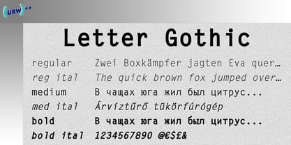 Letter Gothic was designed for IBM between 1956 and 1962 for use on the Selectric typewriter. Letter Gothic is a monospaced, sans serif face that can be useful for technical documentation and tabular work.
 - Inhuman BB - Personal use only

- Caslon Bold by Bitstream,
$29.99The Bitstream version of Caslon 3 of the American Type Founders, 1905. - Foundry Dat by The Foundry,
$50.00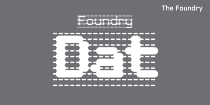 Foundry Dat is created with a common horizontal dash grid structure for accurate layering when characters are superimposed. Foundry Dat’s integrated background aligns vertically and horizontally, when set solid, forming a continuous pattern. Foundry Dat’s companion family Foundry Dit functions as a legible correspondence font, with a ‘typewriter’ feel. Each family contains: light, regular, medium and bold weights. Foundry Dat comes with a series of dashes to extend the background grid. Characters can also be offset to make different patterns – in the process becoming images – a graphic language with total integration of form and function.
 - Foundry Flek by The Foundry,
$99.00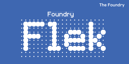 Foundry Flek and Foundry Plek are created on the same dot matrix grid system. Each family includes: light, regular, medium and bold weights – with a selection of dot patterns that can extend the grid vertically and horizontally. The underlying matrix common to each weight allows experimentation with overlays, and mixing weights produces varying effects. Foundry Plek used conventionally works well for serious correspondence, with a 'typewriter font' effect. Foundry Flek has an integral dot matrix grid as a background. With these two fonts a whole new graphic language can be explored.
 - Foundry Plek by The Foundry,
$99.00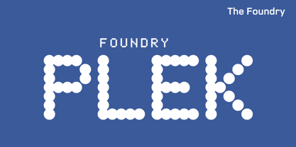 Foundry Plek and Foundry Flek are created on the same dot matrix grid system. Each family includes: light, regular, medium and bold weights – with a selection of dot patterns that can extend the grid vertically and horizontally. The underlying matrix common to each weight allows experimentation with overlays, and mixing weights produces varying effects. Foundry Plek used conventionally works well for serious correspondence, with a 'typewriter font' effect. Foundry Flek has an integral dot matrix grid as a background. With these two fonts a whole new graphic language can be explored.
 - Passing Stranger by Bogstav,
$17.00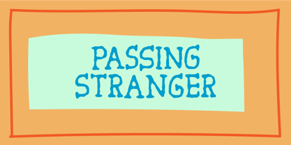 Say hello to my all caps wannabe typewriter font. It’s distressed, but still perfectly legible! I have added 5 slightly different versions of each letter for a more handmade feeling, and of course multilingual support!
 - Mom´sTypewriter is a distinct font typified by its vintage, nostalgic charm, reminiscent of the classic typewritten documents of the mid-20th century. Designed by Christoph Mueller, this font capture...
- Espinosa Nova by Estudio CH,
$-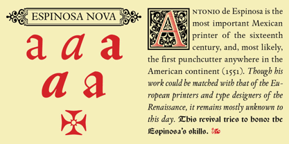 Espinosa Nova is a revival based on the types used by Antonio de Espinosa, the most important Mexican printer of the sixteenth century and very probably the first punchcutter anywhere in the American continent (1551). In 2010, its main fonts were awarded two certificates of excellence: one by TDC2 (Type Directors Club Typeface Design Competition), one by Tipos Latinos (Biennial of Latin American Typography). According to Robert Bringhurst, it is “an unusually intelligent family of type, reaching back to one of the most exciting moments in typographic history and reaching forward to the typographic future”. All of the fonts intended for setting text include small caps, five sets of figures (oldstyle and lining, both proportional and tabular, plus tabular small caps), many f and long s ligatures, and capital sharp S (U+1E9E). In addition, the Capitular fonts allow to create interesting effects by overlapping layers. This family feels very comfortable in books, but it can be used everywhere a touch of classic & elegance is required.


