10,000 search results (0.041 seconds)
  1. Whackadoo Upper Wide - Unknown license
  2. Haven Code - Unknown license
  3. GF Fuffiger - Unknown license
  4. Komika Tread - Unknown license
  5. Chinese Ruler - 100% free
  6. Scriptina - Alternates - Unknown license
  7. GF Gesetz - Unknown license
  8. the Gingerbread House - Unknown license
  9. Chizz Wide - Unknown license
  10. Choda Chado - Unknown license
  11. District - 100% free
  12. the Gingerbread House - Unknown license
  13. Frigate - Unknown license
  14. Uneasy - Unknown license
  15. Acadian by Scriptorium, $12.00
    A lovely decorative Victorian period font taken directly from samples printed on an old press right from the metal type in the collection of typophile Steve Saxe.
  16. Quit Smoking by PizzaDude.dk, $20.00
    Legible even at small sizes, when viewed at large sizes you'll notice the slight elegant twist! Besides, it always a good thing, if you conside quitting smoking!
  17. Rosedal by Del Alma, $15.00
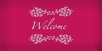
    Rosedal is the right choice for those who love decorating their works. Lots of frames are ready to embellish your cards, webpages, invitations, book covers, and more.
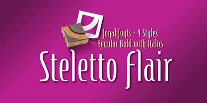
  18. Steletto OS Flair by Jonahfonts, $42.00
    Condensed Oldstyle Gothic with flair. Great for tight-fitting headlines and other condensed titling situations such as headlines, ads, invitations, captions, packaging, bulletins, posters, and greeting cards.
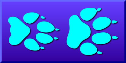
  19. Make Tracks by Gerald Gallo, $20.00
    The character set contains 47 left foot animal track designs. The shift+character set contains the 47 right foot animal track designs corresponding to the character set.
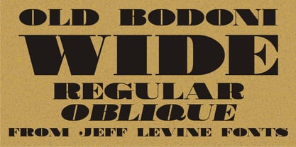
  20. Old Bodoni Wide JNL by Jeff Levine, $29.00
    Old Bodoni Wide JNL is based on examples of this classic Bodoni design and contains the quirks and imperfections one might find within a wood type font.
  21. LT Asus Pro - 100% free
  22. LT Speak - 100% free
  23. Banbury - Personal use only
  24. Deutschlander - Personal use only
  25. Dark & Black - Personal use only
  26. Freakshow - Personal use only
  27. Getboreg Slab - Personal use only
  28. BN-67.9010-03, at first glance, might seem like just another entry in the vast world of typography, but a closer look reveals its unique charm and potential as a creative tool for artists and designe...
  29. VTC-SumiSlasherOne - Personal use only
  30. Red Nose Day - Personal use only
  31. VTC-KomikSkans-Two - Personal use only
  32. Breughel by Linotype, $29.99
    Adrian Frutiger came up with this unusually purposeful and strong design in 1981 for Linotype. Early humanistic typefaces of the sixteenth century, especially Jenson, served as models for Breughel. The right sides of the stems are vertical and at right angles to the baseline while the left sides of the stem curve into the serifs, making the typeface look as though it slants to the right, and giving it a sense of movement and liveliness. The ductus of the broad-edged pen is reflected in the flow, rhythm, and texture of text set in Breughel, but at the same time this design has a regularity of form that is typographically solid. Breughel is an ideal typeface for the designer with skill and vision. Use it to create innovative publications, posters, and advertisements.
  33. Burton's Nightmare is a captivating display font that appears as if sprung from the feverish dreams of a storyteller who dances on the edge of whimsy and the macabre. Its design pays homage to the go...
  34. The CF Anarchy font by CloutierFontes is a vivid expression of freedom and rebellion. Crafted by the visionary Steve Cloutier, this font is more than just a collection of characters; it's a statement...
  35. Nexa Slab by Fontfabric, $35.00
    Nexa Slab is a geometric slab serif font whose design is based on the already popular best-seller Nexa . The font family contains 3 basic forms: italics, obliques and uprights, each of which has 8 different weights. This visual richness makes it the ideal slab serif font family for the web as well as for print, for motion graphics, logos, t-shirts and so on. It is also great for headings, fitting nicely with both small and large typesetting text blocks. Nexa Slab draws from the rich traditions of the classic Neo-Grotesque slab serif fonts such as Lubalin Graph, Rockwell and Memphis, which conceal the richness of typesetting text in its crucial advertising function. Just like these fonts, it’s design is subject to rational, carefully thought-out, thick and thin bars with a low contrast between them. The letters are characterized by the strict geometry and square proportions of the original, extra-fortified by suitably balanced slab serifs. Nexa Slab is serious without being rigid and inflexible, finished and lacking in nothing, systematic without being monotonous, and though it may seem at first glance to be more suitable for short, direct messages; in the hands of a master designer... it can build and create exquisite and harmonic designs. Open Type Features: Lining figures (proportional and tabular) The “f” ligature set Alternate characters (a, g, y) Automatic fractions Automatic numerators Automatic denomerators Automatic subscript and superscript Automatic ordinals Extended language support (most Latin-based scripts supported)*
  36. Radona by insigne, $29.00
    Radona is a blast from the 80’s that's rader than rad. Radona is the typeface version of Synthwave, an electronic music subgenre that takes influence from the 1980s but builds on it, resulting in a construct that lives in the minds of both those who have experienced it and those who haven't. Radona expresses a nostalgia for 1980s culture, attempting to replicate and appreciate the era's vibe, but extends it further with something new. This sans family has plenty of 80's flavor, but with some fresh twists to push it to the limit. Radona is a geometric sans-serif typeface. Radona has a few quirky characteristics, but it has a generally neutral tone and structure that makes it ideal for usage in print, especially when a contemporary look is desired. It looks amazing in both body text and headlines. The geometric grotesques that were popular in the 1980s served as inspiration. It's a typeface that's been crafted for usage in a range of design fields, from branding to packaging, and it can be used in anything from interfaces to apps. Radona is an excellent typeface for use on websites and other digital applications. Radona comes with a wide variety of styles and a large selection of stylistic alternatives, ligatures, small caps and other special features. Along with parachute pants, synthesized guitar riffs, and VHS scanlines, Radona brings back the 1980’s.
  37. Vinila by Plau, $30.00
    Grotesques can answer a really wide variety of design problems and go from small sizes to large without missing a beat. Vinila is Flora de Carvalho's take on the genre. The family’s multi-purpose intention comes from having 4 widths - from compressed to extended, each with 6 weights and obliques. Rhythm and music played an important part in the design of this font, which started off as the lettering for a Brazilian Music album. Its distinctiveness comes from having powerful ink traps that go from elegant and supple in the lighter styles to commanding and impactful in the heavier styles. A distinct rhythm is achieved, making it a strong face for editorial design, branding projects and so much more. Vinila is the ideal companion to expressive display faces, where it serves a supporting role with a marked presence. We use Vinila every day in our own brand identity. We've had some of the best designers use it and test it in many different environments, printed, digital, mobile and more (they really like it!). Also in the package, Vinila Variable is an experimental version of Vinila, where you can have a virtually infinite mix of weights, widths and slant, all from a single font file. Available when you license the complete family. Vinila pairs happily with our cheerful Manteiga , elegantly with our organic didone Tenez and mechanically with our monospaced Odisseia . What other matches can you think of?
  38. Floro by Andinistas, $29.95
    Floro is a typographic family with 3 members designed by Carlos Fabian Camargo. Its idea combines medieval ideas, grotesque, stencil and grunge for T-shirts, stickers, advertising material design. More specifically the concept of Floro join several DNAís coordinating X height, ascendant, descendant and wide, in which proportions and adaptive optics were determined to inject great visual impact when composing titles. Its forms and counter forms have imperfections controlled with vitality and consistency. Floro is useful for ranking words and phrases with corroded edges and creases between the lines of his letters. In that vein, Floro refers to improvised design, deletion and copying. For that reason, its determinants seem stencil patterns that attract the attention of the reader. Its inaccurate decisions were planned that way, in which the type of contrast seems made with a flat tip and the amount of contrast between thick and thin is medium. Its sizes, regular and italic shine by their systematic wear and terminations sometimes in pointed forms resembling medieval darkness. In short, we can say that Floro comes from the miscegenation of Gothic calligraphy texture, foundational calligraphy and some refinements of gothic writings with italic sans-serif ideas of late 19th century. Even with the blur appearance, floro has ideal proportions to pile for horizontal and vertical areas when composing titles with striking looks and robust. And finally, floro dingbats are related shields and stamps, to accompany the written resulting useful at the level of visual support and hierarchical.
  39. Disc - Personal use only
  40. Utendo - Personal use only
Looking for more fonts? Check out our New, Sans, Script, Handwriting fonts or Categories
abstract fontscontact usprivacy policyweb font generator
Processing