10,000 search results
(0.037 seconds)
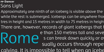
- FP Dancer Pro by Fontpartners,
$29.00 - Olympukes by Barnbrook Fonts,
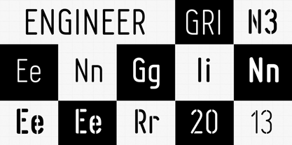
$30.00 - Engineer by GRIN3 (Nowak),
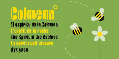
$15.00 - Colmena by ParaType,
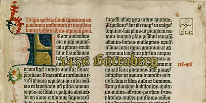
$25.00 - 1456 Gutenberg by GLC,
$38.00 - FatStack BB - Personal use only
- Anja Eliane - Unknown license
- Saddlebag - Personal use only
- Walter - Unknown license
- Tonky - 100% free
- LC Bagira - Unknown license
- Adam - Unknown license
- Puritan Swash - Personal use only
- WhoopAss - Personal use only
- MW SMART - Personal use only
- MW ISLET - Personal use only
- MW HONE - Personal use only
- Akvaléir - Unknown license
- MW CODE - Personal use only
- Rossano - Personal use only
- GD-Digit13LED-OTF - Unknown license
- ZANG - Unknown license
- MW POLKA - Personal use only
- MW TALON - Personal use only
- Fontin - Unknown license
- Novich - Unknown license
- coop deville - Unknown license
- MW BISHOP - Personal use only
- MW POLKA2 - Personal use only
- RNS BARUTA BLACK - 100% free
- MW PITHY - Personal use only
- CorrodetClassicaps-Black - Unknown license
- Worstveld Sling Extra Oblique - Personal use only
- BabyBazonga - Unknown license
- SF Eccentric Opus Shaded - Unknown license
- SF Eccentric Opus - Unknown license
- Blambot Custom - Personal use only
- Lakmus - Unknown license
- Puritan Alternate - Personal use only
- Chemistry - Unknown license
