10,000 search results
(0.064 seconds)
- MBF Modern Rebel by Moonbandit,
$15.00 modern rebel, modern futuristic display font with cyberpunk era inspiration. Unique diagonal ornament in the typeface design maximize the effect. Best usage as a title, large size display, logotype, wordmark and many others. Modern rebel also supports multi language.
 - Long Tall Palito by Pedro Teixeira,
$15.00 This font can make a great art element to emphasize, to provide impact, can stand out as a banner, or with a few words in headers and headlines and allow you to optimize space and keep neat and organized.
 - Madisson by Ditatype,
$29.00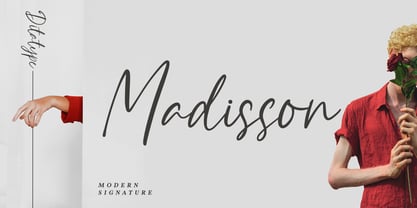 Madisson is a modern signature font. With a classy and natural style, it brings a classy and chic typeface. Madisson best used for weddings, branding, logotype, invitation, and quotes. Features: - Beautiful Ligatures - PUA Encoded - Multilingual Support - Numerals and Punctuation
 - Nadianne by Monotype,
$40.99Aldo Novarese, the famous Italian type designer (ITC Novarese, Eurostile, and many others), designed Nadianne. The elegant, readable Agfa Nadianne looks as good on an invitation as it does on a business letter. Featured in: Best Fonts for Tattoos - BOSS M - 100% free

- Slam Normal by Wiescher Design,
$12.00 »SLAM« is my new, very sturdy but elegant slab-serif font family. I designed this font family with body copy in mind and gave it all the glyphs necessary for use with all latin writing languages. I also gave the fonts all kinds of different numerals as well as a complete set of small caps and overall extensive kerning. It comes in eight normal weights with corresponding oblique cuts and it comes in a rounded version and corresponding obliques as well. Enjoy this original font, it is a real work horse!
 - Slam Rounded by Wiescher Design,
$12.00 »SLAM« is my new, very sturdy but elegant slab-serif font family. I designed this font family with body copy in mind and gave it all the glyphs necessary for use with all latin writing languages. I also gave the fonts all kinds of different numerals as well as a complete set of small caps and overall extensive kerning. It comes in eight rounded weights with corresponding oblique cuts and it comes in a normal version and corresponding obliques as well. Enjoy this original font, it is a real work horse!
 - Lucrezia by Florence,
$19.95 A decorative capitalis font inspired by the renaissance font Rotunda and old calligraphic foundings. From the beginning my aim was to design a font which focusses on simplyfing historical typography. I wanted to give people the possiblity to write with letters which refer to history but still are readable and modern. It is perfect for headlines and logos that need a historical touch. The font Lucrezia and its dangerous forms (the stitchy endings) are also inspired by the history of Lucrezia Borgia, who as we know, was a very mysterious person.
 - Rastalia by Romie Creative,
$15.00 Hi everyone, I would like to introduce my newest font. Rastalia Script is a beautiful modern calligraphy typeface, I hope you will be interested in this font, if you want to use it for your work. This font can be used easily and simply because there are many features in it. contains a complete set of upper and lowercase letters, a wide variety of punctuation marks, numbers, and multilingual support. fonts also contain a lot ligatures and many others contain alternative Style Sets like the heart swash alternative.
 - Queenly by Anmark,
$18.00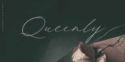 I’m pleased to introduce my handwritten font Queenly. Queenly is an elegant, feminine font. Modern calligraphy uppercase letters are ideal for your wedding monograms and logos. Use this font for wedding invitations, branding, packaging, magazines, florist shops, social media, restaurant menus, greeting cards, headers and many more. This font includes ligatures and a full set of lowercase alternates to make your text as close to a natural handwritten script as possible. It's perfect for wedding design projects, instagram, invitations, signatures, watermarks, logos, letterpress address, titles, birthday invitations, handwriting and other.
 - Capture The Waves by pentagonistudio,
$15.00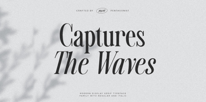 Captures The Waves Is A Modern Display Serif Fonts Inspired By Luxury and Ligature Characters. Font Features : SOFTWARE REQUIREMENTS : Fonts and alternate : No special software required they may be used in any basic program /website apps that allows standard fonts That's it folks! You can go ahead and get cracking :) Follow My Shop For Upcoming Updates Including Additional Glyphs And Language Support. And Please Message Me If You Want Your Language Included or If There Are Any Features or Glyph Requests, Feel Free to Send me A Message. Have a Good Day !
 - Elowen by Katsia Jazwinska,
$- Elowen is my new awesome font family with a handmade calligraphy style, which includes two typefaces: • Elowen - a bold script font with a dancing baseline and some double letter ligatures for a natural look. • Elowen Caps - an excellent companion for Elowen script in cases where a headline needed. Each font from the family supports the following languages: English, French, Italian, Spanish, Portuguese, German, Swedish, Norwegian, Danish, Dutch, Turkish, Polish, Finnish, Romanian, Hungarian, Estonian, Russian (and other languages with cyrillic alphabet) and more. Hope you enjoy the font family, thanks for purchasing and have fun!
 - Winter Delight by Supfonts,
$15.00 Winter Delight / Casual handwritten font Winter Delight it is a casual handwritten font with exquisite accents. The font is very cute and contains a huge number of ligatures. It is perfect for branding, wedding invitations and invitation cards and many more Font includes a full set of gorgeous uppercase and lowercase letters, numbers & large selection of punctuation marks Test it out below to see how it could look for your next project! Includes: Regular Script All latin languages support Uppercase and lowercase Numbers and punctuation Check out my blog: https://www.instagram.com/leopardletters pinterest.com/dmitriychirkov7 Enjoy
 - NorB Pen by NorFonts,
$28.00 NorB Pen was inspired from Arial Round font, I use this font for my jazz lead-sheets. It's a handwritten text font emulating a round marker permanent pen. You can use this font with any word processing program for text and display use, print and web projects, apps and ePub, comic books, graphic identities, branding, editorial, advertising, scrapbooking, cards and invitations and any casual lettering purpose… or even just for fun! NorB Pen comes with 8 weights, each with their matching italics and in a Light, Normal, Bold and Heavy version.
 - Gentle Whisper by Anmark,
$15.00 I’m pleased to introduce my new handwritten floral font Gentle Whisper. Gentle Whisper comes in two styles: Floral and Regular. Gentle Whisper Floral is an elegant, decorative, feminine font. Floral uppercase letters are ideal for your wedding monograms and logos. Use this font for wedding invitations, branding, packaging, magazines, florist shops, social media, restaurant menus, greeting cards, headers and many more. Gentle Whisper Regular is a modern calligraphy font. It's perfect for wedding design projects, instagram, invitations, signatures, watermarks, logos, letterpress address, titles, birthday invitations, handwriting and more.
 - Soul Skull by Otto Maurer,
$19.00 Soul Skull ist a special Version of my Font „Soul“ (soul ultra black). For a long Time i want to make a Font like this. Before FL6 that was impossible. I know it is a big File Size for a Font with all the Graphics but i need a Font like this for a Halloween Projekt. And so i did it myself. I hope you like it as i do! At this time i will say Thank you for FontLab 6 It is so much better than V5. I love this App :)
 - Karope by Nian Keun Studio,
$12.00 Karepo is a remarkably cool and dynamic serif font designed to elevate the visual appeal of your display. This font brings a sense of modernity and vitality to your designs, making them more captivating and engaging. Ideal for graphic design, social media, and branding projects, Karepo seamlessly integrates into the contemporary design landscape, adding a touch of sophistication and charm. Elevate your visual communication with this versatile serif font, perfect for creating a lasting impact across various platforms. Thank you for coming to my shop and enjoying other fonts.
 - Joe Cool by Studio K,
$45.00 Joe Cool is a bold geometric sans with minimal counters designed to achieve the maximum weight, solidity and impact on the page. Joe Cool Extended was actually created first, then it seemed like a good idea to add progressively more compact versions for added variety and versatility. See also Gravitas, my Bauhaus inspired font family which explores similar territory.
 - Arfindes Orthem by madeDeduk,
$12.00 Introducing Arfindes Orthem is a brush handwritten font and will be perfect for all your project design book, title branding, product packaging, invitation, quotes, label, poster, logo etc. Feature Uppercase & Lowercase Number & Symbol International Glyphs Multilingual support Alternative Ligature Feel free to drop us a message any time and follow my shop for upcoming updates Hope you enjoy it.
 - Budhayanti by madeDeduk,
$14.00 Budhayanti is a duo with both a script and sans-serif. This font perfect for poster design, book covers, merchandise, fashion campaigns, newsletters, branding, advertising, magazines, greeting cards, album covers, and quote designs and more. If you need anything else just shoot me an email at: dedukvic@gmail.com Find more previews on my Instagram here : https://www.instagram.com/acekelgondolayu/
 - Hippyfreak by Type Innovations,
$39.00 Hippyfreak was created by manipulating my Beatnik font. I stretched and distorted the outlines until I got an interesting effect reminiscent of the Hippie generation. It has a cool and hip rhythm and movement. Great to use for those funky headlines, or whenever a retro look is desired. Works great at all point sizes. Groovin' baby.
 - Raque by madeDeduk,
$15.00 Introducing Raque is a Capital Modern Serif, use this font for any branding, product packaging, invitation, quotes, t-shirt, label, poster, logo etc. Feature Uppercase & Lowercase Number & Symbol International Glyphs Multilingual support Alternative Ligature Shoot me on email at: dedukvic@gmail.com and find more previews on my Instagram here : https://www.instagram.com/acekelgondolayu/?hl=en Hope you enjoy it.
 - Woliu Maners by madeDeduk,
$16.00 Woliu Maners is a Modern Sans, use this font for any branding, product packaging, invitation, fashion, label, poster, logo etc. Feature Uppercase & Lowercase Number & Symbol International Glyphs Multilingual support Alternative Ligature Feel free to drop us a message any time and follow my shop for upcoming updates Shoot me on email at: dedukvic@gmail.com Hope you enjoy it.
 - Corpo Serif by Borutta Group,
$19.00 Corpo Serif is REFRESHED version of my old font Korpo Serif. Corpo Serif, designed by Mateusz Machalski, is a serif type family with a friendly feel. This type comprises 12 variants with 6 weights. The high contrast and high x height is perfect for headlines and display uses. Corpo Serif is a great complement for Corpo Sans.
 - Kopi Senja by Orenari,
$10.00 Kopi means coffee, and Senja means sunset. The inspiration of Kopi Senja Font Duo is indie music fans. Every curves of the character is originaly drawn by my hand with heart. Kopi Senja has sans and script version, mix and match it with your own imagination. Be creative and make your project stand out with Kopi Senja.
 - PiS HansHand Pro by PiS,
$28.00 HansHand started out in 2003 as a simple free font, the adaption of my grimy handwriting. For its 10th anniversary it got a complete overhaul and lots of new characters. Now also available in BOLD for the first time, featuring scribbles, strokes, circles and boxes to underline the fast taking-notes-while-on-the-phone look!
 - Heavy by madeDeduk,
$14.00 Introducing Heavy is a fun bold font and will be perfect for book, title branding, product packaging, invitation, quotes, t-shirt, label, poster, logo etc. Feature Uppercase & Lowercase Number & Symbol Alternates Ligatures International Glyphs Multilingual support Feel free to drop us a message any time and follow my shop for upcoming updates Hope you enjoy it.
 - Cocaine Sans - Unknown license

- cabanyalZ - Personal use only

- Evil Dead - Unknown license

- Friday13 - Unknown license

- Feast of Flesh BB - Personal use only

- Carnivalee Freakshow - Personal use only

- Dirty Female Feet - Personal use only

- Burton's Nightmare - Unknown license

- Knife Fight - Personal use only

- BackSplatter - Unknown license

- Soul Of Holitter Alternative - 100% free

- GhostTown - Unknown license

- It Lives In The Swamp (BRK) - 100% free


