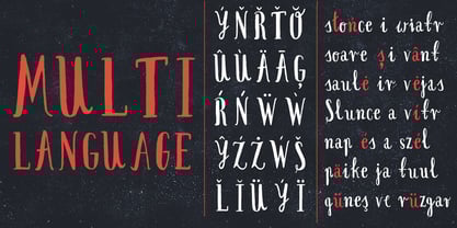
Avocado by Justyna Sokolowska, $15.00 Avocado is handwritten font. It's very suitable for the fashion industry and culinary. This font is crazy but readable, so it can be used for large amounts of text.
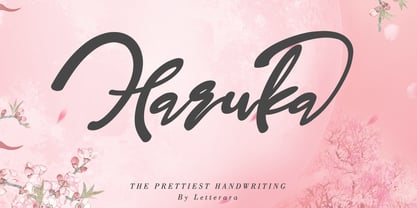
Haruka is a unique and bold handwritten font that is inspired by Japanese artistry. It will add an authentic and dynamic touch to a big variety of design projects.
Abracadabra is a headline font and shows its characteristics best in big sizes. Abracadabra loves to be used for fashionable reasons and likes to play with religious-looking symbols.
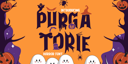
Purgatorie - Quirky Halloween Font is an enigmatic display typeface tailor-made for the spooktacular season of Halloween. With its sharp, angular letterforms, it effortlessly embraces the eerie and horror-themed design aesthetic. This font offers a whopping ten alternative variations, each inspired by different Halloween motifs like skeletons, bats, tombstones, blood, pumpkins, bats, witches' hats, and ghosts. Ideal for crafters and designers who enjoy creating products with a variety of themes, Purgatorie is a fantastic choice for logos, packaging, product branding, stickers, crafting, greeting cards, and invitations. Its ability to bring a playful and whimsical Halloween spirit to your creative projects makes it a must-have for the season. With its quirky Halloween style, Purgatorie allows you to create a bewitching atmosphere in your designs and celebrate the spooky holiday.
Ah, if fonts were people, Struck Base PERSONAL USE ONLY PERSONAL USE ONLY by Måns Grebäck would be that incredibly charismatic friend who insists on making a dramatic entrance at every party, yet onl...
The font named Big Top conjures up images a lively circus tent bustling with activity, underpinned by a sense of nostalgic whimsy and enchantment. This font is designed to capture the essence of the ...

With its extended complement, this comprehensive redesign of Bank Gothic by Elsner+Flake offers a wide spectrum for usage. After 80 years, the typeface Bank Gothic, designed by Morris Fuller Benton in 1930, is still as desirable for all areas of graphic design as it has ever been. Its usage spans the design of headlines to exterior design. Game manufacturers adopt this spry typeface, so reminiscent of the Bauhaus and its geometric forms, as often as do architects and web designers. The creative path of the Bank Gothic from hot metal type via phototypesetting to digital variations created by desktop designers has by now taken on great breadth. The number of cuts has increased. The original Roman weight has been augmented by Oblique and Italic variants. The original versions came with just a complement of Small Caps. Now, they are, however, enlarged by often quite individualized lower case letters. In order to do justice to the form changes and in order to differentiate between the various versions, the Bank Gothic, since 2007 a US trademark of the Grosse Pointe Group (Trademark FontHaus, USA), is nowadays available under a variety of different names. Some of these variations remain close to the original concept, others strive for greater individualism in their designs. The typeface family which was cut by the American typefoundry ATF (American Type Founders) in the early 1930’s consisted of a normal and a narrow type family, each one in the weights Light, Medium and Bold. In addition to its basic ornamental structure which has its origin in square or rectangular geometric forms, there is another unique feature of the Bank Gothic: the normally round upper case letters such as B, C, G, O, P, Q, R and U are also rectangular. The one exception is the upper case letter D, which remains round, most likely for legibility reasons (there is the danger of mistaking it for the letter O.) Because of the huge success of this type design, which follows the design principles of the more square and the more contemporary adaption of the already existing Copperplate, it was soon adopted by all of the major type and typesetting manufacturers. Thus, the Bank Gothic appeared at Linotype; as Commerce Gothic it was brought out by Ludlow; and as Deluxe Gothic on Intertype typesetters. Among others, it was also available from Monotype and sold under the name Stationer’s Gothic. In 1936, Linotype introduced 6pt and 12pt weights of the condensed version as Card Gothic. Lateron, Linotype came out with Bank Gothic Medium Condensed in larger sizes and a more narrow set width and named it Poster Gothic. With the advent of photoypesetters and CRT technologies, the Bank Gothic experienced an even wider acceptance. The first digital versions, designed according to present computing technologies, was created by Bitstream whose PostScript fonts in Regular and Medium weights have been available through FontShop since 1991. These were followed by digital redesigns by FontHaus, USA, and, in 1996, by Elsner+Flake who were also the first company to add cursive cuts. In 2009, they extended the family to 16 weights in both Roman and Oblique designs. In addition, they created the long-awaited Cyrillic complement. In 2010, Elsner+Flake completed the set with lowercase letters and small caps. Since its redesign the type family has been available from Elsner+Flake under the name Bank Sans®. The character set of the Bank Sans® Caps and the Bank Sans® covers almost all latin-based languages (Europe Plus) as well as the Cyrillic character set MAC OS Cyrillic and MS Windows 1251. Both families are available in Normal, Condensed and Compressed weights in 4 stroke widths each (Light, Regular, Medium and Bold). The basic stroke widths of the different weights have been kept even which allows the mixing of, for instance, normal upper case letters and the more narrow small caps. This gives the family an even wider and more interactive range of use. There are, furthermore, extensive sets of numerals which can be accessed via OpenType-Features. The Bank Sans® type family, as opposed to the Bank Sans® Caps family, contains, instead of the optically reduced upper case letters, newly designed lower case letters and the matching small caps. Bank Sans® fonts are available in the formats OpenType and TrueType.
Vodka by Fenotype, $19.00 Vodka - a display pack with an edge. Vodka is a display combo pack of four styles and six fonts. Vodka fonts are clean but soft. Vodka's core is two weights of a Brush Script and a Monoline Script with similar characters. Vodka Sans is a bold sans with very soft features. Vodka Sans lowercase letters are a bit condensed version of uppercase. Vodka Slab is a rounded bold display type. Vodka Brush and Pen are equipped with automatic Contextual Alternates and Standard Ligatures that help to keep the flow smooth. For more expressive letters there’s Swash Alternates for every standard letter. Vodka fonts are designed to play together but can easily be used as themselves too. For the best price purchase the whole pack!
Portmeirion No.6 started life as an experiment by our designer, who was exploring the possibilities of a completely 'over-the-top' display Roman face, bringing in elements of Tuscan and 'Circus' design, along with anything else he felt like. He's instilled a little more discipline in the finished result...but just ever so little. We have Fred Stevens, a regular reader of our website to thank for the name. He's comment on seeing a preview of the design was 'Over the top, Italianesque decorative and intriguing. add some 60's TV and voila Portmeirion.' Why No.6-well you'd need to know a bit about 1960s television to understand that, but we'll give you a hint..."Where am I?"..."In the village".
The Angelique Rose font, crafted by the talented type designer deFharo, stands as a whimsical and enchanting script font, capturing the essence of hand-written elegance with a modern twist. Its desig...
I bought something online, but when I received it, it wasn’t exactly what I had hoped it would be. So I read the return policy and sent it back. And… came up with this font and its name in the process! Return Policy is a hand drawn slab serif, inspired by a bunch of slab serifs from the early 20th century. Return Policy has been given a ‘grunge’ overhaul, making it ideal for sturdy products, websites with an industrial look and manly posters.
The font D3 Littlebitmapism Square, created by the entity known as D3, is a distinctive typeface that evokes the essence of early digital graphics and retro gaming aesthetics. As its name suggests, i...
The Guede Demo font, crafted by the talented David F. Nalle, is a distinctive and visually compelling typeface that offers a glimpse into the broader capabilities and aesthetics of its full version. ...
The Halcion font, brought to life by the innovative designers at Apostrophic Labs, is a distinctive typeface that seamlessly blends modern flair with a touch of nostalgia. Its creation reflects a car...
Gamegirl Classic is a charming and nostalgia-infused font that seems to teletransport its audience back to the bygone era of handheld gaming, reminiscent of the iconic Nintendo Game Boy that dominate...
"The Hands of Deaf" by SpideRaY is a font that truly speaks in the silent poetry of hands. Imagine a world where the alphabet dances gracefully at the tips of fingers, where each letter is a ballet o...
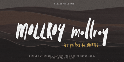
Please welcome Mollroy. A simple but special handwritting and it's perfect for quotes. Mollroy also fit for any range of your design projects. This font is naturally written by my self, so the flow of each characters became unique. Take your design project to the next level with Mollroy.
Show you school spirit with this sporty, collegiate font. These big chunky serifs let the world know you speak with authority, and they'll read your message clear as a bell. It's like a traditional college font, but it's got a chanky flair. Good for hockey jerseys and house parties.
"F*ck Beans," created by the intriguingly inventive Michael Tension, is not just a font but an audacious statement wrapped within the art of typography. It strides boldly away from the conventional p...
ColorTube, created by Bulgarian designer Ivan Filipov, is a vibrant and visually engaging font that is as playful as it is functional. It is an epitome of creativity, designed to bring color and life...
Oliandre Demo, designed by Katario Studio, is a font that effortlessly captures the essence of modern sophistication and artistic expression, blended with a hint of whimsicality. This distinctive fon...
The Rodrigues PERSONAL USE ONLY font, designed by the renowned typographer Måns Grebäck, is a testament to his craftsmanship in creating visually compelling and unique typefaces. This font captures a...
LT Oksana is a typeface created by the designer known as Nymphont that embodies a unique blend of charm, elegance, and artistic flair. This font is not just a collection of characters; it's a visual ...
As of my last update in April 2023, there is limited widespread recognition or documentation of a font specifically named "Rogers2". Without direct details or specifications about this font, it's cha...
The font Inked, crafted by GemFonts | Graham Meade, carries with it an unmistakable air of creativity and artistic flair. This font seems to channel the spirit of traditional tattoo design, merging i...
The font "Catchland PERSONAL USE ONLY PERSONAL USE ONLY" by Måns Grebäck is a distinctive typeface that embodies creativity and flair. This particular font comes from the prolific body of work produc...
HL2MP is not a widely recognized font in the traditional sense, such as Helvetica or Times New Roman, especially within professional typography or design circles. The name "HL2MP" seems to reference ...
SF Proverbial Gothic, created by ShyFoundry, is a distinctive typeface that seamlessly marries the essence of traditional gothic design with contemporary flair, thus creating a versatile font suitabl...

This is a large group of typefaces inspired by those borders and patterns you see going across documents from the Middle Ages and Medieval times, eventually becoming this collection of fonts where you can scroll various repeating patterns across a page, for example. You can get a repeating pattern that scrolls seamlessly by repeating the same letter. The default text displaying on the web-page is bbbbbbbb, for example. There's over 2 dozen basic styles, and each style has 52 designs within it, using the characters Upper Case A - Z and lower case a - z, with the lower case being the negative/reverse colour of the Upper Case version, it will be the corresponding design just reverse coloured and with an edging strip. There's also a space - but nothing else. The styles in these fonts usually have groups of six characters (A to F, G to L, M to R, S to X), and where the second group is a variation on the first - usually thicker lines - and the third grouping is another variation on that, usually thicker lines again, making the first 24 letters. (Sometimes there's three groups of eight characters). The pattern within a group normally starts off plain then gets busier as it progresses - such as there'd be a more complex pattern of circles and diamonds as you go through the letters. Then the letters Y & Z are somewhat different to the rest. There's four versions starting with Z, and they're a little bit different, and they're grouped in fives - getting bolder as you progress through the letters, but with similar patterns within each group of 5, and that makes the first 25 characters. The letter Z character is extra busy. Again, lower case is the reverse colour of the Upper Case. Mostly you can get patterns and borders that combine seamlessly by using letters within the same group of 6 or 8 (like maybe abdcedcb). There are a few occasions when that doesn't work out, because there may be circles or diamonds at the sides of the letters that don't match up with another letter that has a different pattern at the side. But you can create a pattern with the exact level of complexity you want perfectly easily. You can see examples of this in the poster images. Neighbouring letters without embellishments at the sides of the letters will usually fit together. Have fun with it, that's what it's there for. aah yes fonts
Public Secret DEMO, created by David Kerkhoff, reflects an intriguing blend of mystery and openness, as its name intriguingly suggests. This typeface navigates the delicate balance between revealing ...
Bleeding Freaks is a font that resonates with the essence of horror, suspense, and a touch of macabre artistry. It's a font that belongs to the decorative or display category, crafted with the intent...
Alecto Demo, as conceptualized by The Scriptorium, embodies a distinctive character that is a blend of vintage charm and contemporary flair. This font is named after Alecto, one of the Furies in anci...
U.S.A. Condensed is a distinctive typeface designed and released by Iconian Fonts, a notable foundry known for its extensive collection of unique and thematic fonts. Iconian Fonts, operated by Dan Za...
As of my last update in 2023, the "Copyright Violations Nudged" font by GemFonts | Graham Meade isn't a widely recognized or popularly discussed font in mainstream typography circles, which suggests ...
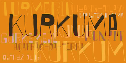
Kurkuma (Turmeric in Dutch) is a spice I use in all of my curries. And I love curry! It's not more than fair to name a font after my favorite ingredient, so here you have it: Kurkuma. It is a unique and somewhat bizarre font with both an angelic and a diabolical side. I wouldn't set a whole text in it, but it does look great in headlines, posters and websites.
Swithin is based on hand lettering from the titles in a Victorian fairy tale collection. It has a playful look which seems just right for the holiday season, with some rough, hand-drawn variations which make make it feel more unique. It's conceptually similar to our Candlemas and Summerisle fonts, but has its own special personality. It ought to be excellent for holiday cards and other seasonal uses.
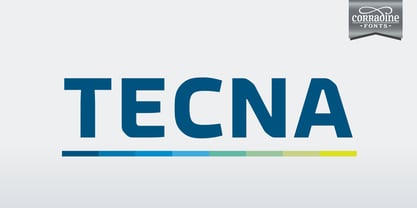
Tecna by Corradine Fonts, $24.95 Tecna is a modern sans typeface with straight cuts, rounded angles and curved thinnings at the endings that make the letter shapes fresher. The rounded characters are squarish giving to the layout a very structural appearance. Its wide proportions give big impact to the texts. It has a tall x-height that enhances its legibility in smaller sizes. Its character set has coverage for Western and Central European languages.
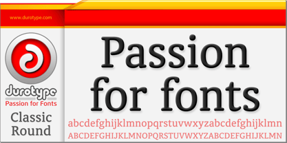
Classic Round. It’s classic. It’s round. Classic design; present-day roundness. Versatile. Soft. Warm. Peaceful. For text and display use. When using Classic Round in small text sizes, it will be a reliable and legible workhorse. When using it in big display sizes, it will show its interesting details. Classic Round has the companion typeface Classic XtraRound. For more information about Classic Round, download the PDF Specimen Manual.
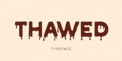
Thawed by Larin Type Co, $13.00 Thawed This is a display font of a narrow specialization, its letters seem to have melted and flowed, but at the same time it retains the shape of the letters and is well read. It is perfect for branding, logos, labels, short display inscriptions and advertising materials from flyers to billboards. This font includes drops of style, they make it possible to make the font more voluminous and give detail.
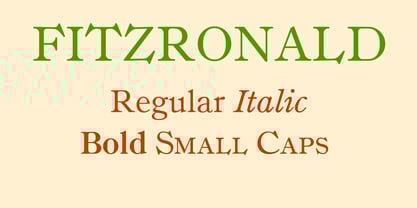
Fitzronald is a body text typeface with a strong personality combined with a good legibility in small sizes. It is an excellent book typeface, but it can be used in e.g. advertising and packaging as well. Due to its good legibility at low resolution, it is a superb website and e-book typeface. Fitzronald is based on Ronaldson, an American typeface originally cut by MacKellar, Smiths & Jordan in 1884.
