10,000 search results (0.031 seconds)
  1. TOYZARUX - Personal use only
  2. Qebab Shadow FFP - Personal use only
  3. Maus - Personal use only
  4. Ben Pioneer - Unknown license
  5. 13_Roshi - Personal use only
  6. Vampetica - Personal use only
  7. Cherry Blue - Personal use only
  8. MonaKo - 100% free
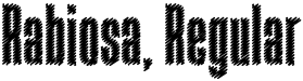
  9. Rabiosa - Personal use only
  10. Bauer - Unknown license
  11. Reprise Stamp - Unknown license
  12. Frankfurt - Unknown license
  13. KG Something to Believe In - Personal use only
  14. PackardClipperNF - 100% free
  15. Quad Light - 100% free
  16. Photonica - Unknown license
  17. Tapeworm - Unknown license
  18. Thyssen J - Unknown license
  19. Tasmin Reference - Unknown license
  20. White Bold - Unknown license
  21. Paper-Mache - Personal use only
  22. Ozone - Unknown license
  23. WhoopAss - Personal use only
  24. ACID LABEL___ - Personal use only
  25. D3 Euronism Bold - Unknown license
  26. Khan - Unknown license
  27. Ankora - Unknown license
  28. AB UltraChic - 100% free
  29. PEIXE FRITO - Personal use only
  30. Opus Pix - Personal use only
  31. Opal - Unknown license
  32. Alfredo Heavy Hollow - Unknown license
  33. Oaxaqueña Tall - Personal use only
  34. Verdana - Unknown license
  35. Hitch - Unknown license
  36. TRUEblood - Personal use only
  37. Kake by Eclectotype, $30.00
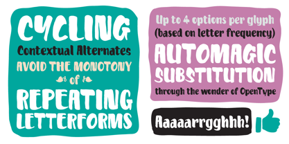
    Kake’s upper case letters are inspired by a hand-painted sign outside a temple in Ubud, Bali. The rest of the font is made to fit the style. The hand-made aesthetic is increased by the implementation of contextual alternates, which automatically swap glyphs to alternate forms to avoid the monotony of repeating letters. The amount of variations for each glyph is dependent on letter frequency in English; there are more a’s and e’s than q’s and j’s. Even with only two variations of some glyphs, the programming makes sure that no two matching glyphs are ever next to eachother, and for the most part they will rarely be even two letters apart. This all makes for type that looks like it isn't type. The glyphs bounce and subtly change weight with willful abandon. Some of the letters on that original sign are somewhat quirky. If you're not a fan you can engage stylistic alternates or stylistic sets to change the C, G, S, Y, c, s and y glyphs to a less idiosyncratic form. These variations still have variations themselves, so with contextual alternates on, they will look as random as all the rest. Case sensitive forms and automatic fractions are included, as are 98 ornaments, ranging from the useful to the (let’s just say) esoteric. These can be accessed from the glyph palette. I know you've probably never realized you need an anchor, a fuel pump, skull and crossbones and chess symbols in the same font before, but that doesn't mean you don't! Kake is full on display typography. It’s legible for small blocks of copy but don't go setting essays in it. Unless you really want to... in which case, go for it.
  38. Blackheat by Almarkha Type, $19.00
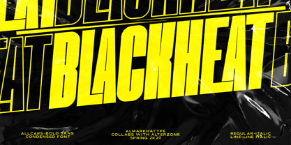
    Blackheat is a bold, condensed sans with 4 styles inspired by the title of the sports poster. We designed it to look very energetic, taking into account the thickness and density of each glyph. Extra ligatures give you even more possibilities. This family is suitable for the titles, clothes, posters, magazines, brochures, packaging, websites and much more.
Looking for more fonts? Check out our New, Sans, Script, Handwriting fonts or Categories
abstract fontscontact usprivacy policyweb font generator
Processing