10,000 search results
(0.07 seconds)
- DecoCaps - Personal use only

- Dragon Order - Personal use only

- Nife Fites - Personal use only

- Nife Fite - Unknown license

- Nife Fiter - Unknown license

- Tectura II by Greater Albion Typefounders,
$14.50 Tectura II is Greater Albion's answer to the infamous Comic Sans. It's a family of four 'hand printed' typefaces that provides our very own answer to the infamous 'Comic Sans', and follows on from one of our early release 'Tectura'. Tectura II offers a distinctive blend of hand written character with legibility.
 - Angel Tears - Personal use only

- Terfens Gothic by insigne,
$29.00 Terfens Gothic is the perfect choice for your next project! With its medium contrast and approachable design, this calligraphic sans serif has a classic feel that will never go out of style. Terfens Gothic is the perfect typeface for anyone looking to add a touch of uniqueness to their designs. With its generous x-height and rounded terminals, it's perfect for creating one-of-a-kind designs that are sure to impress. Its large x-height gives it a welcoming, but not too casual vibe. With forty-eight different typefaces, it has the versatility and aesthetic options you need to make your project stand out. Choose from regular, condensed, and extended styles, each with nine different weights and italics. Terfens Gothic has the look you need to make a powerful impression. Terfens is the ideal typeface for any project that has to stand out, thanks to its towering verticality. Terfens may be utilized for a variety of purposes because of its adaptable design. Terfens is a sans unlike any other- it starts with a beautiful calligraphic chancery script and then adds movement and personality. This sans is guaranteed to make your next project more exciting! The Terfens Type System's third typeface, Terfens Gothic, is an amazing addition to any type collection. The Terfens Type System's adaptability is unrivaled, with its vast choice of styles, widths, and weights. This font family has everything you need to create unique, customized designs that will suit your individual needs. Whether you need a narrow or wide font, or a hairline or bold weight, the Terfens Type System has you covered! And, with its Opentype features, the Terfens Type System is perfect for anyone who wants to add a personal touch to their projects.
 - Magazin ST by siquot'types,
$39.99 Magazin ST is powerful but delicate. What fascinated me seeing, a couple of letters, in Bob Roy Kelly's book (American Wood Type:1828-1900) were the little squares in the corners that represent a glow from lighting coming from below and from the right. Such ambiguity excited me and I thought that today with digital resources it wouldn't take long to do it. Seeing it working is excellent. Look In the posters what it is for and the effects it produces, including the sensation of relief.- L.S.
 - Red Hot Mama NF by Nick's Fonts,
$10.00The Zanerian Manual of Alphabets and Engrossing, published in numerous editions since 1895, featured many elegant and elaborate script typefaces. However, it seems that, from time to time, calligraphers just want to have fun, and this little number is definitely fun. Light, lively and just a little loopy, Red Hot Mama is sure to add just the right amount of spice to your special project. Both versions contain the complete Unicode 1252 (Latin) and Unicode 1250 (Central European) character sets, with localization for Romanian and Moldovan. - Arturo by Hackberry Font Foundry,
$24.95 Arturo is a brand new font family drawn from the original inspiration of an old alphabet in one of Dan Solo 's Dover Clip Art books. It has moved far away from those raw roots, however. Every character has been redrawn. For example, I had a light version that I never could get working. Arturo is based on that light style and called Arturo Book. The name comes from a good friend of mine in El Paso. He was the guinea pig upon whom I foisted off the beginnings of this style so many years ago. I did several marketing pieces for him using the raw drawings. I figured that he deserved to have the family named after him, at the very least. This is a normal font family for me in that it has caps, lowercase, small caps with the appropriate figures for each case. This font has all the OpenType features in the set for 2009. There are several ligatures for your fun and enjoyment: bb gg ff fi fl ffi ffl ffy fj ft tt ty Wh Th and more. Like all of my fonts, there are: caps, lowercase, small caps, proportional lining figures, proportional oldstyle figures, & small cap figures, plus numerators, denominators, superiors, inferiors, and a complete set of ordinals 1st through infinity. Enjoy!
 - Albeit Grotesk Stencil Caps by Cloud9 Type Dept,
$20.00 Albeit Grotesk Stencil Caps is a graphic geometric stencil-style all caps display font family of four weights (Light, Regular, Medium and Bold) with slightly exaggarated diacritics for better readability making it ideal for headlines.
 - Cabaret by ITC,
$29.00Cabaret was designed by Alan Meeks, a light-hearted, fun font. From the shapes of the letters to the shading within the outline forms, Cabaret displays a variety of details making it unique and appealing. - Skisterstone by Maulana Creative,
$12.00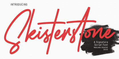 Skisterstones Signature Script Font Skisterstone is a Casual Signature Script font. With regular mono-line stroke, fun character with a bit of ligatures. To give you an extra creative work. Skisterstone font support multilingual more than 100+ language. This font is good for logo design, Social media, Movie Titles, Books Titles, a short text even a long text letter and good for your secondary text font with sans or serif. Make a stunning work with Skisterstone font. Cheers, MaulanaCreative
 - Feeltrips by Maulana Creative,
$15.00 Feeltrips is an all caps handwritten display font. With bold stroke, italic and fun character with a bit of ligatures. To give you an extra creative work. Feeltrips font support multilingual more than 100+ language. This font is good for logo design, Social media, Movie Titles, Books Titles, a short text even a long text letter and good for your secondary text font with sans or serif. Make a stunning work with Feeltrips font. Caps only fonts. Cheers, MaulanaCreative
 - Nemo - Unknown license

- Spiraling - Unknown license

- Chunkmuffin - Unknown license

- Deanna - Unknown license

- Clarendon No 1 by URW Type Foundry,
$35.99 The first Clarendon was introduced in 1845 by R Besley & Co, The Fan Street Foundry, as a general purpose bold for use in conjunction with other faces in works such as dictionaries. In some respects, Clarendon can be regarded as a refined version of the Egyptian style and as such can be used for text settings, although headline and display work is more usual. Clarendon is a trademark of Linotype GmbH registered in the U.S. Patent and Trademark Office and may be registered in certain other jurisdictions.
 - FS Pimlico by Fontsmith,
$80.00 Born in the 70s Personal influences are unavoidable in type design and usually find their way through into finished fonts. At Fontsmith, one period in particular provides inspiration, according to FS Pimlico designer, Fernando Mello. “Jason and Phil have always known that I’m very into the visual language of the 70s. I know that Jason shares my love of the 70s and Phil will sometimes admit to being a fan, too. I think that’s the reason they were both so supportive in the development of this font. “And, of course, we all share an interest in good-humoured and intelligent design. We like to think it’s a Fontsmith characteristic.” Back from black FS Pimlico started in an unusual place: with a tubby, penguin-like lowercase “a” that Fernando Mello had been sketching. From “a” grew the rest of the alphabet – a bubbly, fat, friendly family with a brush-written quality that became FS Pimlico Black. The black weight certainly isn’t the normal starting point for creating a regular and bold weight, but Fernando pressed on, driven by a glut of influences: brush-writing; Letraset and early digital systems catalogues; the type of Herb Lubalin and Tony di Spigna; 70s clothes and vinyl; and 70s revival disco nights in London’s Pimlico and Vauxhall. Natural or flourished Not often do fonts come along that seem to span the ages. FS Pimlico is at home in an office environment providing a fresh clear identity in communications or providing text that’s clear and easy to read. But it likes to party, too, 70s style. With the OpenType features switched on, a designer can totally change the look of their work, and create point-of-sale, headlines and titles that stand out and get noticed.
 - FS Pimlico Variable by Fontsmith,
$249.99Born in the 70s Personal influences are unavoidable in type design and usually find their way through into finished fonts. At Fontsmith, one period in particular provides inspiration, according to FS Pimlico designer, Fernando Mello. “Jason and Phil have always known that I’m very into the visual language of the 70s. I know that Jason shares my love of the 70s and Phil will sometimes admit to being a fan, too. I think that’s the reason they were both so supportive in the development of this font. “And, of course, we all share an interest in good-humoured and intelligent design. We like to think it’s a Fontsmith characteristic.” Back from black FS Pimlico started in an unusual place: with a tubby, penguin-like lowercase “a” that Fernando Mello had been sketching. From “a” grew the rest of the alphabet – a bubbly, fat, friendly family with a brush-written quality that became FS Pimlico Black. The black weight certainly isn’t the normal starting point for creating a regular and bold weight, but Fernando pressed on, driven by a glut of influences: brush-writing; Letraset and early digital systems catalogues; the type of Herb Lubalin and Tony di Spigna; 70s clothes and vinyl; and 70s revival disco nights in London’s Pimlico and Vauxhall. Natural or flourished Not often do fonts come along that seem to span the ages. FS Pimlico is at home in an office environment providing a fresh clear identity in communications or providing text that’s clear and easy to read. But it likes to party, too, 70s style. With the OpenType features switched on, a designer can totally change the look of their work, and create point-of-sale, headlines and titles that stand out and get noticed. - Royalite by Sarid Ezra,
$13.00 Royalite Script is classic script font that contain stylistic alternate, swash, etc to create your own customized signature. You can feel the elegant and luxury from this font. It's time to try a new classic script. Use this font for your fashion brand now! Also Royalite support multi language. This font available in OTF and TTF. Also Support PUA. Royalite contain start and end swash that you can use only by activate opentype. You can try this feature with copy and paste to the font testing -- -3royalite+3
 - Versica by Letrasupply Typefoundry,
$25.00 Versica is a handcrafted display font. This font family consists of multiple style fonts that can be used either as authentic individual fonts or can be combined to get cool layered type. The package is completed with swashes, shadow and serif font. Don't forget to play with stylistic alternates character that featuring the font. You may get a perfect font for any advertise or editorial work issues.
 - Florentine SwashCaps - Unknown license

- ArTarumianBehrensInitialen by Tarumian,
$100.00 Behrens Initialen is based on the type graphics of the German architect and type designer Peter Behrens (1868-1940). The drawing of the original typeface is in tune with the Art Nouveau (Jugendstil) style in which Behrens worked. This is a light, delicate, somewhat theatrical typeface, the forms of which bear at the same time a certain shade of Gothic and modernity, and can be used, in particular, when there is a need to make a reference to medieval graphics while maintaining the modern style of composition. In the proposed version, the original initial graphics are used not only for uppercase letters, but also for Arabic figures, while for lowercase letters and for the base of other characters are used the letters themselves - without decorative framing. This feature can be useful for obtaining various effects when using both lower and upper cases in parallel, including when they are overlaid. The font includes the Latin, Cyrillic and Armenian ranges. Created by Ruben Tarumian in 2020.
 - Tellumo by Monotype,
$52.99 Tellumo, a new humanist geometric sans serif typeface, has all the attributes you need for a workhorse sans with a few surprising details. It has moderate proportions, a low stroke contrast, open apertures, and an x-height that makes it drive with ease in running text. A modest range of six weights, from Thin to ExtraBold, make it versatile without being overwhelming. The lightest and heaviest weights are best saved for headlines and subheads. It features a set of swash caps that can add magnitude and sparkle to short headlines, making it excel in packaging designs. Tellumo feels at home with Mid-century Modern and Art Deco aesthetics. It looks precise, tidy, and welcoming for architecture and home goods. It looks clean, fresh and modern for beauty and wellness, or elegant and approachable for fashion. It has a balance of clarity and personality, suitable for branding and advertising of all kinds, print & digital design alike. Tellumo radiates warmth, charm, and joyfulness from its geometric foundation.
 - Phrasa by Arrière-garde,
$12.00 Phrasa is a robust humanist sans-serif typeface family which will carry you through most of your design needs. Designed for legibility, she truly shines in running text. However her solid (yet elegant) construction allows for usage in such settings as branding or signage. Phrasa's most prominent features are: 13 weights, from hairline to black Moderate x-height Large apertures Modern capitals proportions Designed for readability… … without sacrificing good looks True Italics Small capitals Adobe Latin 3 language range Cyrillic alphabet Old-style and tabular figures The idea behind Phrasa was to create a stylish typeface but with legibility in mind. The inspiration came from history, namely from two of the most legible typefaces known: Garamond and Gill Sans. The new typeface boasts a smooth, easy-on-the-eyes texture which allows the reader to simply sink into the text. It also posses a set of true italics to compliment it. Phrasa has a broad linguistic range, spanning from extended latin alphabet to cyrillic.
 - Monocle by Reserves,
$39.99 Monocle is a clean and contemporary monospaced geometric sans that excels in titling, data and numerical settings due to its clear and systematic design. The capitals-only format increases the harmony between letter pairings, opposing the irregularity of mixed case fixed-width typefaces. Stylistically, Monocle has the feel of a neutral sans, yet its underlying structural finish exudes a strong sense of order and authority. Its geometric foundation is especially pronounced in the constructed round forms. With multiple stylistic sets, individual letters can be exchanged to fine-tune text settings for a unique custom type solution. Features include: -Basic Ligature set including ‘f’ ligatures (ae, oe, fi, fl, ff, fh, fj, ft, tt, th, ct, st) -Alternate characters (O, I, S, G, R, Q, _, $, ©, #, •, %) -Slashed zero -Full set of numerators/denominators -Automatic fraction feature (supports any fraction combination) -Extended language support (Latin-1 and Latin Extended-A) *Requires an application with OpenType and/or Unicode support.
 - Tellumo Variable by Monotype,
$313.99 Tellumo, a new humanist geometric sans serif typeface, has all the attributes you need for a workhorse sans with a few surprising details. It has moderate proportions, a low stroke contrast, open apertures, and an x-height that makes it drive with ease in running text. A modest range of six weights, from Thin to ExtraBold, make it versatile without being overwhelming. The lightest and heaviest weights are best saved for headlines and subheads. It features a set of swash caps that can add magnitude and sparkle to short headlines, making it excel in packaging designs. Tellumo feels at home with Mid-century Modern and Art Deco aesthetics. It looks precise, tidy, and welcoming for architecture and home goods. It looks clean, fresh and modern for beauty and wellness, or elegant and approachable for fashion. It has a balance of clarity and personality, suitable for branding and advertising of all kinds, print & digital design alike. Tellumo radiates warmth, charm, and joyfulness from its geometric foundation.
 - Fresh Spirit by Yumna Type,
$25.00 It can be a time-wasting process to find a perfect font for your projects that unfortunately may end in unexpected results as you want to stand out your unique designs without spending hours on searching the right font. For that reason, we would like to introduce you to Fresh Spirit. Fresh Spirit is a unique display font in round, twisting styles on the letters' edges. It is very suitable to apply for products related to food and drink especially fruit due to its fun, cute characteristics. Fresh Spirit font, which provides a clipart in line with the theme as a bonus, will create some soft, fun, adorable nuances and increase visual attractiveness to your designs. In addition, you can enjoy the available features here. Features: Multilingual Supports PUA Encoded Numerals and Punctuations Fresh Spirit fits best for various design projects, such as brandings, headings, magazine covers, quotes, printed products, merchandise, social media, etc. Find out more ways to use this font by taking a look at the font preview. Thanks for purchasing our fonts. Hopefully, you have a great time using our font. Feel free to contact us anytime for further information or when you have trouble with the font. Thanks a lot and happy designing.
 - Sixties Flashback by Mysterylab,
$15.00 Here's a lettering style that just might be exactly on your wavelength. Add just the right dose of vintage freak-a-delia to your retro graphics with this original psychedelic-style design. Great for music posters, album graphics, book titles, etc. Evoke a warpy, wavy, whimsical vibe that harks back to the carefree 1960s or early 1970s era with Sixties Flashback; it's pure hippie, trippy fun!
 - Petrarka by HiH,
$12.00 Petrarka may be described as a Condensed, Sans-Serif, Semi-Fatface Roman. Huh? Bear with me on this. The Fatface is a name given to the popular nineteenth-century romans that where characterized by an extremity of contrast between the thick and thin stroke. The earliest example that is generally familiar is Thorowgood, believed to have been designed by Robert Thorne and released by Thorowgood Foundry in 1820 as "Five-line Pica No. 5." Copied by many foundries, it became one of the more popular advertising types of the day. Later, in the period from about 1890 to 1950, you find a number of typeface designs with the thin stroke beefed up a bit, not quite so extreme. What you might call Semi-Fatfaced Romans begin to replace the extreme Fatfaces. Serifed designs like Bauer’s Bernard Roman Extra Bold and ATF’s Bold Antique appear. In addition, we see the development of semi-fatface lineals or Sans-Serif Semi-Fatfaces. Examples include Britannic (Stephenson Blake), Chambord Bold (Olive), Koloss (Ludwig & Mayer), Matthews (ATF) and Radiant Heavy (Ludlow). Petrarka has much in common with this latter group, but is distinguished by two salient features: it is condensed and it shows a strong blackletter influence, as seen in the ‘H’ particularly. Petrark was released about 1900 by the German foundry of Schelter & Giesecke of Leipzig and is one of the designs of the period that attempts to reconcile roman and blackletter traditions. Making a cameo appearance in this Multi-Lingual font is the Anglo-Saxon letter yogh (#729), which, along with the thorn and the eth, is always useful for preparing flyers in Old English. There are still pockets of resistance to the Norman French influence that washed up on England’s shores in 1066. This font stands with King Canute, seeking to hold back the tide (ignoring the fact that Canute was a Dane). Support the fight to preserve Anglo-Saxon culture. Buy Petrarka ML today. Petrarka Initials brings together the Petrarka upper case letters with a very sympatico Art Nouveau rendering of a female face.
 - Very Frank by Up Up Creative,
$16.00 Meet Very Frank, a font that won’t feed you any lines or tell you any lies. Straight and tall and lacking in all but the subtlest softening details (look at the leg on that uppercase K, though…). Very Frank is a condensed sans serif display font (in regular and italic) with tall, straightforward lines and subtle curves to soften things up. It includes a ton of standard and discretionary ligatures and two stylistic sets to spice things up and add some fun. It's perfect for headlines, editorial design, monograms, branding, logos, poster design, and more. Very Frank includes approximately 540 glyphs and more than 75 standard and discretionary ligatures. Additional OpenType features include character variants, stylistic sets, and multilingual support (including multiple currency symbols). The OpenType features can be very easily accessed by using OpenType-savvy programs such as Adobe Illustrator and Adobe InDesign. (To access these awesome features in Microsoft Word, you'll need to get comfortable with the advanced tab of Word's font menu.)
 - Supertuba by Tipos Pereira,
$10.00 Supertuba is a :) geometric sans vernacular humanist :) display type family with 6 weights. There's literally dozens of ligatures in this font so It works very well for flyers, package, stickers and posters, also you can use it as a text font if you're looking for something slightly bold. Supertuba has multilingual support and useful open type features. Letter boards that used to be seen in churches, dive bars and butcher shops are the main inspiration for this typeface. The name Supertuba came from an old supermarket that no longer exists in the city of Indaiatuba , I just believe this name is super fun (at least in Portuguese) and wanted to keep it alive. I was in Indaiatuba when I get started designing this typeface so this is fair enough. Supertuba the third piece of a particular trilogy of fonts that Stubby and Stubby Rough take part, from the lazy vernacular drawing to an unusual geometry. Enjoy!
 - Kokomo Breeze by Nicky Laatz,
$35.00 Say hello to Kokomo Breeze - A deliciously bold and nonchalant casual marker font. Kokomo Breeze was designed to keep a naturally handwritten marker-style look , while still maintaining some subtle inky marker imperfections on its edges , to keep in line with a more realistic, yet very legible look. Great for headlines, bold branding, classy packaging, eye-catching callouts and stand-out advertising, Kokomo Breeze is designed to be your jack of many trades. Be sure to turn on your OpenType features when type with Kokomo Breeze - it’s packed with natural-looking ligatures and alternate characters for both upper and lower case - all of these opentype extras make your type design look mush less mechanical, and much more like naturally formed words as you type. Pair it with a bold tall sans serif font, or a classy serif to add another whole new dimension to this very versatile marker font. Great as large and small sizes, Kokomo Breeze is perfect for any size design.
 - Authemia by Skinny Type,
$15.00 Authemia is a font duo Script, Sans, and plus Extras typeface with characters dancing along its baseline. It has a casual and elegant touch. Can be used for various purposes such as logos, wedding invitations, headings, t-shirts, letterheads, signage, labels, news, posters, badges etc. OpenType features with alternative styles, ligatures, and multi-language support. To enable OpenType Stylistic alternates, you need a program that supports OpenType features such as Adobe Illustrator CS, Adobe Indesign & CorelDraw X6-X7, Microsoft Word 2010 or a later version. How to access all alternative characters, using the Windows Character Map with Photoshop: https://www.youtube.com/watch?v=Go9vacoYmBw How to access all alternative characters using Adobe Illustrator: http://youtu.be/iptSFA7feQ0 There are additional ways to alternate / swash, using the Character Map (Windows), Nexus Font (Windows), Font Book (Mac) or a software program like PopChar (for Windows and Mac). Need help? If you need help or advice, please contact me via email. Thank you!
 - The Munday by Alit Design,
$18.00 Presenting 🍃The Munday Typeface🍃 by alitdesign. The Munday is a sans serif font that features a nature concept with leaf swashes. It has a modern and clean design that can be used for various design projects such as branding, titles, logos, and more. Its leaf swashes give it a unique and playful touch, making it suitable for projects with a nature or organic theme. Yes, that's correct. The Munday font has support for ligatures, which are special character combinations that create a more visually appealing text appearance. It also supports multiple languages and has a total of 648 glyph characters, providing a wide range of options for users in different countries and regions. This makes the font versatile and suitable for various international projects. Language Support : Latin Basic, Western European, Central European, South European, Vietnamese. In order to use the beautiful swashes, you need a program that supports OpenType features such as Adobe Illustrator CS, Adobe Photoshop CC, Adobe Indesign and Corel Draw.
 - Genty by Flavortype,
$19.00 Meets Genty, A new carefully crafted Delightful Bold on a script typefaces. A Creation of combining on our last 2 fonts which is Budge and Glaw. It generates a lot more fun, more trendy and more vibrant. It’s Versatile, Fun, Cute and Beauty feel that you get in Genty Typefaces. Genty Created with a tons of opentype features!. beautiful swashes, contextual alternates, stylistic sets up to 15 alternates, ligatures, ascender & descender swashes, Uppercase swashes, swoosh under the letters and swoosh at final of the letters. Every glyphs for alternates are curated for the best and possible without eliminate characteristic of this fonts. Genty also comes with a Font Pair Sans Serif that complete the needs for your design. Our creation on the display to give you a reference what it looks like on your project. such as Branding, Header, Logotype, Poster, Magazine, Packaging, Food Menus, and etc. It shows that Genty clearly can accommodate various design style.
 - Save The Date by Latinotype,
$40.00 A wedding begins long before the "I Do's" on the big day—everyone works together throughout the process to make sure that everything happens as planned: details, color combinations, decorations, the way we convey the magic of the visual elements and deliver our message of love. Through this beautiful font, we would like to deliver to you that very message, you make it your own and express yourself in your own way—through the perfect invitation on your wedding day. No matter how sweet or wild your invitation looks, try to be yourself. Save the Date is a font collection consisting of 9 styles and 4 variants: Script, Sans, Serif and Small. The font set is intended to provide users with a wide range of choices for any design project. Save the Date was designed by Paula Nazal and Daniel Hernández. Digital editing by Rodrigo Fuenzalida. Photos by Mónica Muñoz. Mónica specializes in wedding photography. You can find more of her work here: www.thewildbrides.com


