3,938 search results (0.019 seconds)
  1. Minster No 1 - Unknown license
  2. Skeksis - Unknown license
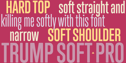
  3. Trump Soft Pro by Canada Type, $39.95
    Trump Soft Pro is the softer, round-cornered version of Trump Gothic Pro, the popular condensed gothic seen on films, magazines, book covers and frashion brands all over the globe. Trump Soft offers a friendlier grade of the same economic functionality, clear modular aesthetic and extended character sets as Trump Gothic. The sharper Trump Grothic series is a reconception of ideas from Georg Trump’s seminal 1955 Signum typeface and its later reworking (Kamene) by Czech designer Stanislav Marso. Originally cobbled together for a variety of film projects in the late 1990s and early 2000s, the Trump Gothic family was made available for the general public in 2005. Shortly thereafter, it became extremely popular. It continues to be used extensively today. In 2013, the typeface was redrawn, refitted, optimized and greatly expanded into a multiscript family of six fonts, each containing over 1020 glyphs and a wealth of OpenType features, including small caps, caps-to-small-caps, stylistic alternates, unicase/monocase alternates, fractions, ordinals, class-based kerning, and support for Latin, Cyrillic and Greek locales.
  4. Germanica - 100% free
  5. Germania - Personal use only
  6. Lupus Blight - Personal use only
  7. Mordred - Unknown license
  8. KlausBFraktur - 100% free
  9. Necros - Unknown license
  10. Devil's Snare - Unknown license
  11. Schmalfette Fraktur - Personal use only
  12. Abaddon™ - Unknown license
  13. Lombardic - Unknown license
  14. Psycho Poetry - Unknown license
  15. Gotenburg A - Personal use only
  16. The Centurion by Creativework Studio, $18.00
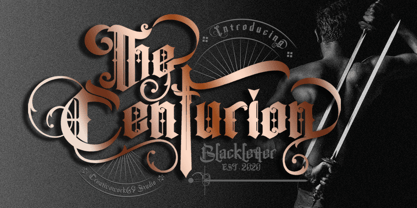
    The Centurion is a gothic blackletter. It feels classic and artistic. Add this beautiful font to each of your creative ideas and notice how it makes them stand out! The Centurion is perfect for Band logos & branding, product designs, label, product, movie, book tittle, product packaging, t’shirt design
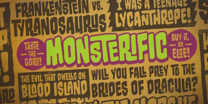
  17. Monsterific BB by Blambot, $20.00
    Monsterific BB was inspired by classic 70s horror magazine titles, and features a large complement of European characters and over 160 Opentype Autoligatures! Perfect for Halloween or any spooky time of the year!
  18. Vectora by Linotype, $40.99
    In creating Vectora, Adrian Frutiger was influenced by American Gothic styles, especially those of Morris F. Benton’s Franklin Gothic and News Gothic. Vectora is light and balanced, giving text legibility and a harmonious appearance.
  19. Ya Vez by Volcano Type, $19.00
    Ilustrations of different "moves" in Mexican wrestling; a sport popular in the late 60s and 70s.
  20. Deco Inline by BA Graphics, $45.00
    A hot revival of the 60s and 70s a great headline face with that retro look.
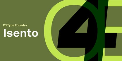
  21. Isento by DSType, $40.00
    We always wanted to design a gothic typeface. Our most similar typefaces are Rude and Firme, but Rude has some very delicate curves especially visible in the vertical strokes and Firme introduces a type family with reasonably big ascenders and descenders. On the other hand, Isento has a much more straightforward approach to the particular genre. Loosely inspired by Times Gothic, introduced in the American Type Founders Specimen Book and Catalogue from 1923, soon followed its very own path. Is our first typeface that clearly shows a distinct weight difference between the uppercase and the lowercase and the spacing is very open to provide a much more mechanical feeling. Isento and Isento Slab ranges from Thin to ExtraBold with perfectly matching italics. Immediately seemed very clear that a slab serif companion would follow the sans, therefore Isento Slab is the perfect companion to Isento, with very strong rectangular serifs, ideal to set short passages of text or to become the key actor in a big headline.
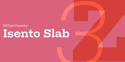
  22. Isento Slab by DSType, $40.00
    We always wanted to design a gothic typeface. Our most similar typefaces are Rude and Firme, but Rude has some very delicate curves especially visible in the vertical strokes and Firme introduces a type family with reasonably big ascenders and descenders. On the other hand, Isento has a much more straightforward approach to the particular genre. Loosely inspired by Times Gothic, introduced in the American Type Founders Specimen Book and Catalogue from 1923, soon followed its very own path. Is our first typeface that clearly shows a distinct weight difference between the uppercase and the lowercase and the spacing is very open to provide a much more mechanical feeling. Isento and Isento Slab ranges from Thin to ExtraBold with perfectly matching italics. Immediately seemed very clear that a slab serif companion would follow the sans, therefore Isento Slab is the perfect companion to Isento, with very strong rectangular serifs, ideal to set short passages of text or to become the key actor in a big headline.
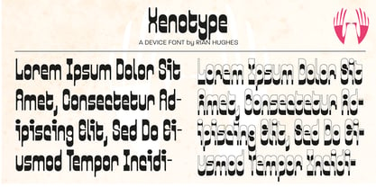
  23. Xenotype by Device, $29.00
    Xenotype is an examination of heavy horizontal weighting and develops ideas underlying 60s and 70s headline faces.
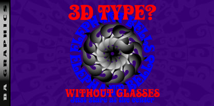
  24. Elephant Bells by BA Graphics, $45.00
    This 60's 70's design has a great nostalgic look. It appears to flourish within itself.
  25. Versal - Personal use only
  26. Binner - Unknown license
  27. A Charming Font - Personal use only
  28. KellyAnnGothic - Unknown license
  29. AnglicanText - Personal use only
  30. Sanctuary - Unknown license
  31. Caswallon Demo - Unknown license
  32. Lohengrin - Personal use only
  33. Baltra by Galapagos, $39.00
    After researching the type styles contemporary graphic designers have been using over the past few years, I noticed a consistent use of Copperplate Gothic, and its derivative designs, for various corporate advertising campaigns. That level of usage gave me the inspiration to design a display font possessing subtle characteristics of Copperplate Gothic, and various Latin Condensed designs. The font I ended up designing was semi-condensed, with more contrast between thicks and thins than in Copperplate. Baltra also has a subtle flair in its otherwise traditional lowercase, while possessing a larger than average lowercase x-height. Copperplate Gothic, on the other hand, has minimal contrast and uses small capitals for its lowercase. After examining extensive type specimens from wood type, metal type, phototype and digital type, I was not able to find a single design possessing a majority of Baltra's characteristics. Consequently, I consider Baltra to be a truly unique design, sharing with Copperplate Gothic only its flairs on stems, and having only subtle characteristics in common with traditional Latin designs.
  34. Moonshadow by Curvature Creations, $10.00
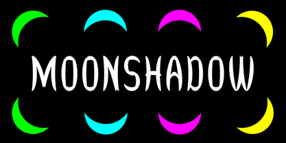
    My font Shadowmoon was created with the PowerPoint shape moon and just like the real moon, my font has amazing curves that brightly standout. The curves take on a flowing action that visibly attracts an amazing style.
  35. Amherst by Linotype, $29.99
    Amherst is a family of blackletter-inspired typefaces. This family, created by British designer Richard Yeend in 2002, is unique in that it mains the feel of blackletter/medieval type without relying directly on historical forms. Amherst is split into two different sub-families, Amherst and Amherst Gothic. Amherst is very geometric interpretation of Fraktur. Fraktur was a style of German type very popular in central Europe from 1517 until the early 20th Century. Its letters appear "broken" at certain angles and joints. Still, we recommend using it primarily for display purposes. Amherst is available in three weights: Regular, Bold, and Heavy. Amherst Gothic is very loosely inspired by late medieval letterforms, often called Texturas or Gothics. However, the letterforms of Amherst Gothic seem just as inspired by the Art Deco movements of the 1920s and by contemporary sans serif type design as anything else. Nevertheless, certain letters in this typeface do appear more "gothic" than others, especially A, D, M, Y, d, r, and x. Amherst Gothic is made up of three fonts, Amherst Gothic Split, Amherst Gothic Split Alternate, and Amherst Gothic Italic. Amherst Gothic Split has in-lined characters, and appears very ornamented. The alternate characters in Amherst Gothic Split Alternate are quite medieval in their appearance. Amherst Gothic Italic is the least medieval-looking of the set; its characters are very round, and more geometric. All six styles of the Amherst Family are OpenType format fonts, and include old style figures.
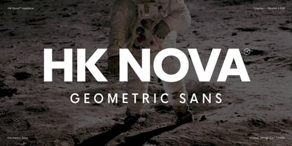
  36. HK Nova by Hanken Design Co., $30.00
    HK Nova is a geometric sans inspired by the Century Gothic and Futura. It formalizes Century Gothic and softens Futura.
  37. Krylon - Unknown license
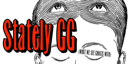
  38. Stately GG by Baseline Fonts, $39.00
    TWO LAYERED FONT: Be sure to get both the FRONT and the BACK! Maintaining simultaneous shades of whimsy and versatility is no simple feat, but the meticulously constructed Stately Gothic accomplishes just that, elegantly. Stately Gothic is a redrawn version of Grit Gothic. The strong vertical character of this stacking/layered typeface make it an ideal solution for use where legibility matters most: posters, logos, book and album covers, and so on. It is part of Grit History Series B along with Heirloom Artcraft, Worn Gothic, Grit Sans, and Grit Gothic.
  39. CrappyGothic - Unknown license
Looking for more fonts? Check out our New, Sans, Script, Handwriting fonts or Categories
abstract fontscontact usprivacy policyweb font generator
Processing