10,000 search results
(0.11 seconds)
- Mosse by Deltatype,
$49.00 Mosse is an extraordinary sans-serif typeface that designed for improve readability, formal but casual, with straight cut at terminal and reverse angled at spur and finial give a little bit sweet. Mosse is simple and identical, come with nine weights allowed you to use the right weight to the right proportions. Mosse also support many languages, thanks to extended latin glyphs. Mosse come with standard Adobe Latin 4 glyphs, world-ready and mark2mark support.
 - Lagom Grotesk by S6 Foundry,
$20.00 Lagom Grotesk is a contemporary neo-grotesque sans serif typeface with strong stylistic geometric contrasts. Its distinctive wide-open stance was designed to give the right visual consistency for branding and communications, representing the shifting contemporary aesthetics. The distinctive stance gives the right visual consistency for branding and communications. Lagom Grotesk is perfectly suited for headlines, large-format prints, brand identities, social media, advertising, editorial design, posters, magazines, logos, headings, body copy, digital and more.
 - NCS Radhiumz by Namara Creative Studio,
$12.00 NCS Radhiumz is a modern powerful quality sans serif font with great versatility. This extended font can be used for bold editorial statements, graphic heavy prints or just as a simple logo. This new type will definitely make your designs stand out and unique. Included 08 variant to choose : Light Light Italic Regular Italic Bold Bold Italic Bold Rounded Bold Shadow Included uppercase, lowercase, numerals, punctuations, multilingual support, and some alternates & ligatures.
 - Contax Pro by Type Innovations,
$39.00 Contax Pro is a contemporary design based on generous proportions and clean, crisp lines. Forget about 'Helvetica'. Look out 'Univers'. Contax Pro is the new geometric sans typeface series for the 21st century. Contax Pro makes for easy reading and is ideal for long lines of copy. Contax Pro includes true drawn small capitals and old style figures. The family comes in 6 weights: ultra light, thin, light, regular, medium and bold.
 - Wolfie Font Family by Oui Studio,
$17.00 Hello friends! The 'Wolfie' font family is coming; a dynamic and new vintage feel. It's perfect for branding, logo, packaging, header, title, etc. Wolfie is great if you pair it with an 80s illustration, it will make the design even more dope. Wolfie are available in 3 Widths (Condensed - Ultra Condensed - Normal) with matches 5 weights (Light - Semi Light - Regular - SemiBold - Bold) total 30 fonts and support for 75+ language. Happy creating :)
 - Anaglyph by Luxfont,
$18.00 Introducing incredible COLOR ANAGLYPH font. Unique font family with anaglyph stereo effect - a novelty in the field of color fonts. Inspired by global trends in contemporary design with a touch of retro 90s, electric music and minimalistic purity of glyphs. Truly a reflection of modern POP culture. Font is ideal in entertainment design. Night club poster design, fashionable business card, website title, magazine illustration - there are countless options for using it. Font family has two thicknesses - bold & regular, 3 types of stereo effect, 2 font colors with stereo effect (black and white). Font consists of letters of the same height without division into uppercase and lowercase glyphs. This font family is based on the Regular & Bold fonts Boldini - which means that if necessary you can combine these two families and they will be absolutely stylistically identical and complement each other. Check the quality before purchasing and try the FREE DEMO version of the font to make sure your software supports color fonts. Features: Free Demo font to check it works. 36 OTF SVG fonts in the family 2 thicknesses: Bold, Regular 3 types of stereo anaglyph effect 6 font colors with stereo effect Kerning IMPORTANT: - OTF SVG fonts contain vector letters with gradients and transparency. - Multicolor OTF version of this font will show up only in apps that are compatible with color fonts, like Adobe Photoshop CC 2017.0.1 and above, Illustrator CC 2018. Learn more about color fonts & their support in third-party apps on www.colorfonts.wtf - Don't worry about what you see all fonts in black and not in multicolor in the tab “Individual Styles” - all fonts are working and have passed technical inspection, but not displayed in multicolor they, just because the website MyFonts is not yet able to show a preview of colored fonts. Then if you have software with support colored fonts - you can be sure that after installing fonts into the system you will be able to use them like every other classic font. Question/answer: How to install a font? The procedure for installing the font in the system has not changed. Install the font as you would install the classic OTF | TTF fonts. How can I change the font color to my color? · Adobe Illustrator: Convert text to outline and easily change color to your taste as if you were repainting a simple vector shape. · Adobe Photoshop: You can easily repaint text layer with Layer effects and color overlay. ld.luxfont@gmail.com
 - Uniform Pro by Miller Type Foundry,
$29.00 THE SPARK Uniform started as a spark of inspiration one day while I was shopping at the store. I was looking at some typography on a can of dog food and the idea popped into my head, “What if there was a geometric typeface with a circular O that when condensed, the O became straight sided, instead of becoming an oval?” I quickly sketched out the concept of Uniform and liked what I saw, the only problem was I was working full time as a graphic designer, and as a newly married husband, I didn’t have any time to make the extensive typeface. LETDOWN A year and a half later, shortly after the birth of my first child, my boss cut my hours in half. Although stressful, I saw this event as an opportunity to finally have time to complete the typeface I had in my head. I spent a couple months putting together a Kickstarter campaign, thinking it would be a smashing success, and I would be able to live off the donations long enough to complete the typeface. Wrong! The campaign was a flop and I was left discouraged and dejected, thinking that the great idea I had in my head would never become a reality... PERSEVERANCE At the end of the year, in December 2013, I decided to go for it and make this new type family no matter what it took. I began waking up a few hours before work each morning (getting only four hours of sleep each night) carefully crafting each individual glyph day by day. After nine months of hard work (and just about killing myself in the process!) in October 2014, I finally had a finished product ready to be released to the public! THE PINNACLE Fast forward a few years and now Uniform has reached it's pinnacle, Uniform Pro. Uniform Pro now offers extended language support including Cyrillic and Greek character sets, integrated italic styles, additional weights, and additional OpenType features.
 - Cinema Macabre by Wing's Art Studio,
$10.00 Cinema Macabre: Horror Fonts Torn from the Pages of Giallo A Hand-drawn Display Font for Creating the Most Diabolical Horror Titles This loose and inky brush font takes its inspiration from the classic Giallo film posters of the 1960s to 1980s - a cult cinematic subgenre beloved for its stylish visuals, haunting soundtracks and exploitation led marketing. It's a devilishly drawn design that aims to capture the feeling of vintage horror, preserving analogue details of old print while remaining versatile enough to work across a variety of digital designs. The Cinema Macabre font family boasts six fonts, each containing a unique set of uppercase and lowercase characters, as well as numerals, punctuation and language support. Add to this a host of custom ligatures, underlines and graphic elements and you have an essential toolbox for creating truly hand-made looking title designs. Cinema Macabre if a font that rewards experimentation by mixing all the various upper and lowercase alternatives, with interesting combinations waiting to be found and inspire terror across your own movie posters, book covers, albums and editorials. Few other fonts offer the versatility to create such diabolical designs! A Brief Introduction to Giallo: In popular cinema, Giallo is a genre of mystery fiction and thrillers often containing slasher, psychological horror, exploitation, supernatural and erotic elements. The term giallo (meaning yellow) derives from a series of pulp novels published by Mondadori from 1929 taking the name from its trademark yellow covers. The series consisted of Italian translations of mystery novels by well-known authors such as Agatha Christie, Edgar Allan Poe and Raymond Chandler. The popularity of these cheap paperbacks eventually established the word Giallo as a synonym in Italian for a mystery novel. The cinematic Giallo subgenre developed during the 1960-80s and are noted for their vivid cinematography, memorable soundtracks and inventive gore-filled scenarios. Key examples include Dario Argento's Suspiria, Tenebrae and Deep Red - stylish films that at once influenced the American slasher (see Black Christmas and Friday 13th) up to todays horror in Censor and Last Night In Soho.
 - HONKUS - Personal use only

- Tip Me Cheapy - Unknown license

- You Suckin' Thief - Unknown license

- The British Telegraph by Vintage Voyage Design Supply,
$14.00 The British Telegraph font family was inspired by classic headers of Britain newspapers from the middle of XX century. Classic look with three width – Light, Regular and Bold. Great for headers, signs or logos. Also, working well for text blocks. - The British Telegraph Light: Use it for text blocks, or for gently light header typographic. Try to make more wide tracking with capitals, it looks good. - The British Telegraph Regular: Great for simple message, quotes, subheaders (If the header is Bold) or advert slogans. - The British Telegraph Bold: Is a killing title buddy. Massive, strong, bold and in the same time – very gentle. Perfectly for main words, headers, signs or logo's. The British Telegraph has full glyph set with standard and discretionary ligatures (Open Type Features).
 - Love Notes JNL by Jeff Levine,
$29.00 Love Notes JNL is a total reworking of one of Jeff Levine's old freeware fonts. This revised version has an alphabet set jogged left and right in different upper and lower case variations. Playing around with the shift key will bring you the optimum results. On the left and right parenthesis keys are blank hearts logged left and right, and the corresponding fill fonts are on the bracket keys. (NOTE: You may have to do some manual adjustments, as the overlay placement can vary slightly in some programs.) There are numerals as well, and scattered around the keyboard are classic "message hearts" - just like in the boxes of candy. A backfill glyph for the numerals and message hearts is on the backslash key.
 - Circle Two Letter by Fauzistudio,
$12.00 Cilcle TwoLetter Monogram Logo Font Family with OpenType magic that can adjust to front and back letters, there are 10 frame variations that you can access at numbers 0-9 how to activate it simply by adding a number in front of your initials, typing something (0AB - 9AB) it will automatically compose . you can use it on any Logo project it is perfect to add to your collection. Cilcle TwoLetter font FAMILY – includes 9 weights (Thin, Extra light, Light, Regular, Medium, Semi Bold, Bold, Extra Bold, Black) : Cilcle TwoLetter Thin Cilcle TwoLetter Extralight Cilcle TwoLetter Light Cilcle TwoLetter Regular Cilcle TwoLetter Medium Cilcle TwoLetter Semibold Cilcle TwoLetter Bold Cilcle TwoLetter Extra Bold Cilcle TwoLetter Black Hope you enjoy. Intuisi Creative
 - Pentagram Two Letter by Fauzistudio,
$9.00 Pentagram TwoLetter Monogram Logo Font Family with OpenType magic that can adjust to front and back letters, there are 10 frame variations that you can access at numbers 0-9 how to activate it simply by adding a number in front of your initials, typing something (0AB - 9AB) it will automatically compose . you can use it on any Logo project it is perfect to add to your collection. Pentagram TwoLetter font FAMILY – includes 9 weights (Thin, Extra light, Light, Regular, Medium, Semi Bold, Bold, Extra Bold, Black) : Pentagram TwoLetter Thin Pentagram TwoLetter Extralight Pentagram TwoLetter Light Pentagram TwoLetter Regular Pentagram TwoLetter Medium Pentagram TwoLetter Semibold Pentagram TwoLetter Bold Pentagram TwoLetter Extra Bold Pentagram TwoLetter Black Hope you enjoy. Intuisi Creative
 - Fenomen Sans by Signature Type Foundry,
$38.00 Geometrical drawing of Fenomen Sans typeface goes back to the roots of the Bauhaus aesthetics and the entire architectural and design avant-garde of the 20th century. It is still a symbol of functional rationality, clean aesthetics in relation to shape, and of progressive thinking. Its popularity is timeless and permanent. The set contains eight basic alphabets of a square pattern, eight semicondensed, eight condensed and eight extremely condensed alphabets, all in Latin and Cyrillic alphabets. Every font of the family has four types of numerals, small caps and variant letters. The typesetting can fluently use all fonts simultaneously. The typeface originated between the years 2011–2014 and was subjected to a series of tests for the fluent legibility of narrow fonts even in extreme conditions. Narrow fonts provide this set with the maximum use also for newspaper typesetting. The typeface has an elegant, delicate design in thin fonts and sufficient legibility in bold. Mutual contrast produces creative tension. Font name acronyms described: SCN = SemiCondensed CN = Condensed XCN = ExtraCondensed
 - Univia Pro by Mostardesign,
$25.00 Designed by Olivier Gourvat in December 2015, Univia Pro is a new contemporary OpenType font family with modernity and versatility in mind. Distinctive with its pleasant look and extremely modern, Univia Pro has a lot of personality mostly achieved by smooth curves and round corners that forms a very identical style of the entire family. Univia Pro is perfect both for display and text use and due to its ultra modern look, it is more than excellent for e-books, web-sites, user interface font, mobile apps etc. The Univia Pro font family is heavily equipped with OpenType features: case sensitive, scientific superiors and inferiors, standard ligatures, old style, lining figures, proportional and tabular figures, slashed zeros, stylistic sets. It also provides broad language support. The font family offers 18 variations (9 weights plus italics): Thin, Thin Italic, Ultra Light, Ultra Light Italic, Light, Light Italic Book, Book Italic, Regular, Regular Italic, Bold, Bold Italic, Black, Black Italic, Ultra and Ultra Italic. Univia Pro supports Latin, Extended latin and Cyrillic languages.
 - Road Work JNL by Jeff Levine,
$29.00 The October 5, 1935 issue of “Universal Weekly” (a publication detailing current film releases from Universal) was promoting the film “Remember Last Night”. Hand lettering used for this advertisement was an ultra-bold sans serif design with chamfered corners and some stylized characters. This is now available digitally as Road Work JNL in both regular and oblique versions.
 - Nightjump by Balpirick,
$15.00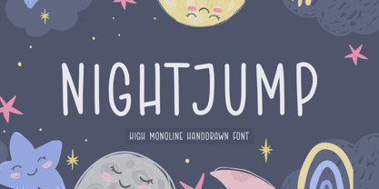 NIGHTJUMP is a High Monoline Hand drawn Font. Night Jump is a handwritten font with a casual look. It is perfect for product packaging, branding project, magazine, social media, wedding, or just used to express words above the background. NIGHTJUMP also multilingual support. Enjoy the font, feel free to comment or feedback, send me PM or email.
 - Favorite Hangout JNL by Jeff Levine,
$29.00A "thick and thin" line weight treatment is given to Jeff Levine's Hash and Beans JNL, providing a whole new take on the design - first inspired by a sign in an old photograph of a diner. Favorite Hangout JNL conjures up memories of summer nights, drive-ins, your best guy or gal and sharing some tasty burgers and fries. - Insomniac by Hanoded,
$15.00 Insomniac is a tall, narrow, handwritten typeface. A little rough, a little shaky, a little uneven. The idea for this font came to me in the middle of the night - hence the name. Insomnia is an all caps font, but upper and lower case differ and glyphs can be freely interchanged. Comes with a diacritics dream team.
 - Graveyard Smash by Comicraft,
$19.00 Tombstones tumble as the night shift begins; as bloodsucking bats turn into pale predators and the undead reach through the dirt that covers their coffins to crush and destroy those who dare cross the cemetery path... Finally there emerges a cold cast of creepy characters, a macabre cadre of lurid letters we had to call… GRAVEYARD SMASH.
 - Genghis Khan - Personal use only

- PT Banana Split - Unknown license

- New Wishes - Personal use only

- Mouse Deco - Personal use only

- Distant Stroke - 100% free

- Ornatique - 100% free

- Janda Stylish Script - Personal use only

- gantz - Personal use only

- Holitter Circle - 100% free

- More than Enough - Personal use only

- Albertino - Personal use only

- Holitter Hollow - 100% free

- Dynamic Blend - Personal use only

- KG Payphone - Personal use only

- Moderna - 100% free

- republicstroke - 100% free

- Labtop - Unknown license

- Janda Quirkygirl - Personal use only


