2,846 search results (0.019 seconds)
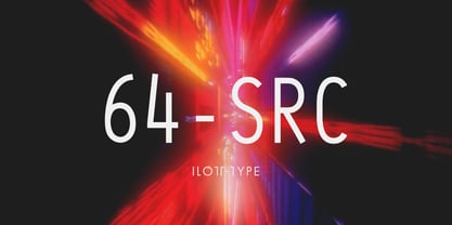
  1. 64-SRC by ILOTT-TYPE, $49.00
    64-SRC is a condensed monospace font inspired by 1960s IBM Selectric type seen on HAL’s telemetric displays in 2001: A Space Odyssey. It is characterized by unique "double-space" alternates for the widest characters such as “w” and “m”. These alternates maximize legibility, improve the rhythm of readability and keep typographic color even. As a result 64-SRC is as well suited for extensive copy as it is display type.
  2. Clairveaux Demo - Unknown license
  3. Hadrianus Demo - Unknown license
  4. Dust Mites - Unknown license
  5. Jerash Demo - Unknown license
  6. Pullman Demo - Unknown license
  7. Zono - Unknown license
  8. Ligeia Demo - Unknown license
  9. Bloktype - Unknown license
  10. greenbeans - 100% free
  11. Honeybomb - Unknown license
  12. Pyle Initials Demo - Unknown license
  13. Hubbard Demo - Unknown license
  14. Plowright Demo - Unknown license
  15. Platthand Demo - Unknown license
  16. Artfonts Sampler - Unknown license
  17. Page Rules Promo - Unknown license
  18. Linear Curve Fatty - Unknown license
  19. El Rio Lobo - Unknown license
  20. Goddard Demo - Unknown license
  21. Melcheburn Demo - Unknown license
  22. Odeon Demo - Unknown license
  23. Bayern - Unknown license
  24. Zono Dingbats - Unknown license
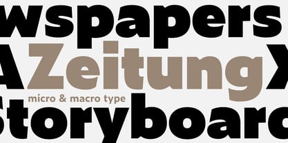
  25. Zeitung Pro by Underware, $50.00
    Zeitung is a sans serif family which works equally well on print and web. First of all: Zeitung is a sans serif made according to contemporary standards: 8 weights, romans and italics, all equipped with small caps. Lots of OpenType features, like uppercase punctuation or 5 figure styles to make sure any of your mathematical or financial charts, tables and diagrams look cool. Zeitung’s typographic palette focuses on utility and legibility, but in the farthest corners you’ll discover a rich array of flavours: punchy black weights, fashionable thin styles, carefully hand crafted true italics, distinct small caps. But Zeitung has more to offer. Its optical sizes offer the best style for each size of your text. Zeitung fonts are devided to two optical families: Zeitung Standard and Zeitung Micro. Zeitung Standard works great in most sizes, while Zeitung Micro fonts are specially made for very small sizes in print and web. Zeitung Micro fonts are perfectly legible in web, where the same technical font styles have to survive in many environments, from older browsers to most up to date mobile screens. Next to that: the lightest weights also function as grades, because they share the same metrics. This can be very handy for selecting the optimal weight for your specific situation, especially on screens or when type is printed by a newspaper press. Letters are rendered in many various ways on different screens. Maybe the interface of your next app requires a different grade than your latest website? Zeitung allows you to change the weight of your text without any further consequence for the design. That is a welcome relief during the design process. Zeitung will help to bring your message across in many different circumstances, from large text in print to small type on screens.
  26. Grov AB - Unknown license
  27. Shamen Remix - Unknown license
  28. Intramural JL - 100% free
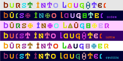
  29. Orden by ParaType, $30.00
    PT Orden™ was designed by Oleg Karpinsky in 2000-2001 and licensed by ParaType. Orden is a genuine Cyrillic typeface, it contains antique Cyrillic letter forms such as d, z, N with a diagonal stroke, symmetrical Y ,× and Ù, rare in modern typography. Another specialties: one alphabet and old style figures. Lower case consists of upper case letters except for some alternative variants of the capitals. For use in advertising and display typography.
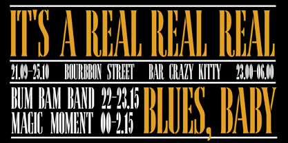
  30. Bardi by ParaType, $30.00
    An original typeface designed for ParaType in 2004 by Armenian designer Manvel Shmavonyan. Based on the lettering created in 1970s by outstanding Armenian type designer Henrik Mnatsakanyan (1923-2001) of the same name. In Armenian 'Bardi' means 'Poplar'. Extra compressed decorative stenciled typeface. Its letterforms resemble many Neo-Classicism extra compressed faces and magazine lettering of the 1950s-60s. For use in advertising and display typography especially in magazine headlines and logos.
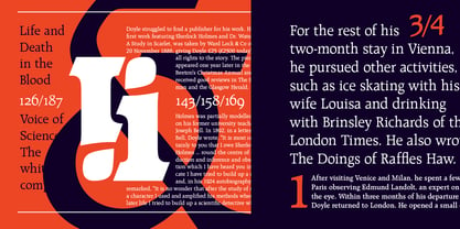
  31. Raleigh by ParaType, $30.00
    Raleigh was produced in 1977 by Robert Norton based on Carl Dair’s Cartier typeface which was designed for the 1967 Montreal World's Fair. It was renamed after Dair’s death. Adrian Williams added three weights for a display series, and Robert Norton developed the text versions. A contemporary old style serif with calligraphic features. For use both in text and display typography. Cyrillic version was developed at ParaType in 2001 by Vladimir Yefimov.
  32. Rough Stamp Times by TypoGraphicDesign, $9.00
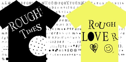
    The typeface Rough Stamp Times is designed from 2016–2022 for the font foundry Typo Graphic Design by Manuel Viergutz. The display font based on the original rubber stamps from flea market. The font started from 50+ stamps (analog) and was finally digitalize and extended to 600+ glyphs (digital). 4 font-styles (Rough, Clean, Misprint, Impact) with 601 glyphs incl. decorative extras like icons, arrows, dingbats, emojis, symbols, geometric shapes (type the word #LOVE for ♥︎ or #SMILE for ☺ as OpenType-Feature dlig) and stylistic alternates (9 stylistic sets). For use in logos, magazines, posters, advertisement plus as webfont for decorative headlines. The font works best for display size. Have fun with this font & use the DEMO-FONT (with reduced glyph-set) FOR FREE! Font Spe­ci­fi­ca­ti­ons ■ Font Name: Rough Stamp Times ■ Font Styles: 4 (Rough, Clean, Misprint, Impact) + DEMO (with reduced glyph-set) ■ Font Cate­gory: Dis­play for head­line size ■ Font For­mat:.otf (Mac + Win, for Print) + .woff (for Web) ■ Glyph Set: 601 glyphs incl. extras like icons (decorative extras like arrows, dingbats, emojis, symbols) ■ Design Date: 2016–2022 ■ Type Desi­gner: Manuel Viergutz
  33. Sunspots AOE - Unknown license
  34. Barbecue - Unknown license
  35. Parador Tryout - Unknown license
  36. Norumbega Demo - Unknown license
  37. Mariette Tryout - Unknown license
  38. Poppy AOE - Unknown license
  39. Mechoba - Unknown license
  40. Ah, LaPerutaFLF, the font that decided it was too cool for the mainstream yet not quite ready for the underground indie scene. Picture this: if fonts had personalities, LaPerutaFLF would be that quie...
Looking for more fonts? Check out our New, Sans, Script, Handwriting fonts or Categories
abstract fontscontact usprivacy policyweb font generator
Processing