10,000 search results
(0.034 seconds)
- Shoot the Messenger - Unknown license

- Shoot the Messenger - Unknown license

- Amsterdam Graffiti - Unknown license

- Asian Girl - Unknown license

- Jaggy Fries - Unknown license

- (((O))) Basic - 100% free

- Pictoserie 4 - Personal use only

- Café Norden - Personal use only

- decadence - Unknown license

- alien strawberry - Unknown license

- KrazyKool - Unknown license

- Shoot the Messenger - Unknown license

- comic andy - 100% free

- TNA Bound for Glory - Unknown license

- Shoot the Messenger - Unknown license

- ZeroGene - Unknown license

- Daydream Daily - 100% free

- tulisan tanganku - Unknown license

- quiñók - Unknown license

- lydeke Handwrithing - Unknown license

- JT Symington by JAM Type Design,
$15.00
- BoldAyres by Wiescher Design,
$39.50
- Art Topic JNL by Jeff Levine,
$29.00
- MS Reference Specialty by Microsoft Corporation,
$29.00 - Kurly by Bogusky 2,
$34.50 - Auro by Typogama,
$19.00
- Eroxion BT by Bitstream,
$50.99 - Rebeca JY by JY&A,
$39.00 - Cordial by Elemeno,
$25.00 - Template Basic JNL by Jeff Levine,
$29.00
- Dublon by ParaType,
$30.00
- Tes by Alien,
$60.00
- TRGrunge by Ingrimayne Type,
$9.00
- Simple Fact by Bogstav,
$10.00
- Thanks Valentine by Sakha Design,
$12.00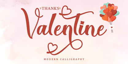
- Designers Gothic by Jonahfonts,
$30.00
- Liliming by Cubo Fonts,
$25.00
- Pekora by Typoforge Studio,
$15.00
- Arsis by URW Type Foundry,
$35.99
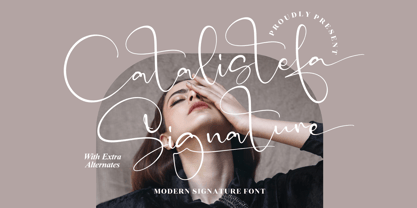
- Catalistefa Signature by Letterena Studios,
$9.00