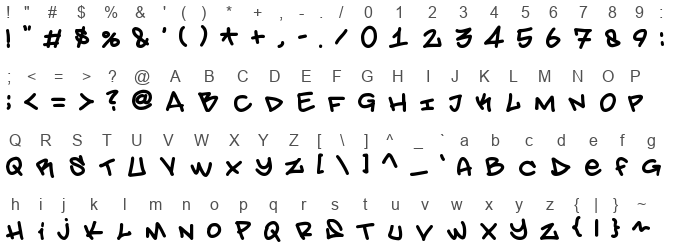
Ah, the Amsterdam Graffiti font! Picture this: you're wandering the vibrant streets of Amsterdam, where the scent of fresh stroopwafels fills the air and bicycles whiz past at every turn. Suddenly, your eyes catch the energetic swirls of color dancing across the brick walls – that, my friend, is the essence of the Amsterdam Graffiti font materialized.
Amsterdam Graffiti is not your average, run-of-the-mill typeface. No sir! It's the visual equivalent of a breakdancer spinning wildly in the middle of a bustling city square. Its letters are imbued with the kind of rebellious spirit that would make even the sternest of librarians want to throw down her glasses and spray paint her manifesto on the nearest wall. Each character in the font bristles with an unruly energy, featuring exaggerated swashes, unpredictable curves, and perhaps a splash or two of virtual paint for good measure.
But let's not forget the heart of this font: its connection to the rich street art culture of Amsterdam. This font captures the city's artistic soul, where every letter seems to have its own backstory, perhaps inspired by a local legend or a famous canal-side spot known only to the coolest of the cool. Using Amsterdam Graffiti in your work isn't just about choosing a typeface—it's about inviting a piece of Dutch artistry and rebellion into your project.
Whether you're designing a flyer for the hippest underground concert or crafting a logo for a boutique that sells nothing but left-handed guitar picks, Amsterdam Graffiti brings a touch of urban edginess that says, "I not only know where the best coffee shops are, but I might also have spray painted my initials on a hidden alley off the Leidseplein." So, embrace the chaos, let your creativity off the leash, and let Amsterdam Graffiti transform your designs from the mundane to the magnificently mischievous.
Character map

Characters
! " # $ % & ' ( ) * + , - . / 0 1 2 3 4 5 6 7 8 9 : ; < = > ? @ A B C D E F G H I J K L M N O P Q R S T U V W X Y Z [ \ ] ^ _ ` a b c d e f g h i j k l m n o p q r s t u v w x y z { | } ~
Languages
CommentsFollow
No comments. Be the first one!


