10,000 search results
(0.023 seconds)
- Serpentine by Image Club,
$29.99Dick Jensen (USA) designed Serpentine, is a contemporary-looking display font, for the Visual Graphics Corporation in 1972. With the rise of digital typesetting and desktop publishing, this typeface quickly became both popular and ubiquitous. This dynamic, wide, boxy design is identifiable via tiny triangular swellings at the stroke endings - what might be called semi-serifs. Serpentine is available in six different font styles: Light, Light Oblique, Medium, Medium Oblique, Bold, and Bold Oblique. Serpentine" is a greenish rock that sometimes resembles a serpent's skin, and is often used as a decorative stone in architecture. Though this font doesn't seem at all snaky or sinuous, it does have an architectural, stone-like solidity. The subtle, almost non-existent curves and semi-serifs keep it from being too stern or cold. Although the underlying strokes of each weight are similar, the six members of the Serpentine font family all present their own individual personalities. Serpentine Light lends itself well to text for onscreen displays, for instance, while the numbers from typeface's heavier weights are seen around the world on soccer jerseys! Additionally, the oblique styles convey a streamlined sense of speed, furthermore lending Serpentine well to sport and athletic applications (especially the faster, high-speed varieties). Because of its 1970s pedigree, Serpentine has come to be known as a genuine "retro" face. This makes the typeface even more appropriate for display usage, in applications such as logo design, magazine headlines, and party flyers. If you like Serpentine, check out the following similar fonts in the Linotype portfolio: Copperplate Gothic (similar serifs) Eurostile (similar width) Princetown (another "athletic" font) Insignia (similar "techno" feeling)" - Serpentine by URW Type Foundry,
$35.99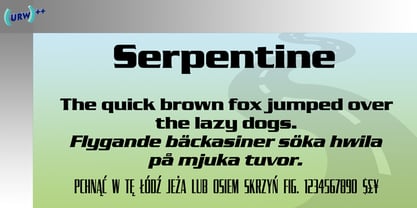
- Serpentine by Linotype,
$29.00Dick Jensen (USA) designed Serpentine, is a contemporary-looking display font, for the Visual Graphics Corporation in 1972. With the rise of digital typesetting and desktop publishing, this typeface quickly became both popular and ubiquitous. This dynamic, wide, boxy design is identifiable via tiny triangular swellings at the stroke endings - what might be called semi-serifs. Serpentine is available in six different font styles: Light, Light Oblique, Medium, Medium Oblique, Bold, and Bold Oblique. Serpentine" is a greenish rock that sometimes resembles a serpent's skin, and is often used as a decorative stone in architecture. Though this font doesn't seem at all snaky or sinuous, it does have an architectural, stone-like solidity. The subtle, almost non-existent curves and semi-serifs keep it from being too stern or cold. Although the underlying strokes of each weight are similar, the six members of the Serpentine font family all present their own individual personalities. Serpentine Light lends itself well to text for onscreen displays, for instance, while the numbers from typeface's heavier weights are seen around the world on soccer jerseys! Additionally, the oblique styles convey a streamlined sense of speed, furthermore lending Serpentine well to sport and athletic applications (especially the faster, high-speed varieties). Because of its 1970s pedigree, Serpentine has come to be known as a genuine "retro" face. This makes the typeface even more appropriate for display usage, in applications such as logo design, magazine headlines, and party flyers. If you like Serpentine, check out the following similar fonts in the Linotype portfolio: Copperplate Gothic (similar serifs) Eurostile (similar width) Princetown (another "athletic" font) Insignia (similar "techno" feeling)" - Serpentine EF by Elsner+Flake,
$35.00 - Serpentine Sans by Image Club,
$29.99Serpentine is a square-shaped sans serif design that is similar to Eurostile, but with more contrast between thick and thin strokes. The style is reminiscent of digital types and conveys a science fiction feel. The Serpentine font family is suitable for posters, signs and advertising. - Serpentine Stencil by Apply Interactive,
$30.00 - Terpentijn by Hanoded,
$15.00 Terpentijn is Dutch for Turpentine. If you say it out loud, it actually sounds quite similar! Here you thought you were just buying a font, but you get to learn some Dutch too! Terpentijn is a handmade typeface with a serious twist. It is very uneven, very unusual, and, if I may say so myself, very adorable. Terpentijn has that ‘eroded’ look, which will make your designs stand out. It comes in a regular and an inline version, plus a handy shapes pack, which will add that extra wow to your work. Besides Dutch, terpentijn speaks a lot of languages!
 - VNI-HLThuphap - Unknown license

- VNI-Thufap2 - Unknown license

- VNI-Thufapfan - Unknown license

- VNI-Thufap1 - Unknown license

- VNI-Thufap3 - Unknown license

- Serpents - Unknown license

- Serpent - Unknown license

- EF Serpentine Serif by Elsner+Flake,
$35.00 - Serpentine Stencil EF by Elsner+Flake,
$35.00 - Ovnis - Personal use only

- UNY by TEKNIKE,
$45.00 UNY is a display slab serif font. UNY is a distinct all caps geometric typeface inspired by varsity, college and university sports as well as the military. The UNY name was derived as a new styled acronym from the word university. UNY is great for sports, sports teams, schools, fantasy, display work, invitations, writing, quotes, posters, acronyms and headings.
 - Venis by Chank,
$99.00 On first impression, Venis is a traditional text typeface: clean, simple and elegant with nice contrast. On closer inspection, you'll notice nuances that add charm and wonder, much like its name (rhymes with "tennis"). Is this font a serif or sans serif? Hmmmm, it never really commits. Further design liberties were taken to create unique qualities in its characters, which are best exemplified by the signature lowercase y. This font family is optimized for print, and has worked beautifully for letterpress projects including wedding invitations and birth announcements. Venis will also work well in newsletters, brochures, proposals, magazines, books, and other text-heavy paper products, bringing creative elegance to your designs.
 - Vani by Microsoft Corporation,
$49.00 - Ony by Cuda Wianki,
$20.00 Ony font was made by cutting letters in cardboard and printing them on paper. This non-perfect printing was used to get heavy, dirty letters. Font has alternate characters so it can imitate real printed words.
 - Bolded by We Make Font,
$16.00 Bolded is a new complete type family, designed and developed by creative professionals. Contains geometric and rounded features, optimized for both long texts and small screens and texts. The complete family offers seven weights divided between the basic, italic, condensed and condensed italic family. Created in 2022, Bolded has a modern and functional look, designed for the most diverse uses and projects. Bolded is a geometric rounded family that can meet the needs of the most varied professionals looking for a clean and elegant font family with a wide set of Latin characters.
 - Bolde by Figuree Studio,
$18.00 Bolde is a powerful sans serif font family with modern touches. A balance of hard lines and smooth curves makes them able to stand on their own dynamically Features: five all caps font, Numbers & Punctuation / Extensive Language Support Bolde works great in any branding, logos, magazines, film. The different styles give you the full range to explore a whole host of applications. Thanks for having a peek at Bolde. As always, if you have any questions just send me a message!
 - Turpentine Kisses by Bogstav,
$18.00 Based loosely on Clarendon, Turpentine Kisses breaks all the rules of the classic serif fonts. It's jumpy and bouncy with a clear handmade look. It's playful yet legible, and full of personality. I've added 3 different versions of each lowercase letter, and they automatically cycle as you type. Or you can just select the one you prefer from the glyph menu.
 - Uni Tortred - Unknown license

- uni-sol - Unknown license

- Fuel Uni by VersusTwin,
$39.00 The Fuel Uni typefaces are a modern update on the techno sans, adding further versatility with unicase design complete with soft rounded corners as well as decorative inktraps. Stylistic Alternates included within all styles are alternates for the capital B, E, and R, as well as lowercase g characters, as well as all of their accented siblings. The Fuel Complete package bundles all of the dynamic styles of the Fuel, Fuel Extended, Fuel Uni, Fuel Uni Extended, and Fuel Script typefaces into one powerhouse of a collection.
 - Henry VII by Greater Albion Typefounders,
$15.00 Henry VII draws it's inspiration from an inscription in Westminster Abbey dedicated to the memory of His Late Majesty of the same appellation. However, it is also in large part in the best tradition of 19th and 20th century Tudor revival. The inscription consisted wholly and completely of Capital Letter forms and we have 'imagined' all the rest in similar style, so Henry VII is very much a Mock Tudor work. Never the less, we feel it is great fun and ideal for lending an aire of 'Olde England' to any piece of design. Best used with 'Greensleeves' playing ever so softly in the background!
 - Le Vin by Kellina James Designs,
$20.00 Le Vin is a calligraphy inspired font that was has a playful elegant design. It includes upper and lowercase letters, numerals, punctuation, and multilingual support. In addition, there are also special characters, alternates, and ligatures to add more flair to your projects. Great for invitations, headers, packaging, branding, wall art, and more.
 - Uni Neue by Fontfabric,
$29.00 Uni Neue is the whole new redesigned version (remake) of Uni Sans – one of the most recognizable and signature font families of Fontfabric type foundry. From major changes like proportions, widths and thickness (weights) to the smaller details, this new family enables us to feel and understand the font at a completely new level. Uni Neue is а modern sans serif with a distinctive character and geometric feel. The rounded corners give the typeface a friendly look, yet it retains a professional quality suitable for branding even the most serious corporate identities. The attention to detail paid during its development means that this typeface offers a vast range of design possibilities – it helps users create eye-catching designs and brands that really stand out. It is perfect for TV, screen, editorial and publishing, logos, branding, advertising and packaging. It supports a wide range of languages, including Extended Latin, Cyrillic and Greek. The family has seven weights, ranging from Thin to Black, with corresponding italics. The font was manually hinted to ensure great web and desktop performance.
 - Metroflex Uni by GarageFonts,
$39.00 - Uni Magnetic by Substance,
$10.00 Hand drawn, photocopied, scanned, printed and rescanned x 3.
 - Uni Sans by Fontfabric,
$29.00 Important! There is a whole new redesigned version (remake) of Uni Sans called Uni Neue . The Uni Sans font family includes 14 weights - seven uprights with seven italics. It is characterized by excellent legibility in both - web & print design areas, well-finished geometric designs, optimized kerning, excellent web-font performance and legibility etc. Inspired by the classic grotesque strong typefaces like DIN and Dax - Uni Sans has his own unique style in expressed perfect softened geometric forms. The font family is most suitable for headlines of all sizes, as well as for text blocks that come in both maximum and minimum variations. Uni Sans font styles are applicable for any type of graphic design in web, print, motion graphics etc and perfect for t-shirts and other items like posters, logos. PDF Specimen also available - click here .
 - Ascender Uni by Ascender,
$197.99Ascender™ Uni is a proportionally spaced comprehensive Unicode-compatible font with support for the Unicode Standard, v2.1 (supporting most major code pages and character sets in modern use). Ascender Uni is a 39MB TrueType (TTF) font with approximately 53,000 glyphs. The Latin and related glyphs (designed by Steve Matteson) are Sans Serif, with Gothic ideographs drawn in Japanese style, and complementary styles for other scripts. There are also versions of Ascender Uni that provide localized support for Korean, Simplified Chinese and Traditional Chinese. OpenType layout support is included for Arabic (initial, medial, final, isolate, and required ligature forms, as well as basic mark positioning), and vertical writing for CJK locales (consisting mostly of Latin, symbol, punctuation, and kana glyph variants). Character Set: Latin-1, WGL Pan-European (Eastern Europe, Cyrillic, Greek and Turkish), Chinese, Japanese, Korean, Thai, Vietnamese, Hebrew, Arabic. NOTE: Not all applications provide complete support for all the glyphs in this Unicode font. - Karvwood bold - Personal use only

- White Bold - Unknown license

- Goulong Bold - Unknown license

- Chopin-Bold - Unknown license

- Belta Bold - Personal use only

- Writers bold - Unknown license


Page 1 of 250Next page