10,000 search results
(0.026 seconds)
- Domotika Pro by Zetafonts,
$39.00 Domotika was first designed for Zetafonts by Cosimo Lorenzo Pancini in 2018, trying to translate the modernist and humanist ideals into typographic form, looking for a conversation between the classical and the contemporary, the hand-made and the technological. Following the motto of Mies Van Der Roe and Gustave Flaubert ("God is in the details"), Domotika takes inspiration from architectural practice, with a pragmatic attention to functionality that doesn't forget aesthetics. Its design juxtaposes the open humanist letterforms to slight calligraphic curve endings that marries perfect readability to expressive design. The name itself of the typeface is an homage to the science of living comfortably, with its reference to "domotics", robotic technology for use in the home. In 2021 Andrea Tartarelli, who originally designed Domotika italics, completely reworked the original type family adding over five hundred glyphs to the original set and extending the language coverage to include over two hundred languages using latin, Cyrillic and greek alphabets. Open type features have been also expanded, including positional numbers, small caps, ligatures, contextual alternates and stylistic sets, as well as tabular, lining and old-style numerals. • Suggested uses: conceived as a great tool for editorial use, great for display usage too, where readability and personality must match design space needs; • 18 styles: 8 weights + 8 italics + 2 variable fonts; • 1075 glyphs in each weight; • Useful OpenType features: Access All Alternates, Small Capitals From Capitals, Contextual Alternates, Case-Sensitive Forms, Glyph Composition / Decomposition, Denominators, Fractions, Kerning, Lining Figures, Localized Forms, Mark Positioning, Mark to Mark Positioning, Alternate Annotation Forms, Numerators, Oldstyle Figures, Ordinals, Proportional Figures, Stylistic Alternates, Scientific Inferiors, Small Capitals, Stylistic Set 1, Subscript, Superscript, Tabular Figures, Slashed Zero; • 219 languages supported (extended Latin, Cyrillic, Greek alphabets): English, Spanish, Portuguese, French, Russian, German, Javanese (Latin), Vietnamese, Turkish, Italian, Polish, Afaan Oromo, Azeri, Tagalog, Sundanese (Latin), Filipino, Moldovan, Romanian, Indonesian, Dutch, Cebuano, Igbo, Malay, Uzbek (Latin), Kurdish (Latin), Swahili, Greek, Hungarian, Czech, Haitian Creole, Hiligaynon, Afrikaans, Somali, Zulu, Serbian, Swedish, Bulgarian, Shona, Quechua, Albanian, Catalan, Chichewa, Ilocano, Kikongo, Kinyarwanda, Neapolitan, Xhosa, Tshiluba, Slovak, Danish, Gikuyu, Finnish, Norwegian, Sicilian, Sotho (Southern), Kirundi, Tswana, Sotho (Northern), Belarusian (Latin), Turkmen (Latin), Bemba, Lombard, Lithuanian, Tsonga, Wolof, Jamaican, Dholuo, Galician, Ganda, Low Saxon, Waray-Waray, Makhuwa, Bikol, Kapampangan (Latin), Aymara, Zarma, Ndebele, Slovenian, Tumbuka, Venetian, Genoese, Piedmontese, Swazi, Zazaki, Latvian, Nahuatl, Silesian, Bashkir (Latin), Sardinian, Estonian, Afar, Cape Verdean Creole, Maasai, Occitan, Tetum, Oshiwambo, Basque, Welsh, Chavacano, Dawan, Montenegrin, Walloon, Asturian, Kaqchikel, Ossetian (Latin), Zapotec, Frisian, Guadeloupean Creole, Q’eqchi’, Karakalpak (Latin), Crimean Tatar (Latin), Sango, Luxembourgish, Samoan, Maltese, Tzotzil, Fijian, Friulian, Icelandic, Sranan, Wayuu, Papiamento, Aromanian, Corsican, Breton, Amis, Gagauz (Latin), Māori, Tok Pisin, Tongan, Alsatian, Atayal, Kiribati, Seychellois Creole, Võro, Tahitian, Scottish Gaelic, Chamorro, Greenlandic (Kalaallisut), Kashubian, Faroese, Rarotongan, Sorbian (Upper Sorbian), Karelian (Latin), Romansh, Chickasaw, Arvanitic (Latin), Nagamese Creole, Saramaccan, Ladin, Kaingang, Palauan, Sami (Northern Sami), Sorbian (Lower Sorbian), Drehu, Wallisian, Aragonese, Mirandese, Tuvaluan, Xavante, Zuni, Montagnais, Hawaiian, Marquesan, Niuean, Yapese, Vepsian, Bislama, Hopi, Megleno-Romanian, Creek, Aranese, Rotokas, Tokelauan, Mohawk, Onĕipŏt, Warlpiri, Cimbrian, Sami (Lule Sami), Jèrriais, Arrernte, Murrinh-Patha, Kala Lagaw Ya, Cofán, Gwich’in, Seri, Sami (Southern Sami), Istro-Romanian, Wik-Mungkan, Anuta, Cornish, Sami (Inari Sami), Yindjibarndi, Noongar, Hotcąk (Latin), Meriam Mir, Manx, Shawnee, Gooniyandi, Ido, Wiradjuri, Hän, Ngiyambaa, Delaware, Potawatomi, Abenaki, Esperanto, Folkspraak, Interglossa, Interlingua, Latin, Latino sine Flexione, Lojban, Novial, Occidental, Old Icelandic, Old Norse, Slovio (Latin), Volapük
 - Macaroni Sans by Type Associates,
$30.00 Macaroni Sans evolved from our search for an extended font family consisting of a range of weights in both uprights and obliques, with a contemporary appeal. The desired character was to be sympathetic with a range of high-tech consumer products so a friendly, soft approach was called for. The resulting mix of geometric shape, rounded terminals, subtle italic angle of just six degrees and a few quirky stroke endings met with an enthusiastic response. As its subject product line exhibits brilliant color and imagery, a style was called for that conveyed contemporary appeal and readability but would not compete with the savvy products. We arrived at a clean, modern, sociable look that would suit a broad subject field in either text, semi display or signage. Its simple lines and monoline strokes fit well with logo usage or screaming posters, enhancing letterheads or websites, for foodstuffs to autos, insurance to swimming pools, lawfirms to babyfood. Macaroni Sans is the perfect typeface for branding, logotypes, may even flatter challenging viewing conditions. Rounded types have been around (pardon the pun) for centuries; numerous examples can be seen on old wood type posters, which in a small way prompted the name: in fashion Macaroni was a term used in mid-eighteenth century Europe to describe a dandy, a chap who displayed flamboyance in dress and hairstyle and spoke outlandishly or in an effeminate manner. Hence the term macaronic verse.
 - Bartholeme by Galapagos,
$39.00The four weight semi-condensed Bartholemé family came into existence as a family expansion based on the designer's earlier concept, Bartholemé Open. This hybrid family was inspired by and loosely based on a number of contemporary mid-twentieth century type concepts having Old Face or Modern influence. Those inspirational type designs were primarily designed for various proprietary photolettering technologies of the time. The award-winning* Bartholemé Open and its companion design Bartholemé small capital open were inspired by various Shaded, Inline and Handtooled type models from the nineteenth and twentieth centuries. Most of those inspirational type designs were designed as titling fonts with all capital sets only. To set it apart from the earlier models, Bartholemé Open is semi-condensed intentionally designed with a lowercase. Design qualities include a large x- height, tightly curved ample counters, crisp serifs and tight bracketing. The overall plan of the family was originally intended for display usage in titling and short passages of text. At higher output resolutions all fonts read well at smaller point sizes. The Bartholemé family works well on its own, but also is compatible with type styles possessing qualities that complement or enhance its own. The Bartholemé family consists of a Regular weight complementing a Bold weight, along with Medium complementing an Extra Bold weight. The companion true-drawn italics are based on the Bartholemé roman design. * Award for Design Excellence bukva: raz! Type Design Competition of the Association Typographique Internationale, 2001 - Rolling Pen by Sudtipos,
$79.00 After doing this for so many years, one would think my fascination with the old history of writing would have mellowed out by now. The truth is that alongside being a calligraphy history buff, I'm a pop technology freak. Maybe even keener on the tech thing, since I just can't seem to get enough new gadgets. And after working with type technologies for so many years, I'm starting to think that writing and design technologies as we now know them, being about 2.5 post-computer generations, keep becoming more and more detached from what the very old humanity arts/tasks they essentially want to facilitate. In a world where command-z is a frequently used key combination, it’s difficult to justify expecting a Morris-made book or a Zaner-drawn sentence, but accidental artistic “mutations” become welcome, marketable features. When fluid pens were introduced, their liquid saturation influenced type design to a great extent almost overnight an influence professional designers tend to play down. Now round stroke endings are a common sight, and the saturation is so clean and measured, unlike any liquid-paper relationship possible in reality. Some designers even illustrate their work by overlaying perfect circles at stroke ends, in order to illustrate how “geometric” their work was. Because if it’s measured with precise geometry, it’s got to be meaningful design. And once in a while, by a total freak accident, the now-cherished mutations prove to have existed long before the technology that caused them. Rolling Pen was cued by just such a thing: A rounded, circular, roll-flowing calligraphy from the late nineteenth century seemingly one of those experimental takes on what inspired Business Penmanship, another font of mine. Looking at it now it certainly seems to be friendlier, more legible, and maybe even more practical and easier to execute than the standard business penmanship of those days, but I guess friendliness and simplicity were at odds with the stiff manner business liked to present itself back then, so that kind of thing remained buried in the professional penman’s oddities drawer. It would be quite a few years before all this curviness and rounding were thought of as symbolic of graceful movement, which brought such a flow closer to the idea of fine art. Even though in this case the accidental mutation just happens to not be a mutation after all, the whole technology-transforms-application argument still applies here. I'm almost sure “business” will be the last thing on people’s minds when they use this font today. One extreme example of that level of disconnect between origin and current application is shown here, with the so-called business penmanship strutting around in gloss and neon. Rolling Pen is another cup of mine that runneth over with alternates, swashes, ligatures, and other techy perks. To explore its full potential, please use it in a program that supports OpenType features for advanced typography. Enjoy the new Rolling Pen designed by Ale Paul with Neon’s visual poetry by Tomás García.
 - Telepath by Coniglio Type,
$19.95 TELEPATH Telepath by Coniglio Type, first appeared in 1998. It is now in opentype .otf as of 2021. Telepath is a master sampling of a Royal office typewriter of industrial strength provided by the Miller Furniture store, of Dunkirk, New York. It had a baseline set of numbers to make accounting practices easy and line up nicely on the statements. (No gentile old fashioned numerical ascenders and descenders.) Yet, for a a rather old and stolid machine, it was very luxurious and built to definitely take the test of time. Cudo's for Royal Typewriter Company, is all I can say. The set of images were very carefully gathered and has fallen into the preferred category for a typewriter font that has it all. The font has exceptional value as a text font -and- a display font. It contains a great deal of graphic information and doesn't spike at higher sizes. Telepath presents a strikingly handsome typewriter font with a uniquely intuitive difference. Unlike the original source material—scans of monospaced typewriter copy, every font is painstakingly hand kerned for your most demanding copy fitting work in justified or casually ragged settings for print or the web. All Coniglio Type fonts are 100% embeddable. It will get you there.
 - Times New Roman Windows compatible by Monotype,In 1931, The Times of London commissioned a new text type design from Stanley Morison and the Monotype Corporation, after Morison had written an article criticizing The Times for being badly printed and typographically behind the times. The new design was supervised by Stanley Morison and drawn by Victor Lardent, an artist from the advertising department of The Times. Morison used an older typeface, Plantin, as the basis for his design, but made revisions for legibility and economy of space (always important concerns for newspapers). As the old type used by the newspaper had been called Times Old Roman," Morison's revision became "Times New Roman." The Times of London debuted the new typeface in October 1932, and after one year the design was released for commercial sale. The Times New Roman World Version is an extension of the original Times New Roman with several other scripts like with the Helvetica World fonts. It is part of the Windows Vista system. The following code pages are supported:1250 Latin 2: Eastern European 1251 Cyrillic 1253 Greek 1254 Turkish 1255 Hebrew 1256 Arabic Note: The Roman and Bold versions include the arabic scripts but they are not part in the corresponding italic versions. 1257 Windows Baltic 1258 Windows Vietnamese
- Goldwyre by Mofr24,
$11.00 Introducing Goldwyre, an extraordinary typeface meticulously crafted to captivate and inspire. With its seamless blend of elements from medieval to modern times, Goldwyre stands out as a truly unique font that embodies the essence of timelessness and elegance. Drawing inspiration from the intricate beauty of Gothic Blackletter and enriched with bold calligraphic strokes, this typeface exudes a mesmerizing charm that effortlessly bridges the gap between the past and the present. What sets Goldwyre apart from other typefaces is its ability to seamlessly combine medieval and modern aesthetics. By skillfully integrating the ornate and elaborate forms of Gothic Blackletter with contemporary design elements, Goldwyre offers a truly captivating typographic experience. This fusion of styles creates a font that is both classic and contemporary, making it an exceptional choice for projects that require a touch of sophistication and versatility. In addition to its captivating design, Goldwyre is available in two weights: regular and bold. The regular weight showcases the delicate intricacies of the typeface, while the bold weight accentuates its bold calligraphic strokes, adding a sense of strength and impact to any design. This versatility allows designers to explore a range of creative possibilities, whether it's designing eye-catching posters, compelling marketing materials, engaging titles, stylish T-shirt designs, or attention-grabbing headlines. Goldwyre is also a highly functional typeface, offering extensive multilingual support to cater to diverse audiences. It features a wide range of characters and diacritical marks, ensuring that it can effectively communicate in various languages and scripts. This broad language coverage expands the possibilities for global projects, making Goldwyre an excellent choice for international brands, publications, and design agencies. When conceptualizing Goldwyre, our design team aimed to create a typeface that harmoniously blends the grandeur of medieval typography with the sleekness of modern design. We wanted to pay homage to the rich history of typography while infusing it with a contemporary twist, resulting in a font that seamlessly integrates into both traditional and modern contexts. The deliberate fusion of styles and the meticulous attention to detail in Goldwyre's creation reflect our passion for typography and our commitment to delivering exceptional design solutions. Goldwyre was born out of a desire to provide designers and creatives with a captivating and stylish typographic solution that effortlessly merges the beauty of the past with the demands of the present. We believe that design is a powerful tool for self-expression, and with Goldwyre, we sought to empower designers to create visually striking and evocative designs that leave a lasting impression. Its timeless appeal and versatile nature make it the perfect choice for those who seek to elevate their projects and make a bold statement. Pairing Goldwyre with related families or other typefaces can further enhance its visual impact. It complements well with minimalist sans-serif fonts, such as Futura or Helvetica, providing a striking contrast between the intricate forms of Goldwyre and the clean lines of the sans-serif typefaces. This combination creates a harmonious balance, allowing designers to play with different aesthetics and create visually dynamic compositions. In conclusion, Goldwyre is more than just a typeface; it's a captivating journey through time. With its seamless blend of medieval and modern elements, extensive multilingual support, and versatile weights, Goldwyre empowers designers to create visually stunning designs across a wide range of applications. Whether you're designing posters, marketing materials, titles, T-shirt designs, or headlines, Goldwyre is the ultimate choice for those seeking to infuse their projects with a touch of timeless elegance and captivating beauty. Experience the magic of Goldwyre and unlock the true potential of your designs.
 - OldStyle 1 - Unknown license

- GhostTown - Unknown license

- Diploma - Unknown license

- Tandelle by Typodermic,
$11.95 Welcome to the world of Tandelle—a sans-serif typeface with a unique flavor that will make your designs stand out. Tandelle was designed with a specific purpose in mind: to operate efficiently when there is a limited amount of horizontal space available. Its narrow letterforms are perfect for headlines, captions, and other types of text where space is at a premium. What sets Tandelle apart from other sans-serif typefaces is its flat points on verticals such as “A” and sharp points on horizontals such as “Z”. These distinctive features add a touch of sophistication and elegance to your designs, making them visually appealing and easy to read. Tandelle’s spacious shapes and minimal detail make it simple to read despite its narrowness. The typeface’s clean lines and modern design lend themselves to a wide range of applications, from branding and advertising to packaging and web design. Tandelle comes in four styles: Regular, Italic, Bold, and Bold-Italic. Whether you’re looking for a subtle accent or a bold statement, Tandelle has you covered. With its narrow letterforms and unique flavor, Tandelle is the perfect choice for any project that requires a touch of sophistication and style. So why settle for ordinary when you can have extraordinary? Try Tandelle today and see the difference for yourself. Most Latin-based European writing systems are supported, including the following languages. Afaan Oromo, Afar, Afrikaans, Albanian, Alsatian, Aromanian, Aymara, Bashkir (Latin), Basque, Belarusian (Latin), Bemba, Bikol, Bosnian, Breton, Cape Verdean, Creole, Catalan, Cebuano, Chamorro, Chavacano, Chichewa, Crimean Tatar (Latin), Croatian, Czech, Danish, Dawan, Dholuo, Dutch, English, Estonian, Faroese, Fijian, Filipino, Finnish, French, Frisian, Friulian, Gagauz (Latin), Galician, Ganda, Genoese, German, Greenlandic, Guadeloupean Creole, Haitian Creole, Hawaiian, Hiligaynon, Hungarian, Icelandic, Ilocano, Indonesian, Irish, Italian, Jamaican, Kaqchikel, Karakalpak (Latin), Kashubian, Kikongo, Kinyarwanda, Kirundi, Kurdish (Latin), Latvian, Lithuanian, Lombard, Low Saxon, Luxembourgish, Maasai, Makhuwa, Malay, Maltese, Māori, Moldovan, Montenegrin, Ndebele, Neapolitan, Norwegian, Novial, Occitan, Ossetian (Latin), Papiamento, Piedmontese, Polish, Portuguese, Quechua, Rarotongan, Romanian, Romansh, Sami, Sango, Saramaccan, Sardinian, Scottish Gaelic, Serbian (Latin), Shona, Sicilian, Silesian, Slovak, Slovenian, Somali, Sorbian, Sotho, Spanish, Swahili, Swazi, Swedish, Tagalog, Tahitian, Tetum, Tongan, Tshiluba, Tsonga, Tswana, Tumbuka, Turkish, Turkmen (Latin), Tuvaluan, Uzbek (Latin), Venetian, Vepsian, Võro, Walloon, Waray-Waray, Wayuu, Welsh, Wolof, Xhosa, Yapese, Zapotec Zulu and Zuni.
 - FF Scratch by FontFont,
$41.99 Dutch type designer Max Kisman created this display FontFont in 1990. The family contains 2 weights and is ideally suited for poster and billboards and sports. FF Scratch provides advanced typographical support with features such as ligatures and case-sensitive forms. It comes with proportional lining figures.
 - ITC Newtext by ITC,
$40.99ITC Newtext was designed by Ray Baker, who created a well designed and legible typeface and built into it every design refinement which could optimize its usefulness. The expanded shapes are generous and legible and the economical vertical set results in more lines to the page. - Pillow Fort by Fromletterel,
$12.00 Pillow Fort is a quirky handwritten font to energize your designs, this font really fits cute and casual concept. Others than that Pillow Fort also fits the degins that need magical fantasy vibe. This font will be suitable for branding, greeting cards, quotes and other beautiful projects.
 - Alessyia by Umbra95,
$15.00 Alessyia is a classic style typeface font. This font has classic but at the same time a fresh look. "Alessia family" includes 3 font types: Regular ( Classic and elegant with straight geometric lines ) Grunge ( Dirty and messy ) Retro ( Hand drawn brush font with an uneven texture )
 - Pelin by Koray Özbey,
$9.00 The design of Pelin, which began as an experiment, inspired by the harmony created by the contrast between the soft, flowing movements and sharp movements found in Circassian dances. To capture this harmony, both curved and sharp lines were used along with stems that contrasting angles.
 - FF DuMifu by FontFont,
$30.99 Belgian type designer Dung van Meerbeeck created this script FontFont in 1992. The font is ideally suited for festive occasions, film and tv as well as poster and billboards. FF DuMifu provides advanced typographical support with features such as ligatures. It comes with proportional lining figures.
 - Quality Capcay Black Light by Sulthan Studio,
$6.00 Quality Capcay Black is a handwritten that comes with three fonts. This font is fresh and cute and it will be fun for you when use it. File include - Quality Capcay Black(line). otf/ttf - Quality Capcay Black(light). otf/ttf - Quality Capcay Black. otf/ttf
 - Goldfish by Letterara,
$16.00 Goldfish is a modern and classic serif typeface with a unique style and modern look. Fall in love with its incredibly stylish and glam vibe and use it to create spectacular designs! This font is PUA encoded which means you can access all of the glyphs.
 - Reality Check by Hanoded,
$15.00 Reality Check is a family of two display fonts (plus their Italics). These fonts can be used together in a design, but work just as fine on their own. Reality Check comes with an alternative s - just in case you get bored with the ‘normal’ one.
 - Sweet Nancy by Matteson Typographics,
$9.99 Sweet Nancy is a monoline connected script typeface with a nostalgic, yet modern feel. Elegant cues inspired by Art Deco combine with a modern lettering style for lovely invitations, announcements, logos, book jackets and menus. Enjoy Sweet Nancy’s flowing lines in whimsical, romantic or fantastical designs.
 - Calligraphic Ornaments by ITC,
$29.99English designer Richard Bradley created the Calligraphic Ornaments symbol font for ITC in the 1990s. Drawn in a lively traditional style similar to fine calligraphy, this font's characters set the perfect holiday spirit with little teddy bears, a Santa Claus, ringing bells, holly leaves, and other charms. - Xero by Megami Studios,
$12.50 Xero is an intentionally loose creation of a humanist font, given a Russian flair! Played rougher than its counterparts Helvetica and Arial, Xero works well for those who want to go that route but don't want the sharply defined lines of others in the humanist family.
 - FF DuMathieu by FontFont,
$30.99 Belgian type designer Dung van Meerbeeck created this script FontFont in 1992. The font is ideally suited for festive occasions, film and tv as well as poster and billboards. FF DuMathieu provides advanced typographical support with features such as ligatures. It comes with proportional lining figures.
 - Eyebel by Ingrimayne Type,
$6.95 Eyebel was an attempt to form letters as simply as possible using only straight lines but still have them legible. The family is low contrast and has a boxy look. Eyebel-Ruff was formed by randomly moving control points. None of these faces have any curves.
 - FF DuTurner by FontFont,
$30.99 Belgian type designer Dung van Meerbeeck created this script FontFont in 1992. The font is ideally suited for festive occasions, film and tv as well as poster and billboards. FF DuTurner provides advanced typographical support with features such as ligatures. It comes with proportional lining figures.
 - Madeline Forhes by Luhop Creative,
$29.00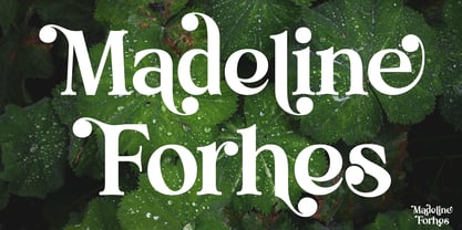 Madeline Forhes is a stylish and modern serif font that’s perfect for bringing a touch of sophistication to your designs. Its clean lines and contemporary letterforms create a timeless yet fresh look that’s perfect for editorial design, branding, and any project that requires a touch of elegance.
 - Toronto Gothic by E-phemera,
$12.00Toronto Gothic was developed from a headline in a 1920s issue of the Toronto Star. In a previous life, it was probably Condensed Titling Gothic #11, but in this form its rounded corners and irregular lines are meant to make it look worn from years of use. - FF DuGauguin by FontFont,
$41.99 Belgian type designer Dung van Meerbeeck created this script FontFont in 1992. The font is ideally suited for festive occasions, film and tv as well as poster and billboards. FF DuGauguin provides advanced typographical support with features such as ligatures. It comes with proportional lining figures.
 - Fox Grotesque Pro by TipografiaRamis,
$39.00 Fox Grotesque Pro is follow-up version of Fox Grotesque family. Typeface consists of ten font styles with extended support for most Latin languages plus Cyrillic. Fox Grotesque Pro release in OTF format and includes some opentype features – proportional/tabular, lining/oldstyle figures, slashed zero, ligatures, fractions...
 - Inventory JNL by Jeff Levine,
$29.00Inventory JNL is based on a "solid letter" stencil where you trace the body of the letter and fill in the top and bottom connecting lines to each character. This is another font in Jeff Levine's series of digital designs based on classic lettering stencil guides. - Nedo by Typogama,
$25.99 Nedo is a retro inspired, single weight display font based on a series of geometric lines. It features a large set of ligatures and some alternate characters that allow a range of possible combinations for text layouts and is best suited for use in large settings.
 - FF Orbital by FontFont,
$41.99 Slovakian type designer Peter Bil'ak created this display FontFont in 1996. The font is ideally suited for film and tv, music and nightlife as well as software and gaming. FF Orbital provides advanced typographical support with features such as ligatures. It comes with tabular lining figures.
 - HippityDippity by Ingrimayne Type,
$9.00 HippityDippity is a whimsical typeface with big, sloppy serifs and no straight lines or smooth circles. It comes in two weights and an inline variation. HippityDippity Inline Middle and HippityDippity Inline Inside are designed to be layered with HippityDippity Inline to produce bicolored or tricolored letters.
 - Coaction by Oui Studio,
$17.00 Hello, friend! 'Coaction' font is coming; a playful retro font with a stylish script typeface. Inspired by the 70's roller skates era, Coaction is ready to rollin' on your artwork. Coaction is perfect for branding, logo, invitation, funky vibes, fashion, headlines, event, title, and more.
 - Tomoli by PizzaDude.dk,
$20.00Tomoli is short for "things of more or less importance". In this dingbat font you'll find 52 stylized drawings of animals, food and lots of different stuff - that is of more or less importance! :) Furthermore, the drawings are made of remarkbly steady lines! - Go have a look! - Simple Pen by Zeenesia Studio,
$10.00 Simple Pen Font Duo, Introducing of our new product the name is Simple Pen, Simple Pen is a Quirky Serif Font. came with two style, Solid and Line who make your design so classy, Simple Pen very good for crafting, kids poster, promotion poster, cartoon, comic etc
 - Secret Boudoir by Creative Corner,
$9.00 Secret Boudoir is a handwritten type of font with a sensual, romantic vibe. The style of handwritting is feminine. The font contains decorative alternative capitals. It will be perfect for themes like weddings, lifestyle, feminity but also for quotes, titles, blogs for product names and packaging.
 - Diagonal ND by Neufville Digital,
$29.60 Inspired by Barcelona’s Diagonal street, Antoni Morillas designed Diagonal ND in 1970. A sans that alternates straight and inclined lines, with a strong rhythm and its own personality. Its range of possible usages are very varied: signage, headlines, packaging, etc. Diagonal is a Trademark of BauerTypes SL
 - Capzule by Bogusky 2,
$24.50The capsule shape has long been a favorite of mine. So, why not use it as the basis for a font design. And if you hit the cap bar key, you'll find a hidden capzule. Take two and catch some Zs before you resume surfing for fonts.


