10,000 search results (0.028 seconds)
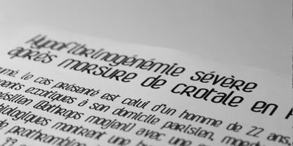
  1. French Semi by Wooden Type Fonts, $20.00
    A revival of one of the popular wooden type fonts of the 19th century, condensed, bold, flat thick serifs, a very useful design for display.
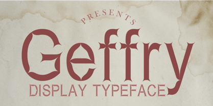
  2. Geffry by Rezastudio, $9.00
    Geffry is a retro inspired display typeface. It's fun and groovy with a bold personality. Perfect for masthead, logo, or anything your creativity takes you.
  3. Utica JNL by Jeff Levine, $29.00
    Utica JNL takes the basic components of Boat Decals JNL and reworks the characters into a bold, block font with thick-and-thin line variations.
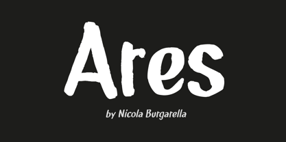
  4. NBAres by Nicola Burgarella, $9.00
    This new font family full fit all your comic balloons, onomatopoeia and... SCREAMS! Comes with Regular, Italic and Bold Italic with a great organic look.
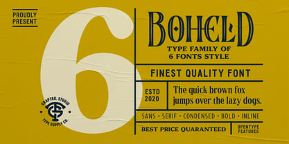
  5. Boheld by Graptail, $21.00
    Boheld comes with 6 different style variations such as Sans, Serif, Bold, Condensed, and Inline. It is inspired by classic labels, tickets, posters, and more.
  6. General Merchant JNL by Jeff Levine, $29.00
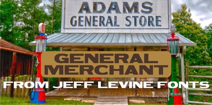
    General Merchant JNL is a bold, compressed sans design in the 'Grotesk' fashion with varying character widths and flattened tops on the usually rounded characters.
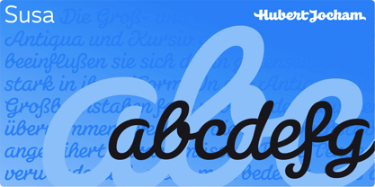
  7. Susa by Hubert Jocham Type, $29.90
    Susa is an elegant and flowing brush script typeface. Ideal for short text in the lighter weights and for headlines in bold and heavy weights.
  8. Boa by Alien, $30.00
    Boa bold is a basic display font made for print. It was created for an Artbook about reptiles. It needed to be round and clear.
  9. Architec by Monotype, $29.99
    This caps only hand lettering could have come from an architect. Speedy written on a 45 degree slope with a bold felt pen or brush.
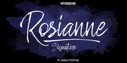
  10. Rosianne by HandletterYean, $10.00
    Rosianne is a bold and unique handwritten font with a distorted and classic feel. It will effortlessly turn any creative idea into a stand out.
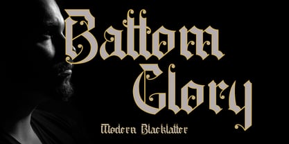
  11. Battom Glory by Sealoung, $10.00
    Battom Glory is a bold and distinct blackletter font. Add this font to your creative ideas and notice how it will make them stand out!
  12. Sign Letters JNL by Jeff Levine, $29.00
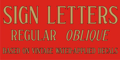
    A few scant examples of some condensed Roman style water-applied decals inspired Sign Letters JNL. The decals were once part of the gold and black "Signmaker" letters and numbers once manufactured by the Duro Decal Company of Chicago and were sold through hardware and variety stores across the country. The condensed letters (which were eight inches in height) did not sell as well as Duro's mainstay sizes of 1/2 inch to 3-1/2 inches and were discontinued long before the rest of the line was supplanted by self-adhesive lettering.
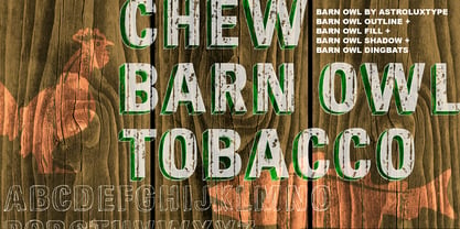
  13. Barn Owl by astroluxtype, $20.00
    Vintage, country, distressed or just plain worn out. The Texas general store on the side of the highway that has been there since 1954 and they're still selling old fashion bottled soda. A renovation/excavation at a downtown urban construction site reveals the old ad on exterior brick. Barn Owl provides the headline in your project with the ultimate in aged retro visualization. It is a basic minimal font set which includes only uppercase letterforms. It is a headline font best used above 36 points in size. The first of our “Trifonictype” (Tin Sign is the 2nd) there are three components to the font, Barn Owl Outline, Barn Owl Fill and Barn Owl Shadow. These can be used in different combinations for different effects, copy and paste type then indicate a different font each time. Paste in the front or back in application to see effects in combination. Fill and Shadow could be used with irregular letter spacing for various effects. Outline could be used with just Shadow for a another effect. Use your photo manipulation program to overlay and change the transparency of your headline. There are a few extended glyphs and barn(ding)bats in the lowercase letter strokes indicated in a poster sample, these are found only in the Barn Owl Outline. Download PDF manual for complete showing.
  14. Maison Luxe by FontMesa, $25.00
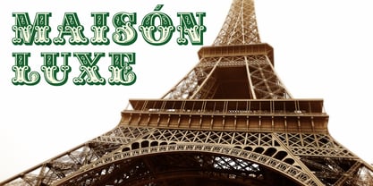
    Maison Luxe is a revival of a very old font designed in France in or around the year 1820. You may have seen this font in the past under the names of Circus, Roma, Madame and Gillé Classic. As of November 2016 we have changed the name of this font from Gillé Classic to Maison Luxe which means Luxury House in French. For many years Joseph Gillé was credited as the original designer of this font however we've recently been contacted by a type historian in France reporting that he could not find any evidence supporting Joseph Gillé as the designer and to the best of his knowledge an artist by the name of Sylvestre may be the true designer. If you love this classic font then you're sure to enjoy the alternate version also with a matching lowercase available from FontMesa under the name of Home Style. This version of the classic with its squared off shadow is true to the original design where Home Style has diagonal lines creating a cast shadow. New in 2016 for Maison Luxe is a new matching lowercase, an uppercase German Double S (versal eszett), Greek character set, opentype features including case sensitive forms and old style numerals. We know you'll enjoy the new additions to this timeless classic design.
  15. Club - Personal use only
  16. ALCATRAZ - Personal use only
  17. Teatral - Personal use only
  18. HeummSwifthongcha142 - Unknown license
  19. Shanghai - Unknown license
  20. KG Lego House - Personal use only
  21. Staubach - 100% free
  22. 84 Rock! - Personal use only
  23. Digital tech - Personal use only
  24. Cher Font - Unknown license
  25. GarbageG - Unknown license
  26. Espresso - Unknown license
  27. PlasterCaster - Unknown license
  28. GASMASK - Personal use only
  29. Drebiek - Unknown license
  30. Kings of Pacifica - Personal use only
  31. VTCSuperMarketSaleTallTilt - Unknown license
  32. SF Piezolectric Inline - Unknown license
  33. Ebola - Unknown license
  34. Avain - Personal use only
  35. Wonton - Unknown license
  36. Riquoth - Unknown license
  37. Vincenza Display by The Rare Form, $35.00
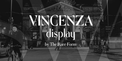
    Vincenza Display is a modern high-contrast semi-sans with sharp edges and sleek curves. A distinctive typeface for exquisite headlines. Winner, Gold Award, Graphis 2018 Typography 4. http://www.graphis.com/entry/f6b469fe-c5d3-4bea-87e3-796c1d727b3c/ We felt there was a missing in the world of fashion-forward high-contrast typefaces, so we created Vincenza Display. Based loosely on the proportions of Bodoni, Vincenza features stylized curved descenders and unique semi-serifs, bringing a bold and distinct look to your headlines. The typeface has several alternates and ligatures, and is spaced for all caps as well as sentence case executions. It also contains a robust number of special characters. Vincenza Display is the debut typeface from the team at The Rare Form.
  38. Cougher by Context, $10.00
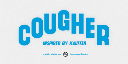
    A big fat quirky face for big bold weird uses. Inspired by E. McKnight Kauffer and vintage travel posters, both styles have support for multiple languages.
  39. KG Always A Good Time by Kimberly Geswein, $5.00
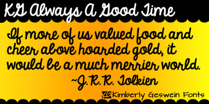
    Happily-lettered handwriting full of optimism. This handwriting was drawn with a chunky round marker and is bold enough for drawing attention yet still completely legible.
Looking for more fonts? Check out our New, Sans, Script, Handwriting fonts or Categories
abstract fontscontact usprivacy policyweb font generator
Processing