10,000 search results
(0.086 seconds)
- Bogdan by ParaType,
$30.00 An original script font designed by Victor Kharyk and licensed by ParaType in 2006. Based on Ukrainian Skoropis (fast handwriting) of 16-17th centuries. The font was named after Ukrainian Getman Bogdan Khmelnitsky, because the main sources and inspirations for the project were taken from collection of handwriting Universals (decrees) of that time -- the middle of 17th century. The shape of letters imitates flat nib quill handwriting with stress, bringing them informal liveliness. The Bogdan font character set contains Cyrillic, Old Slavonic , Glagolitic, Latin and Greek alphabets in two variants: Rejestrowy (Regular) and Siczowy (Alternate). The font is for use in display typography, but can work quite well for short text setting. Bogdan type is well suited for historical and cultural texts associated with Europe of 15-17th centuries
 - TradaSans by Hoftype,
$49.00 TradaSans is a new addition in the range of Univers and Helvetica. It represents a fresh face in this ongoing strong category of sans serif typefaces. TradaSans slightly squarish tendency, and its technical and neutral look create an objective and factual appearance. TradaSans is an ideal typeface for universal use. It offers high reading qualities with longer text applications and its sophisticated design details make it a distinctive headline typeface. TradaSans consists of 20 well tuned weights and is well equipped for advanced typography. It comes in OpenType format with extended support for up to 80 languages. All weights contain small caps, ligatures, superior characters, proportional lining figures, tabular lining figures, proportional old style figures, lining old style figures, matching currency symbols, fraction- and scientific numerals, matching arrows and alternate characters.
 - Marian Churchland Journal by Comicraft,
$39.00 Tall, thin and elegant, Marian Churchland’s fonts are very much like her.. and now available from those awfully nice chaps at Comicraft to allow you to pretend that you are too! Marian Churchland was born in Canada in 1982, and was raised on a strict diet of fine literature and epic fantasy video games. She has a BA in Interdisciplinary Studies (English Literature and Visual Arts) from the University of British Columbia, and has been doing professional illustration work, including book covers and magazine articles, since she was 17. Last year, she became the first woman to solo-illustrate a CONAN story, and this year she’s illustrating three issues of ELEPHANTMEN for Image Comics. Artwork by Marian Churchland from Elephantmen #20. See the families related to Marian Churchland Journal: Marian Churchland .
 - Maribor by Dima Pole,
$30.00 Maribor is a slab serif font with nice shapes, they are both soft and angular. It is perceived calmly and with a twist. Maribor means "Mara`s pinery". The energy of the Universe, reflecting the modification, renewal and change for the better is called Mara; Ancient wise ancestors called it so. Today it is known as the goddess Mara in the Vedic worldview of the Slavic-Aryan peoples. Maribor is a multilingual font, it contains characters for 104 Latin languages and all Slavic, including all capitals for them. There are all major currency signs, including the ruble and the Euro. Many OpenType features allow you to make a variety of compositions; as well as to see the font from the new side thanks to the stylistic sets for the Slavic alphabets.
 - Delectables by ITC,
$29.99A former lettering artist at Hallmark Cards, Rob Leuschke now has his own thriving design businesses, Alphabytes and the new TypeSETit. Growing up in St Charles, Missouri, where he still lives, Rob showed great artistic promise at an early age. He earned a BFA in graphic design at the University of Missouri at Columbia. After graduation, his stint at Hallmark Cards gave him the opportunity to learn from and work with some of the best lettering artists in the industry. Rob struck out on his own in 1987 and now boasts a long list of clients from all over the world. Rob has created over 250 custom typefaces, and his work has been exhibited in New York. Ambiance BT is Rob’s first typeface published by Bitstream, with more to follow. - Fuse by W Type Foundry,
$25.00 This font is inspired by two typographic styles, incorporating (both) geometry and humanism. It combines the rhythm of such typefaces as Meta Pro and The Sans, as well as terminations and structures from fonts like Din and Futura. This results in a font that plays with condensation and a parallel rhythm, simple and functional. Fuse is perfectly equipped with Opentype, it contains alternative glyphs, fractions, modern and old numbers, superscripts and subscripts, ligatures and Small Caps. We always kept the idea of having Fuse be humanistic, rational and universal, which makes it ideal for graphic design, printed publications, web design, motion graphics, interaction design and branding. Learn about upcoming releases, work in progress and get to know us better! On Instagram W Type Foundry On facebook W Type Foundry wtypefoundry.com
 - Quodlibet Serif by Signature Type Foundry,
$43.00 The new typeface system is based on legibility of Renaissance and Baroque Antiqua. It maintains the quality of drawings without an overpowering historical legacy. The current concept makes the system a universal whole. Abrading of sharp edges which could catch one’s attention leads to a fine rounding of details. In this way, a sans drawing does not look hard and sterile unlike most of its contemporaries. Special attention was paid to every detail of each letter. The professional question of how to incorporate brightening wedges into the dark places of individual strokes’ onsets was resolved by rounded shapes that have their graphic response in the detail of the serifs. Particularly in larger sizes the typeface offers drawing sophistication and dimensional interconnection. Apart from Cyrillic alphabet, the alphabet design includes Vietnamese accents.
 - Pepi/Rudi by Suitcase Type Foundry,
$39.00 The superfamily Pepi and Rudi is based on playful experimentation with basic geometric shapes - the circle, rectangle and triangle - elements that laid the foundations for typographic Modernism. The Pepi and Rudi introduces a number of current elements into a time-proven concept of primitively constructed typefaces. The typeface's somewhat uniform character width establishes a more regular rhythm; the character set is expanded, and legibility is improved thanks to taller lowercase. A wide range of ten styles, from hairline-thin to extra-thick with adequate Italics allow for universal use across the whole scope of graphic design. Carefully designed diacritics, clear punctuation marks, table number characters, ligatures, arrows or alternative lowercase characters are standard; this is sure to please everyone needing to work effectively with a neutral, geometric headline typeface.
 - Book Jacket by Canada Type,
$24.95 Book Jacket is arguably the most famous of all typefaces done in the Typositor era. Designed by Ursula Suess over an entire year, and published in 1972, Book Jacket became an instant success story that lasted well into the 1980s (even though it was copied by Phil Martin who published it under the name Bagatelle shortly after its release). Almost 40 years later, Ursula Suess and Canada Type consolidate their talents to bring you a revised, improved and expanded digital version of this film type classic, including small caps, additional swashes and new alternative forms. Book Jacket is available as a 4-font package in Mac PostScript and universal TTF format, or a single Pro OTF which includes features for small caps, swashes, caps to small caps, stylistic alternates, and class-based kerning.
 - Quodlibet Sans by Signature Type Foundry,
$43.00 The new typeface system is based on legibility of Renaissance and Baroque Antiqua. It maintains the quality of drawings without an overpowering historical legacy. The current concept makes the system a universal whole. Abrading of sharp edges which could catch one’s attention leads to a fine rounding of details. In this way, a sans drawing does not look hard and sterile unlike most of its contemporaries. Special attention was paid to every detail of each letter. The professional question of how to incorporate brightening wedges into the dark places of individual strokes’ onsets was resolved by rounded shapes that have their graphic response in the detail of the serifs. Particularly in larger sizes the typeface offers drawing sophistication and dimensional interconnection. Apart from Cyrillic alphabet, the alphabet design includes Vietnamese accents.
 - Therhoernen by Proportional Lime,
$9.99 Arnold Therhoernen. (Arnoldus ther Hornen, Drucker des Dictys , Arnold ter Hoernen, Arnold ther Hoernen, Arnoldus TherHornen.) Who was this guy? He was a printer active in the city of Cologne, having graduating from the university there. He learned his craft under Ulrich Zell. He printed books from 1470 to 1482 when the plague carried him off. Was he just another printer of the era? No, he brought out the first edition of the "Fasciculus temporum'' (The most popular work by a living author at that time.) And he was the first to use both a title page and page numbers. His page numbers, an idea probably suggested to him by Werner Rolevinck, were interesting in that they were centered half way down the page on the outer margin and were set in Roman Numerals.
 - Citizen Kern by Pierre Tur,
$9.00 Citizen Kern is a modern, geometrical grotesk typeface. It comes in 5 different styles and opentype features for a better use of typography: it’s good for both headlines and body copy. It was made from the simplest geometrical shapes for a universal appearance, with enhanced overlaps to ensure an offbeat look. Citizen Kern is meant to work for any graphic project. You can use it for branding, editorial design, signage or even motion design : its simple shapes make it super easy to animate. Do you love the classic sans serif fonts? We all do. But what if you could add some singularity to your projects? Then Citizen Kern is the ideal pick for you. It will never be as perfect as the classics but will definitely offer an alternative, and freshness to your work.
 - Ariata by Monotype,
$50.99 Ariata™, from Malou Verlomme, is three typefaces in one. Like phases of the moon, they gracefully meld from one to the other. The “Text” weights are sturdy designs that perform as well in blocks of copy as they do in the occasional headline. The “Display” versions of Ariata are delicate but confident designs that shine in large sizes, while the “Stencil” typefaces are eye-catching and provocative. Each version is available in four weights, from a forthright regular to a robust black, making for a family that is comfortable taking on a wide variety of tasks. The individual designs can be combined with each other to create a distinctive, yet cohesive typographic statement, or stand on their own as confident communication tools. If you want a little more variety, Ariata’s solid glyphic shapes will serve as a dynamic counterpoint to just about any Humanistic sans. Space economical and distinctly original, Ariata easily creates commanding headlines, pull-quotes and subheads. Packaging, game branding, posters, book jackets and advertising design are all also within its comfort zone. While primarily intended for print applications, Ariata’s full-bodied x-heights, generous counters and clear apertures make for a design that is also at home in many digital environments. Verlomme is an award-winning Senior Type Designer at Monotype. He has a degree in graphic design from l'École Duperré in Paris, and an MA in Typeface Design from the University of Reading. He taught type design at several universities in Paris and still occasionally lectures and gives workshops. His typeface Camille has the honor of being part of the collection at France’s Centre National des Arts Plastiques (CNAP). Verlomme also designed Placard® Next, Madera™ and Johnston100, London’s new underground branding typeface. Click here to see all of https://www.monotype.com/studio/malou-verlomme Malou Verlomme’s typeface designs.
 - Maxima Now Pro by Elsner+Flake,
$59.00 The sans serif linear antiqua Maxima which was created in the beginning of the sixties by Prof. Gert Wunderlich for Typoart Dresden, was newly actualized in 2007 after more than 45 years. Many hands and heads were involved in the successful re-design of Maxima Now over a period of two years to assist the designers of the Elsner+Flake Design Studios in Hamburg, and the typeface family is now available. The re-design happened in close cooperation with Wunderlich who has given support to numerous projects in Elsner+Flake’s studio in Hamburg. A great deal of care was given to the necessary preliminary tasks such as the viewing of the original designs and print tests, the analysis of the digital Typoart data which had been in the possession of Elsner+Flake since 1985 and 1989, and a design conceptualization based on detail correlations, as well as the extension of the character complement. It had been Elsner+Flake’s goal to include as many of the existing Maxima cuts into the re-design program as possible. The result is an extended font family with 25 weights in EuropaPlus layout.
 - aaaiight! fat - Unknown license

- Arkitech Round - Personal use only

- Soprani Variable by insigne,
$129.99 "Step into a world where the 1920s meet the future with Soprani—a typeface that seamlessly blends vintage charm and modern sophistication. Drawing inspiration from a distinctive plaque unearthed in New Zealand, Soprani showcases serifs that flare and shimmer, capturing the essence of art nouveau and arts & crafts in a contemporary light. Dive into its rich OpenType features, granting designers unparalleled flexibility to bring their visions to life. Its condensed yet elegant letterforms are the perfect fit for everything from artful table books and stylish menus to dynamic media showcases in TV and film. Spanning from the graceful subtlety of its thin variant to the undeniable boldness of the black, Soprani is diverse and dynamic. Soprani isn't just a typeface—it's a revolution in design. Production assistance by Lucas Azevedo and ikern.
 - Bucinta by Goodigital13,
$20.00 It easily cooperating together For Magazine, Movies, or Book Titles. For Photography, Wedding Invitation, Restaurant Menu or T-shirt Design. For Flyers, Banner Ads, web and printing. From Food and Fashion to a Cosmetics product beautiful typographic harmony for a diversity of design projects, including logos & branding, wedding designs, social media posts, advertisements & product designs.
 - Beauty Handwriting by Nirmana Visual,
$22.00 Beauty Handwriting is a Natural handwriting modern calligraphy font. full set of lowercase and uppercase letters, numerals and punctuation, multilingual symbols, lowercase beginning and ending swashes. 80 ligatures giving realistic hand-lettered style. Beauty Handwriting offers beautiful typographic harmony for a diversity of design projects, including logos & branding, social media posts, advertisements & product designs.
 - Long giraffe by Ask Foundry,
$19.00 Meet "Long giraffe," a condensed font inspired by a giraffe's elongated neck. It offers two font families, one displaying significant thickness contrast between horizontal and vertical strokes. Perfect for mobile screens and narrow spaces. Supports Western and Eastern European languages, making it versatile for diverse design needs. Embrace the elegance and functionality of Long giraffe.
 - Gizmo - Unknown license

- Bauer Bodoni by Linotype,
$45.99 Giambattista Bodoni (1740-1813) was called the King of Printers; he was a prolific type designer, a masterful engraver of punches and the most widely admired printer of his time. His books and typefaces were created during the 45 years he was the director of the fine press and publishing house of the Duke of Parma in Italy. He produced the best of what are known as "modern" style types, basing them on the finest writing of his time. Modern types represented the ultimate typographic development of the late eighteenth and early nineteenth centuries. They have characteristics quite different from the types that preceded them; such as extreme vertical stress, fine hairlines contrasted by bold main strokes, and very subtle, almost non-existent bracketing of sharply defined hairline serifs. Bodoni saw this style as beautiful and harmonious-the natural result of writing done with a well-cut pen, and the look was fashionable and admired. Other punchcutters, such as the Didot family (1689-1853) in France, and J. E. Walbaum (1768-1839) in Germany made their own versions of the modern faces. Even though some nineteenth century critics turned up their noses and called such types shattering and chilly, today the Bodoni moderns are seen in much the same light as they were in his own time. When used with care, the Bodoni types are both romantic and elegant, with a presence that adds tasteful sparkle to headlines and advertising. The Bauer Bodoni was done by Heinrich Jost for Bauer Typefoundry in 1927. This version has finer details of the original Bodoni types. It works well for headlines, logos, advertising.
 - Alumina by Rafaeiro Typeiro,
$27.00 Discover Alumina, a typeface that exudes elegance and authority. Its robust weights demand attention, while lighter variants display grace. From bold statements to subtle emotions, Alumina empowers your creativity effortlessly. Suitable for diverse mediums, Alumina remains legible and versatile. Unleash customization with OpenType features like ligatures and fractions. Embrace Alumina as your creative companion, sparking change and expression.
 - Headline Brush by MJB Letters,
$16.00 Headline Brush is a versatile brush script font designed for a natural, casual feel. Crafted from hand-brushed letters scanned into vector format. Making it ideal for diverse projects like logo design, poster design, blog titles, posters, clothing, and branding. The font's variations and alternative underlines enhance text and design, adding a distinctive touch to any professional endeavor.
 - Zokak Arabic by FarahatDesign,
$39.00 Zokak is a first-of-its-kind ultra condensed Arabic typeface designed for display uses. The name means an alley in Arabic which comes from its very narrow letters, which makes it perfect in small spaces. Zokak has two main styles, the default style and the tall one to give more diversity and to be suitable for more uses.
 - Red Ribbory by FallenGraphic,
$20.00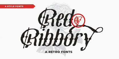 Red Ribbory is stands out as a diverse selection of typefaces, beautiful alternates character that maintain a coherent look and feel throughout. font is perfect for branding, headings, signatures, logos, blog, t-shirts, letterhead, merchandise, signage, lable, news, posters, badges etc. FEATURES : Character Set A-Z Numberal Accents (Multilingual characters) PUA encode Alternates MULTiLINGUAL ACCENT žŠŒšŸÀÁÂÃÄÅÆÇÈÉÊËÌÍÎÏÐÑÒÓÔÕÖØÙÚÛÜÝßàáâãäåæçèéêëìíîïðñòóôõöøùúûüýÿ
 - Pesha by Valentino Vergan,
$20.00 Pesha is a beautiful and unique sans serif typeface that is inspired by the early art nouveau typestyles. Pesha combines diverse styles from different eras, to create a unique blend between contemporary and retro. Pesha works best for elegant titles, magazines, logos, wedding invitations, headlines, editorials and much more. I hope you enjoy using the Pesha typeface.
 - Arnika by Typejockeys,
$50.00 This charming type family comes in four widths: Regular, Semi Condensed, Condensed and Extra Condensed – bringing flexibility and diversity to your drawing table. Crisp details convey confidence without losing fineness. Arnika is your ally for all things classy. Although it is a match made in heaven for beauty products and fashion magazines, we leave its usage to your imagination.
 - Quentes Fleur by FallenGraphic,
$20.00 Quentes Fleur is stands out as a diverse selection of typefaces, beautiful alternates character that maintain a coherent look and feel throughout. font is perfect for branding, headings, signatures, logos, blog, wedding invitations, t-shirts, letterhead, merchandise, signage, labels, news, posters, badges etc. FEATURES: Character Set A-Z Numeral Accents (Multilingual characters) PUA encode Alternates MULTILINGUAL ACCENT žŠŒšŸÀÁÂÃÄÅÆÇÈÉÊËÌÍÎÏÐÑÒÓÔÕÖØÙÚÛÜÝßàáâãäåæçèéêëìíîïðñòóôõöøùúûüýÿ
 - Konichiwa by Motokiwo,
$18.00 Brush textured with casual handwritten gesture, say hi to Konichiwa. This is hot and tasty font that very recommended for food branding such as Burger, BBQ, Coffee and Pizza. It's also great for fashion and cosmetic projects that need diversity. Features: Uppercase Lowercase Numbers & Punctuation Standard Latin Multilingual Support Ligatures Easy to use on any devices
 - Brisa Pro by Sudtipos,
$59.00 The dynamic design duo of Koziupa drawing and Paul digitizing strikes again. This time they cover the space from light nonchalance to eerie darkness, and everything in between. Quicker than lightning and just as poignant, Brisa Pro shows unprecedented determination, presence of spirit, and finality of confidence. Brisa Pro is the teenager leaving home, the lover leaving one last note on the refrigerator door, the prophet announcing the imminence of doom, the rebel scratching anger on the wall, the bereaved clawing torment into life, and the bogeyman dropping a line to keep your eyes wide open through the night.
 - Buddies by Sudtipos,
$59.00 Buddies, designed by Guille Vizzari, is a script font that was initially born as a piece of lettering. It is the result of an experiment between brush pen and pencil, and in this way, Buddies takes the imprint of the brush, the freshness of sign painting, and some (or a lot) of quirks by the author. The font at times enjoys dancing in titles and short lines of text, pouring rhythm and movements through its lowercase various x-height sets. Buddies also has a vast uppercase set with daring and atypical shapes that surprisingly function beautifully for composing short all-caps texts; messages are brought to life with awesome personality, ideal for packaging, fashion or even editorial. Buddies is a friendly font, a humble invitation to the brush letters universe, but from an unpredictable point of view.
 - Steady Bonanza by Just Font You,
$10.00 Fashion is a trend, Style lives within a person *Oscar de la Rerta. I believe everybody's special. You have your own original character in every single appearance. And i feel so addicted to bring that something special in you to be shown to the universe. And that's what it cames from. Introducing, Steady Bonanza. A versatile hand lettering script typeface to dig up your authentic style. Made from the authenticity of brush and ink character, and delivers with so many style so you can always show up fresh in every use of it. Undoubtedly fit for your fashion branding, logo, posters, promotions kit, social media post, brochure, quote, lookbook, and a possibility to expand more such as wedding stuff, food and beverage, girly things, hand crafted stuff, you got the full control on it, dont stop yourself!
 - Hwaiting Serif by Konstantine Studio,
$20.00 Inspired by the emerging Korean culture that grabbing the worldwide actuation in so many realms of the industry. To bridge the vibes and to make it easier to consume, we found the gap to fill with simple things in life that are useful for it, and yes, it's a new day it's a new font. So without any further ado, please welcome Hwaiting Serif. 3/3 series of Korean vibes typefaces. It's a serif font with a thick and thin style of visuals, aiming the luxury and glamorous tone to catch up with high-fashion branding and today's graphic design trends Crafted with deep research about Korean traditional letters, shaped up with the approach of universal Latin letters. This is the last drop of 3 series from the Hwaiting family. Thank you for your engagement with us.
 - Karayel Handwritten by Tatbikililer,
$19.00 Erdogan Karayel, a master in graphic arts and a cartoon artist, has long dreamed of transforming characters made up of his own handwriting into fonts. This dream has come true with the technical support of Karayel's school friend Sabahattin Kayış, a graduate of the Istanbul School of Applied Fine Arts (Marmara University Faculty of Fine Arts). The biggest problem of handwritten fonts in the font world is the difficulty of reading in long texts due to their curved and flexible letters that create spacing problems when used side by side. The "Karayel Calligraphy", on the contrary, is created as a solution to this problem. It's a font that is sufficiently fluid, visually satisfying and easy to read. In particular, a lot of effort is made to ensure the utmost harmony between the character's spaces. The “Karayel Calligraphy” font is now available for download.
 - SL Che by Sudtipos,
$29.00SL Che is a homage to Ernesto Guevara de la Serna, “El Che”, who lived between 1928 and 1967. El Che turned into an universal icon through a memorable photograph which was reproduced and multiplied to the infinite. It was that way he became a synonymous of resistance, revolution and change for lots of generations. That "Che" comes back today by the hand of the genial Jorge Alderete, who designed heroic, laughing and cool variations of that popular first icon. SL Che unfolds like a fan of thousands of "Che", in a development plenty of metaphors. SL Che abridges a sum of original iconographic illustrations in True Type format, which masterly synthesizes the most important themes of the grand genius of the literature. SL Che takes part of the "Icons of Icons" Gallery, developed by SinergiaLab for Sudtipos - Nomina by Tokotype,
$40.00 Nomina is a family of sans serif fonts for use from large to small sizes. The weights of the family itself contain 16 styles plus italic, ranging from ExtraLight to Black. The font family takes was inspired by classic Grotesk typefaces such as Venus and Akziden Grotesk. Unlike any other modern Grotesk typefaces, the details of the contrast in this font family are quite subtle and yet still harmonize while standing in between another character, the open apertures help them to increase the quirkiness accompanied by the sharp terminals on each rounded glyphs. The Nomina family is well equipped with lots of selective alternates and OpenType features, and the main usage of this font is universal, this means this can use it any design style as long as the look and feel keep match with its characteristics.
 - Blend by Typesenses,
$49.00 Blend is a hand drawn collection that takes its cues from the visual universe of bakeries and coffee shops. The name refers to the combining of different kinds of coffee beans to get a balanced taste, and Blend does just that, although here each typographic flavor can also be enjoyed separately. Projects such as branding, children’s books, wedding invitations and labels are sweetened with this cute family. The bouncing informal Script programmed with Open Type offers a wide range of features like ligatures, swashes, endings, initial forms and lots of alternates. Use professional software that widely support Open Type features. Otherwise, you may not have access to some glyphs. Keep the Standard Ligatures feature always active. For further information about features and alternates, see the User Guide Blend has extensive Western, Central and Eastern European language support. Make some coffee and enjoy!
 - Nora Grotesque by vve.type,
$34.99 Nora Grotesque is a modern sans serif type family of five weights plus true matching obliques, all completely equipped with opentype features, fractions, lining numbers, old style figures, capsular numbers, superscript and inferiors. It has been designed parallel within the neogrotesque universe of typefaces and is inspired by humanist proportions and humanist-grotesk features in multiple languages, support Central and Eastern European as well as Western European languages. Working on Nora Grotesque type family, we've aimed to create a modern geometric grotesk with the widest implementation range, a reliable workhorse. Nora Grotesque is equipped for complex, professional typography with a high x-height for maximum legibility and a powerful personality then other alternates. We've been especially careful working on the uniq geometry of each glyph, both from the point of view of visual correctness and forms continuity.
 - Goga by Narrow Type,
$42.00 Introducing Goga, a versatile sans serif family available in 10 weights from hairline to black. It is a typeface that combines the best of geometric sans serifs and neo-grotesques. It draws inspiration from typefaces like Avenir on the one hand and Helvetica on the other. Although Goga is a universal and neutral typeface, it is rather warmer and friendly in nature. If you want to add more juice to your project, you can do so by using unusual stylistic alternates of the lowercase g (hence the name Goga). Goga is a typeface suitable for both large sizes and smaller text, thanks to its large x-height. It contains Latin-extended character set, and thus supports most Latin languages. It also offers many open type features such as fractions, old-style figures, tabular figures, discretionary ligatures and more.


