10,000 search results
(0.024 seconds)
- Morpeth by G-Type,
$60.00 Hardworking and versatile condensed sans family originally designed for Morpeth Borough's wayfinding system and thus eminently usable for signage purposes. The 6 weight OpenType family includes discretionary ligatures, small caps, 5 sets of numerals plus coverage for Central European, Baltic and Turkish languages.
 - Explora by TypeSETit,
$24.95 This formal calligraphic face is light, and delicate with beautiful lines and curves. The Pro version adds extra elegance with alternate caps and beginning and ending swashes. Explora has over 600 glyphs and features international languages including the entire Cherokee Nation character set.
 - Bubbly Kids by Create Big Supply,
$15.00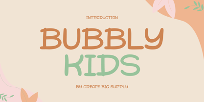 Bubbly Kids Font is a cute and fun display font. This will add a cheerful, happy touch to your design. Features: Uppercase & lowercase Numbers and punctuation Multilingual PUA Encoding Full Character Set !"#$%&()*+,-./0123456789:;?@ABCDEFGHIJKLMNOPQRSTUVWXYZ[\]^_abcdefghijklmnopqrstuvwxyz{|}~ ¡¢£¤¥§©ª«®°±²³¹º»¿ÀÂÃÄÅÆÇÈÉÊËÌÍÎÏÑÒÓÔÕÖ×ØÙÛÜÝÞßàáâãäåæçèéêëìíîïñòóôõö÷øùúûüýþÿıŒœŠšŸž–—‘’“”†‹›€−…·•/‚„
 - Astrospy JNL by Jeff Levine,
$29.00Astrospy JNL is a square-shaped, futuristic techno-style font from Jeff Levine. It is very well suited for short phrases, but caution should be used in setting too many words with it because of legibility issues. Best used in larger point sizes. - Big Tent Players NF by Nick's Fonts,
$10.00A WPA poster announcing the latest production by—guess who?—the Big Tent Players inspired this eye-catching, if somewhat unconventional, typeface. Both versions of the font include the 1252 Latin and 1250 CE character sets (with localization for Romanian and Moldovan). - Farmer by SparkyType,
$19.00The OpenType version of Farmer contains two sets of slightly different upper-case letters. The alternate version is accessible as Titling Caps in OpenType feature enabled software. Mixed and matched they create a strong and persuasive headline, logo or For Sale notice. - Beringin by Arendxstudio,
$16.00 Beringin is a signature font that is unique and elegant. It is designed with an original hand stroke so it will be very suitable for your design projects. Features : • Character Set A-Z • Numerals & Punctuations (OpenType Standard) • Accents (Multilingual characters) • Ligature • Swash
 - Foppish Birdie by Natalie Thomson,
$15.00 Foppish Birdie is a font family with character of birds that was inspired by the font Guakala by RodrigoTypo. Foppish Birdie - dynamic, cheerful, a special typeface for children's short titles and brands, containing the Cyrillic set. Take each letter and make game!
 - Woodhaven Initials JNL by Jeff Levine,
$29.00 Woodhaven Initials JNL were designed using an outline cast shadow wood type set against a rectangle with horizontal "engraving" lines to add background texture to the initials. An ampersand is on the corresponding keystroke, and a blank rectangle is on the period key.
 - Coldsmith by Aerotype,
$49.00 Coldsmith uses the OpenType ligature feature to substitute a unique pair of distressed characters when any upper or lower case letter is keyed twice in a row. Coldsmith Pro extends the character set to support Eastern European Latin, Baltic, Greek and Turkish.
 - Trade Printer JNL by Jeff Levine,
$29.00Trade Printer JNL is another font design inspired by an old rubber stamp sign printing set. In this case, the lettering has a classic "wood type" look, reminiscent of the letterheads, billheads and fliers made by local printers of the 1880s-1920s. - Thunderhouse by Aerotype,
$29.00 A tasty jambalaya of two different weights of wood type, Thunderhouse has alternates for every capital and lowercase letter, consecutive characters are controlled with the OpenType Ligature feature. Thunderhouse Pro extends the character set to support Eastern European Latin, Baltic, Greek and Turkish.
 - Diaper Money by Fonthead Design,
$19.00On October 15, 2006 we became proud parents of three babies. To commemorate (and help pay for diapers) I decided to release this baby-themed dingbat set. All proceeds for the next few years goes to pay for lots and lots of diapers. - Blok by Studio Few,
$10.00 Built on a square grid, Blok's variable axis conforms to your canvas. With pre-defined weights ranging from 2x1, through to 1x16, Blok is as flexible as it is structured. Character Set: A-Z, Period & Exclamation Mark Weights: 6 Normal & 6 Rounded
 - Wavy Rounded BT by Bitstream,
$50.99Wavy Rounded is a stylized sans serif display typeface by Japanese designer Hajime Kawakami. Some of the characters possess quirky features that randomly create fun visual “waves”. There is a handful of alternate characters including an old style figure set. Catch the Wave. - Brooklyn Samuels by Samuelstype,
$30.00 Brooklyn Samuels is a sans-serif family of fonts designed by Hans Samuelson. Based on geometrical shapes it is primarily intended for headline use but also offers excellent legibility in small sizes. Stylistic sets offer a more text-friendly alternative for some letters.
 - Fokers by Letterhend,
$14.00 Fokers, a new display typeface with classy and luxury look! Fokers' different styles works perfectly for headline, logotype, apparel, invitation, branding, packaging, advertising, and more. Fokers comes in uppercase, lowercase, with punctuation, symbols, numerals, stylistic set alternate, ligatures and also multi-lingual support.
 - LHF Spencer by Letterhead Fonts,
$42.00 LHF Spencer exemplifies the quirkiness of late 1800's lettering. Uppercase is set below the baseline, adding a hand drawn look. Curved swashes juxtaposed with traditional thick and thin strokes make Spencer's letters stand out in a design. Includes 29 OpenType alternates.
 - Elicit Script by Monotype,
$40.99 Elicit Script is a hybrid script family, that can be as casual or formal as the occasion demands. Created by Laura Worthington and Jim Wasco, the design is based on pointed pen Spencerian Script handwriting. “It’s like one of those German italics from the early 20th century, that have beautiful shapes that hold their own,” says Wasco. Elicit Script spans five weights, from Extra Light to Bold, and three styles – Formal, Normal and Casual. This makes it an incredibly versatile script design, easily paired with other typefaces and able to be dressed up or down, depending on what it’s used for. The monoline Casual style offers a more relaxed tone of voice, while Formal sits at the more decorative end of the spectrum. Designers can keep things straightforward, tidy and practical with the typeface’s simple caps, or add in swash caps if they need more exuberance and expression. Generous spacing means Elicit Script works well at smaller sizes as well. Elicit Script Variable Set is a single font file that features two axes: Weight and Contrast. The Weight axis has instances from Extra Light to Bold. The Contrast axis has instances from Casual (low contrast) to Formal (high contrast).
 - Beverly Shores Script SG by Spiece Graphics,
$39.00 If you take the South Shore Line from Chicago to South Bend, your train will pass though the small community of Beverly Shores, Indiana. The beautifully restored and highly colorful “Beverly Shores” train station sign not far from the Lake Michigan beach is the source of inspiration for this connecting script typeface. The sign’s existing ten letters have now been extended to include the entire alphabet. This old-fashioned depot letterstyle is much in the spirit of such faces as Fulton Sign and Inserat Cursive. Ascenders and descenders have been lengthened and capitals are now much larger. Alternate lowercase swashes, capitals, and small figures have been included for your convenience. And custom uphill words such as “The,” “for,” and “to” have been added for more novelty and spark in headline settings. Beverly Shores Script with Alternates is also available in the OpenType Std format. Some new characters including old style figures have been added to this OpenType version. Advanced features currently work in Adobe Creative Suite InDesign, Creative Suite Illustrator, and Quark XPress 7. Check for OpenType advanced feature support in other applications as it gradually becomes available with upgrades. All aboard for Beverly Shores!
 - Sabio by Greater Albion Typefounders,
$11.95 I regard Sabio as an evolutionary face. By this I mean that it merges elements of script and Roman design into one elegant whole. The design was 'evolved' somewhere between these two classic approaches. The resulting family of faces makes an excellent display family, but is also clear and legible at small sizes and can be used as a text face with a distinctive flair. Sabio is a wonderfully flexible face that can sit happily alongside artwork that owes its inspiration to any era from the Art Deco onwards. The regular form is gently and subtly oblique, and the glyphs have a slight hint of swash about them. Alternate and perpendicular forms are also offered. The regular, alternate and perpendicular forms are all in turn offered in regular, and bold weights as well as in a condensed form. All in all Sabio is a humanist face with which almost anything can be done offering flair and elegance for almost any project. Whether it's a distinctive way of setting paragraph text, or poster work that's eye catching yet flowing and clearly legible, Sabio offers the answer.
 - Atrament by Suitcase Type Foundry,
$75.00The Atrament font family was originally conceived in 2003 as the corporate display type family for Suitcase Type Foundry. Its original source of inspiration is the front cover of the Devetsil - Revolucni slovn’k almanac (1922), designed by Karel Teige. The lettering on this cover is a condensed sans serif with rounded stroke terminals. Atrament is significantly broader than the model and its characters are better balanced, reflecting the evolution of semi-condensed sans serifs throughout the 1960s. The horizontal strokes of both lower and upper case are less stressed than the vertical stems. Noteworthy are the unusual tiny gaps in the apex and vertex of letters with diagonal strokes, designed to prevent ink from spreading and smudging the letter shapes. This detail is one of the main features of the font's character. The general feel of the italics closely matches the strictly vertical, parallel character of the regular cut. When converting the family to OpenType the alternate character shapes from the Alternator weights were incorporated in the regular cut, which allows the user to switch selected characters from one shape to another within the same font. A number of glyphs and accents were corrected, and all the glyphs missing in the Suitcase Standard character set were added, along with the relevant kerning pairs. The individual weights of Atrament Std thus contain accented upper and lower case, small caps, alternate glyphs for most European languages, nine types of numerals, superscript characters, caps glyph versions, and much more. Its narrow proportions make Atrament the perfect choice whenever economy of space is a must. It is however not very well suited for setting long texts. Ideal for headlines and display use, it is perfect for situations where the text needs to make a great impact in a little space. - The College Block II font is a Display Slab-Serif typeface that is inherently associated with collegiate and sports themes, making it perfect for university sweaters or ...
- The "Only Fools and Horses" font is inspired by the classic British television comedy series of the same name. This font captures the essence and heart of the show, which has been beloved by audience...
- Imagine stepping into a comic book universe where every corner hides unseen perils and unforeseen heroes – this is where the "Super Danger" font by Last Soundtrack takes its stand, bold and unflinchi...
- GauFontLoveRocket is an enchanting display font that captures the whimsy and excitement of unexpected love and cosmic adventures. Its design, characterized by playful curves and sharp, dynamic angles...
- SCR-N by URW Type Foundry,
$39.99 SCR fonts are screen optimized (also called 'pixel fonts'). Unlike standard fonts (and like the few well-hinted fonts like Verdana or Arial), they give a crisp look on screen at very small sizes, thus increasing legibility. The perfect applications for those fonts are web pages and software user interfaces (computer, cellular phones, console games and any other system that uses a screen interface). Unlike most pixel fonts, SCR fonts contain kerning information. Kerning is the adjustment of space between certain pairs of characters (like 'AV') to make text look more fluid, thus increasing legibility and appeal. To benefit from this feature, auto-kerning must be activated in the application. In Photoshop, kerning must be set to 'Metrics'. Although SCR fonts are optimized for screen, they can be used for print (in Illustrator or Indesign for example) for a decorative 'computer text' effect. In this case, there is no constraint: they can be used as any other font. For screen use (in Photoshop, Fireworks, Flash... ), they have to keep aligned with the screen pixel grid not to look blurred or distorted. To achieve this, here are the guidelines to follow: RESOLUTION If the application permits it (Photoshop, Fireworks), document resolution must be set to 72 pixels per inch. SIZE The font size must be set to 10 (or multiples of 10) points. POSITIONING & ALIGNMENT The reference points of text fields and text blocks (upper left corner for left aligned text, upper right for right aligned text) must be positioned at integer values of pixels. In Photoshop, text can be precisely moved with [Edit Free Transform]. In Flash, movie clips containing text fields must also be positioned at integer values on the stage. Text must be aligned to the left or right only. Center alignment can be simulated with left alignment by adding spaces at the begin of each line. To dispense with the positioning and alignment constraints, text anti-aliasing can be turned off if the application permits it (Photoshop, Flash MX 2004). OTHER SETTINGS Leading (line spacing), tracking (letter spacing), manual kerning and baseline shift must be set either to integer values of points or to multiples of 100 units (depending on the application). Vertical and horizontal scaling must be set to 100%. Faux bold or Faux italic must not be used. The document must neither be resized on export, nor allow resizing (Flash Movies).
 - SCR-I by URW Type Foundry,
$39.99 SCR fonts are screen optimized (also called 'pixel fonts'). Unlike standard fonts (and like the few well-hinted fonts like Verdana or Arial), they give a crisp look on screen at very small sizes, thus increasing legibility. The perfect applications for those fonts are web pages and software user interfaces (computer, cellular phones, console games and any other system that uses a screen interface). Unlike most pixel fonts, SCR fonts contain kerning information. Kerning is the adjustment of space between certain pairs of characters (like 'AV') to make text look more fluid, thus increasing legibility and appeal. To benefit from this feature, auto-kerning must be activated in the application. In Photoshop, kerning must be set to 'Metrics'. Although SCR fonts are optimized for screen, they can be used for print (in Illustrator or Indesign for example) for a decorative 'computer text' effect. In this case, there is no constraint: they can be used as any other font. For screen use (in Photoshop, Fireworks, Flash... ), they have to keep aligned with the screen pixel grid not to look blurred or distorted. To achieve this, here are the guidelines to follow: RESOLUTION If the application permits it (Photoshop, Fireworks), document resolution must be set to 72 pixels per inch. SIZE The font size must be set to 10 (or multiples of 10) points. POSITIONING & ALIGNMENT The reference points of text fields and text blocks (upper left corner for left aligned text, upper right for right aligned text) must be positioned at integer values of pixels. In Photoshop, text can be precisely moved with [Edit Free Transform]. In Flash, movie clips containing text fields must also be positioned at integer values on the stage. Text must be aligned to the left or right only. Center alignment can be simulated with left alignment by adding spaces at the begin of each line. To dispense with the positioning and alignment constraints, text anti-aliasing can be turned off if the application permits it (Photoshop, Flash MX 2004). OTHER SETTINGS Leading (line spacing), tracking (letter spacing), manual kerning and baseline shift must be set either to integer values of points or to multiples of 100 units (depending on the application). Vertical and horizontal scaling must be set to 100%. Faux bold or Faux italic must not be used. The document must neither be resized on export, nor allow resizing (Flash Movies).
 - P22 Monumental Titling by IHOF,
$24.95 Based on Transitional Roman forms, this tasteful and well crafted Humanist display face exudes an air of authority along with a subtle playfulness. Narrow proportions allow for space conservation. Alternate letterforms & ligatures give this caps-only font expanded possibilities for any given text setting.
 - Brother Grade by Create Big Supply,
$15.00 Brother Grade clean and stamp effect. This font is PUA encoded which means you can access all the glyphs and sweeps easily Features: All Uppercase Numbers and punctuation Multilingual Alternates PUA Encoding Full Character Set !"#$%&()*+,-./0123456789:;?@ABCDEFGHIJKLMNOPQRSTUVWXYZ[\]^_abcdefghijklmnopqrstuvwxyz{|}~ ¡¢£¤¥§©ª«®°±²³¹º»¿ÀÁÂÃÄÅÆÇÈÉÊËÌÍÎÏÑÒÓÔÕÖ×ØÙÚÛÜÝÞßàáâãäåæçèéêëìíîïñòóôõö÷øùúûüýþÿıŒœŠšŸž–—‘’“”†•‹›€−
 - Moving Message JNL by Jeff Levine,
$29.00 A vintage printer's cut for the masthead of the "Fed-O-Gram" (a monthly publication of the Farm Bureau Federation, Inc.) had its title set in letters that emulated a moving message board. This design formed the basis for what is Moving Message JNL.
 - PT Script Monsoon by ParaType,
$25.00Based on informal handwriting. For use in advertising and display typography. Part of a Handwritten Set that includes 12 fonts carefully selected to represent various styles of writing. These fonts will expand your design capabilities by adding a personal touch to your computer typography. - Dusky Pub by Gleb Guralnyk,
$14.00 Introducing a vintage typeface named Dusky Pub. It's a layered font set made in classic western style. Bold shape with slab serifs makes it perfect for various labels and product designs. Wide range of languages support is available, including west european and cyrillic characters.
 - PT Script Rainbow by ParaType,
$25.00Based on informal handwriting. For use in advertising and display typography. Part of a Handwritten Set that includes 12 fonts carefully selected to represent various styles of writing. These fonts will expand your design capabilities by adding a personal touch to your computer typography. - James Paul by Fajardo,
$9.00James Paul is a versatile display font based on the designer's handwriting. The letterforms are legible even at small sizes. When set bigger, this bold script reveals hairline ink trails that add rhythm to its lively forms. James Paul contains alternate glyphs and ligatures. - Savour Pro by profonts,
$51.99 Savour Pro's elegant, classic form has a calligraphic touch, almost a hand-written feel. The individual creation of the characters provide additional dynamics and vitality. Savour Pro comes with a complete set of upper case swashes as well as lining and old style figures.
 - Artartika by Tour De Force,
$25.00 Artartika contains two Regulars – one Slab and one Sans Serif. Condensed width, geometric shaped, with distinctive stem contrast, Artartika recommends itself for titles, product names, branding, but it's also fully applicable for longer text and paragraph use. Contains Extended Latin character set with Cyrillic support.
 - Zoning Department JNL by Jeff Levine,
$29.00 A 1930s-era sign lettering template set manufactured for the National Carbon Company by Wrico (The Wright-Regan Instrument Company) yielded the familiar lettering that comprises Zoning Department JNL. This rounded-end typestyle was also widely used on architectural drawings, signage, blueprints and the like.
 - Brush Star by Nirmana Visual,
$19.00 Brush Squad is a Dry Brush Handwritten typeface, full set of lowercase and uppercase letters, numerals and punctuation, multilingual symbols. Very suitable for the title, logo, typography, clothes, magazines, brochures, packaging and much more for your design needs, making your designs more modern and professional.
 - Caffe Lungo by Hanoded,
$15.00 Caffe Lungo is a beautiful set of handmade fonts. Lungo is very legible, very clear, but has that authentic ‘handmade’ look. Caffe Lungo comes in three weights, each with its own Italic style. I also added ligatures for the g_j and j_j letter combinations.