10,000 search results
(0.041 seconds)
- Diana by ParaType,
$25.00 Designed for ParaType in 2002 by Sergey Volhonsky (Moldova). An original calligraphic script for use in advertising and display typography.
 - Leftheria by Sea Types,
$19.00 Leftheria structure is designed from the Greek order Ionic columns and their capitals, is a condensed typography with vertical emphasis.
 - Ramphox by Atom,
$15.00 RAMPHOX strong display font. With extra attention to fast and straightforward streaks, RAMPHOX is guaranteed to deliver hard and fast messages for logos, clothing, quotes, product packaging, or anything that requires a turbo typographic boost.
 - East by Tarallo Design,
$22.99 East is a simple and confident typeface. It is timeless and current, but with a subtle nostalgia of vintage Jazz albums, film credits, newspapers, and signage. The light weight has excellent legibility at small sizes. The Extra Bold weight will capture attention. Its condensed width allows a lot of text in little space. East is versatile, but would be a good choice for film titles, labels + packages, posters, publications or any design where space is limited. It has six weights between Light and Extra Bold. A variable font with weight and slant axes is available and included in a full family purchase. The OpenType features include; stylistic sets, a one story ‘a’, hooked letters, seriffed uppercase I and 1, a slashed zero, raised colon and punctuation (Spanish), several German eszetts, ligatures, diverse bullets, and vertically stacked pre-built fractions. It will support western and central European languages as well as other Latin-based written languages. Read on if you are not familiar with variable fonts. What makes a variable font special is that all font weights are inside of one file and you can incrementally control the width and italic slant between Light (300) and ExtraBold (800). These changes are commonly made with slide controls in the font/type palette of the software. Variable fonts are also smaller in file size, which benefit both web and software performance. Currently variable fonts are supported by Adobe, Sketch, Corel Draw, and most web browsers. Check for your software support here: www.v-fonts.com/support.
 - Compasse by Dharma Type,
$24.99 Compasse is a semi-condensed sans-serif family designed by Ryoichi Tsunekawa and the whole family consists of 12 style: six weights from Thin to ExtraBold and their matching Italics. The range of styles provides flexibility for title, headline and body text. And the large x-heights increases legibility and readability. The basic skeleton of their letterform was not designed over-modularly but moderately semi-modularly (adjusted by designer's experience). Therefore the typical artificiality and unnaturalness which come from module-design does not exist in this family. The sophisticated letterform and its universal, neutral, and standard design make it possible to be used across a wide range of applications in all medias, all purposes. Compasse supports almost all european languages: Western, Central, South Eastern Europeans and afrikaans. And superior figures, inferior figures, denominators, numerators and fraction can be accessed by using OpenType features.
 - Geon Soft by cretype,
$20.00 Geon Soft is the rounded version of Geon. Geon Soft Family is a modern sans-serif typeface that is clean, simple, soft and highly readable. Letters in this type family are designed with geometric shapes without any decorative distractions. The spaces between individual letter forms are precisely adjusted to create the perfect typesetting. Geon Soft is a versatile type family of 54 fonts. Geon Soft family consists of 9 weights (Thin, ExtraLight, Light, Regular, Medium, Bold, ExtraBold, Heavy & Black) & 3 widths (Condensed, Normal & Expanded)with their corresponding italics. The Open Type fonts contain complete Latin 1252, Cyrillic, Central European 1250, Turkish 1254 character sets. Each font includes proportional figures, tabular figures, numerators, denominators, superscript, scientific inferiors, subscript, fractions and case features. We highly recommend it for use in books, web pages, screen displays, and so on.
 - Conectiva by JVB Fonts,
$25.00 A font face with cyber, spatial, and virtual connotations that offers a decisive futuristic and techno spirit. Inspired by geometric forms from visual tendencies in the early 2000s, it was used once in corporate identity. Originally created in 1998, it remained unpublished by its author until today. It is now offered with many improvements. With one alternate for H and more diacritics and ligatures and extended range glyphs, Conectiva can be used in titles and display text that require a futuristic and dynamic style. Conectiva 2.0 has been arranged and improved with more glyphs and new OpenType features (Fractions, discretional and standard ligatures, slashed zero and more new stylish alternates). This upgrade includes 4 new weight variables (Light, book, bold and extrabold). Recommended for games, presentations, or any graphic pieces that reveal and need futuristic, techno, and/or Sci-fi style.
 - Eighty Starlight by Godbless Studio,
$17.00 Sneak a peak Eighty Starlight, a font with a futuristic and experimental concept created with a strong and charismatic character. following the current trend design style. Eighty Starlight is made experimentally following a futuristic style recipe with alternate characters made with inktrap and display that makes this font more stylish and varied. Eighty Starlight is a variable font that has 9 weights from thin to black. also includes alternates that are more varied with variables. Eighty Starlight is a versatile font system, designed primarily for display uses with a need of visual impact. Variable : Thin & Italic Light & Italic ExtraLight & Italic Regular & Italic Medium & Italic SemiBold & Italic Bold & Italic ExtraBold & Italic Black & Italic Feature : Alternate Character Ligature Discretionary Ligature Multilingual Support Numeral & Puctuation etc Wish you enjoy our font and if you have a question, don't hesitate to drop message & I'm happy to help.
 - Chalky Letters by DimitriAna,
$22.00 Chalky Letters is a multilayered font collection, created for the chalk-lettering lovers. Letters and ornaments are carefully hand-drawn to resemble the authentic chalk effect. 4 different vintage typographic styles along with a variety of decorations and shadow effects make endless combinations. The collection gives the designer the freedom to use it in any typographic project he can imagine: greeting cards, labels, large scale prints, branding, packaging, signage, editorial design. Typographic styles: Chalky Letters Heading: All caps, old fashioned, serif, with 2 styles of decoration and shadow effects Chalky Letters Label: All caps, heavy, serif, vintage, solid and outline, with 4 styles of decoration and a shadow effect Chalky Letters Script: Simple modern calligraphic with terminal forms and 2 alternate styles of descenders. Combined with a shadow effect. Chalky Letters Note: All caps, simple, thin, old fashioned, with a shadow effect Chalky Letters Extras: 2 styles of ribbons, frames and ornaments. The font collection supports Central, Eastern, Western European, Baltic, Turkish and Greek languages.
 - Itaca by Tipo Pèpel,
$21.00 Known sometimes as “utopia”, “journey” other times, but also named with name´s place where one wants to go, “Ithaca” home of Ulysses. Typographic Cartesian coordinates are usually two, from the skeleton, the narrower, to the black, the widest. Nowadays, Maese Patau had traveled a road made by four Cartesian axes of typographic geography. A road from thick to thin, from expanded to condensed, to offer us a new family, a larger and extensive series than the traditional family. 48 “relatives” in a pure neo-grotesque font, with a large “eye” that makes it especially suitable for display. Solid hinting in small sizes due to it´s pure and simple basic forms. The jazzy cursive, available in all weights, looks as a simply slanted letter, but when works in conjunction with its regular version, generates an outstanding typographic game. As usual, Maese Patau offer us a extensive typeface in weights, extensive on supported languages, and all kind of OpenType´s capabilities.
 - Naste by Tipo Pèpel,
$22.00 Tipo Pèpel strikes again with a lush splurge on pure basic geometrical shapes and sizes, those that inspired Paul Renner’s typographic milestone “Futura”. A new look to classic shapes, bringing them back plenty of delightfullly details as the lowercase cursive forms’ long tiles that break the supposed linearity expected from a purely geometrical font. Rhythm given by hidden details in each character of each weight, push “Naste” out of German geometric sobriety, will help us to easily create typographic hierarchies upon the many weights available and the many and accurate details. Excellent results with minimal effort. Wide ‘x’ height, restrained ascending and descending stems; thick but elegant, easy to read and in need of generous white space around, where it feels comfortable. More is better than less. As usual in Type Pépel, full sets of Opentype alternatives and Unicode support for 104 languages plus Cyrillic. 16 weights of typographic beauty in all its glory.
 - Kalender Serif by Gurup Stüdyo,
$10.00 ∙Kalender is designed as a high-contrast modern serif for display use. Kalender is provides you an elegant and luxurious typographic colour. ∙When Kalender's lines invisible at small sizes you can use Kalender No 2 which have thicker lines and serifs to assist readability. ∙Kalender Blok is arranged for situations which are diacritical marks overflow to leadings of the headline and headline typographical color is affected negatively from this situation. For this purpose, majiscule diacritical letters are resolved within the letter height. However, when this is done, new forms are obtained by integrated diacritical marks with letters instead of directly merging them. The idea behind this approach is to preserve the typographic value of diacritical marks and emphasize the semantic value of diacritical letters. 68 letters have been redesigned in this way. And also Kalender have different meanings in Turkish: large, humble etc. I considered this name appropriate because it described the structure of this font well.
 - Upper Clock by Casloop Studio,
$5.00 Introducing Upper Clock Typeface, your ticket to a world of typographic innovation, drawing inspiration from the sleek design of the ETCH Clock. Prepare to explore a myriad of creative possibilities for your Display Text with this cutting-edge typeface. Tired of mundane, uninspiring fonts that lack personality and flair? Upper Clock Typeface is here to infuse your digital designs with the vivacity of Retro Flat, the whimsy of Memphis, and the evocative nostalgia of Modern Nostalgia. Comprehensive multi-language support, including Western European, Central European, South Eastern European, South American, Oceanian, and even Esperanto. Upper Clock isn't merely a typeface; it's your ultimate solution to typographic challenges. This versatile tool is your gateway to crafting visually stunning, one-of-a-kind designs within the realm of Display Text. As you implement Upper Clock Typeface, watch in awe as your typographic dilemmas seamlessly transform into relics of the past. Take your design endeavours to new heights with Upper Clock Typeface today! Upper Case.
 - Ponta Text by Outras Fontes,
$25.00 Ponta Text is an incise semi-serif type family designed for editorial purposes. It includes 18 fonts – 9 weights and their respective italics – providing you with versatility and flexibility for many of your typographic needs. Designed for legibility and readability, Ponta Text is specifically intended for long-form texts such as in books and magazines, in both print or digital media. Its letterforms and fine-tuned spacing ensures comfortable reading experiences, while its subtle details and elegant sharp corners add a touch of sophistication to your designs. These features allow you to fine-tune your typographic settings and create stunning layouts with ease. All the fonts include an array of typographic features such as ligatures, contextual alternates, lining, oldstyle, and tabular figures, as well as superscript / subscript numerals and fractions. The entire family can be used both as static instances or variable fonts. All of them come together in the Complete Family package.
 - Babetta by Viktor Nübel Type Design,
$- Babetta is a display typeface that comes with some decorative typographical features. Alongside a set of arrows and flower icons, it also includes an alternative ›E‹, some special diacritic marks, a wavy ›S‹ and a series of ligatures. It features 5 weights, a special ›Neon‹ version and supports a wide range of Latin languages. This typographical tool box provides a large and playful variety of options for headlines and logotypes. Babetta supports Latin and Cyrillic languages. The initial inspiration for Babetta was an illuminated vintage shop sign—that of a famous bookstore in Berlin called Karl-Marx-Buchhandlung that dates back to the days of East Germany. During the course of the design process, this slightly shabby historical original was kissed by an Italian Art Deco beauty and has blossomed into a new typeface with its own special charm. The aim was not to preserve the original lettering, but to use it as a starting point for typographical exploration.
 - SG Mikura by Studio Gulden,
$20.00 Introducing SG Mikura: Redefine Possibilities with Typography. Elevate your designs with the perfect blend of variability and versatility offered by our brand new font. With 9 meticulously crafted weights and over 600 meticulously designed glyphs, your creativity knows no bounds. From elegant finesse to bold statements, let SG Mikura be the cornerstone of your visual masterpiece. Discover the art of expression through typography today.
 - Economica by TipoType,
$19.90 Typography created in Montevideo, Uruguay. The project's development typography Economica covered much of 2007 and received assistance of colleagues from all over Latin America. Economica has four basic versions: normal, bold, italic and bold italic. It was inspired by saving space for publishing texts without loss of height. Includes a comprehensive set of characters that lets you deal with diverse languages in its four variants.
 - The Amgesta by TM Type,
$12.00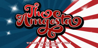 The Amgesta is a Vintage retro font inspired by retro typography and lettering in the 60s and 80s combined with a bold typography style. This font is perfect for vintage and retro designs, badges, logos, t-shirts, posters, branding, packaging, signage, book covers, and so much more! This font is PUA encoded, which means you can access all of the glyphs and swashes with ease!
 - Monthstage by ahweproject,
$10.00 Monthstage is a Vintage retro font inspired by retro typography and lettering in the 70s and 80s combined with a bold typography style. This font is perfect for vintage and retro designs, badges, logos, t-shirts, posters, branding, packaging, signage, book covers, and so much more! This font is PUA encoded, which means you can access all of the glyphs and swashes with ease!
 - So Prolix by Sudtipos,
$29.00 A tribute to calligraphy, with the thinness of modern times. So Prolix is presented as a calligraphic typography with uniform sketches and very particular features. Its harmonious and soft rhythm will impregnate every word with a great personality. Elegant, strong and harmonious, So Prolix irradiate its own style on every character. Rescuing particular features, So Prolix is even a modern typography and useful, giving distinction to words.
 - Hyper Fatos by Bisou,
$15.00 Crafted with passion in La Chaux-de-Fonds, Switzerland, the Hyper Fatos typography was born in a moment of pure delight as the creator (Bisou) indulged in a delicious pizza. Inspired by the excitement and satisfaction that come from the most indulgent culinary pleasures, he designed this unique typography to capture the essence of gluttony and the irresistibility of the most appetizing dishes. Hyper Fatos was meticulously crafted to evoke an undeniable sense of indulgence. Its boldness and rounded forms bring to mind juicy hamburgers, crispy fries, and donuts overflowing with icing. It's the perfect typography for fast-food restaurant signs, tantalizing menus, or even advertising campaigns for giant burgers and decadent milkshakes. Picture Hyper Fatos in bright letters above a hot dog stand, and you'll see lovers of greasy food rushing to satisfy their most voracious cravings. This typography is the ultimate choice to whet your customers' appetites and encourage them to indulge in culinary delight.
 - TypographerTextur Schatten - Personal use only

- TypographerFraktur Contour - Personal use only

- TypographerFraktur Shadow - Personal use only

- John Davidson by Mindtype Co.,
$35.00 Introducing the John Davidson, a beautiful modern calligraphy font with handwritten, sophisticated flows. John Davidson offers beautiful typographic harmony for a diversity of design projects, including logos & branding, wedding designs, social media posts, advertisements & product designs.
 - Tioxo Sans by Fo Da,
$2.00 Tioxo Sans is a display font of a single weight, ideally suited for advertising and packaging, festive occasions, editorial and publishing, creative industries and posters . Tioxo Sans provides advanced typographical support with features such as ligatures.
 - Mentari by Surotype,
$35.00 Mentari a brush script typeface, bold and elegant, with several alternate characters in each letter to give you ease in accomplishing the work of typographic such as logotype, poster, headline, T-shirt and other creative projects.
 - Concapita by Lone Army,
$15.00 Concapita is a bold modern vintage display font, featuring thick and weighty characters. Ideal for headlines and branding, its fat, bold strokes seamlessly blend contemporary and vintage aesthetics, creating a unique and attention-grabbing typographic style.
 - Fashion Wacks by Nirmana Visual,
$22.00 Fashion Wacks , contemporary of serif font, Inspired by all the retro aesthetics making a comeback, Fashion Wacks offers beautiful typographic harmony for a diversity of design projects, including logos & branding, social media posts, advertisements & product designs.
 - Steamer by Erik Bertell,
$29.95 Steamer is a grimy grotesque with a thick early 20th century air to it. A tireless workhorse, it is accustomed to carrying out any typographic task from continuous text to bold headlines steadily through any conditions.
 - Nostalgic - Unknown license

- ROUGHAGE - Unknown license

- Metzada MF by Masterfont,
$59.00 Metzada is a vivid choice when you want to effortlessly make your designs stand out with a remarkable sharp crafted typography.
 - Cykor by K94 Studio,
$9.00 Cykor is a display typeface with reversed contrast inspired by typography of the late 70s designed in 2020 by Kacper Janusiak.
 - Plain Script by ParaType,
$25.00Designed at ParaType in 1995 by Tagir Safayev. Based on informal handwriting (caps-only). For use in advertising and display typography. - Irina by ParaType,
$25.00 Designed at ParaType in 1995 by Tagir Safayev. Based on informal handwriting (caps-only). For use in advertising and display typography.
 - Jozef by Underscore,
$35.00 Jozef is a serif typeface family with modern character and a firm voice. It is equally suited to setting text on screen and in print. With eight weights, matching italics, and decorative capitals it offers a plentiful typographic range, and provides language support for extended latin. The sharp serifs equip this typeface with a strong tone and clear legibility, while the italics offer a softer but equally solid appearance. Opentype features, number sets and a wide range of typographic characters make this a resourceful text typeface. Jozef was designed by Johannes Neumeier and published through Underscore in 2018.
 - EFCO Fairley by Ephemera Fonts,
$35.00 EFCO Fairley Font Collection includes 11 fonts that have different styles in sans, serif and script, which are all works great together or in their own. The script version also combined with ending swashes, use stylistic alternates from 0 to 9 to work with them. The Inspiration for this collection comes from today's graphic design trends. EFCO Fairley Font Collection was designed carefully to create dozens of font combinations and get really unique typographic for your project. It would be a perfect choice for posters, logos, t-shirt and magazine prints, eye-pleasing typographic designs and more.
 - Bona Nova by Borutta Group,
$- ☞ Bona Nova is a collective revival project of Bona typeface designed in 1971 by the author of polish banknotes Andrzej Heidrich. Besides giving the project a digital font form the aim was to expand the base character set: preparation of small caps, designing the alternative glyphs and multiple opentype features. Working together with the author we designed two new text versions: regular and bold – to give the family a form of a classic script triad. ☞ It is accompanied by three title versions and three contour styles under the name of Bona Sforza. All styles contains over 1200 glyphs. ☞ Bona Nova is an unprecedented typographic adventure for our team. We hope that our work will allow the cultural heritage of Bona and the work of Andrzeja Heidricha to gain new followers and fans. This project connected three generations of graphic designers who graduated the same school – the Academy of Fine Arts in Warsaw. ☞ Bona Nova isn’t only a typeface. We have also prepared a book about the project (including an interview with Andrzej Heidrich, my text about the digitalisation and a font specimen). The Bona Nova release party was a big exhibition (over 1000 guests). I’ve invited 26 graphic designers to prepare their own initials of Bona Nova – they were presented as posters on exhibition too. LINKS Bona Nova WEB Bona Nova FP Bona-Nova-(FREE-FONT) Bona Nova Book BONA NOVA IN THE MEDIA Typeroom Typography Guru Slanted Designalley Stgu Typografie Info Wikipedia Bona Nova is a non-profit project, all founds that we raise we reinvest to develop the Bona Nova project (new styles, Cyrillic & Greek, extend character set).
 - Ceciliany by Brenners Template,
$19.00 Ceciliany is a classy font family that adds calligraphic touches to the basic structure of the display serif. Italic styles share a language set and OpenType Features compared to static styles, but have a completely different metrics In addition, an elaborate and detailed kerning system is also operated separately. 9 weights and 18 unique styles offer designers the amazing creativity of the serif font family. It offers a variety of options for editorial design as well as typography work for various channels. Features 9weights, 18styles Optimized Kernings Stylistic Set Fractions Oldstyle Figures Discretionary Ligatures : AM, AR, BA, BR, CA, CH, CR, DE, EA, El, FR, GA, GH, HR, IL, IM, JA, KA, KR, Ki, LA, LE, LO, MA, Ma, Me, NA, NE, NT, Nu, PS, RA, RE, RO, Ro, SA, ST, TH, UB, Ze, Zo, ft, li. Standard Ligatures : ff, fi, fl. * In particular, ligatures displayed in preview images can be easily applied to Adobe apps. Check out the ligature features of the software you are using.


