10,000 search results
(0.026 seconds)
- Adria Grotesk by FaceType,
$-
- Onry Display by NicolassFonts,
$35.00
- Carbonium by Paweł Burgiel,
$38.00
- The Peninsula font, crafted by the talented type designer Vladimir Nikolic, is a distinctive typeface that stands out for its unique characteristics and versatile application. This font can be catego...
- Ryo Gothic PlusN by Adobe,
$79.00 - Trivial - Unknown license

- Wanax Demo - Unknown license

- Mailart Rubberstamp - Unknown license

- Subway Ticker - Unknown license

- PixL - Unknown license

- Arcade by Solotype,
$19.95 - Brown Now by Studio Fat Cat,
$15.00
- Bruce 1490 by Intellecta Design,
$26.90
- Editorial Comment JNL by Jeff Levine,
$29.00 - Cloverdale JNL by Jeff Levine,
$29.00 - Goodbees by ZetDesign,
$15.00
- Bresley by Blankids,
$27.00
- Crestwood by Ascender,
$29.99 - Avebury by Parkinson,
$25.00
- FF TradeOne by FontFont,
$30.99
- Dyane by Wiescher Design,
$39.50
- Salamander by Fenotype,
$35.00
- Europa Text by Solotype,
$19.95 - Westmore by Solotype,
$19.95 - Fashioniqa by Timurtype,
$14.00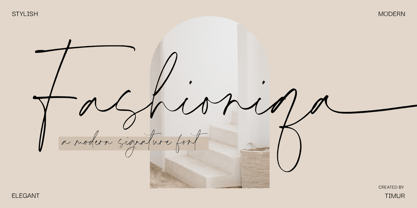
- Delightica by Timurtype,
$14.00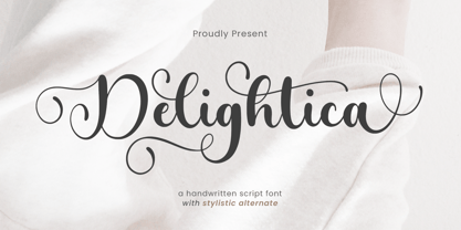
- Cinio Text by TeGeType,
$29.00
- Katydid JNL by Jeff Levine,
$29.00
- Fayte by That That Creative,
$15.00
- Glosa Display by DSType,
$55.00
- Kaufmann by URW Type Foundry,
$35.99
- PR Foxtail 01 by PR Fonts,
$5.00
- MPI Headline Modified by mpressInteractive,
$5.00
- Stencil Chamfer JNL by Jeff Levine,
$29.00
- Sunlight JNL by Jeff Levine,
$29.00 - Date Night JNL by Jeff Levine,
$29.00
- Modal Stencil by Schriftlabor,
$42.00
- Subway Novella by KC Fonts,
$34.00
- Crispy Yellow by Bogstav,
$14.00
- Gummed Alphabet JNL by Jeff Levine,
$29.00


